


Vue 开发 UI 组件库
前言
- 首先你得会 Vue 的使用
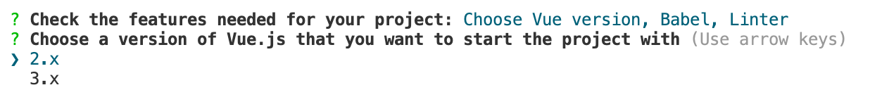
- 该项目使用的环境为 Vue2
- Vue2 开发的组件似乎只能在 Vue2 项目中使用,不能在 Vue3 项目中使用
- 组件一有时间就补充
- 该文章中的示例组件代码并不完整,示例的作用是方便了解对应组件的实现原理
一、开发环境搭建
1、项目初始化
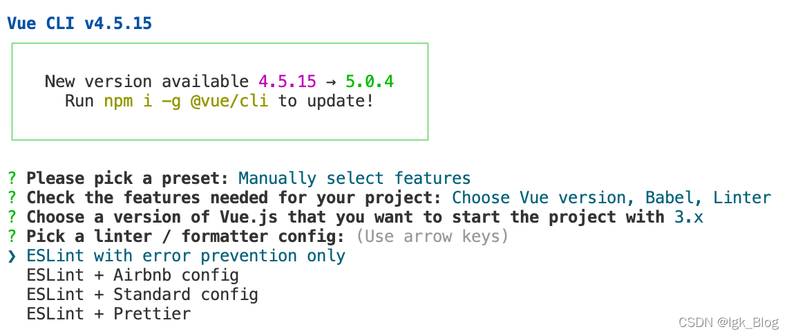
- 使用 Vue-Cli 脚手架搭建一个项目
vue create 项目名
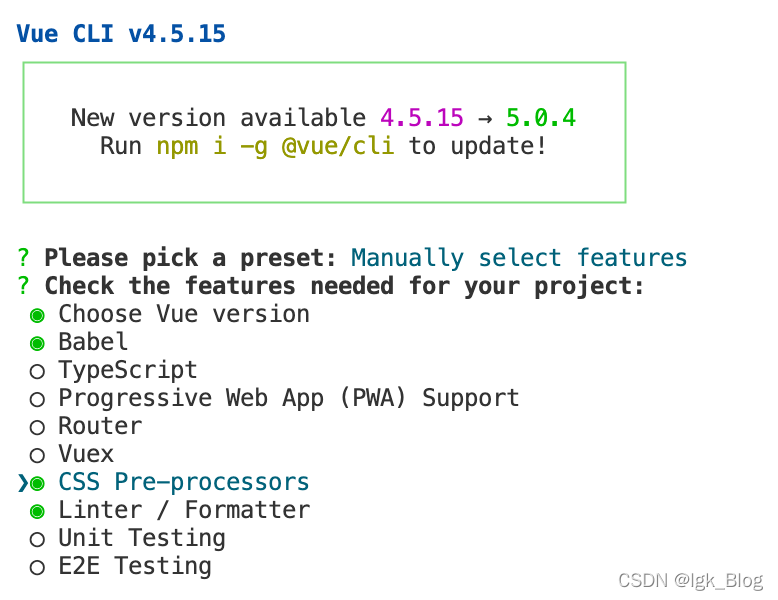
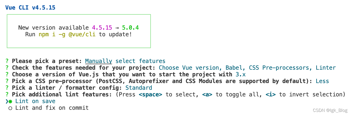
- 选择手动选择
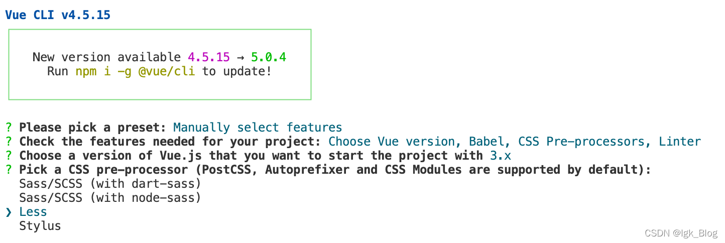
- 上下按钮控制“箭头指向”,空格键确定选择
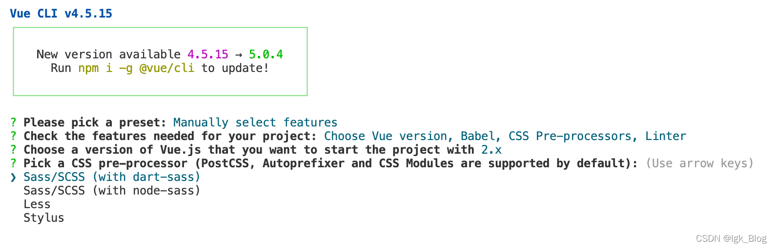
- 这里我选择“Sass/SCSS(with dart-sass)”
- 不想受 Eslant 困扰的话选择只有报错时才校验
- 保存时校验
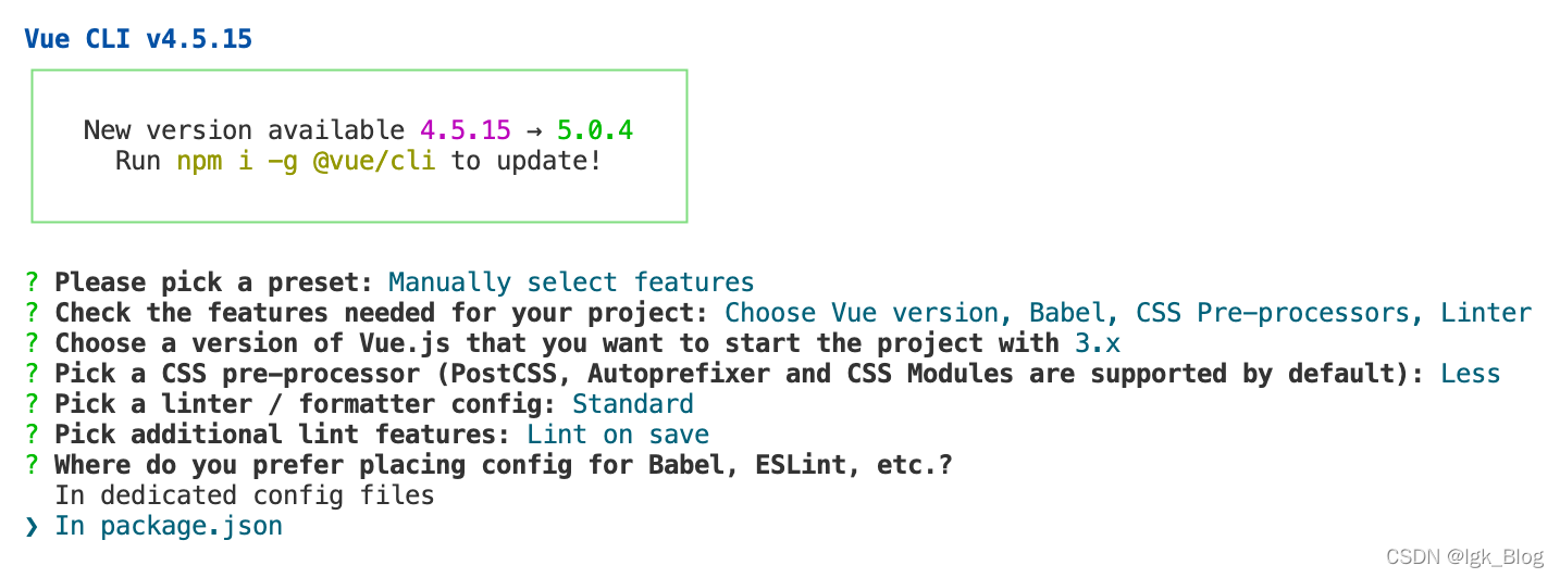
- 安装到 package.json
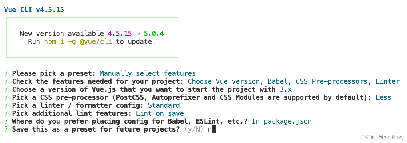
- 是否保存这次的选择方便以后使用,输入“n”不保存
2、开发前准备
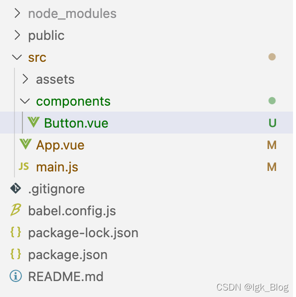
- 清空 assets、components 目录,并在 components 目录下创建一个用于测试的组件
// Button.vue
<template>
  <div class="button">Button</div>
</template>
<script>
export default {
  name: "TestButton",
};
</script>

<style lang="less" scoped></style>
- 全局注册组件
// main.js
import { createApp } from 'vue'
import App from './App.vue'
import Button from "./components/Button.vue"

const app = createApp(App)

// 全局注册组件
app.component(Button.name, Button)

app.mount('#app')
- 使用组件
// App.vue
<template>
  <div>
    <test-button></test-button>
  </div>
</template>

<script>
export default {
  name: "App",
};
</script>

<style></style>
二、Vue 实现常用组件
1、button 组件
1.1 参数支持
| 参数名 | 参数类型 | 参数描述 | 默认值 |
|---|---|---|---|
| type | String | 按钮值:primary、success、warning、danger | default |
| plain | Boolean | 是否没有背景填充 | false |
| circle | Boolean | 是否是圆形按钮 | false |
1.2 事件支持
| 事件名 | 说明 |
|---|---|
| click | 用户点击按钮时触发该事件 |
1.3 Button 组件
- Button 组件
<template>
  <button
    class="button"
    :class="[`button-${type}`, { 'is-plain': plain, 'is-circle': circle }]"
    @click="handleClick"
  >
    <span v-if="$slots.default"><slot></slot></span>
  </button>
</template>
<script>
export default {
  name: "LgkButton",
  props: {
    type: {
      type: String,
      default() {
        return "default";
      },
    },
    plain: {
      type: Boolean,
      default() {
        return false;
      },
    },
    circle: {
      type: Boolean,
      default() {
        return false;
      },
    },
    icon: {
      type: String,
      default() {
        return "";
      },
    },
  },
  methods: {
    handleClick(e) {
      this.$emit("click", e);
    },
  },
};
</script>

<style scoped>
.button {
  display: inline-block;
  line-height: 1;
  white-space: nowrap;
  cursor: pointer;
  background: #fff;
  border: 1px solid #dcdfe6;
  color: #606266;
  -webkit-appearance: none;
  text-align: center;
  box-sizing: border-box;
  outline: none;
  margin: 0;
  transition: 0.1s;
  font-weight: 500;
  /* 禁止元素的文字被选中 */
  -moz-user-select: none;
  -webkit-user-select: none;
  -moz-user-select: none;
  padding: 12px 20px;
  font-size: 14px;
  border-radius: 4px;
}
.button:hover,
.button:focus {
  color: #409eff;
  border-color: #c6e2ff;
}

.button-primary {
  color: #fff;
  background: #409eff;
  border-color: #409eff;
}
.button-primary:hover,
.button-primary:focus {
  color: #409eff;
  border-color: #c6e2ff;
}

.button-success {
  color: #fff;
  background: #67c23a;
  border-color: #67c23a;
}
.button-success:hover,
.button-success:focus {
  color: #67c23a;
  border-color: #c6e2ff;
}

.button-warning {
  color: #fff;
  background: #e6a23c;
  border-color: #e6a23c;
}
.button-warning:hover,
.button-warning:focus {
  color: #e6a23c;
  border-color: #c6e2ff;
}

.button-danger {
  color: #fff;
  background: #f56c6c;
  border-color: #f56c6c;
}
.button-danger:hover,
.button-danger:focus {
  color: #f56c6c;
  border-color: #c6e2ff;
}

/* 朴素的按钮 */
.button.is-plain:hover,
.button.is-plain:focus {
  background: #fff;
  border-color: #409eff;
  color: #409eff;
}

.button-primary.is-plain {
  background: #ecf5ff;
  border-color: #b3d8ff;
  color: #409eff;
}
.button-primary.is-plain:hover,
.button-primary.is-plain:focus {
  background: #fff;
  border-color: #409eff;
  color: #409eff;
}

.button-success.is-plain {
  background: #f0f9eb;
  border-color: #c2e7b0;
  color: #67c23a;
}
.button-success.is-plain:hover,
.button-success.is-plain:focus {
  background: #67c23a;
  border-color: #67c23a;
  color: #fff;
}

.button-warning.is-plain {
  background: #fdf6ec;
  border-color: #f5bad1;
  color: #e6a23c;
}
.button-warning.is-plain:hover,
.button-warning.is-plain:focus {
  background: #e6a23c;
  border-color: #e6a23c;
  color: #fff;
}

.button-danger.is-plain {
  background: #fef0f0;
  border-color: #fbc4c4;
  color: #f56c6c;
}
.button-danger.is-plain:hover,
.button-danger.is-plain:focus {
  background: #f56c6c;
  border-color: #f56c6c;
  color: #fff;
}

/* 圆 */
.button.is-circle {
  border-radius: 50%;
  padding: 10px;
}
.button.icon {
  margin-left: 5px;
}
</style>
1.4 测试使用
- App.vue 文件中测试使用
<template>
  <div>
    <lgk-button>按钮</lgk-button>
    <lgk-button type="primary">按钮</lgk-button>
    <lgk-button type="success">按钮</lgk-button>
    <lgk-button type="warning">按钮</lgk-button>
    <lgk-button type="danger" @click="handleClick">按钮</lgk-button>
  </div>
  <div>
    <lgk-button plain>按钮</lgk-button>
    <lgk-button type="primary" plain>按钮</lgk-button>
    <lgk-button type="success" plain>按钮</lgk-button>
    <lgk-button type="warning" plain>按钮</lgk-button>
    <lgk-button type="danger" plain>按钮</lgk-button>
  </div>
  <div>
    <lgk-button circle>图</lgk-button>
    <lgk-button type="primary" circle>图</lgk-button>
    <lgk-button type="success" circle>图</lgk-button>
    <lgk-button type="warning" circle>图</lgk-button>
    <lgk-button type="danger" circle>图</lgk-button>
  </div>
</template>

<script>
export default {
  name: "App",
  methods: {
    handleClick() {
      // console.log("hello world");
    },
  },
};
</script>

<style></style>
2、DatePicker 组件
2.1 参数
| 参数名 | 参数类型 | 参数描述 | 默认值 |
|---|---|---|---|
| value | Date | 传入的时间,格式为 new Date() | 必须传值 |
| width | String | 输入框的宽 | 180px |
| height | String | 输入框的高 | 30px |
| color | String | 输入框的字体颜色 | #606266 |
| fontSize | String | 输入框的字体大小 | 14px |
| border | String | 输入框的边框 | 1px solid #dcdfe6 |
| borderRadius | String | 输入框的圆角 | 4px |
| background | String | 输入框的背景颜色 | 14px |
| fontSize | String | 输入框的字体大小 | #fff |
2.2 事件
| 事件名 | 说明 | 示例值 |
|---|---|---|
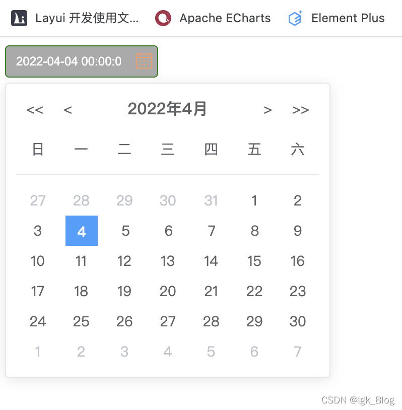
| change-value | 用户点击某天时触发该事件,返回年、月、日、时、分、秒 | 2022 4 4 0 0 0 |
2.3 DatePicker 组件
<template>
<div class="date-picker" :style="{ width: width, height: height }" v-inner>
<div
class="date-picker-input"
:style="{ border: border, background: background }"
>
<span class="left-icon" v-if="$slots.leftIcon"
><slot name="leftIcon"></slot
></span>
<input
:style="{
color: color,
fontSize: fontSize,
borderRadius: borderRadius
}"
placeholder="请选择日期"
:value="formatDate(activeDay)"
/>
<span class="right-icon" v-if="$slots.rightIcon"
><slot name="rightIcon"></slot
></span>
</div>
<div
class="date-picker-calender"
:style="{ color: calenderColor, background: calenderBgColor }"
v-if="show"
>
<!-- 头部:显示年月 -->
<div class="calender-header">
<div class="calender-header-left">
<span @click="minusYear(-1)"><<</span>
<span @click="minusMonth(-1)"><</span>
</div>
<div class="calender-header-middle">
<span>{{ year }}年</span>
<span>{{ month }}月</span>
</div>
<div class="calender-header-right">
<span @click="addMonth(1)">></span>
<span @click="addYear(1)">>></span>
</div>
</div>
<div
class="calender-weeks"
:style="{ borderBottom: calenderWeeksBorderBottom }"
>
<span v-for="item in weeks" :key="item">{{ item }}</span>
</div>
<div class="calender-days">
<!-- 遍历行 6 -->
<div class="calender-days-row" v-for="row in 6" :key="row">
<!-- 遍历列 7 -->
<span
class="calender-days-col"
:class="{
notCurMonth: !isCurrentMonth(
getCalendar[(row - 1) * 7 + (col - 1)]
),
isToday: isToday(getCalendar[(row - 1) * 7 + (col - 1)]),
activeDay: getCalendar[(row - 1) * 7 + (col - 1)] == activeDay
}"
v-for="col in 7"
:key="col"
@click="
handleSelectDateClick(getCalendar[(row - 1) * 7 + (col - 1)])
"
>{{ getCalendar[(row - 1) * 7 + (col - 1)].getDate() }}</span
>
</div>
</div>
</div>
</div>
</template>
<script>
import * as utils from '../utils'
export default {
name: 'LgkDatepicker',
props: {
value: {
type: Date,
required: true
},
width: {
type: String,
default() {
return '180px'
}
},
height: {
type: String,
default() {
return '30px'
}
},
color: {
type: String,
default() {
return '#606266'
}
},
fontSize: {
type: String,
default() {
return '14px'
}
},
border: {
type: String,
default() {
return '1px solid #dcdfe6'
}
},
borderRadius: {
type: String,
default() {
return '4px'
}
},
background: {
type: String,
default() {
return '#fff'
}
},
calenderColor: {
type: String,
default() {
return '#606266'
}
},
calenderBgColor: {
type: String,
default() {
return '#fff'
}
},
calenderWeeksBorderBottom: {
type: String,
default() {
return '1px solid #e7e8eb'
}
}
},
data() {
return {
show: false,
year: utils.formatTime(this.value).year,
month: utils.formatTime(this.value).month,
weeks: ['日', '一', '二', '三', '四', '五', '六'],
activeDay: this.value
}
},
directives: {
// 该指令的作用是判断当前点击的区域在不在日前选择面板之内
inner: {
// 指令的钩子函数
bind(el, bindings, vnode) {
// dom 元素,参数集,虚拟dom(只有一个有用的属性 context)
// vnode.context 就是表示当前组件
// console.log('vnode=>', vnode)
// 监听用户的点击行为,看在不在日前选择面板内
el.hander = function (e) {
// 面板的区域(el)和当前点击的区域(e.target)做对比
// console.log('e=>', el)
// 如果点击的区域在日前选择面板区域内,不隐藏面板,否则隐藏日前选择面板
if (el.contains(e.target)) {
// console.log('包含')
if (!vnode.context.show) {
vnode.context.onFocus()
}
} else {
// console.log('不包含')
if (vnode.context.show) {
vnode.context.onBlur()
}
}
}
document.addEventListener('click', el.hander)
},
unbind(el) {
document.removeEventListener('click', el.hander)
}
}
},
computed: {
getCalendar() {
// let { year, month } = utils.formatTime(this.value)
let year = this.year
let month = this.month
// 获取某月的第一天
let firstDay = new Date(year, month - 1, 1)
// 获取某年某月的第一天对应星期的位置
let weekIndex = firstDay.getDay()
if (weekIndex == 0) {
weekIndex = 7
}
// 计算在 6*7 的面板中的第一天,即上个月的多少号是在当前月对应面板的第一天
let firstDate = firstDay - weekIndex * 24 * 60 * 60 * 1000
// 得到当前年月 6 * 7 面板的日期
let arr = []
for (let i = 0; i < 42; i++) {
arr.push(new Date(firstDate + i * 24 * 60 * 60 * 1000))
}
// console.log('change year=>', arr)
return arr
}
},
methods: {
// 获得焦点
onFocus() {
this.show = true
},
// 失去焦点
onBlur() {
this.show = false
},
formatDate(t) {
let { year, month, day } = utils.formatTime(t)
month = utils.zeroFill(month)
day = utils.zeroFill(day)
return year + '-' + month + '-' + day
},
// 判断不是当前月
isCurrentMonth(date) {
// date 是不是当前月
// 如果 date 所属的年月 和 当前 value 所属的年月一样
let { year, month } = utils.formatTime(date)
return year === this.year && month === this.month
},
// 判断是不是当天
isToday(today) {
let { year, month, day } = utils.formatTime(today)
let { year: y, month: m, day: d } = utils.formatTime(new Date())
return year === y && month === m && day === d
},
/**
* 触发传值给父组件
*/
handleSelectDateClick(date) {
this.activeDay = date
this.$emit('change-value', utils.formatTime(date))
},
/**
* 年减1
*/
minusYear(num) {
this.year = this.year + num
},
/**
* 年加1
*/
addYear(num) {
this.year = this.year + num
},
/**
* 月减1
*/
minusMonth(num) {
this.month = this.month + num
},
/**
* 月加1
*/
addMonth(num) {
this.month = this.month + num
}
}
}
</script>
<style scoped lang="scss">
.date-picker {
// width: 180px;
// height: 30px;
// 输入框的样式
.date-picker-input {
width: 100%;
height: 100%;
border: 1px solid #dcdfe6;
border-radius: 4px;
cursor: pointer;
display: flex;
justify-content: space-between;
align-items: center;
& .left-icon,
& .right-icon {
margin: 0 3px;
}
& input {
display: inline-block;
width: 100%;
height: 100%;
// color: #606266;
padding: 0 10px;
box-sizing: border-box;
border-radius: 4px;
cursor: pointer;
border: none;
background: none;
// border: 1px solid #dcdfe6;
outline: none;
-webkit-appearance: none;
}
}
// 日前选择器的样式
.date-picker-calender {
position: absolute;
width: 323px;
line-height: 30px;
// color: #606266;
border: 1px solid #e4e7ed;
box-shadow: 0 2px 12px 0 rgba(0, 0, 0, 0.1);
// background: #fff;
border-radius: 4px;
margin: 5px 0;
padding: 10px;
box-sizing: border-box;
.calender-header {
width: 100%;
// color: #fff;
display: flex;
justify-content: space-between;
align-items: center;
.calender-header-left {
// color: #606266;
font-size: 14px;
& span:nth-of-type(1) {
margin: 0 10px;
}
& span:nth-of-type(2) {
margin-left: 10px;
}
}
.calender-header-middle {
// color: #606266;
font-size: 16px;
font-weight: 500;
}
.calender-header-right {
font-size: 14px;
& span:nth-of-type(1) {
margin-right: 10px;
}
& span:nth-of-type(2) {
margin: 0 10px;
}
}
}
.calender-weeks {
width: 100%;
height: 40px;
// border-bottom: 1px solid #e7e8eb;
margin: 10px 0;
font-size: 14px;
display: flex;
justify-content: space-around;
}
.calender-days {
.calender-days-row {
height: 30px;
display: flex;
justify-content: space-around;
.calender-days-col {
width: 30px;
font-size: 14px;
text-align: center;
}
}
}
}
.notCurMonth {
color: #c0c4cc;
}
.isToday {
color: #409eff;
font-weight: 700;
border: 1px solid #409eff;
}
.activeDay {
color: #fff;
background: #409eff;
}
}
</style>
2.4 测试
// main.js
import Vue from 'vue'
import App from './App.vue'
// import DatePicker from "./../packages/components/DatePicker.vue"
// import LgkVueUI from "./../packages"
// import "./../dist/lgk-vue-ui.css"
import LgkVueUI from "lgk-vue-ui"
import "lgk-vue-ui/dist/lgk-vue-ui.css"

Vue.config.productionTip = false

// Vue.component(DatePicker.name, DatePicker)
Vue.use(LgkVueUI)

new Vue({
  render: h => h(App),
}).$mount('#app')
// App.vue
<template>
<div id="app">
<lgk-datepicker
v-model="time"
:width="'180px'"
:height="'30px'"
:fontSize="'14px'"
:color="'#606266'"
:border="'1px solid #dcdfe6'"
:borderRadius="'4px'"
:background="'#fff'"
:calenderColor="'#606266'"
:calenderBgColor="'#ccc'"
:calenderWeeksBorderBottom="'1px solid #e7e8eb'"
@change-value="changeValue"
>
<!-- <template slot="leftIcon">
<span class="icon iconfont iconStyle"></span>
</template> -->
<template slot="rightIcon">
<span class="icon iconfont iconStyle"></span>
</template>
</lgk-datepicker>
</div>
</template>
<script>
// import LgkDatepicker from './components/DatePicker.vue'
export default {
name: 'App',
components: {
// LgkDatepicker
},
data() {
return {
// time: new Date(2021, 4, 1),
time: new Date()
}
},
methods: {
changeValue(date) {
let { year, month, day, hour, minute, second } = date
console.log('app date=>', year, month, day, hour, minute, second)
}
}
}
</script>
<style lang="scss">
@import url('./assets/icon/iconfont.css');
#app {
.iconStyle {
color: #f49c68;
font-size: 20px;
}
}
</style>
3、TreeData 组件
- 树型结构大概如下面的代码,图片可以替换成自己想要的
- 组件需要传一个 Object 类型的数据
{
  id: "id",
  title: "名称",
  key: "key",
  children: [
    {
      id: "id",
      title: "名称",
  	  key: "key",
  	  children: [
    	{
          id: "id",
  		  title: "名称",
  		  key: "key",
  		  children: [
    		{
      		  title: "假设是最后层",
      		  id: "id",
      		  key: "key"
    		}
    	  ]
    	}
  	  ]
    },
    {
      id: "id",
      title: "名称",
  	  key: "key",
  	  children: [
    	{
          id: "id",
  		  title: "名称",
  		  key: "key",
  		  children: [
    		{
      		  title: "假设是最后层",
      		  id: "id",
      		  key: "key"
    		},
    		{
      		  title: "假设是最后层",
      		  id: "id",
      		  key: "key"
    		}
  		  ]
    	}
  	  ]
    },
  ]
}
- TreeData 组件
- 递归 TreeData 需要加上 v-bind=“$attrs” ,否则不能使用 $emit 触发事件传递给父组件
<template>
  <div class="treeData">
    <div class="treeData-item" @click="toggleChildren(item)">
      <div class="treeData-item-outermost" v-if="item.id == 0">
        <img src="./../../assets/images/common/treedata-open-img.png" alt="" />
      </div>
      <div class="treeData-item-inner" v-else>
        <div
          class="treeData-item-img__folder"
          v-show="item.children && item.children.length > 0"
        >
          <img
            class="folder-down"
            src="./../../assets/images/common/treedata-down-img.png"
            alt=""
            v-if="isOpen"
          />
          <img
            class="folder-right"
            src="./../../assets/images/common/treedata-right-img.png"
            alt=""
            v-else
          />
        </div>
        <div
          class="treeData-item-img__spotted"
          v-show="!item.children || item.children.length == 0"
        >
          <img
            src="./../../assets/images/common/treedata-red-dot-icon.png"
            alt=""
            v-if="isOpen"
          />
          <img
            src="./../../assets/images/common/treedata-green-dot-icon.png"
            alt=""
            v-else
          />
        </div>
      </div>
      <div class="treeData-item-text">{{ item.title || item.name }}</div>
    </div>
    <div v-show="isOpen" v-if="isFolder">
      <tree-data
        v-for="(child, index) in item.children"
        :key="index"
        :item="child"
        v-bind="$attrs"
      />
    </div>
  </div>
</template>
<script>
export default {
  props: {
    item: {
      type: Object,
      default() {
        return {};
      },
    },
  },
  data() {
    return {
      isOpen: false,
    };
  },
  computed: {
    isFolder() {
      return this.item.children && this.item.children.length;
    },
  },
  methods: {
    toggleChildren(item) {
      if (this.isFolder) {
        this.isOpen = !this.isOpen;
      } else {
        // console.log("make folder=>", item.key);
        let key = item.key;
        this.$emit("key-click", key);
      }
    },
  },
};
</script>
<style lang="less" scoped>
.treeData {
  width: 100%;
  color: #fff;
  padding-left: 15px;
  box-sizing: border-box;
  display: flex;
  flex-direction: column;
  .treeData-item {
    width: 100%;
    height: 22px;
    padding: 0px 10px;
    box-sizing: border-box;
    cursor: pointer;
    display: flex;
    justify-content: flex-start;
    align-items: center;
    .treeData-item-outermost {
      height: 100%;
      display: flex;
      justify-content: center;
      align-items: center;
      margin-top: -5px;
      & img {
        width: 12px;
        height: 12px;
      }
    }
    .treeData-item-inner {
      height: 100%;
      .treeData-item-img__folder {
        height: 100%;
        display: flex;
        justify-content: center;
        align-items: center;
        .folder-right {
          width: 8px;
          height: 12px;
        }
        .folder-down {
          width: 12px;
          height: 8px;
        }
      }
      .treeData-item-img__spotted {
        width: 10px;
        height: 10px;
        display: flex;
        justify-content: center;
        align-items: center;
        margin-top: 4px;
        & img {
          width: 100%;
          height: 100%;
        }
      }
    }

    .treeData-item-text {
      height: 100%;
      color: #fff;
      font-size: 13px;
      text-align: left;
      margin: 0px 10px;
      overflow: hidden;
      white-space: nowrap;
      text-overflow: ellipsis;
    }
  }
}
</style>
4、Table 组件
5、Pagination 组件
三、UI 组件库的封装
- 在项目下创建一个 packages 目录,用于存放所有组件
- 然后在 packages 目录下创建一个入口文件 index.js,用于全局注册组件
// packages/index.js
/**
 * packages 的入口文件
 */
import Button from "./Button.vue"

const components = [Button]
const install = function (Vue) {
  // 全局注册组件
  components.forEach(item => {
    Vue.component(item.name, item)
  })
}

// 判断是否是直接引入文件,如果是,就不用调用 Vue.use()
if (typeof window !== 'undefined' && window.Vue) {
  install(window.Vue)
}

export default { install }
- 在 vue.config.js 文件中添加对 packages 目录的编译
const path = require('path')

module.exports = {
  // 扩展 webpack 配置,使 packages 加入编译
  chainWebpack: config => {
    config.module.rule('js')
      .include.add(path.resolve(__dirname, 'packages')).end()
      .use('babel')
      .loader('babel-loader')
      .tap(options => {
        return options
      })
  }
}
- 在 package.json 文件中添加打包成库的命令
"scripts": {
    "serve": "vue-cli-service serve",
    "build": "vue-cli-service build",
    "lint": "vue-cli-service lint",
    "lib": "vue-cli-service build --target lib packages/index.js"
  },
- 然后执行 nom run lib 进行打包
四、发布到 npm 与 gitee
1、上传到 Gitee
- 上传的步骤以后再补
- 项目源码地址:https://gitee.com/lgk2021/lgk-vue-ui
2、发布到 npm
2.1 注册 npm 账号
- npm 注册:https://www.npmjs.com/signup
- 填写个人注册信息,用户名、邮箱、密码
- 勾选接受协议,点击“Create an Account”

2.2 发布到 npm
发布前准备:
- 需要将 package.json 中的 private 属性值改为 false
- 保证在 npm 中没有相同名字的库,即修改 package.json 中的 name 属性值唯一
- 指定下载的文件,在 package.json 中添加 main 属性用于指定下载文件
- 指定作者、描述、协议等(可填可不填)
  "name": "项目名唯一",
  "version": "0.1.0",
  "private": false,
  "main": "dist/项目名.umd.min.js",
  "author": {
    "name": "lgk"
  },
  "scripts": {
    "serve": "vue-cli-service serve",
    "build": "vue-cli-service build",
    "lint": "vue-cli-service lint",
    "lib": "vue-cli-service build --target lib packages/index.js"
  },
- 创建一个 .npmignore 文件,用于将一些没必要上传到 npm 的文件剔除
// .npmignore
# 剔除的目录
packages/
public/
src/

# 剔除的文件
vue.config.js
babel.config.js
*.map
.gitignore
发布到 npm:
- 查看当前所使用的源
npm get registry
- 检查现在所使用的 npm 源,如果不是 npm 源,需要切换回来
nrm ls
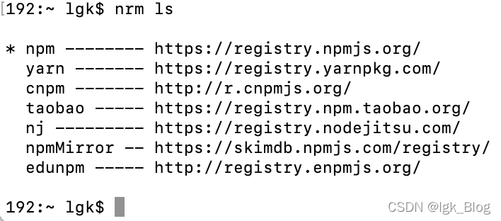
- 切换 npm 源为 https://registry.npmjs.org/
// 切换为 npm 源
npm config set registry https://registry.npmjs.org/
// 切换为 taobao 源
npm config set registry http://registry.npm.taobao.org/
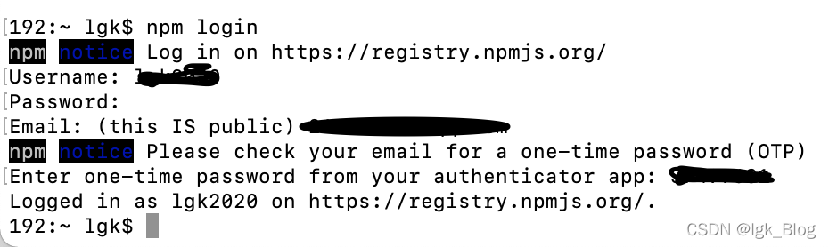
- 登录 npm,输入用户名、密码、邮箱、验证码
npm login
- 进入项目内
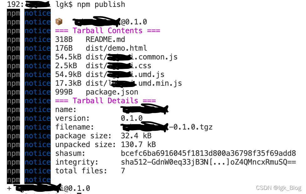
- 使用命令发布到 npm 仓库
npm publish
- 如果显示如下图信息表示发布成功,也可以登录到 npm 中查看


 938
938

 被折叠的 条评论
为什么被折叠?
被折叠的 条评论
为什么被折叠?
 到【灌水乐园】发言


