


逻辑: 利用 document.createElement 实时生成组件插入到 Html 中。
# 用类创建一个实例子。
创建 plugins.ts 文件,写入以下
/** confirm 消息确定框 */
// 参数 扩展属性
interface ConfirmOptions {
    title?: string;
    message?: string;
    showCancelButton?: boolean;
    cancelButtonText?: string;
    confirmButtonText?: string;
}
class Confirm {
    private element: HTMLElement | null = null;
    // 默认值
    readonly defaultOptions: ConfirmOptions = {
        showCancelButton: true,
        cancelButtonText: "取消",
        confirmButtonText: "确定",
    };
    public open(opts: ConfirmOptions) {
        // 默认值
        const options: ConfirmOptions = Object.assign(JSON.parse(JSON.stringify(this.defaultOptions)), opts);
        return new Promise((resolve, reject) => {
            this.element = this._element();
            this.element.innerHTML = `
                <div class="confirm-card">
                    <div class="confirm-header">
                        <h4 class="modal-title">${options.title}</h4>
                        <span class="fas fa-times cancel-btn"></span>
                    </div>
                    <div class="confirm-body">
                        ${options.message}
                    </div>

                    <div class="confirm-footer">
                        <button type="button" class="cancel-btn ${options.showCancelButton ? '' : 'none'}">${options.cancelButtonText}</button>
                        <button type="submit" class="confirm-btn">${options.confirmButtonText}</button>
                    </div>
                </div>
            `;
            /** 打开遮罩层 */
            this._mask(true)
            // 添加事件代理到父元素
            this.element.addEventListener('click', (event) => {
                const target = event.target as HTMLElement;
                if (target.classList.contains('confirm-btn')) {
                    this._clear()
                    return resolve(true)
                } else if (target.classList.contains('cancel-btn')) {
                    this._clear()
                    return reject(true)
                }
            });
        });
    }
    // 创建元素
    private _element() {
      const existingElement = document.getElementById("confirm-content");
      if (existingElement) {
        return existingElement;
      }
      const newElement = document.createElement("div");
      newElement.setAttribute("id", "confirm-content");
      document.body.appendChild(newElement);
      return newElement;
    }
    // 创建遮罩层
    private _mask(isOpen: boolean = false) {
        let element = document.getElementById("confirm-mask");
        if (!element) {
            element = document.createElement("div");
            element.setAttribute("id", "confirm-mask");
            document.body.appendChild(element);
        }
        if (!isOpen) {
            element.remove();
        }
    }
    // 清除 element
    private _clear() {
        this._mask()
        if (this.element) {
            this.element.remove();
            this.element = null;
        }
    }
}
/*抛出实例*/
export default {
    $confirm: new Confirm(),
}
确认框的整体已建构完毕, 下面要做的就对确定框进行样式调整
/* 这里使用 less 预处理器的写法,需注意*/
/* confirm */
.confirm-mask{
    position: fixed;
    z-index: 2072;
    left: 0;
    top: 0;
    width: 100%;
    height: 100%;
    opacity: .5;
    background: #000;
}
#confirm-content{
    position: fixed;
    top: 0;
    bottom: 0;
    left: 0;
    right: 0;
    text-align: center;
    z-index: 2073;
    & + #confirm-mask, & ~ #confirm-mask{
        width: 100vw;
        height: 100vh;
        position: fixed;
        top: 0;
        left: 0;
        background: #333;
        opacity: .5;
        z-index: 2072;
    }
    .confirm-card{
        z-index: 2073;
        display: inline-block;
        max-width: 420px;
        width: 90%;
        vertical-align: middle;
        background-color: #fff;
        border-radius: 4px;
        border: 1px solid #ebeef5;
        font-size: 18px;
        box-shadow: 0 2px 12px 0 rgba(0,0,0,.1);
        text-align: left;
        overflow: hidden;
        backface-visibility: hidden;
        margin-top: calc(50vh - 200px);
        .confirm-header{
            position: relative;
            padding: 15px 15px 10px;
            .modal-title{
                padding-left: 0;
                margin-bottom: 0;
                font-size: 18px;
                line-height: 1;
            }
            .cancel-btn{
                position: absolute;
                top: 15px;
                right: 15px;
                font-size: 16px;
                color: #CCC;
                cursor: pointer;
                &.none{
                    display: none;
                }
            }
        }
        .confirm-body{
            padding: 10px 15px;
            font-size: 14px;
        }
        .confirm-footer{
            text-align: right;
            padding: 10px 15px;
            button{
                outline: none;
                padding: 0 12px;
                line-height: 28px;
                height: 28px;
                font-size: 12px;
                &.confirm-btn{
                    background: #409eff;
                    border-radius: 3px;
                    color: #fff;
                }
            }
        }
    }
}
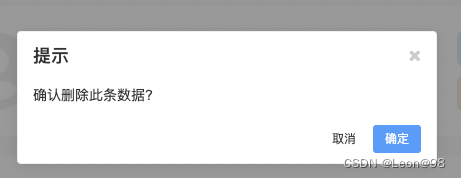
下面介绍使用方法及效果展示
import plugins from '@/utils/plugins';
plugins.$confirm.open({ title: "提示", message: "确认删除此条数据?" }).then(() => {
	console.log("点击了确认")
});
致辞纯 TS 版本的消息确认框完工, 假如你需要一些情景框,可以自主的扩充一下 Confirm的类。


 2万+
2万+


 被折叠的 条评论
为什么被折叠?
被折叠的 条评论
为什么被折叠?
 到【灌水乐园】发言


