


1-引入依赖
fl_chart: ^0.35.0 # 折线图2-条形图具体实现
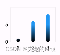
条形图
代码:
import 'package:fl_chart/fl_chart.dart';
import 'package:flutter/material.dart';

class MyHomePage extends StatefulWidget {
  const MyHomePage({super.key, required this.title});
  final String title;
  @override
  State<MyHomePage> createState() => _MyHomePageState();
}

class _MyHomePageState extends State<MyHomePage> {
  @override
  void initState() {
    super.initState();
  }
  @override
  Widget build(BuildContext context) {
    return Scaffold(
      appBar: AppBar(
        backgroundColor: Theme.of(context).colorScheme.inversePrimary,
        title: Text(widget.title),
      ),
      body: Container(
            height: 200,
            width:230,
            margin: EdgeInsets.only(top: 20),
            padding: const EdgeInsets.all(30),
            child: BarChart(
              BarChartData(
                alignment: BarChartAlignment.spaceAround,// 柱状图的对齐方式
                maxY:10,//Y轴的最大值
                // 点击可出现提示框
                barTouchData: BarTouchData(
                  enabled: true,
                  // 修改提示框的样式和展示文字
                  touchTooltipData: BarTouchTooltipData(
                     tooltipBgColor:const Color.fromRGBO(255, 237, 142, 1),// 设置弹出框的背景色
                     tooltipRoundedRadius: 8,//圆角边框
                     tooltipPadding: const EdgeInsets.all(5), // 内边距
                     tooltipMargin: 2, // 外边距
                     maxContentWidth:100, // 提示框的最大宽度
                     direction:TooltipDirection.top, // 提示框的位置
                     // 设置弹出框内容
                     getTooltipItem: (group, groupIndex, rod, rodIndex) {
                         String myData ="";
                         if(group.x.toInt()==0){
                             myData = "第一条数据" ;
                         }else if(group.x.toInt()==1){
                             myData = "第二条数据" ;
                         }else if(group.x.toInt()==2){
                             myData = "第三条数据" ;
                         }
                         // rod.y.toInt() -- 当前y轴的数值
                         return BarTooltipItem("$myData ${rod.y.toInt()}", const TextStyle(color: Color.fromRGBO(180, 172, 130, 1)));
                     }
                  )
                ),
                titlesData: FlTitlesData(
                    // 纵轴
                  leftTitles: SideTitles(
                    showTitles: true, // 是否展示
                    interval: 5,
                    margin: 8,
                    reservedSize: 30,
                    getTextStyles: (value)=> const TextStyle(
                      color: Colors.black,
                      fontSize: 15
                    ) ,
                    getTitles: (value){
                      if(value.toInt()==0){
                        return "0";
                      }else if(value.toInt() == 5){
                        return "5";
                      }else{
                        return "";
                      }
                    },
                  ),
                  // 横轴
                  bottomTitles: SideTitles(
                    showTitles: true,
                    interval: 5,
                    margin: 8,
                    reservedSize: 30,
                    getTextStyles: (value)=> const TextStyle(
                      color: Colors.black,
                      fontSize: 15
                    ) ,
                    getTitles: (value){
                      if(value.toInt()==0){
                        return "1";
                      }else if(value.toInt() == 1){
                        return "2";
                      }else if(value.toInt() == 2){
                        return "3";
                      }else{
                        return "";
                      }
                    },
                  )
                ),
                // 是否展示边框
                borderData: FlBorderData(
                  show: true,
                  border:Border.all(
                    color: Colors.black12,
                      width: 1,
                      style: BorderStyle.solid
                  ),
                ),
                groupsSpace: 12, // 调整组与组之间的间隔
                // 条形图的数据
                barGroups: [
                    BarChartGroupData(
                        x: 0, // x轴坐标
                        barRods: [
                            // [Colors.black,Colors.blue]:渐变
                            // 一个值为纯色
                          BarChartRodData(y: 1,colors: [Colors.black,Colors.blue],width: 10)
                        ]
                  ) ,
                  BarChartGroupData(
                        x: 1,
                        barRods: [
                          BarChartRodData(y: 6,colors: [Colors.black,Colors.blue],width: 10)
                        ]
                  ) ,
                  BarChartGroupData(
                        x: 2,
                        barRods: [
                          BarChartRodData(y: 8,colors: [Colors.black,Colors.blue],width: 10)
                        ]
                  ) ,
                ],
              ),
              swapAnimationDuration: const Duration(microseconds: 500),
              swapAnimationCurve: Curves.easeInOut,
            ),
          )
    );
  }
}
组合条形图
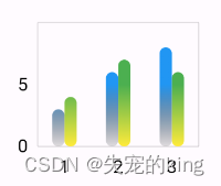
                // 条形图的数据
                barGroups: [
                    BarChartGroupData(
                        x: 0, // x轴坐标
                        barsSpace: 0, // 一个坐标中条形之间的间隔
                        barRods: [
                            // [Colors.black,Colors.blue]:渐变
                            // 一个值为纯色
                          BarChartRodData(y: 3,colors: [Colors.black12,Colors.blue],width: 10),
                          BarChartRodData(y: 4,colors: [Colors.yellow,Colors.green],width: 10)
                        ]
                  ) ,
                  BarChartGroupData(
                        x: 1,
                        barsSpace: 0, // 一个坐标中条形之间的间隔
                        barRods: [
                          BarChartRodData(y: 6,colors: [Colors.black12,Colors.blue],width: 10),
                          BarChartRodData(y: 7,colors: [Colors.yellow,Colors.green],width: 10)
                        ]
                  ) ,
                  BarChartGroupData(
                        x: 2,
                        barsSpace: 0, // 一个坐标中条形之间的间隔
                        barRods: [
                          BarChartRodData(y: 8,colors: [Colors.black12,Colors.blue],width: 10),
                          BarChartRodData(y: 6,colors: [Colors.yellow,Colors.green],width: 10)
                        ]
                  ) ,
], fl_charts:折线图Flutter实战-折线图(fl_chart)-CSDN博客


 6891
6891


 被折叠的 条评论
为什么被折叠?
被折叠的 条评论
为什么被折叠?
 到【灌水乐园】发言


