


目录
Bootstrap 字体图标(Glyphicons)
本章将讲解字体图标(Glyphicons),并通过一些实例了解它的使用。Bootstrap 捆绑了 200 多种字体格式的字形。首先让我们先来理解一下什么是字体图标。
什么是字体图标?
字体图标是在 Web 项目中使用的图标字体。虽然,Glyphicons Halflings 需要商业许可,但是您可以通过基于项目的 Bootstrap 来免费使用这些图标。
为了表示对图标作者的感谢,希望您在使用时加上 GLYPHICONS 网站的链接。
获取字体图标
我们已经在环境安装章节下载了 Bootstrap 3.x 版本,并理解了它的目录结构。在 fonts 文件夹内可以找到字体图标,它包含了下列这些文件:
- glyphicons-halflings-regular.eot
- glyphicons-halflings-regular.svg
- glyphicons-halflings-regular.ttf
- glyphicons-halflings-regular.woff
相关的 CSS 规则写在 dist 文件夹内的 css 文件夹内的 bootstrap.css 和 bootstrap-min.css 文件上。
CSS 规则解释
下面的 CSS 规则构成 glyphicon class。
@font-face {
  font-family: 'Glyphicons Halflings';
  src: url('../fonts/glyphicons-halflings-regular.eot');
  src: url('../fonts/glyphicons-halflings-regular.eot?#iefix') format('embedded-opentype'), url('../fonts/glyphicons-halflings-regular.woff') format('woff'), url('../fonts/glyphicons-halflings-regular.ttf') format('truetype'), url('../fonts/glyphicons-halflings-regular.svg#glyphicons_halflingsregular') format('svg');
}

.glyphicon {
  position: relative;
  top: 1px;
  display: inline-block;
  font-family: 'Glyphicons Halflings';
  -webkit-font-smoothing: antialiased;
  font-style: normal;
  font-weight: normal;
  line-height: 1;
  -moz-osx-font-smoothing: grayscale;
}
所以 font-face 规则实际上是在找到 glyphicons 地方声明 font-family 和位置。
.glyphicon class 声明一个从顶部偏移 1px 的相对位置,呈现为 inline-block,声明字体,规定 font-style 和 font-weight 为 normal,设置行高为 1。除此之外,使用 -webkit-font-smoothing: antialiased 和 -moz-osx-font-smoothing: grayscale; 获得跨浏览器的一致性。
然后,这里的
.glyphicon:empty {
  width: 1em;
}
是空的 glyphicon。
这里有 200 个 class,每个 class 针对一个图标。这些 class 的常见格式如下:
.glyphicon-keyword:before {
  content: "hexvalue";
}
比如,使用的 user 图标,它的 class 如下:
.glyphicon-user:before {
  content: "\e008";
}
用法
如需使用图标,只需要简单地使用下面的代码即可。请在图标和文本之间保留适当的空间。
<span class="glyphicon glyphicon-search"></span>下面的实例演示了如何使用字体图标:
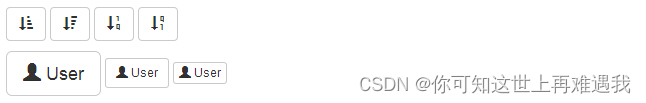
实例
<p>
    <button type="button" class="btn btn-default">
        <span class="glyphicon glyphicon-sort-by-attributes"></span>
    </button>
    <button type="button" class="btn btn-default">
        <span class="glyphicon glyphicon-sort-by-attributes-alt"></span>
    </button>
    <button type="button" class="btn btn-default">
        <span class="glyphicon glyphicon-sort-by-order"></span>
    </button>
    <button type="button" class="btn btn-default">
        <span class="glyphicon glyphicon-sort-by-order-alt"></span>
    </button>
</p>
<button type="button" class="btn btn-default btn-lg">
    <span class="glyphicon glyphicon-user"></span> User
</button>
<button type="button" class="btn btn-default btn-sm">
    <span class="glyphicon glyphicon-user"></span> User
</button>
<button type="button" class="btn btn-default btn-xs">
    <span class="glyphicon glyphicon-user"></span> User
</button>
结果如下所示:
带有字体图标的导航栏
实例
<div class="navbar navbar-fixed-top navbar-inverse" role="navigation">
    <div class="container">
        <div class="navbar-header">
            <button type="button" class="navbar-toggle" data-toggle="collapse" data-target=".navbar-collapse">
                <span class="sr-only">Toggle navigation</span>
                <span class="icon-bar"></span>
                <span class="icon-bar"></span>
                <span class="icon-bar"></span>
            </button>
            <a class="navbar-brand" href="#">Project name</a>
        </div>
        <div class="collapse navbar-collapse">
            <ul class="nav navbar-nav">
                <li class="active">
                    <a href="#">
                        <span class="glyphicon glyphicon-home">Home</span></a>
                </li>
                <li>
                    <a href="#shop">
                        <span class="glyphicon glyphicon-shopping-cart">Shop</span></a>
                </li>
                <li>
                    <a href="#support">
                        <span class="glyphicon glyphicon-headphones">Support</span></a>
                </li>
            </ul>
        </div>
        <!-- /.nav-collapse -->
    </div>
    <!-- /.container -->
</div>
<!-- jQuery (Bootstrap 插件需要引入) -->
<script src="https://cdn.static.runoob.com/libs/jquery/2.1.1/jquery.min.js"></script>
<!-- 包含了所有编译插件 -->
<script src="https://cdn.static.runoob.com/libs/bootstrap/3.3.7/js/bootstrap.min.js"></script>
定制字体图标
我们已经看到如何使用字体图标,接下来我们看看如何定制字体图标。
我们将以上面的实例开始,并通过改变字体尺寸、颜色和应用文本阴影来进行定制图标。
下面是开始的代码:
<button type="button" class="btn btn-primary btn-lg">
  <span class="glyphicon glyphicon-user"></span> User
</button>
定制字体尺寸
通过增加或减少图标的字体尺寸,您可以让图标看起来更大或更小。
<button type="button" class="btn btn-primary btn-lg" style="font-size: 60px">
  <span class="glyphicon glyphicon-user"></span> User
</button>
定制字体颜色
<button type="button" class="btn btn-primary btn-lg" style="color: rgb(212, 106, 64);">
  <span class="glyphicon glyphicon-user"></span> User
</button>
应用文本阴影
<button type="button" class="btn btn-primary btn-lg" style="text-shadow: black 5px 3px 3px;">
  <span class="glyphicon glyphicon-user"></span> User
</button>


 967
967


 被折叠的 条评论
为什么被折叠?
被折叠的 条评论
为什么被折叠?
 到【灌水乐园】发言


