


1、Icon的应用
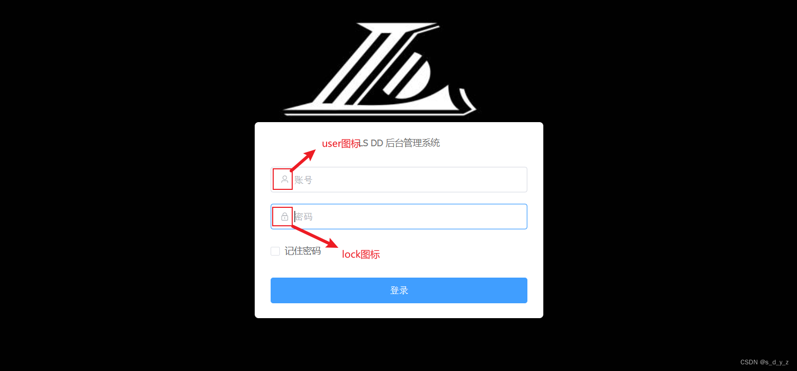
顾名思义,icon是图标的意思,这些图标一般用在是页面更加美观。比如,下图登录页面中,可见图标的应用:
下面说明图标的两种使用方法
2、Icon的使用
2.1 Element-plus前端框架的Icon使用
官网转送阵:Icon的使用
当然,这个框架是基于vue使用的,首先要创建一个vue项目
在项目终端中下载@element-plus/icons-vue,在主机的cmd中也行,只不过我比较喜欢在项目中下载,比较方便
npm install @element-plus/icons-vue
然后,打开main.js,导入图标,并且进行全局注册(在vue中,一般使用一些功能时,都要进行这两步)
import * as ElementPlusIconsVue from '@element-plus/icons-vue'


const app = createApp(App)

for (const [key, component] of Object.entries(ElementPlusIconsVue)) {
    app.component(key, component)
}
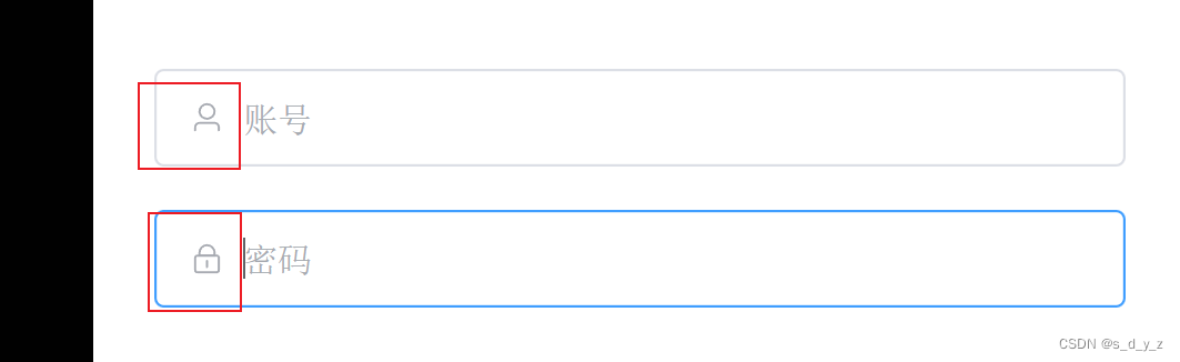
在组件中,我的用法,比如说,我的vue项目中的Login组件组件,要用到这些图标,部分代码:
<!--账号-->
      <el-form-item prop="username">
        <el-input
            type="text"
            size="large"
            auto-complete="off"
            placeholder="账号">
          <template #prefix><el-icon><User /></el-icon></template>
        </el-input>
      </el-form-item>

      <!--密码-->
      <el-form-item prop="password">
        <el-input
            type="password"
            size="large"
            auto-complete="off"
            placeholder="密码"
            @keyup.enter="handleLogin">
          <template #prefix><el-icon><Lock /></el-icon></template>
        </el-input>
      </el-form-item>
效果图,如下:
这个就是,在vue项目中大致的用法
2.2 自定义SvgIcon图标的使用
首先,你要有一个自己的SvgIcon图标库,这个可以在网上搜,一般只要不用百度,还都是可以搜到的(为什么,你们自己懂)
将这个文件夹导入项目中,如下所示:
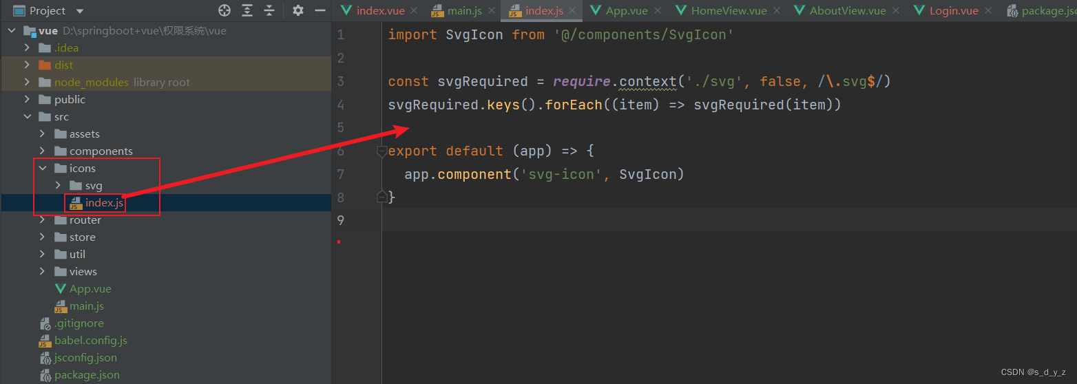
然后,打开main.js,导入图标,并进行全局注册
import SvgIcon from '@/icons'

const app = createApp(App)

SvgIcon(app)
加入一个SvgIcon组件,用于我们使用图标,这个组件就代表我们使用的图标,只不过是根据名字进行图标选择,如下:
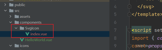
组件的代码如下:
<template>
  <svg class="svg-icon" aria-hidden="true">
    <use :xlink:href="iconName"></use>
  </svg>
</template>

<script setup>
import { computed } from 'vue'
const props = defineProps({
  icon: {
    type: String,
    required: true
  }
})

const iconName = computed(() => {
  return `#icon-${props.icon}`
})
</script>

<style lang="scss" scoped>
.svg-icon {
  width: 1em;
  height: 1em;
  vertical-align: -0.15em;
  fill: currentColor;
  overflow: hidden;
}
</style>
最后,在我们视图的组件中,使用即可
<template #prefix><svg-icon icon="" /></template>
和第一个方法的效果图是大致一样的


 1万+
1万+


 被折叠的 条评论
为什么被折叠?
被折叠的 条评论
为什么被折叠?
 到【灌水乐园】发言


