


🌟 所属专栏:前端只因变凤凰之路
🐔 作者简介:rchjr——五带信管菜只因一枚
😮 前言:该系列将持续更新前端的相关学习笔记,欢迎和我一样的小白订阅,一起学习共同进步~
👉 文章简介:本文介绍CSS的浮动相关知识。知识学习内容来自b站的 @黑马程序员 的视频
😃1 传统网页布局的三种方式
🔥浮动
🔥定位
🔥标准流(普通流/文档流)
所谓的标准流,就是标签按照规定好的默认方式排列。例如:
块级元素会独占一行,从上往下顺序排列
常用块级元素:div,hr,p,h1-h6,ul,ol,form,table
行内元素会按照顺序从左到右顺序排列,碰到父元素边缘则自动换行。
常用行内元素:span,a,i,em
注意:实际开发中,一个页面基本都包含这三种布局方式(移动端会有新的布局方式)
😃2 为什么需要浮动
🔥提问
如何实现一行多个块级元素(如多个div)并列?
如何实现页面左右两个块级元素的对齐?
🔥总结
有很多布局效果标准流无法完成,但是浮动可以解决,因为浮动可以改变标签默认的排列方式。其中浮动最典型的应用就是让多个块级元素一行内并排。
网页布局第一准则:多个块级元素纵向排列找标准流,多个块级元素横向排列找浮动
😃3 什么是浮动
float属性用于创建浮动框,将其移动到一边,知道左边缘或右边缘触及包含块或者另一个浮动框的边缘
<!DOCTYPE html>
<html lang="en">

<head>
    <meta charset="UTF-8">
    <meta http-equiv="X-UA-Compatible" content="IE=edge">
    <meta name="viewport" content="width=device-width, initial-scale=1.0">
    <title>Document</title>
    <style>
        .left {
            width: 200px;
            height: 200px;
            background-color: aquamarine;
            float: left;
        }

        .right {
            width: 200px;
            height: 200px;
            background-color: pink;
            float: left;
        }
    </style>
</head>

<body>
    <div class="left">
        左边
    </div>
    <div class="right">
        右边
    </div>
</body>

</html>
😃4 浮动的特性
🔥脱离标准流的控制(脱标),浮动的盒子不再保留原先的位置,所以它的位置会被占用
下面的代码将第一个盒子设置为浮动,而第二个盒子没有设置浮动,所以第二个盒子会网上走占据第一个盒子的位置,导致两者重叠了。
<!DOCTYPE html>
<html lang="en">

<head>
    <meta charset="UTF-8">
    <meta http-equiv="X-UA-Compatible" content="IE=edge">
    <meta name="viewport" content="width=device-width, initial-scale=1.0">
    <title>Document</title>
    <style>
        .left {
            width: 200px;
            height: 200px;
            background-color: aquamarine;
            float: left;
        }

        .right {
            width: 200px;
            height: 200px;
            background-color: pink;
        }
    </style>
</head>

<body>
    <div class="left">
        左边
    </div>
    <div class="right">
        右边
    </div>
</body>

</html>
🔥如果多个盒子都设置了浮动,则它们会按照属性值一行内显示并且顶端对齐排列。
<!DOCTYPE html>
<html lang="en">

<head>
    <meta charset="UTF-8">
    <meta http-equiv="X-UA-Compatible" content="IE=edge">
    <meta name="viewport" content="width=device-width, initial-scale=1.0">
    <title>Document</title>
    <style>
        .left {
            width: 200px;
            height: 200px;
            background-color: aquamarine;
            float: left;
        }

        .right {
            width: 200px;
            height: 200px;
            background-color: pink;
            float: left
        }

        .middle {
            width: 200px;
            height: 200px;
            background-color: blueviolet;
            float: left;
        }
    </style>
</head>

<body>
    <div class="left">
        左边
    </div>
    <div class="middle">
        中间
    </div>
    <div class="right">
        右边
    </div>
</body>

</html>
注意:浮动的元素是紧贴在一起的,不会有缝隙。如果父级宽度装不下这些浮动的盒子,多出的盒子则会另起一行
🔥浮动元素会具有行内块元素特性
例如span作为行内元素原本没有宽高(需要转换为行内块元素),但是若给他添加浮动,则不需要转换成行内块元素
<!DOCTYPE html>
<html lang="en">

<head>
    <meta charset="UTF-8">
    <meta http-equiv="X-UA-Compatible" content="IE=edge">
    <meta name="viewport" content="width=device-width, initial-scale=1.0">
    <title>Document</title>
    <style>
        span,
        div {
            float: left;
            width: 200px;
            height: 100px;
            background-color: pink;
        }

        p {
            height: 15 0px;
            background-color: aqua;
            float: right;
        }
    </style>
</head>

<body>
    <span>1</span>
    <div>2</div>
    <p>pppb</p>
</body>

</html>
注意:如果块级盒子没有设置宽度,则默认宽度和父级一样宽。但是添加浮动后,它的大小根据内容来决定。
😃5 浮动元素经常和标准流父级搭配使用
为了约束浮动元素位置,我们一般先用标准流的父级排列上下位置,之后内部子元素采取浮动排列左右位置,这也符合网页布局第一准则

😃6 三个浮动布局案例——小米商城
下面我们来实现如图的案例

<!DOCTYPE html>
<html lang="en">

<head>
    <meta charset="UTF-8">
    <meta http-equiv="X-UA-Compatible" content="IE=edge">
    <meta name="viewport" content="width=device-width, initial-scale=1.0">
    <title>Document</title>
</head>
<style>
    * {
        margin: 0;
        padding: 0;
    }

    .box {
        height: 460px;
        width: 1200px;
        background-color: pink;
        margin: 0 auto;
        background-color: aqua;
    }

    .left {
        width: 230px;
        height: 460px;
        float: left;
        background-color: purple;
    }

    .right {
        width: 970px;
        height: 460px;
        float: right;
    }
</style>

<body>
    <div class="box">
        <div class="left"></div>
        <div class="right"></div>
    </div>
</body>

</html>
再来实现这个,每个小盒子中间有一些空格

<!DOCTYPE html>
<html lang="en">

<head>
    <meta charset="UTF-8">
    <meta http-equiv="X-UA-Compatible" content="IE=edge">
    <meta name="viewport" content="width=device-width, initial-scale=1.0">
    <title>Document</title>
    <style>
        * {
            margin: 0;
            padding: 0;

        }

        li {
            list-style: none;
        }

        .box {
            width: 1226px;
            height: 285px;
            margin: 0 auto;
            background-color: pink;
        }

        .box li {
            width: 296px;
            float: left;
            height: 285px;
            background-color: darkgray;
            margin-right: 14px;
        }

        /* 注意权重问题 */
        .box .last {
            margin-right: 0;
        }
    </style>
</head>

<body>
    <ul class="box">
        <li>1</li>
        <li>2</li>
        <li>3</li>
        <li class="last">4</li>
    </ul>
</body>

</html>
最后再做一个手机模块的案例

网页布局第二准则:先布局盒子的大小,再布局盒子的位置
<!DOCTYPE html>
<html lang="en">

<head>
    <meta charset="UTF-8">
    <meta http-equiv="X-UA-Compatible" content="IE=edge">
    <meta name="viewport" content="width=device-width, initial-scale=1.0">
    <title>Document</title>
    <style>
        .box {
            height: 615px;
            width: 1226px;
            background-color: pink;
            margin: 0 auto;
        }

        .left {
            width: 234px;
            height: 615px;
            background-color: bisque;
            float: left;
        }

        .right {
            width: 992px;
            height: 615px;
            background-color: yellowgreen;
            float: left;
        }

        .right>div {
            width: 234px;
            height: 300px;
            background-color: cadetblue;
            float: left;
            margin-left: 14px;
            margin-bottom: 14px;
        }
    </style>
</head>

<body>
    <div class="box">
        <div class="left">左</div>
        <div class="right">
            <div>2</div>
            <div>2</div>
            <div>2</div>
            <div>2</div>
            <div>2</div>
            <div>2</div>
            <div>2</div>
            <div>2</div>
        </div>
    </div>
</body>

</html>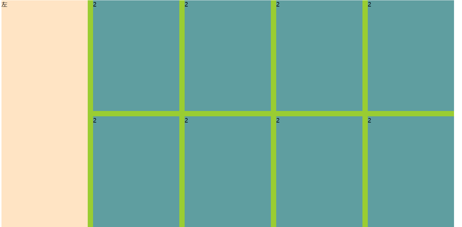


 940
940


 被折叠的 条评论
为什么被折叠?
被折叠的 条评论
为什么被折叠?
 到【灌水乐园】发言


