


一、个人任务
本周我的任务主要有以下两个
- 完善系统前台的侧边栏动态效果
- 后台的可视化实现
二、任务1——完善系统前台的侧边栏动态效果
首先基于前台的静态页面,我增加了和后端对应的接口
<script>
export default {
  data() {
    return {
      showDeleteIcon: null,
    };
  },
  methods: {
    goToProfile() {
      console.log('go to profile');

      this.$router.push({ name: 'profile' })
    },

    createNewChat() {
      console.log('Create New Chat');
      this.$router.push({ name: 'home' }); // 跳转到chat-main.vue页面
    },
    goToChat(bubble) {
      // 路由跳转到历史对话页面(暂未设计)
      console.log('Go to Chat', bubble);
      this.$router.push({ name: 'home' }); // 跳转到chat-main.vue页面
      // this.$router.push('/chat-details'); // 根据你的路由配置和气泡数据使用
    },
    goToSettings() {
      this.$router.push({ name: 'Settings' }); // 跳转到setting.vue页面
    },
    deleteRecord(record) {
      const index = this.chatHistory.indexOf(record);
      if (index !== -1) {
        this.chatHistory.splice(index, 1);
      }
    },
  },
};
</script>
三、任务2——后台的可视化实现
经过小组讨论,我们初步确定了后台可视化的基本内容,我们希望通过对数据库的信息进行可视化处理,可以更好的看到用户对系统的使用过程,并且更了解用户的需求
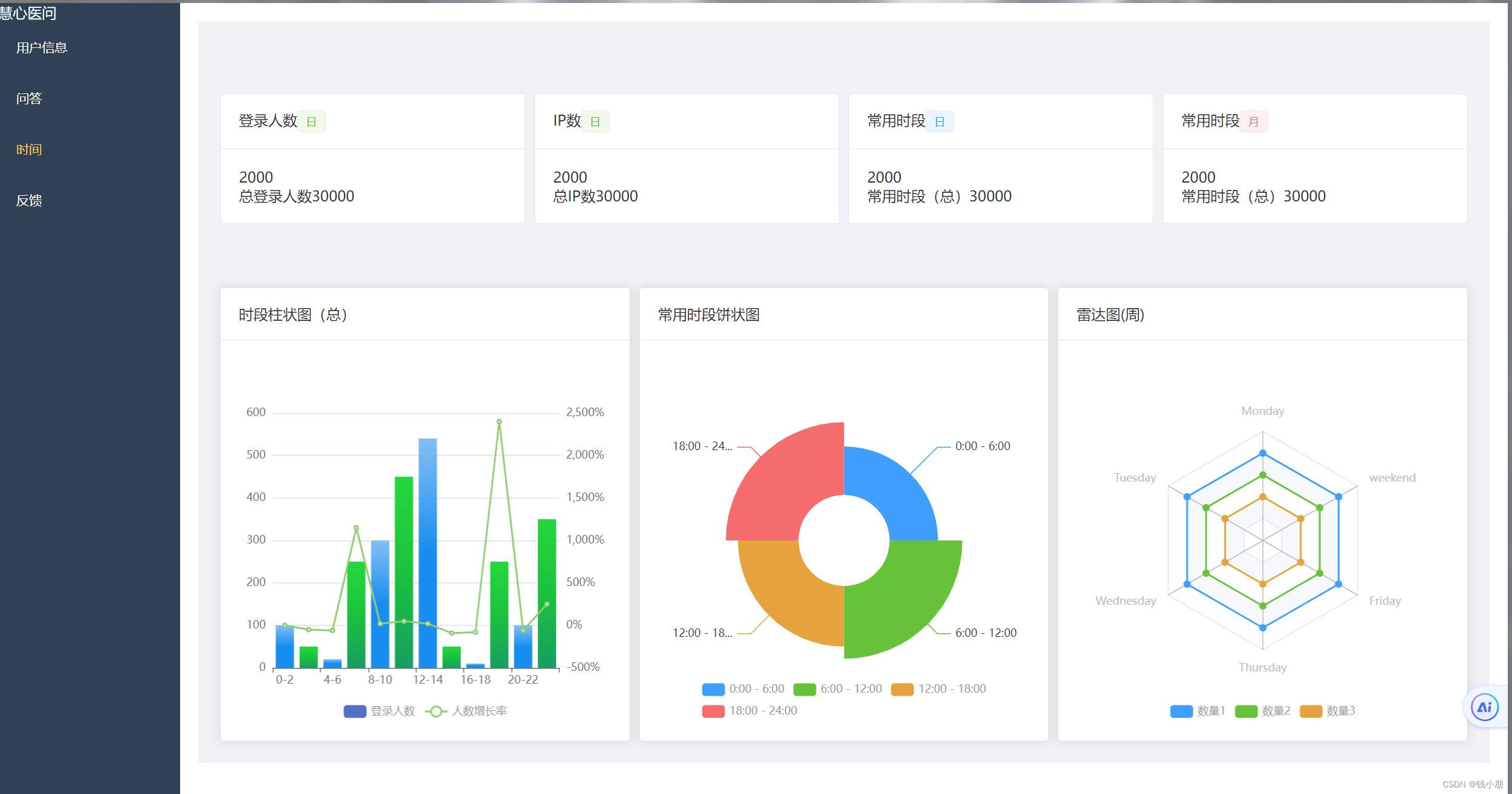
下面是关于用户使用的初步的后台页面
表格记录
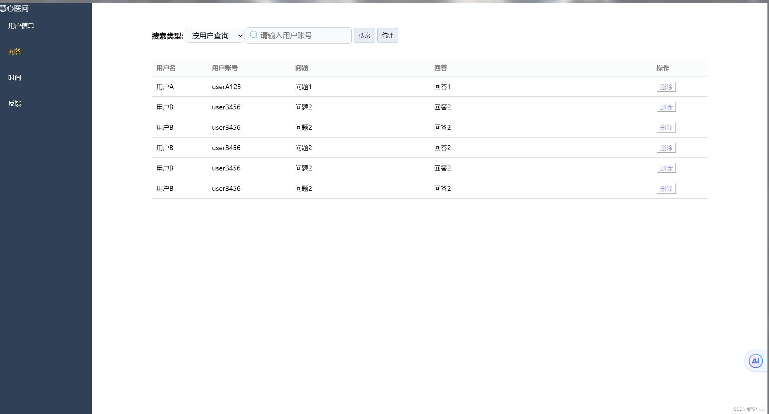
可视化展示
关键代码展示
下面是柱状图代码
<template>
  <el-card>
    <template #header>
      <div class="title">
        时段柱状图(总)
        <el-tooltip effect="dark" content="点击试试下载" placement="bottom">
          <i-ep-download class="download" @click="downloadEchart" />
        </el-tooltip>
      </div>
    </template>

    <div :id="id" :class="className" :style="{ height, width }"></div>
  </el-card>
</template>

<script setup lang="ts">
import * as echarts from "echarts";
import { onMounted } from 'vue';
import { ref } from 'vue';
import { markRaw } from 'vue';
import { onActivated } from 'vue';

const props = defineProps({
  id: {
    type: String,
    default: "barChart",
  },
  className: {
    type: String,
    default: "",
  },
  width: {
    type: String,
    default: "200px",
    required: true,
  },
  height: {
    type: String,
    default: "200px",
    required: true,
  },
});

const loginData = [100, 50, 20, 250, 300, 450, 540, 50, 10, 250, 100, 350];
const growthRateData = loginData.map((value, index) => {
  if (index === 0) {
    return 0; // 初始值设为0
  }
  return (((value - loginData[index - 1]) / loginData[index - 1]) * 100).toFixed(2); // 计算增长率并保留两位小数
});

const options = {
  grid: {
    left: "2%",
    right: "2%",
    bottom: "10%",
    containLabel: true,
  },
  tooltip: {
    trigger: "axis",
    axisPointer: {
      type: "cross",
      crossStyle: {
        color: "#999",
      },
    },
  },
  legend: {
    x: "center",
    y: "bottom",
    data: ["登录人数", "人数增长率"],
    textStyle: {
      color: "#999",
    },
  },
  xAxis: [
    {
      type: "category",
      data: ["0-2", "2-4", "4-6", "6-8", "8-10", "10-12", "12-14", "14-16", "16-18", "18-20", "20-22", "22-24"],
      axisPointer: {
        type: "shadow",
      },
    },
  ],
  yAxis: [
    {
      type: "value",
      axisLabel: {
        formatter: "{value}",
      },
    },
    {
      type: "value",
      axisLabel: {
        formatter: "{value}%",
      },
    },
  ],
  series: [
    {
      name: "登录人数",
      type: "bar",
      data: loginData,
      barWidth: 20,
      itemStyle: {
        color: function (params) {
          // 设置柱子颜色交替显示
          const colors = [
            new echarts.graphic.LinearGradient(0, 0, 0, 1, [
              { offset: 0, color: "#83bff6" },
              { offset: 0.5, color: "#188df0" },
              { offset: 1, color: "#188df0" },
            ]),
            new echarts.graphic.LinearGradient(0, 0, 0, 1, [
              { offset: 0, color: "#25d73c" },
              { offset: 0.5, color: "#1bc23d" },
              { offset: 1, color: "#179e61" },
            ]),
          ];
          return colors[params.dataIndex % colors.length];
        },
      },
    },
    {
      name: "人数增长率",
      type: "line",
      yAxisIndex: 1, // 使用第二个y轴
      data: growthRateData,
    },
  ],
};

const downloadEchart = () => {
  const img = new Image();
  img.src = chart.value.getDataURL({
    type: "png",
    pixelRatio: 1,
    backgroundColor: "#fff",
  });

  img.onload = () => {
    const canvas = document.createElement("canvas");
    canvas.width = img.width;
    canvas.height = img.height;
    const ctx = canvas.getContext("2d");
    if (ctx) {
      ctx.drawImage(img, 0, 0, img.width, img.height);
      const link = document.createElement("a");
      link.download = `时段柱状图.png`;
      link.href = canvas.toDataURL("image/png", 0.9);
      document.body.appendChild(link);
      link.click();
      link.remove();
    }
  };
};

const chart = ref<any>("");
onMounted(() => {
  chart.value = markRaw(
    echarts.init(document.getElementById(props.id) as HTMLDivElement)
  );

  chart.value.setOption(options);

  window.addEventListener("resize", () => {
    chart.value.resize();
  });
});

onActivated(() => {
  if (chart.value) {
    chart.value.resize();
  }
});
</script>

<style lang="scss" scoped>
.title {
  display: flex;
  justify-content: space-between;

  .download {
    cursor: pointer;

    &:hover {
      color: #409eff;
    }
  }
}
</style>
以及饼图的关键代码
<template>
  <el-card>
    <template #header>常用时段饼状图</template>
    <div :id="id" :class="className" :style="{ height, width }"></div>
  </el-card>
</template>

<script setup lang="ts">
import * as echarts from "echarts";
import { onMounted } from 'vue';
import { ref } from 'vue';
import { markRaw } from 'vue';
import { onActivated } from 'vue';

const props = defineProps({
  id: {
    type: String,
    default: "pieChart",
  },
  className: {
    type: String,
    default: "",
  },
  width: {
    type: String,
    default: "200px",
    required: true,
  },
  height: {
    type: String,
    default: "200px",
    required: true,
  },
});

const options = {
  grid: {
    left: "2%",
    right: "2%",
    bottom: "10%",
    containLabel: true,
  },
  legend: {
    top: "bottom",
    textStyle: {
      color: "#999",
    },
  },
  series: [

    {
    //   label: {
    //   show: true,
    //   position: 'outside', // 或者其他您想要的位置
    //   formatter: function (params: any) {
    //     // 这里 params 包含了当前数据项的所有信息
    //     return params.name + ': ' + params.value + '%'; // 显示名称和百分比
    //   },
    //   // 其他您可能需要的配置,如 fontSize, color 等
    // },
      name: "登录时段占比",
      type: "pie",
      radius: [50, 130],
      center: ["50%", "50%"],
      roseType: "area",
      itemStyle: {
        borderRadius: 1,
        color: function (params: any) {
          const colorList = ["#409EFF", "#67C23A", "#E6A23C", "#F56C6C"];
          return colorList[params.dataIndex];
        },
      },
      data: [
        { value: 20, name: "0:00 - 6:00" },
        { value: 30, name: "6:00 - 12:00" },
        { value: 25, name: "12:00 - 18:00" },
        { value: 30, name: "18:00 - 24:00" },
      ],
    },
  ],
};

const chart = ref<any>("");

onMounted(() => {
  chart.value = markRaw(
    echarts.init(document.getElementById(props.id) as HTMLDivElement)
  );

  chart.value.setOption(options);

  window.addEventListener("resize", () => {
    chart.value.resize();
  });
});

onActivated(() => {
  if (chart.value) {
    chart.value.resize();
  }
});
</script>
四、总结
1、前台侧边栏动态效果完善
完善系统前台的侧边栏动态效果。侧边栏作为用户界面的重要组成部分,其动态效果不仅影响着用户的操作体验,还直接关系到系统的整体美观性和易用性。
在完善过程中,我首先对侧边栏的现有动态效果进行了全面的评估,识别出其中存在的问题和不足之处。随后,我结合用户体验设计原则,对侧边栏的动画速度、过渡效果、交互反馈等方面进行了细致的调整和优化。
具体来说,我采用了更流畅的动画效果,确保用户在切换侧边栏时能够感受到自然、平滑的过渡。同时,我还增加了适当的交互反馈,如点击按钮时的震动效果或颜色变化,以增强用户的操作感知。
经过多次迭代和测试,侧边栏的动态效果得到了显著提升,用户在使用系统时能够享受到更加流畅、舒适的操作体验。
2、后台可视化实现
在后台可视化方面,我主要实现了饼图和柱状图两种数据可视化形式。这些图表能够直观地展示系统数据,帮助用户更好地理解和分析系统状态。
在实现饼图和柱状图时,我注重了图表的清晰度和可读性。我采用了鲜明的色彩搭配和合理的布局设计,确保用户能够一眼就看出数据的变化和趋势。同时,我还增加了交互功能,如缩放、拖动、筛选等,以便用户能够更深入地探索和分析数据。
经过努力,我成功实现了后台的可视化功能,并将其集成到系统中。现在,用户可以通过简单的操作就能查看和分析系统数据,大大提高了工作效率和决策的准确性。
总结
本周,我通过努力完成了前台侧边栏动态效果的完善和后台可视化实现两个任务。这些工作的完成不仅提升了系统的用户体验和美观性,还增强了系统的数据展示和分析能力。在今后的工作中,我将继续努力优化系统功能和提高用户体验。


 146
146


 被折叠的 条评论
为什么被折叠?
被折叠的 条评论
为什么被折叠?
 到【灌水乐园】发言


