


CSS居中对齐的几种方式
使用flex布局
利用css3中的flex弹性盒的属性
.parent {

display: flex;

justify-content: center;

align-items: center;

}
利用子元素auto
.parent{
	display:flex;
}
.son{
	margin:auto;
}
使用grid布局
.parent{
display: grid;
place-items: center;
}
或
.parent{
display:grid;
justify-content: center;
align-items: center;
}
使用定位
使用定位与margin
.parent{
 position:relative;
}
.son{
	position: absolute;
	left: 0;
	top: 0;
	right: 0;
	bottom: 0;
	margin: auto;
}
利用CSS3属性transform
.son{

position: absolute;

top: 50%;

left: 50%;

transform: translate(-50%, -50%);

}
使用文本对齐
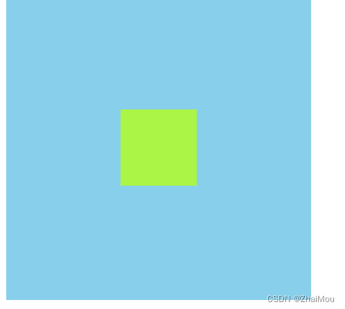
.parent{
width:400px;
height:400px;
background-color: skyblue;
//行高与元素高度一致
line-height: 400px;
//水平对齐
text-align: center;
}
使用table布局
.parent{

width:400px;

height:400px;

background-color: skyblue;

display: table-cell;

vertical-align: middle;

}

.son{

width:100px;

height:100px ;

background-color: greenyellow;

margin: auto;

}
如果文章对你有所帮助,关注+点赞鼓励一下!会持续更新文章


 5628
5628


 被折叠的 条评论
为什么被折叠?
被折叠的 条评论
为什么被折叠?
 到【灌水乐园】发言


