


因为实际的编写的情况比较多上期我们讲到了浮动。
有时候浮动也会给我们带来一些困扰,所以我们也会使用一些方式来清除浮动,以便给我们解决子级浮动引起内部高度为0的问题
-
清除浮动
我们清除浮动的方式主要有三种,但是我们最常用的只有一种,。
第一种 css的clear属性清除浮动
选择器{
clear:属性值;(left清除左边的浮动,right右边,both两边的浮动都清除)
}
如果子元素都浮动,父元素没有设置高度产生浮动的影响,可以使用伪元素的方法来解决清除浮动,主要是使用这种方式。
    <style>
       .fa {
            /* 1. 子元素浮动给父元素设置高度 */
            width: 200px;
            /* height: 300px; */
            border: 1px solid pink;
        }

        .son {
            width: 100px;
            height: 100px;
            background-color: red;
            float: left;
            /* 父级元素因为子级浮动引起内部高度为0的问题 */
        }

        .fabro {
            width: 300px;
            height: 200px;
            background-color: aqua;
            float: left;
        }
        /* 开发中解决清除浮动的影响 */
        /* code hate cv */

        .clearfix::before {
            /* 推荐我们使用 */
            /* clearfix统一名字清除一系列的浮动影响问题
            clear:both 左右两边都清除 */
            content: '';
            display: block;
            height: 0;
            clear: both;
            line-height: 0;
            /* 隐藏 但是依旧占位 */
            visibility: hidden;
        }
        /* 如果子元素都浮动,父元素没有设置高度产生浮动的影响,可以使用伪元素的方法来解决清除浮动 */
    </style>
<body>
    <div class="fa">
        <div class="son"></div>
        <!-- 在浮动元素的末尾添加一个div标签设置clear:both
         1 不是结构 2 没有意义 3 只做清除浮动的作用-->
        <!-- 第二种 <div style="clear: both;"></div> -->
        <!-- 作为fa的最后一个孩子 -->
    </div>
    <div class="fabro"></div>
</body>
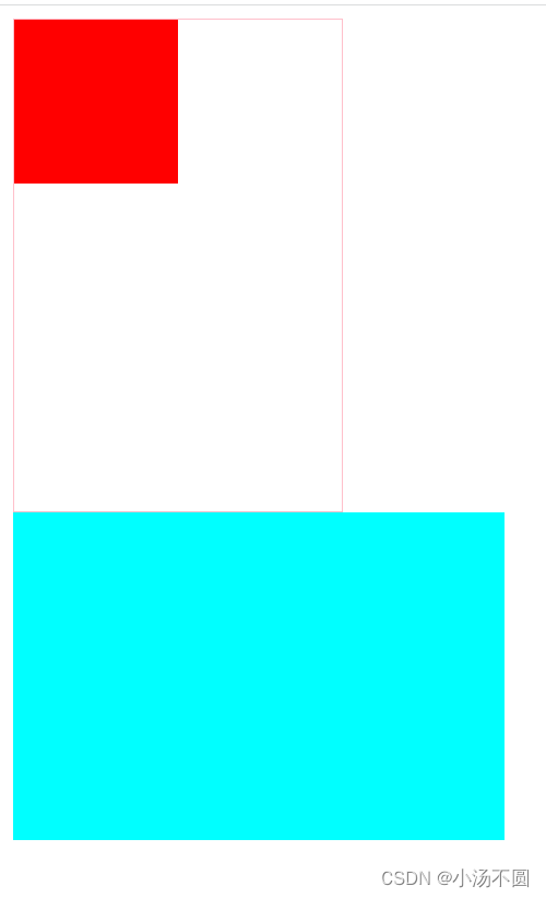
 这是未清除的情况。
 这是清除浮动之后的情况。
第二种就是给我们的父元素设置高度
<style>
.fa {
            /* 1. 子元素浮动给父元素设置高度 */
            width: 200px;
            height: 300px;
            border: 1px solid pink;
        }

        .son {
            width: 100px;
            height: 100px;
            background-color: red;
            float: left;
            /* 父级元素因为子级浮动引起内部高度为0的问题 */
        }

        .fabro {
            width: 300px;
            height: 200px;
            background-color: aqua;
            float: left;
        }
</style>
<body>
    <div class="fa">
        <div class="son"></div>
        <!-- 在浮动元素的末尾添加一个div标签设置clear:both
         1 不是结构 2 没有意义 3 只做清除浮动的作用-->
        <!-- 第二种 <div style="clear: both;"></div> -->
        <!-- 作为fa的最后一个孩子 -->
    </div>
    <div class="fabro"></div>
</body>
设置高度也能解决浮动造成的问题
第三种就是我们的伪类元素清除浮动 ,overflow在这里就是一个伪元素,注意的是它的属性值一定不能是auto。
    <style>
        /* 伪元素清除浮动 */

        .fa {
            width: 200px;
            border: 1px solid pink;
            /* 给父元素设置overflow: 只要不是auto*/
            overflow: hidden;
        }

        .son {
            width: 100px;
            height: 100px;
            background-color: red;
            float: left;
        }

        .fabro {
            width: 300px;
            height: 200px;
            background-color: aqua;
            float: left;
        }
    </style>
<body>
    <div class="fa">
        <div class="son"></div>
    </div>
    <div class="fabro"></div>
</body> 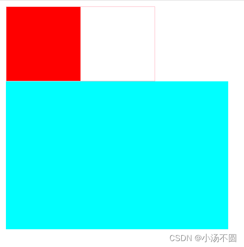
-
定位
relative 相对定位
相对定位,相对于其原文档流的位置进行定位
    <style>
        .fa {
            width: 400px;
            height: 300px;
            border: 1px solid red;
            margin: 50px auto;
        }

        .fa div {
            width: 100px;
            height: 100px;
        }

        .son1 {
            background-color: blue;
        }

        .son2 {
            background-color: #454545;
            position: relative;
            /* 相对于自己原来的位置进行定位
                没有脱离标准流 原来的位置没有
            */
            left: 150px;
            top: 80px
        }

        .son3 {
            background-color: #999999;
        }
    </style>
<body>
    <div class="fa">
        <div class="son1">son1</div>
        <div class="son2">son2</div>
        <div class="son3">son3</div>
    </div>
</body>
定位前的结果。
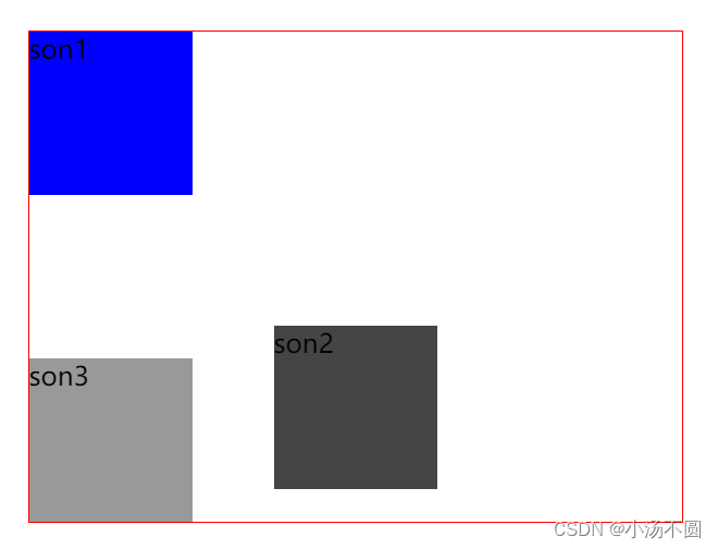 定位后的结果,能看到我们的son2的原位置并没有被son3侵占,这说明我们的son2没有脱离标准流。
absolate绝对定位
绝对定位,相对于其上一个已经定位的父元素进行定位
    <style>
        .fa {
            width: 400px;
            height: 300px;
            border: 1px solid red;
            margin: 50px auto;
        }

        .fa div {
            width: 100px;
            height: 100px;
        }

        .son1 {
            background-color: blue;
            position: absolute;
            /* 绝对定位 */
            /* 父元素没有定位,相对于整个页面的body进行定位*/
            /* 脱离标准流 脱标 */
            left: 150px;
            top: 80px
        }

        .son2 {
            background-color: #454545;
        }

        .son3 {
            background-color: #999999;
        }
    </style>
<body>
    <div class="fa">
        <div class="son1">son1</div>
        <div class="son2">son2</div>
        <div class="son3">son3</div>
    </div>
</body>
脱离标准流了。
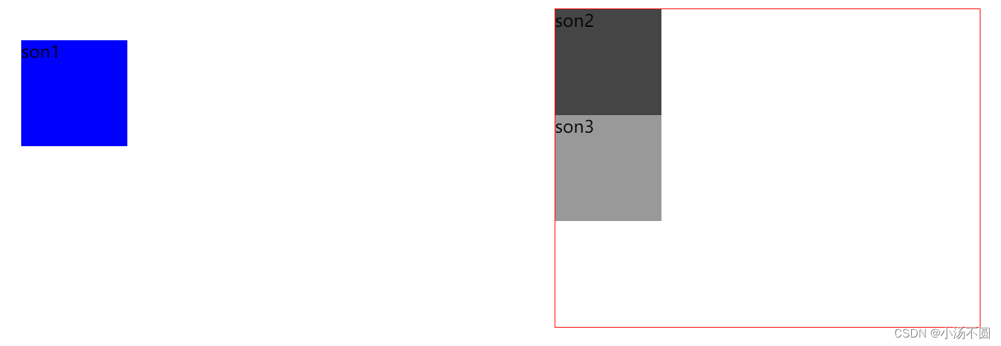
子绝父相
指子元素设置绝对定位,而父元素设置相对定位。
    <style>
        .fa {
            width: 400px;
            height: 300px;
            border: 1px solid red;
            margin: 50px auto;
            position: relative;
        }

        .fa div {
            width: 100px;
            height: 100px;
        }

        .son1 {
            background-color: blue;
            position: absolute;
            /* 绝对定位 */
            /* 父元素没有定位,相对于整个页面的body进行定位*/
            /* 脱离标准流 脱标 */
            right: 20px;
            bottom: 50px;
        }

        .son2 {
            background-color: #454545;
        }

        .son3 {
            background-color: #999999;
        }
    </style>
<body>
    <div class="fa">
        <div class="son1">son1</div>
        <div class="son2">son2</div>
        <div class="son3">son3</div>
    </div>
</body>
脱离标准流 ,son3把son2的位置给侵占了。

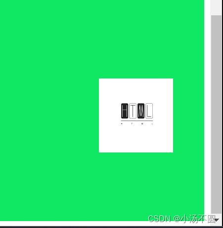
固定定位 fixed
固定定位,相对于浏览器窗口进行定位,我们看到的页面的小广告都使用了固定定位。
    <style>
        /* 固定定位:相对与浏览器进行定位 */

        img {
            position: fixed;
            right: 50px;
            bottom: 100px;
        }

        .scorll {
            width: auto;
            height: 3000px;
            background-color: rgb(16, 232, 99);
        }
    </style>
<body>
    <img src="../a.png" alt="" width="100">
    <div class="scorll"></div>
</body>
我们看到图片和旁边的滚动条一起行动。
小案例
    <style>
        .fa {
            width: 200px;
            height: 300px;
            margin: 100px auto;
            border: 1px solid red;
            position: relative;
        }

        .son {
            width: 80px;
            height: 80px;
            background-color: rgba(66, 66, 66, 0.6);
            border-radius: 50%;
            text-align: center;
            line-height: 80px;
            position: absolute;
            right: 20px;
            bottom: 20px;
        }

        .icon-xiangxia {
            font-size: 50px;
            transition: all 0.2s;
        }
        /* .icon-xiangxia:hover {

        } */
    </style>
<body>
    <div class="fa">
        <div class="son"><span class="iconfont icon-xiangxia"></span></div>
    </div>
</body>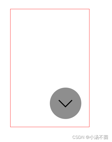
结束,最后一个简单的思维导图。


 被折叠的 条评论
为什么被折叠?
被折叠的 条评论
为什么被折叠?
 到【灌水乐园】发言


