


目录
一、概述
今天我们主要来学习背景图的设置、显示模式、伪类结构,伪元素、盒模型等,这些是我们学习css的重要部分。那么接下来让我们一起学习吧~
二、背景图的设置
1.背景图
a.代码展示
<!DOCTYPE html>
<html lang="zh-CN">
<head>
<meta charset="UTF-8">
<meta name="viewport" content="width=device-width, initial-scale=1.0">
<title>Document</title>
<style>
.box{
width: 500px;
height: 300px;
border: 1px solid greenyellow;
background-image: url('./images/1.webp');
}
p{
background-color: pink;
padding: 50px;
margin: 100px;
}
</style>
</head>
<body>
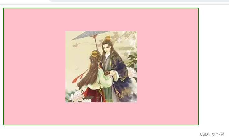
<div class="box"></div>
<p>苔花如米小,也学牡丹开。</p>
</body>
</html>b.运行结果展示
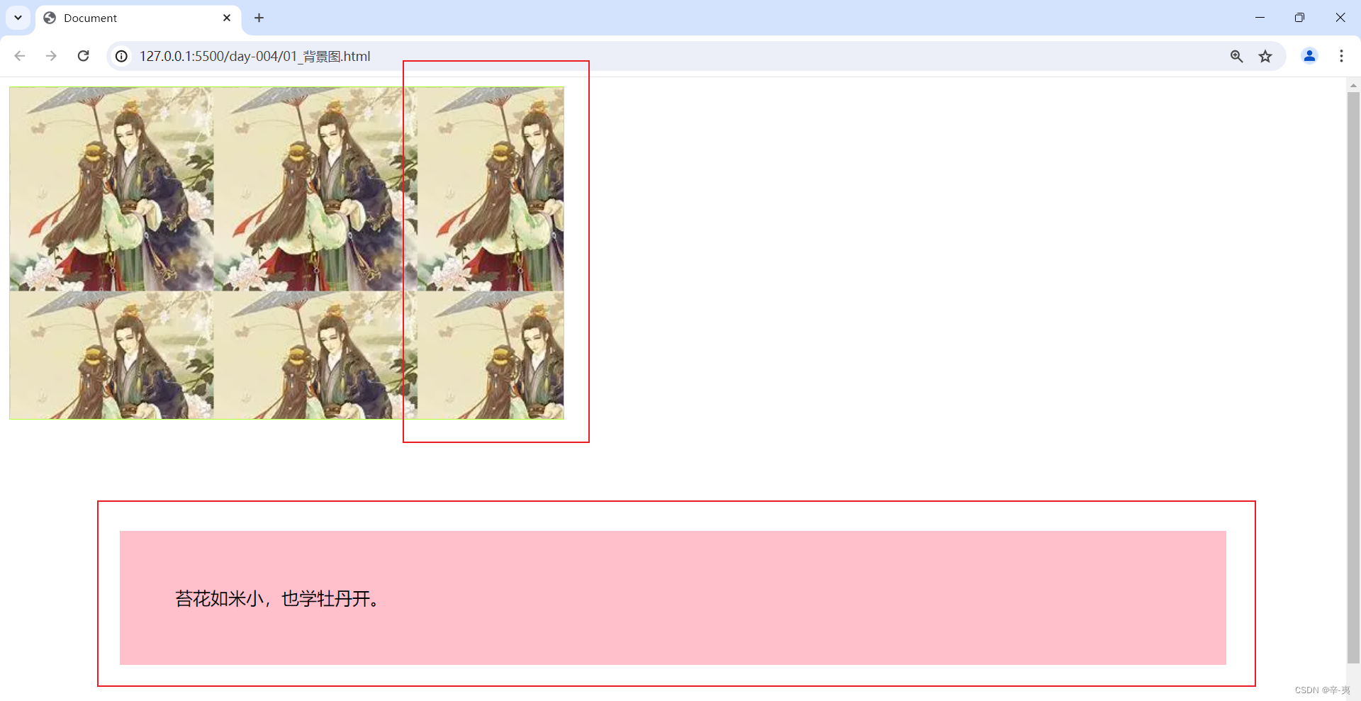
c.小节
background-img 属性设置了一个元素的背景图片
background-color 背景色 值可以是rgb/单词/16进制数
background-color: rgb(125, 0, 0);
background-color: #f90;
background-color:颜色的英文单词
2.背景图平铺
a.属性background-repeat:
<!DOCTYPE html>
<html lang="zh-CN">
<head>
<meta charset="UTF-8">
<meta name="viewport" content="width=device-width, initial-scale=1.0">
<title>Document</title>
<style>
.box {
width: 500px;
height: 300px;
border: 1px solid greenyellow;
/* 设置一个图像的背景图 */
background-image: url('./images/1.webp');
/* background-repeat: repeat;平铺 属性 设置背景图是否平铺(重复) */
/* background-repeat: repeat-x; 水平平铺*/
/* background-repeat: repeat-y ; 垂直平铺 */
background-repeat: no-repeat;
/* 不平铺 */
}
</style>
</head>
<body>
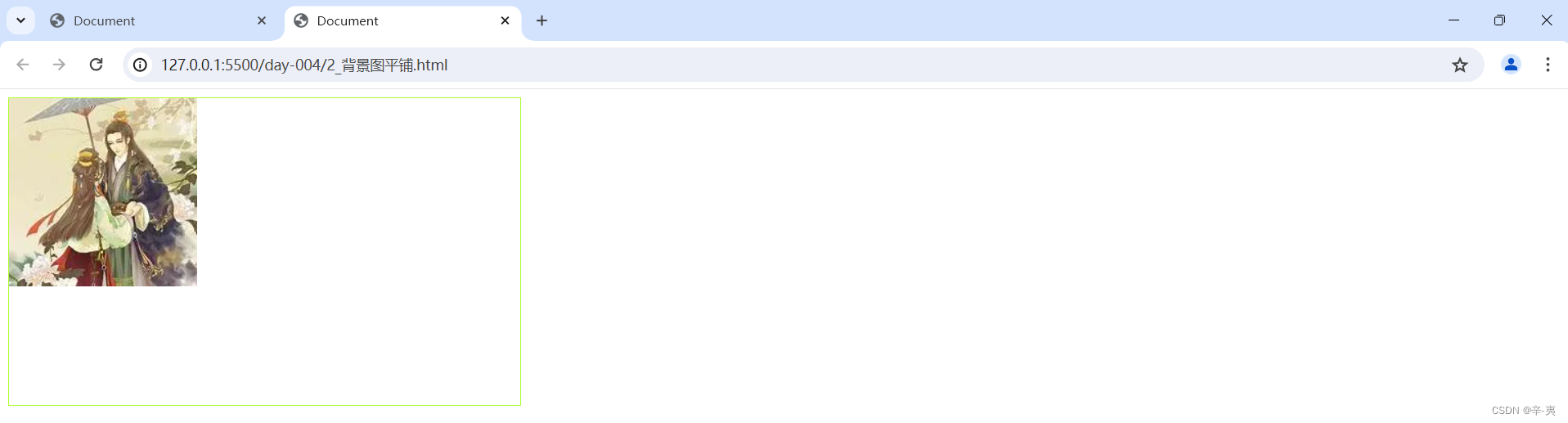
<div class="box"></div>
<p></p>
</body>
</html>b.运行结果
c.小节
repeat;平铺 属性 设置背景图是否平铺(重复)
repeat-x; 水平平铺
repeat-y ; 垂直平铺
no-repeat;不平铺
3.背景图位置background-position
a.代码展示
<!DOCTYPE html>
<html lang="zh-CN">

<head>
    <meta charset="UTF-8">
    <meta name="viewport" content="width=device-width, initial-scale=1.0">
    <title>Document</title>
    <style>
        .box {
            width: 500px;
            height: 300px;
            border: 1px solid greenyellow;
            /* 设置一个图像的背景图 */
            background-image: url('./images/1.webp');
            /* background-repeat: repeat;平铺  属性 设置背景图是否平铺(重复) */
            /* background-repeat: repeat-x; 水平平铺*/
            /* background-repeat: repeat-y ; 垂直平铺 */
            background-repeat: no-repeat;
            /* 不平铺 */
            background-position: center;
            /* background-position属性 设置背景图的位置 background:水平垂直
            水平:left/center/right
            垂直:top/center/bottom
            像素值
            百分比
         */
        }
    </style>
</head>

<body>
    <div class="box"></div>
</body>

</html>
b.运行结果
c.小节
1)background-position属性 设置背景图的位置 background:水平 垂直(先写水平值后写垂直 ,如果都是center就可以只写一个)
2)属性值还可以是像素值、百分比
4.背景图大小属性background-size:
a.代码
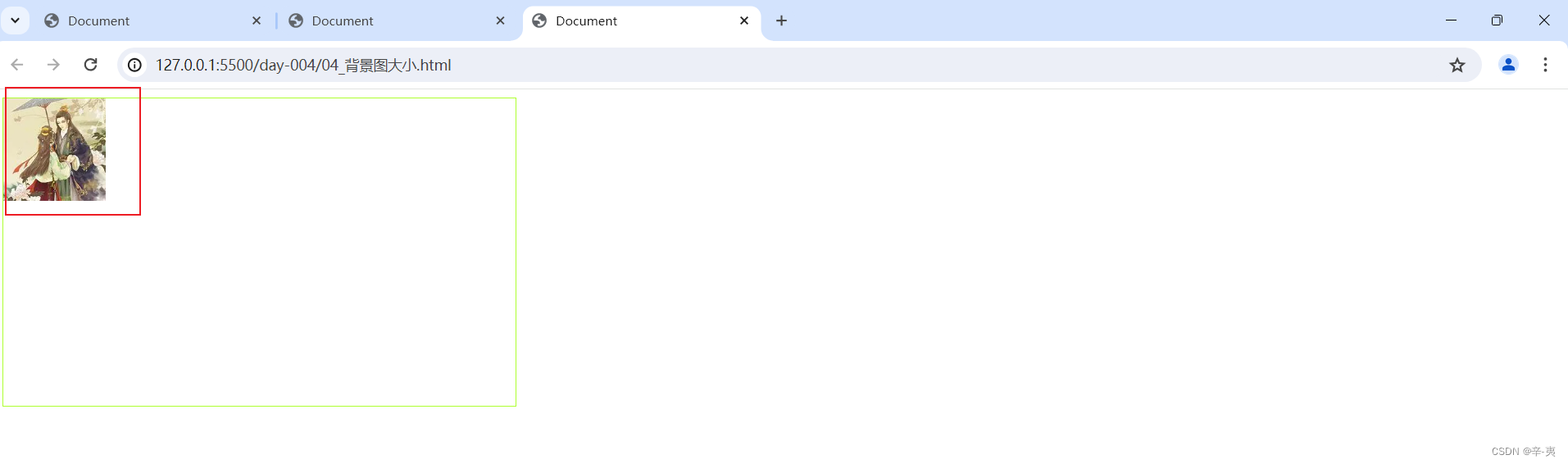
background-size: 100px 100px;b.运行结果
可以明显看到图片变小了
5.背景图的固定background-attachment
a.代码展示
/* background-attachment 背景图的固定 */
<!DOCTYPE html>
<html lang="zh-CN">
<head>
<meta charset="UTF-8">
<meta name="viewport" content="width=device-width, initial-scale=1.0">
<title>Document</title>
<style>
* {
margin: 0;
padding: 0;
}
body {
width: 100px;
height: 100vh;
background-image: url(./images/1.webp);
background-repeat: no-repeat;
background-position: center;
/* background-attachment 背景图的固定 */
background-attachment: fixed;
}
.box {
width: 500px;
height: 300px;
}
</style>
</head>
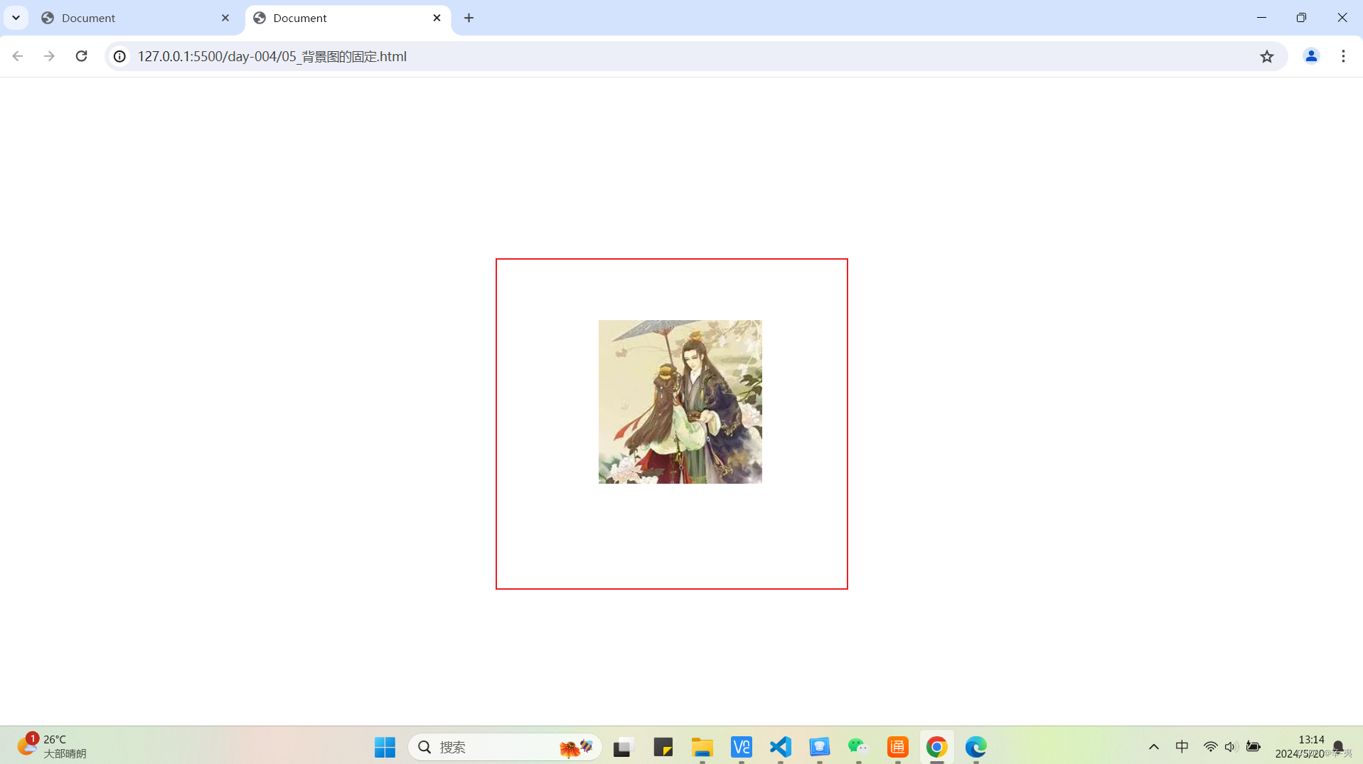
<body>
<div class="box"></div>
</body>
</html>b.运行结果
6.背景图的综合属性
a.代码
<!DOCTYPE html>
<html lang="zh-CN">
<head>
    <meta charset="UTF-8">
    <meta name="viewport" content="width=device-width, initial-scale=1.0">
    <title>Document</title>
    <style>

        .box{

            width: 500px;
            height: 300px;
            border: 2px solid green;
            /* background :background-color bg-img repeat position */
            background: pink url(./images/1.webp) no-repeat center;
        }
    </style>
</head>
<body>
    <div class="box"></div>
</body>
</html>
b.运行结果
c.小节
顺序为background-color bg-img repeat position(颜色 背景图 背景图平铺 位置)
background :background-color bg-img repeat position
7.显示模式
块元素: 独占一行 可以设置宽高
行内元素:共处一行 不可设置宽高
行内块元素: 共处一行 可以设置宽高
(这里不做过多解释,下一节会单独总结所有元素)
8.显示模式转化
a.代码展示
<!DOCTYPE html>
<html lang="zh-CN">
<head>
<meta charset="UTF-8">
<meta name="viewport" content="width=device-width, initial-scale=1.0">
<title>Document</title>
<style>
div {
background-color: red;
width: 100px;
height: 50px;
/* 转化为行内元素 */
display: inline;
/* 转化为行内块元素:display:inline-block; */
/* display:inline-block; */
}
p {
background-color: green;
width: 100px;
height: 50px;
/* 转化为行内元素 */
/* display:inline; */
/* 转化为行内块元素:display:inline-block; */
display: inline-block;
}
span {
background-color: #f90;
width: 100px;
height: 50px;
}
a {
background-color: aquamarine;
}
input {
background-color: #fff;
width: 100px;
height: 50px;
}
img {
background-color: pink;
width: 200px;
height: 300px;
}
</style>
</head>
<body>
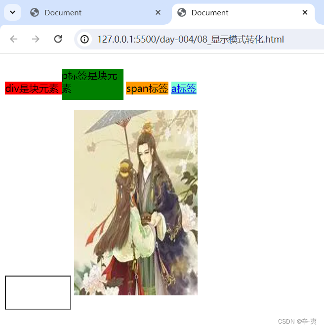
<div>div是块元素 </div>
<p>p标签是块元素</p>
<span>span标签</span>
<a href="#"> a标签</a>
<br>
<input type="text" name="" id="">
<img src="./images/1.webp" alt="">
</body>
</html>b.运行结果
这里我们可以很清楚的看到div标签和标签在同一行,而不是在不同两行。这里就是把块元素转换为了行内块元素。
c.小节
转化为行内元素display:block;
转化为行内元素:display:inline;
转化为行内块元素:display:inline-block;
三、伪类结构选择器
1.属性用法解释
<!DOCTYPE html>
<html lang="zh-CN">
<head>
<meta charset="UTF-8">
<meta name="viewport" content="width=device-width, initial-scale=1.0">
<title>Document</title>
<style>
.list li:first-child {
color: red;
}
.list li:last-child {
color: aqua;
}
.list li:nth-child(3) {
color: chartreuse;
}
.list>li:nth-child(2n) {
color: darkmagenta;
}
.list>li:nth-child(2n+1) {
background-color: blue;
}
.list>li:nth-child(n+2) {
background-color: #9ff;
}
</style>
</head>
<body>
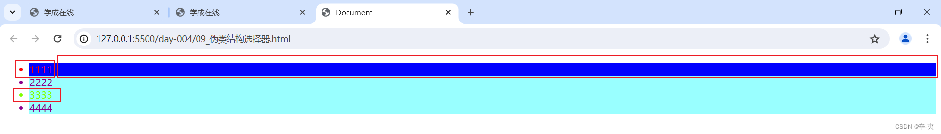
<ul class="list">
<li>1111</li>
<li>2222</li>
<li>3333</li>
<li>4444</li>
</ul>
</body>
</html>2. 运行结果
3.小节
.list li:first-child 第一行改变属性
.list li:last-child 最后一行改变属性
.list li:nth-child(n) 第n行改变属性
.list>li:nth-child(2n) 改变所有的偶数行
.list>li:nth-child(2n+1) 选中所有的奇数行
.list>li:nth-child(n+2) 选中第二行及以后
四、伪元素选择器
1.代码展示
伪元素:只能是前伪元素(作为第一个子元素),后者伪元素(作为最后一个子元素)
<!DOCTYPE html>
<html lang="zh-CN">

<head>
    <meta charset="UTF-8">
    <meta name="viewport" content="width=device-width, initial-scale=1.0">
    <title>Document</title>
    <style>
        /* 伪元素选择器 */
        .box::before {
            /* 内容为空 */
            content: ' ';
            /* 转为块元素 */
            display: block;
            width: 300px;
            height: 2px;
            background-color: chartreuse;
        }

        .box::after {
            content: ' ';
            display: block;
            width: 300px;
            height: 2px;
            background-color: chartreuse;
            /* 绝对定位  (父元素上需要写一个相对定位) */
            position: absolute;
            bottom: 0;
        }

        /* 在左面 */
        /* .box::after{
            content: ' ';
            display: block;
            width: 2px;
            height: 80px;
            background-color: chartreuse;
            position: absolute;
            left: 0;
            bottom: 0;
        }    */
        .box {
            background-color: pink;
            width: 300px;
            height: 80px;
            /* 相对定位 */
            position: relative;
        }
    </style>
</head>

<body>
    <div class="box">
        不想上课好麻烦
    </div>
</body>

</html>
2.结果展示
五、盒模型
1 .属性介绍
a.内边距
padding 内边距 padding-left padding-right padding-top padding-bottom
padding:20px;上下左右都是20px
padding:10px 20px;上下为10 左右20
padding:10px 20px 30px ;上10 左右20 下30
padding:10px 20px 30px 40px;上10 右20 下30 左40
b.外边距
外边距margin-left(左) margin-right(右) margin-top(上) margin-bottom(下)
(数值对应与内边距相同)
margin:20px;
margin:20px 50px;
margin:20px 60px 30px;
margin:20px 60px 30px 40px;
margin:0 auto; (上下为0左右自适应)
2.代码示例
<!DOCTYPE html>
<html lang="zh-CN">
<head>
<meta charset="UTF-8">
<meta name="viewport" content="width=device-width, initial-scale=1.0">
<title>Document</title>
<style>
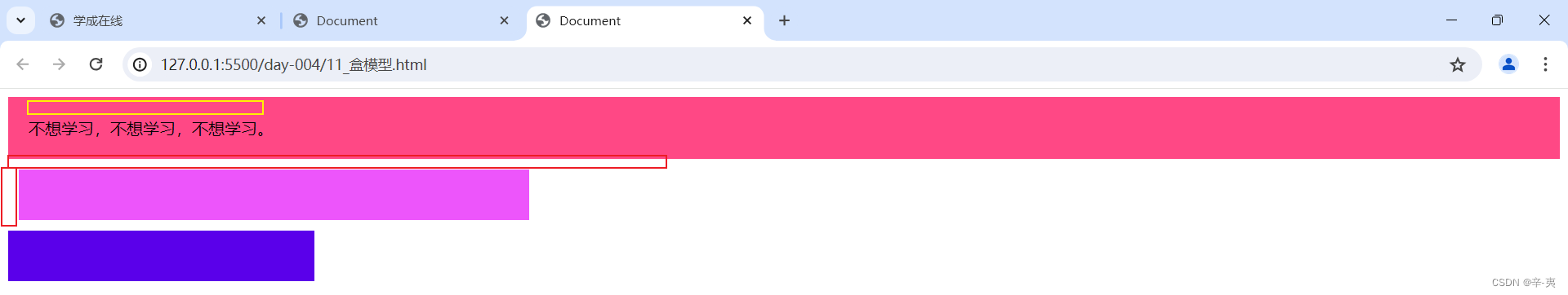
.box{
background-color: rgb(255, 72, 133);
padding: 20px;
}
.box2{
width: 500px;
height: 50px;
background-color: rgb(237, 85, 251);
margin: 10px;
}
.box3{
height: 50px;
width: 300px;
background-color: rgb(90, 0, 234);
}
</style>
</head>
<body>
<div class="box">不想学习,不想学习,不想学习。</div>
<div class="box2"></div>
<div class="box3"></div>
</body>
</html>3.结果展示
六、盒模型的组成
1.属性介绍及代码示例
border- width: 5px;
border-style:solid ;
可用属性有:
dotted:定义点状边框。在大多数浏览器中呈现为实线。
dashed:定义虚线边框。
solid:定义实线边框。
double:定义双线边框。两条单线与其间的空白组合的宽度等于指定的border-width值。
groove:定义3D凹槽边框。其效果取决于边框的颜色值。
ridge:定义3D垄状边框。其效果取决于边框的颜色值。
inset:定义3D凹边边框。其效果取决于边框的颜色值。
outset:定义3D凸边边框。其效果取决于边框的颜色值。
none:定义无边框。
hidden:与none相同。对于表,hidden用于解决边框冲突。
border-color:red;
可以整合为:
border:5px solid red;
顺序是:border:border-width border-style border-color
<!DOCTYPE html>
<html lang="zh-CN">
<head>
<meta charset="UTF-8">
<meta name="viewport" content="width=device-width, initial-scale=1.0">
<title>Document</title>
<style>
.box {
width: 300px;
height: 300px;
border: 5px solid greenyellow;
padding: 10px;
margin: 20px;
/* 标准盒模型转化为怪异盒模型 */
box-sizing: border-box;
/* 怪异盒模型转化为标准盒模型 */
/* box-sizing: content-box; */
}
</style>
</head>
<body>
<div class="box"></div>
</body>
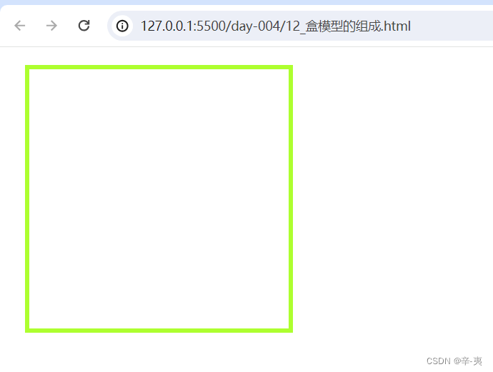
</html>2.运行结果展示
3.盒模型介绍
盒模型:
标准盒模型
宽度=width
怪异盒模型(IE模型)
宽度=content+左右的内边距+左右的边框宽度
七、总节
这一节主要学习了背景图的相关属性以及伪元素选择器,还有我们的盒模型,之后我们会用到这些属性~ 那么下一章节我们就要开始学习浮动与flex 布局方便我们制作网页,让我们的网页更加精致。那么我们下期再见~ see you~


 1047
1047

 被折叠的 条评论
为什么被折叠?
被折叠的 条评论
为什么被折叠?
 到【灌水乐园】发言


