


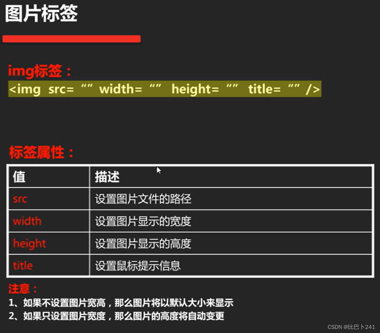
1.img图片
cursor:pointer;鼠标指针显示效果
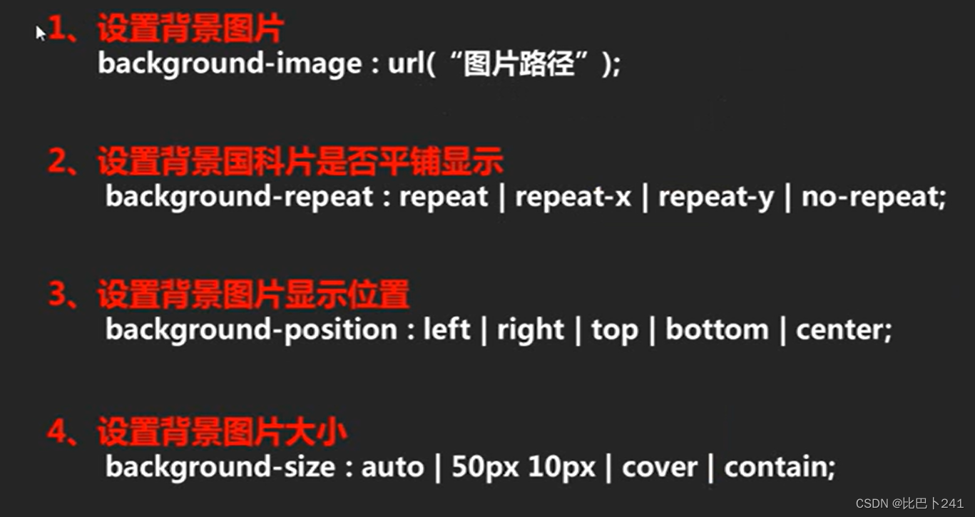
2.背景图片
| 单位 | 值 | 作用 |
| background-color | 颜色值 | 设置背景色 |
| background-image | 图片路径 | 设置背景图片 |
| background-repeat | repeat | no-repeat | repeat-x | repeat-y | 设置背景图片平铺 |
| background-position | 长度 | 设置背景图片位置 |
| background-attachment | scroll | fixed | 设置背景图像是否滚动 |
| background-size | contain | cover | 100px 100px | 50% 100% | 设置背景图像大小 |
display:
| 值 | 描述 |
| none | 此元素不会被显示。 |
| block | 此元素将显示为块级元素,此元素前后会带有换行符。 |
| inline | 默认。此元素会被显示为内联元素,元素前后没有换行符。 |
| inline-block | 行内块元素。 |
| list-item | 此元素会作为列表显示。 |
1.伸缩盒 diaplay:flex;
2.排列方式 flex-direction: row(横向排列) | column(竖向排列);
3.水平对齐 justify-content:flex-start(最左侧) | flex-end (最右侧) | center (中间) | space-around(有白边) | space-between(无白边);
4.垂直对齐
单列 align-items:flex-start | flex-end | center;
多列 a;ign-content : flex-start | flex-end | center | space-around | spce-between;
5.是否多行 flex-wrap:wrap;
6.占比 flex-grow : 数字;
| 属性 | 描述 |
| display | 指定 HTML 元素盒子类型。 |
| flex-direction | 指定了弹性容器中子元素的排列方式 |
| justify-content | 设置弹性盒子元素在主轴(横轴)方向上的对齐方式。 |
| align-items | 设置弹性盒子元素在侧轴(纵轴)方向上的对齐方式。 |
| flex-wrap | 设置弹性盒子的子元素超出父容器时是否换行。 |
| align-content | 修改 flex-wrap 属性的行为,类似 align-items, 但不是设置子元素对齐,而是设置行对齐 |
| flex-flow | flex-direction 和 flex-wrap 的简写 |
| order | 设置弹性盒子的子元素排列顺序。 |
| align-self | 在弹性子元素上使用。覆盖容器的 align-items 属性。 |
| flex | 设置弹性盒子的子元素如何分配空间。 |
响应式布局
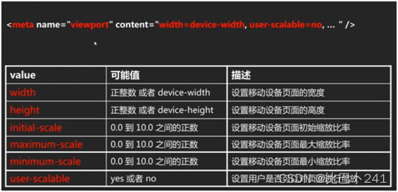
<meta name="viewport" content="width=device-width, initial-scale=1.0">
@media screen and (min-width: 800px)
| 值 | 描述 |
| height | 定义输出设备中的页面可见区域高度。 |
| max-height | 定义输出设备中的页面最大可见区域高度。 |
| max-width | 定义输出设备中的页面最大可见区域宽度。 |
| min-height | 定义输出设备中的页面最小可见区域高度。 |
| min-width | 定义输出设备中的页面最小可见区域宽度。 |
| width | 定义输出设备中的页面可见区域宽度。 |


 1216
1216

 被折叠的 条评论
为什么被折叠?
被折叠的 条评论
为什么被折叠?
 到【灌水乐园】发言


