【鸿蒙 HarmonyOS】尺寸设置:size/layoutWeight/constraintSize

一、背景

常见尺寸:width(宽度)、height(高度)、padding(内边距)、margin(外边距)

主要整理下size(设置高宽尺寸)、layoutWeight(对子组件进行重新布局)、constraintSize(设置约束尺寸,组件布局时,进行尺寸范围限制)

二、size:设置高宽尺寸

可以通过size来设置宽高尺寸,当然也可以直接给组件设置宽和高尺寸

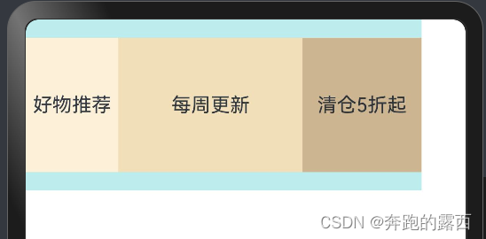
Row().size({ width: '100%', height: '100%' }).backgroundColor(Color.Yellow)

三、layoutWeight:对子组件进行重新布局

父容器尺寸确定时,设置了layoutWeight属性的子元素与兄弟元素占主轴尺寸按照权重进行分配,忽略元素本身尺寸设置,表示自适应占满剩余空间。

默认值:0

说明:

仅在Row/Column/Flex布局中生效。

可选值为大于等于0的数字,或者可以转换为数字的字符串。

3.1、示例代码 

@Entry
@Component
struct SizeExample {
  build() {
    Row() {
      // 权重1,占主轴剩余空间1/3
      Text('好物推荐')
        .size({ width: '30%', height: 110 }).backgroundColor(0xFFEFD5).textAlign(TextAlign.Center)
        .layoutWeight(1)
      // 权重2,占主轴剩余空间2/3
      Text('每周更新')
        .size({ width: '30%', height: 110 }).backgroundColor(0xF5DEB3).textAlign(TextAlign.Center)
        .layoutWeight(2)
      // 未设置layoutWeight属性,组件按照自身尺寸渲染
      Text('清仓5折起')
        .size({ width: '30%', height: 110 }).backgroundColor(0xD2B48C).textAlign(TextAlign.Center)
    }.size({ width: '90%', height: 140 }).backgroundColor(0xAFEEEE)
  }
}

3.2、实现效果:

四、constraintSize:设置约束尺寸,组件布局时,进行尺寸范围限制

4.1、使用场景

在固定容器内包含文本和图标,图标跟在文本后面一行展示,其中文本的内容不是固定的,当文本内容少时文本和图标会在固定容器内,但当文本内容多时整体会挤出固定容器外。

需要实现的效果是:不管文本内容多少,文本和图标都能在容器内,不操出

4.1.1、场景一:当文本少时,文本和图标都在固定容器内

4.1.2、场景二:当文本多时,文本和图标会操出固定容器外

4.2、示例代码:

@Entry
@Component
struct SizeExample {
  build() {
    Row() {
      Text('jkdjksjdkshhhkdhjsdhkshdsjkdhjs')
        .maxLines(1)
        .textOverflow({ overflow: TextOverflow.Ellipsis })
      Image($r('app.media.startIcon')).width(20).margin({ left: 10 })
    }.backgroundColor(Color.Orange).width(150).margin(50).padding(10)
  }
}

4.3、使用场景解决方法

不管文本内容多少,文本和图标都能在容器内;给Text添加constraintSize属性

设置约束尺寸。constraintSize的优先级高于Width和Height。取值结果参考constraintSize取值对width/height影响。

默认值:

{ minWidth: 0,maxWidth: Infinity,minHeight: 0,maxHeight: Infinity }

单位:vp

🚀🚀🚀  踩坑不易,还希望各位大佬支持一下

📃 我的土拨鼠开源项目:

✍Gitee开源项目地址👉:https://gitee.com/cheinlu/groundhog-charging-system

✍GitHub开源项目地址👉:https://github.com/cheinlu/groundhog-charging-system

📃 我的鸿蒙NEXT轮播图开源组件:https://gitee.com/cheinlu/harmony-os-next-swiper

最后:👏👏😊😊😊👍👍  

  • 30
    点赞
  • 16
    收藏
    觉得还不错? 一键收藏
  • 0
    评论
DataGridViewCell 是 DataGridView 控件中的一个单元格类,用于显示和编辑单元格内容。如果需要定制化单元格的显示和编辑行为,可以通过重写 DataGridViewCell 类来实现。 以下是重写 DataGridViewCell 的基本步骤: 1. 创建一个继承自 DataGridViewCell 的新类。 2. 重写 Clone 方法,以确保在复制单元格时正确地复制所有属性。 3. 重写 InitializeEditingControl 方法,以创建和初始化单元格的编辑控件。 4. 重写 Paint 方法,以绘制单元格的外观。 5. 重写 KeyDown 方法,以处理单元格键盘事件。 6. 重写 MouseClick 方法,以处理单元格鼠标单击事件。 7. 可选地重写 GetPreferredSize 方法,以返回单元格所需的最小大小。 8. 可选地重写 GetFormattedValue 方法,以返回格式化后的单元格值。 下面是一个示例代码,演示如何重写 DataGridViewCell 类: ``` public class CustomCell : DataGridViewCell { public CustomCell() : base() { // 设置单元格样式等属性 this.Style.BackColor = Color.Yellow; this.Style.Alignment = DataGridViewContentAlignment.MiddleCenter; } public override object Clone() { CustomCell clone = (CustomCell)base.Clone(); // 复制自定义属性 return clone; } protected override void InitializeEditingControl(int rowIndex, object initialFormattedValue, DataGridViewCellStyle dataGridViewCellStyle) { base.InitializeEditingControl(rowIndex, initialFormattedValue, dataGridViewCellStyle); // 创建和初始化编辑控件 } protected override void Paint(Graphics graphics, Rectangle clipBounds, Rectangle cellBounds, int rowIndex, DataGridViewElementStates cellState, object value, object formattedValue, string errorText, DataGridViewCellStyle cellStyle, DataGridViewAdvancedBorderStyle advancedBorderStyle, DataGridViewPaintParts paintParts) { base.Paint(graphics, clipBounds, cellBounds, rowIndex, cellState, value, formattedValue, errorText, cellStyle, advancedBorderStyle, paintParts); // 绘制单元格外观 } protected override void KeyDown(KeyEventArgs e, int rowIndex) { base.KeyDown(e, rowIndex); // 处理键盘事件 } protected override void MouseClick(DataGridViewCellMouseEventArgs e) { base.MouseClick(e); // 处理鼠标单击事件 } protected override Size GetPreferredSize(Graphics graphics, DataGridViewCellStyle cellStyle, int rowIndex, Size constraintSize) { Size preferredSize = base.GetPreferredSize(graphics, cellStyle, rowIndex, constraintSize); // 计算并返回单元格所需的最小大小 return preferredSize; } protected override object GetFormattedValue(object value, int rowIndex, ref DataGridViewCellStyle cellStyle, TypeConverter valueTypeConverter, TypeConverter formattedValueTypeConverter, DataGridViewDataErrorContexts context) { object formattedValue = base.GetFormattedValue(value, rowIndex, ref cellStyle, valueTypeConverter, formattedValueTypeConverter, context); // 格式化单元格值,并返回 return formattedValue; } } ``` 可以在使用 DataGridView 控件时将这个自定义单元格类应用到需要的列中,例如: ``` DataGridViewTextBoxColumn column = new DataGridViewTextBoxColumn(); column.CellTemplate = new CustomCell(); dataGridView1.Columns.Add(column); ```

“相关推荐”对你有帮助么?

  • 非常没帮助
  • 没帮助
  • 一般
  • 有帮助
  • 非常有帮助
提交
评论
添加红包

请填写红包祝福语或标题

红包个数最小为10个

红包金额最低5元

当前余额3.43前往充值 >
需支付:10.00
成就一亿技术人!
领取后你会自动成为博主和红包主的粉丝 规则
hope_wisdom
发出的红包
实付
使用余额支付
点击重新获取
扫码支付
钱包余额 0

抵扣说明:

1.余额是钱包充值的虚拟货币,按照1:1的比例进行支付金额的抵扣。
2.余额无法直接购买下载,可以购买VIP、付费专栏及课程。

余额充值