


银行电话营销_预测客户是否会购买定期存款_多个分类模型比较
该文章python jupyter ipynb代码链接
https://download.csdn.net/download/wjjc1017/88639886
营销介绍:
公司为客户创造价值并建立强大的客户关系,以便从客户那里获得价值的过程。
科特勒和阿姆斯特朗(2010年)。
营销活动的特点是关注客户需求和整体满意度。然而,有不同的变量决定了营销活动是否成功。在制定营销活动时,我们需要考虑某些变量。
4P原则:
1)人口细分:营销活动将针对哪个人口细分,并为什么?营销活动的这个方面非常重要,因为它将告诉我们应该向人口的哪个部分传达营销活动的信息。
2)达到客户地点的分销渠道:实施最有效的策略,以充分利用这次营销活动。我们应该针对人口的哪个细分?我们应该使用哪种工具来传达我们的信息?(例如:电话,广播,电视,社交媒体等)
3)价格:为潜在客户提供最佳价格是什么?(在银行的营销活动中,这不是必需的,因为银行的主要利益是让潜在客户开设存款账户,以保持银行的运营活动继续进行。)
4)促销策略:这是策略的实施方式,以及如何与潜在客户进行沟通。这应该是营销活动分析的最后一部分,因为必须对以前的活动进行深入分析(如果可能的话),以从以前的错误中吸取教训,并确定如何使营销活动更加有效。
数据集介绍
数据链接
https://archive.ics.uci.edu/dataset/222/bank+marketing
来源
创建者:Paulo Cortez(Univ. Minho)和Sérgio Moro(ISCTE-IUL)@ 2012
过去的使用情况
完整的数据集在以下论文中进行了描述和分析:
S. Moro, R. Laureano和P. Cortez。使用数据挖掘进行银行直销:CRISP-DM方法的应用。
在P. Novais等人(Eds.)的欧洲模拟与建模会议 - ESM’2011的论文集中,第117-121页,葡萄牙吉马良斯,2011年10月。EUROSIS。
相关信息
这些数据与葡萄牙银行机构的直销活动有关。
营销活动基于电话呼叫。通常,需要对同一客户进行多次联系,以确定是否订阅了产品(银行定期存款)。
有两个数据集:
1)bank-full.csv包含所有示例,按日期排序(从2008年5月到2010年11月)。
2)bank.csv包含10%的示例(4521个),是从bank-full.csv中随机选择的。
提供最小的数据集以测试更具计算要求的机器学习算法(例如SVM)。
分类目标是预测客户是否会订阅定期存款(变量y)。
实例数量:
bank-full.csv为45211个(bank.csv为4521个)
属性数量:
16个+输出属性
属性信息:
有关更多信息,请阅读[Moro et al., 2011]。
输入变量:
银行客户数据:
1 - age(数值型)
2 - job:工作类型(分类: “admin.”, “unknown”, “unemployed”, “management”, “housemaid”, “entrepreneur”, “student”,“blue-collar”, “self-employed”, “retired”, “technician”, “services”)
3 - marital:婚姻状态(分类: “married”, “divorced”, “single”;注意:"divorced"表示离婚或丧偶)
4 - education(分类: “unknown”, “secondary”, “primary”, “tertiary”)
5 - default:是否有违约信用?(二元: “yes”, “no”)
6 - balance:平均年度余额,以欧元为单位(数值型)
7 - housing:是否有住房贷款?(二元: “yes”, “no”)
8 - loan:是否有个人贷款?(二元: “yes”, “no”)
与当前营销活动的最后一次联系相关的属性:
9 - contact:联系沟通类型(分类: “unknown”, “telephone”, “cellular”)
10 - day:本月最后一次联系的日期(数值型)
11 - month:本年最后一次联系的月份(分类: “jan”, “feb”, “mar”, …, “nov”, “dec”)
12 - duration:最后一次联系的持续时间,以秒为单位(数值型)
其他属性:
13 - ampaign:在此次活动期间为该客户执行的联系次数(数值型,包括最后一次联系)
14 - pdays:客户上次从上一次活动联系后经过的天数(数值型,-1表示之前未与客户联系过)
15 - previous:在此次活动之前为该客户执行的联系次数(数值型)
16 - poutcome:上一次营销活动的结果(分类: “unknown”, “other”, “failure”, “success”)
输出变量(目标):
17 - y - 客户是否订阅了定期存款?(二元: “yes”, “no”)
缺失属性值:
没有
什么是定期存款?
定期存款是银行或金融机构提供的一种存款方式,其利率固定(通常比普通存款账户更好),在特定的到期时间将返还您的资金。有关定期存款的更多信息,请点击此链接查阅Investopedia的文章:https://www.investopedia.com/terms/t/termdeposit.asp
大纲:
A. 属性描述
I. *银行客户数据
II. *与当前营销活动的最后一次联系相关的属性
III. 其他属性
B. 数据结构化:
I. *数据整体分析
II. *数据结构化和转换
C. 探索性数据分析(EDA)
I. *接受与拒绝定期存款
II. *分布图
D. 分析的不同方面:
I. *营销活动的月份
II. *季节性
III. *对潜在客户的电话次数
IV. *潜在客户的年龄
V. 导致更多定期存款订阅的职业类型
E. 影响潜在客户决策的相关性。
I. *相关性矩阵分析
II. *余额类别与住房贷款
III. 住房贷款与定期存款之间的负相关关系
F. 分类模型
I. 介绍
II. 分层抽样
III. 分类模型
IV. 混淆矩阵
V. 精确度和召回率曲线
VI. 特征重要性决策树C.
G. 下一次营销活动策略
I. 银行应考虑的行动
A. 属性描述:
输入变量:
Ai. 银行客户数据:
1 - age:(数值型)
2 - job: 职业类型(分类型:‘admin.’,‘blue-collar’,‘entrepreneur’,‘housemaid’,‘management’,‘retired’,‘self-employed’,‘services’,‘student’,‘technician’,‘unemployed’,‘unknown’)
3 - marital: 婚姻状态(分类型:‘divorced’,‘married’,‘single’,‘unknown’;注意:'divorced’表示离婚或丧偶)
4 - education:(分类型:primary, secondary, tertiary和unknown)
5 - default: 是否有信用违约?(分类型:‘no’,‘yes’,‘unknown’)
6 - housing:: 是否有住房贷款?(分类型:‘no’,‘yes’,‘unknown’)
7 - loan: 是否有个人贷款?(分类型:‘no’,‘yes’,‘unknown’)
8 - balance: 个人余额。
Aii. 与当前营销活动的最后一次联系相关的属性:
8 - contact: 联系方式(分类型:‘cellular’,‘telephone’)
9 - day: 最后一次联系的月份(分类型:‘jan’, ‘feb’, ‘mar’, …, ‘nov’, ‘dec’)
10 - month: 最后一次联系的星期几(分类型:‘mon’,‘tue’,‘wed’,‘thu’,‘fri’)
11 - duration: 最后一次联系的持续时间,以秒为单位(数值型)。重要说明:此属性对输出目标有很大影响(例如,如果持续时间=0,则y=‘no’)。然而,在进行呼叫之前,持续时间是未知的。此外,呼叫结束后,y显然是已知的。因此,此输入只应用于基准目的,并且如果意图是拥有一个真实的预测模型,则应将其丢弃。
Aiii. 其他属性:
12 - campaign: 在此次营销活动中为该客户执行的联系次数(数值型,包括最后一次联系)
13 - pdays: 在上一次营销活动后经过的天数(数值型;999表示之前未与客户联系过)
14 - previous: 在此次营销活动之前为该客户执行的联系次数(数值型)
15 - poutcome: 上一次营销活动的结果(分类型:‘failure’,‘nonexistent’,‘success’)
输出变量(目标变量):
21 - y - 客户是否订阅了定期存款?(二元型:‘yes’,‘no’)
# 导入所需的库
import numpy as np
import pandas as pd
import matplotlib.pyplot as plt
import seaborn as sns

# 导入绘图库
from plotly import tools
import plotly.plotly as py
import plotly.figure_factory as ff
import plotly.graph_objs as go
from plotly.offline import download_plotlyjs, init_notebook_mode, plot, iplot

# 初始化绘图模式
init_notebook_mode(connected=True)

# 设置主路径
MAIN_PATH = '../input/'

# 读取数据文件
df = pd.read_csv(MAIN_PATH +'bank.csv')

# 创建一个副本
term_deposits = df.copy()

# 查看数据的前几行
df.head()
| age | job | marital | education | default | balance | housing | loan | contact | day | month | duration | campaign | pdays | previous | poutcome | deposit | |
|---|---|---|---|---|---|---|---|---|---|---|---|---|---|---|---|---|---|
| 0 | 59 | admin. | married | secondary | no | 2343 | yes | no | unknown | 5 | may | 1042 | 1 | -1 | 0 | unknown | yes |
| 1 | 56 | admin. | married | secondary | no | 45 | no | no | unknown | 5 | may | 1467 | 1 | -1 | 0 | unknown | yes |
| 2 | 41 | technician | married | secondary | no | 1270 | yes | no | unknown | 5 | may | 1389 | 1 | -1 | 0 | unknown | yes |
| 3 | 55 | services | married | secondary | no | 2476 | yes | no | unknown | 5 | may | 579 | 1 | -1 | 0 | unknown | yes |
| 4 | 54 | admin. | married | tertiary | no | 184 | no | no | unknown | 5 | may | 673 | 2 | -1 | 0 | unknown | yes |
探索基础知识
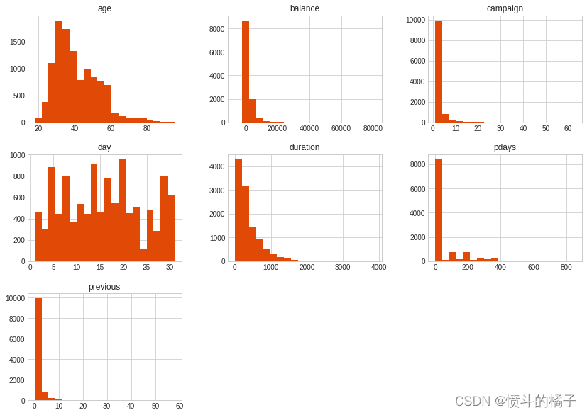
** 概要: **- 平均年龄约为41岁。(最小值:18岁,最大值:95岁。)
- 平均余额为1,528。然而,标准差(std)是一个很大的数字,所以我们可以通过这个了解到余额在数据集中分布很广。
- 根据数据信息,最好删除持续时间列,因为持续时间与潜在客户是否购买定期存款高度相关。此外,持续时间是在向潜在客户打电话后获得的,所以如果目标客户从未接到过电话,这个特征就不那么有用。持续时间与开设定期存款高度相关的原因是,银行与目标客户交谈的时间越长,目标客户开设定期存款的概率就越高,因为较长的持续时间意味着潜在客户的兴趣(承诺)更高。
注意:从描述性数据集中我们无法获得太多见解,因为大部分描述性数据位于“数值”列而不是“分类”列中。
# 对DataFrame进行描述性统计分析
df.describe()  # 使用describe()函数对DataFrame进行描述性统计分析

# 描述性统计分析包括计数、均值、标准差、最小值、25%分位数、中位数、75%分位数和最大值等统计指标

# 计数:统计每列非缺失值的个数
# 均值:计算每列的平均值
# 标准差:计算每列的标准差,反映数据的离散程度
# 最小值:计算每列的最小值
# 25%分位数:计算每列的第25%分位数,即将数据从小到大排序后,处于25%位置的值
# 中位数:计算每列的中位数,即将数据从小到大排序后,处于中间位置的值
# 75%分位数:计算每列的第75%分位数,即将数据从小到大排序后,处于75%位置的值
# 最大值:计算每列的最大值

# describe()函数返回一个新的DataFrame,其中包含了以上统计指标的计算结果
| age | balance | day | duration | campaign | pdays | previous | |
|---|---|---|---|---|---|---|---|
| count | 11162.000000 | 11162.000000 | 11162.000000 | 11162.000000 | 11162.000000 | 11162.000000 | 11162.000000 |
| mean | 41.231948 | 1528.538524 | 15.658036 | 371.993818 | 2.508421 | 51.330407 | 0.832557 |
| std | 11.913369 | 3225.413326 | 8.420740 | 347.128386 | 2.722077 | 108.758282 | 2.292007 |
| min | 18.000000 | -6847.000000 | 1.000000 | 2.000000 | 1.000000 | -1.000000 | 0.000000 |
| 25% | 32.000000 | 122.000000 | 8.000000 | 138.000000 | 1.000000 | -1.000000 | 0.000000 |
| 50% | 39.000000 | 550.000000 | 15.000000 | 255.000000 | 2.000000 | -1.000000 | 0.000000 |
| 75% | 49.000000 | 1708.000000 | 22.000000 | 496.000000 | 3.000000 | 20.750000 | 1.000000 |
| max | 95.000000 | 81204.000000 | 31.000000 | 3881.000000 | 63.000000 | 854.000000 | 58.000000 |
幸运的是,这里没有缺失值。如果有缺失值,我们将不得不用中位数、平均数或众数来填充它们。我倾向于使用中位数,但在这种情况下没有必要填充任何缺失值。这肯定会让我们的工作更容易!
# 打印数据框的信息,包括每列的名称、非空值数量、数据类型等信息。
df.info()
<class 'pandas.core.frame.DataFrame'>
RangeIndex: 11162 entries, 0 to 11161
Data columns (total 17 columns):
age          11162 non-null int64
job          11162 non-null object
marital      11162 non-null object
education    11162 non-null object
default      11162 non-null object
balance      11162 non-null int64
housing      11162 non-null object
loan         11162 non-null object
contact      11162 non-null object
day          11162 non-null int64
month        11162 non-null object
duration     11162 non-null int64
campaign     11162 non-null int64
pdays        11162 non-null int64
previous     11162 non-null int64
poutcome     11162 non-null object
deposit      11162 non-null object
dtypes: int64(7), object(10)
memory usage: 1.4+ MB
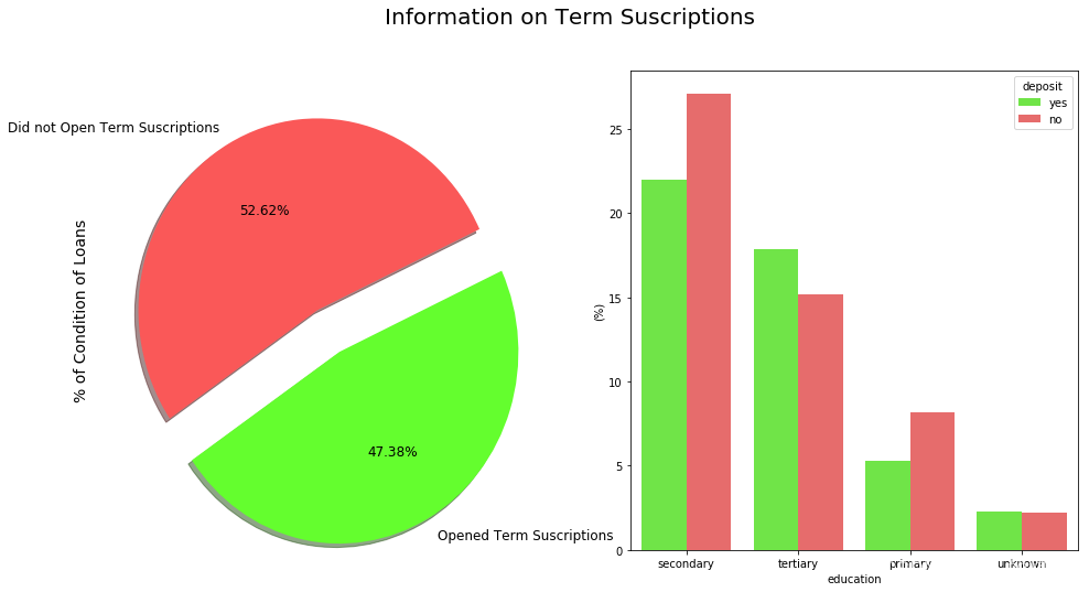
# 创建一个包含两个子图的画布
f, ax = plt.subplots(1, 2, figsize=(16, 8))

# 定义两种颜色和标签
colors = ["#FA5858", "#64FE2E"]
labels = "Did not Open Term Suscriptions", "Opened Term Suscriptions"

# 设置总标题
plt.suptitle('Information on Term Suscriptions', fontsize=20)

# 在第一个子图上绘制饼图
# explode参数用于突出显示某一部分,autopct参数用于显示百分比
# shadow参数用于添加阴影效果,colors参数用于设置颜色,labels参数用于设置标签
# fontsize参数用于设置字体大小,startangle参数用于设置起始角度
df["deposit"].value_counts().plot.pie(explode=[0, 0.25], autopct='%1.2f%%', ax=ax[0], shadow=True, colors=colors,
                                      labels=labels, fontsize=12, startangle=25)

# 设置第一个子图的y轴标签
ax[0].set_ylabel('% of Condition of Loans', fontsize=14)

# 在第二个子图上绘制条形图
# x参数表示x轴的数据,y参数表示y轴的数据,hue参数表示按照某个变量进行分组
# data参数表示使用的数据集,palette参数用于设置颜色,estimator参数用于设置柱子的高度
sns.barplot(x="education", y="balance", hue="deposit", data=df, palette=palette, estimator=lambda x: len(x) / len(df) * 100)

# 设置第二个子图的y轴标签
ax[1].set(ylabel="(%)")

# 设置第二个子图的x轴刻度标签
ax[1].set_xticklabels(df["education"].unique(), rotation=0, rotation_mode="anchor")

# 显示图形
plt.show()
/opt/conda/lib/python3.6/site-packages/scipy/stats/stats.py:1713: FutureWarning:

Using a non-tuple sequence for multidimensional indexing is deprecated; use `arr[tuple(seq)]` instead of `arr[seq]`. In the future this will be interpreted as an array index, `arr[np.array(seq)]`, which will result either in an error or a different result.
# 设置图表样式为seaborn-whitegrid
plt.style.use('seaborn-whitegrid')

# 绘制直方图,bins参数表示将数据分成20个区间,figsize参数表示图表的大小为14x10英寸,color参数表示直方图的颜色为橙色
df.hist(bins=20, figsize=(14,10), color='#E14906')

# 显示图表
plt.show()
# 统计df中'deposit'列的值的频次
df['deposit'].value_counts()
no     5873
yes    5289
Name: deposit, dtype: int64
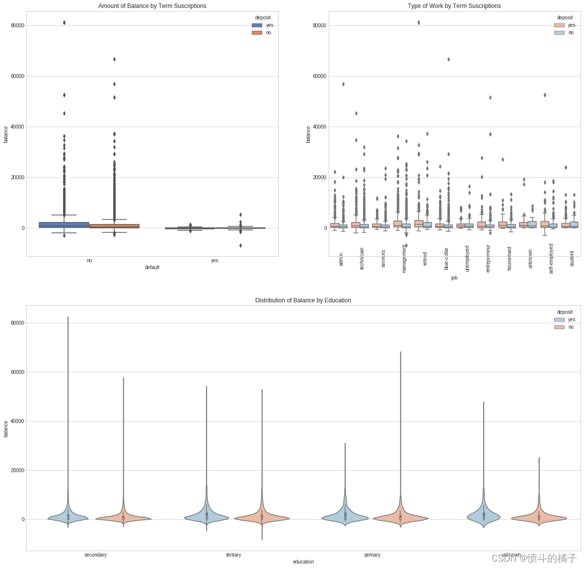
# 设置图表风格为暗色背景
#plt.style.use('dark_background')

# 创建一个大小为20x20的图表
fig = plt.figure(figsize=(20,20))

# 添加子图1,位置为2行2列的第1个位置
ax1 = fig.add_subplot(221)

# 添加子图2,位置为2行2列的第2个位置
ax2 = fig.add_subplot(222)

# 添加子图3,位置为2行1列的第2个位置
ax3 = fig.add_subplot(212)

# 在子图1中绘制箱线图,x轴为"default",y轴为"balance",根据"deposit"进行分组,使用"muted"调色板
g = sns.boxplot(x="default", y="balance", hue="deposit", data=df, palette="muted", ax=ax1)

# 设置子图1的标题为"Amount of Balance by Term Suscriptions"
g.set_title("Amount of Balance by Term Suscriptions")

# 设置子图1的x轴刻度标签为"default"的唯一值,旋转45度
# g.set_xticklabels(df["default"].unique(), rotation=45, rotation_mode="anchor")

# 在子图2中绘制箱线图,x轴为"job",y轴为"balance",根据"deposit"进行分组,使用"RdBu"调色板
g1 = sns.boxplot(x="job", y="balance", hue="deposit", data=df, palette="RdBu", ax=ax2)

# 设置子图2的x轴刻度标签为"job"的唯一值,旋转90度
g1.set_xticklabels(df["job"].unique(), rotation=90, rotation_mode="anchor")

# 设置子图2的标题为"Type of Work by Term Suscriptions"
g1.set_title("Type of Work by Term Suscriptions")

# 在子图3中绘制小提琴图,x轴为"education",y轴为"balance",根据"deposit"进行分组,使用"RdBu_r"调色板
g2 = sns.violinplot(data=df, x="education", y="balance", hue="deposit", palette="RdBu_r")

# 设置子图3的标题为"Distribution of Balance by Education"
g2.set_title("Distribution of Balance by Education")

# 显示图表
plt.show()
/opt/conda/lib/python3.6/site-packages/scipy/stats/stats.py:1713: FutureWarning:

Using a non-tuple sequence for multidimensional indexing is deprecated; use `arr[tuple(seq)]` instead of `arr[seq]`. In the future this will be interpreted as an array index, `arr[np.array(seq)]`, which will result either in an error or a different result.
# 显示DataFrame的前5行数据
df.head()
| age | job | marital | education | default | balance | housing | loan | contact | day | month | duration | campaign | pdays | previous | poutcome | deposit | |
|---|---|---|---|---|---|---|---|---|---|---|---|---|---|---|---|---|---|
| 0 | 59 | admin. | married | secondary | no | 2343 | yes | no | unknown | 5 | may | 1042 | 1 | -1 | 0 | unknown | yes |
| 1 | 56 | admin. | married | secondary | no | 45 | no | no | unknown | 5 | may | 1467 | 1 | -1 | 0 | unknown | yes |
| 2 | 41 | technician | married | secondary | no | 1270 | yes | no | unknown | 5 | may | 1389 | 1 | -1 | 0 | unknown | yes |
| 3 | 55 | services | married | secondary | no | 2476 | yes | no | unknown | 5 | may | 579 | 1 | -1 | 0 | unknown | yes |
| 4 | 54 | admin. | married | tertiary | no | 184 | no | no | unknown | 5 | may | 673 | 2 | -1 | 0 | unknown | yes |
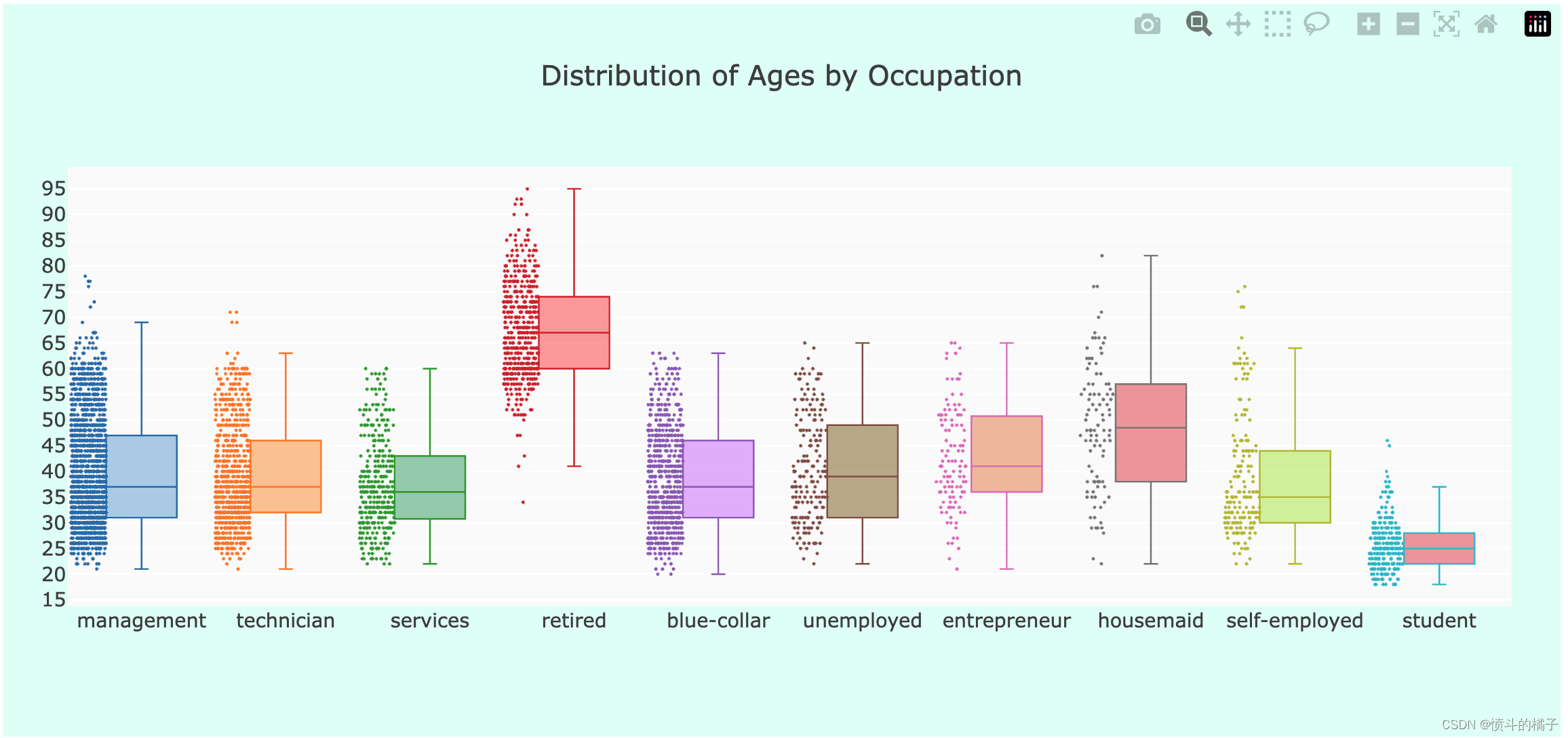
职业分析:
- 职业数量:在这个数据集中,管理职位是最常见的职业。
- 按职业划分的年龄:如预期,退休人员的中位年龄最高,而学生的最低。
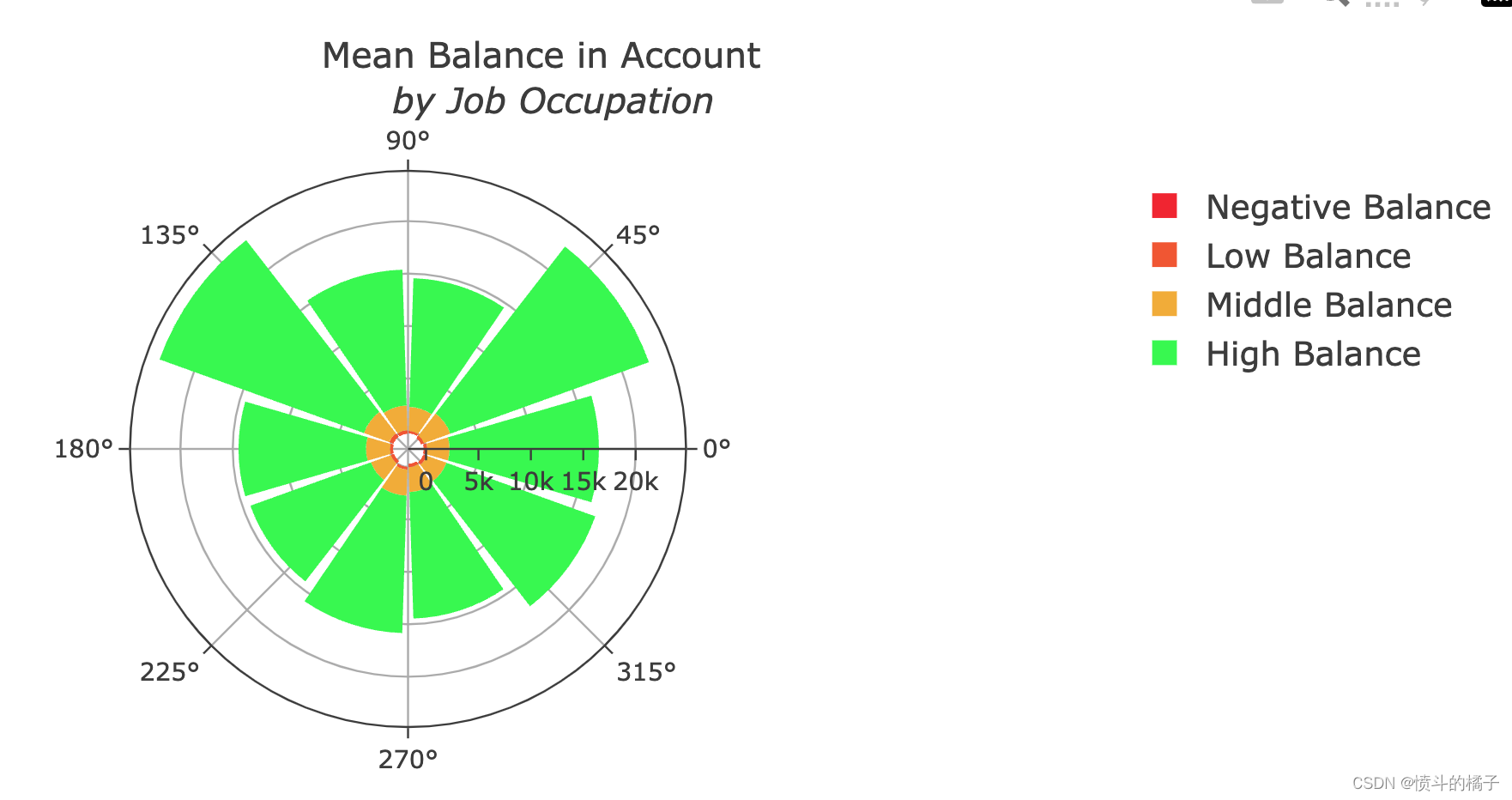
- 按职业划分的余额:管理人员和退休人员是账户余额最高的人群。
# 删除职业为"unknown"的行
df = df.drop(df.loc[df["job"] == "unknown"].index)

# 将"admin."职业归类为"management",因为它们基本上是相同的
lst = [df]

# 对于每个数据框df中的列col
for col in lst:
    # 将职业为"admin."的行的职业改为"management"
    col.loc[col["job"] == "admin.", "job"] = "management"
df.columns
Index(['age', 'job', 'marital', 'education', 'default', 'balance', 'housing',
       'loan', 'contact', 'day', 'month', 'duration', 'campaign', 'pdays',
       'previous', 'poutcome', 'deposit'],
      dtype='object')
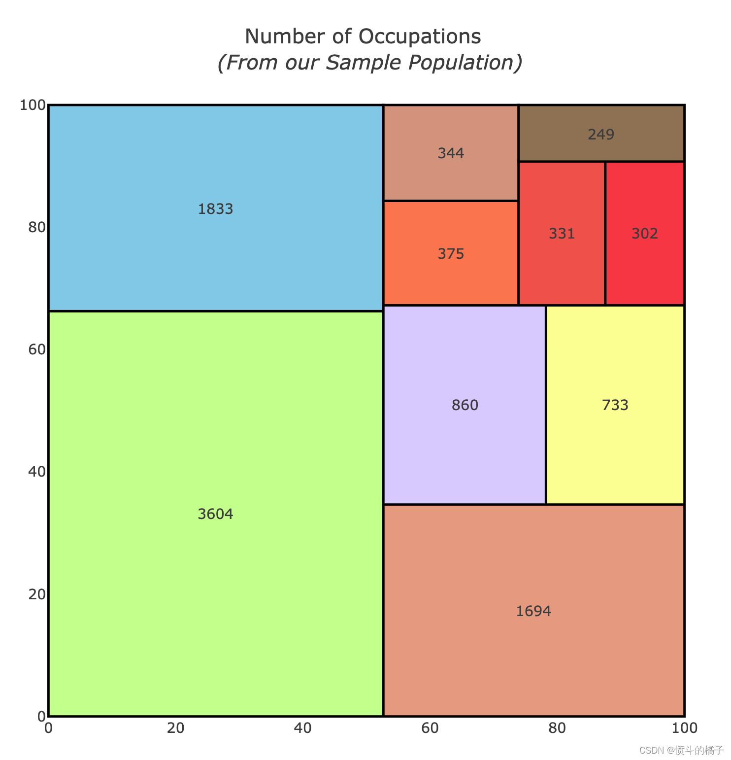
# 导入所需库
import squarify

# 删除balance为0的行
df = df.drop(df.loc[df["balance"] == 0].index)

# 设置初始值
x = 0
y = 0
width = 100
height = 100

# 获取职位名称和对应的数量
job_names = df['job'].value_counts().index
values = df['job'].value_counts().tolist()

# 对数量进行归一化
normed = squarify.normalize_sizes(values, width, height)

# 根据归一化后的数量生成矩形
rects = squarify.squarify(normed, x, y, width, height)

# 设置颜色
colors = ['rgb(200, 255, 144)','rgb(135, 206, 235)',
          'rgb(235, 164, 135)','rgb(220, 208, 255)',
          'rgb(253, 253, 150)','rgb(255, 127, 80)',
         'rgb(218, 156, 133)', 'rgb(245, 92, 76)',
         'rgb(252,64,68)', 'rgb(154,123,91)']

# 初始化形状和注释列表
shapes = []
annotations = []
counter = 0

# 遍历矩形列表
for r in rects:
    # 添加矩形形状
    shapes.append(
        dict(
            type = 'rect',
            x0 = r['x'],
            y0 = r['y'],
            x1 = r['x'] + r['dx'],
            y1 = r['y'] + r['dy'],
            line = dict(width=2),
            fillcolor = colors[counter]
        )
    )
    # 添加注释
    annotations.append(
        dict(
            x = r['x']+(r['dx']/2),
            y = r['y']+(r['dy']/2),
            text = values[counter],
            showarrow = False
        )
    )
    counter = counter + 1
    if counter >= len(colors):
        counter = 0

# 创建用于悬停文本的散点图
trace0 = go.Scatter(
    x = [ r['x']+(r['dx']/2) for r in rects],
    y = [ r['y']+(r['dy']/2) for r in rects],
    text = [ str(v) for v in job_names],
    mode='text',
)

# 设置布局
layout = dict(
    title='Number of Occupations <br> <i>(From our Sample Population)</i>',
    height=700,
    width=700,
    xaxis=dict(showgrid=False,zeroline=False),
    yaxis=dict(showgrid=False,zeroline=False),
    shapes=shapes,
    annotations=annotations,
    hovermode='closest'
)

# 创建图形
figure = dict(data=[trace0], layout=layout)

# 显示图形
iplot(figure, filename='squarify-treemap')
# 现在让我们看看哪些职业的账户更加平衡

suscribed_df = df.loc[df["deposit"] == "yes"]  # 选取订阅了存款的数据

occupations = df["job"].unique().tolist()  # 获取所有职业的列表

# 按职业获取账户余额
management = suscribed_df["age"].loc[suscribed_df["job"] == "management"].values
technician = suscribed_df["age"].loc[suscribed_df["job"] == "technician"].values
services = suscribed_df["age"].loc[suscribed_df["job"] == "services"].values
retired = suscribed_df["age"].loc[suscribed_df["job"] == "retired"].values
blue_collar = suscribed_df["age"].loc[suscribed_df["job"] == "blue-collar"].values
unemployed = suscribed_df["age"].loc[suscribed_df["job"] == "unemployed"].values
entrepreneur = suscribed_df["age"].loc[suscribed_df["job"] == "entrepreneur"].values
housemaid = suscribed_df["age"].loc[suscribed_df["job"] == "housemaid"].values
self_employed = suscribed_df["age"].loc[suscribed_df["job"] == "self-employed"].values
student = suscribed_df["age"].loc[suscribed_df["job"] == "student"].values

ages = [management, technician, services, retired, blue_collar, unemployed,
         entrepreneur, housemaid, self_employed, student]  # 将所有职业的账户余额放入一个列表中

colors = ['rgba(93, 164, 214, 0.5)', 'rgba(255, 144, 14, 0.5)',
          'rgba(44, 160, 101, 0.5)', 'rgba(255, 65, 54, 0.5)',
          'rgba(207, 114, 255, 0.5)', 'rgba(127, 96, 0, 0.5)',
         'rgba(229, 126, 56, 0.5)', 'rgba(229, 56, 56, 0.5)',
         'rgba(174, 229, 56, 0.5)', 'rgba(229, 56, 56, 0.5)']  # 设置每个职业的颜色

traces = []  # 创建一个空列表用于存储每个职业的箱线图数据

# 遍历每个职业,创建对应的箱线图数据
for xd, yd, cls in zip(occupations, ages, colors):
        traces.append(go.Box(
            y=yd,
            name=xd,
            boxpoints='all',
            jitter=0.5,
            whiskerwidth=0.2,
            fillcolor=cls,
            marker=dict(
                size=2,
            ),
            line=dict(width=1),
        ))

layout = go.Layout(
    title='Distribution of Ages by Occupation',  # 设置图表标题
    yaxis=dict(
        autorange=True,
        showgrid=True,
        zeroline=True,
        dtick=5,
        gridcolor='rgb(255, 255, 255)',
        gridwidth=1,
        zerolinecolor='rgb(255, 255, 255)',
        zerolinewidth=2,
    ),
    margin=dict(
        l=40,
        r=30,
        b=80,
        t=100,
    ),
    paper_bgcolor='rgb(224,255,246)',
    plot_bgcolor='rgb(251,251,251)',
    showlegend=False
)

fig = go.Figure(data=traces, layout=layout)  # 创建图表对象
iplot(fig)  # 绘制图表
# Balance Distribution

# 创建一个余额分类列
df["balance_status"] = np.nan
lst = [df]

# 遍历每一列
for col in lst:
    # 将余额小于0的标记为"negative"
    col.loc[col["balance"] < 0, "balance_status"] = "negative"
    # 将余额在0到30000之间的标记为"low"
    col.loc[(col["balance"] >= 0) & (col["balance"] <= 30000), "balance_status"] = "low"
    # 将余额在30000到40000之间的标记为"middle"
    col.loc[(col["balance"] > 30000) & (col["balance"] <= 40000), "balance_status"] = "middle"
    # 将余额大于40000的标记为"high"
    col.loc[col["balance"] > 40000, "balance_status"] = "high"

# 按照余额分类获取各个分类下的余额值
negative = df["balance"].loc[df["balance_status"] == "negative"].values.tolist()
low = df["balance"].loc[df["balance_status"] == "low"].values.tolist()
middle = df["balance"].loc[df["balance_status"] == "middle"].values.tolist()
high = df["balance"].loc[df["balance_status"] == "high"].values.tolist()


# 按照职业和余额分类计算平均余额
job_balance = df.groupby(['job', 'balance_status'])['balance'].mean()


# 创建极地柱状图的第一个数据系列
trace1 = go.Barpolar(
    r=[-199.0, -392.0, -209.0, -247.0, -233.0, -270.0, -271.0, 0, -276.0, -134.5],
    text=["blue-collar", "entrepreneur", "housemaid", "management", "retired", "self-employed",
         "services", "student", "technician", "unemployed"],
    name='Negative Balance',
    marker=dict(
        color='rgb(246, 46, 46)'
    )
)

# 创建极地柱状图的第二个数据系列
trace2 = go.Barpolar(
    r=[319.5, 283.0, 212.0, 313.0, 409.0, 274.5, 308.5, 253.0, 316.0, 330.0],
    text=["blue-collar", "entrepreneur", "housemaid", "management", "retired", "self-employed",
         "services", "student", "technician", "unemployed"],
    name='Low Balance',
    marker=dict(
        color='rgb(246, 97, 46)'
    )
)

# 创建极地柱状图的第三个数据系列
trace3 = go.Barpolar(
    r=[2128.5, 2686.0, 2290.0, 2366.0, 2579.0, 2293.5, 2005.5, 2488.0, 2362.0, 1976.0],
    text=["blue-collar", "entrepreneur", "housemaid", "management", "retired", "self-employed",
         "services", "student", "technician", "unemployed"],
    name='Middle Balance',
    marker=dict(
        color='rgb(246, 179, 46)'
    )
)

# 创建极地柱状图的第四个数据系列
trace4 = go.Barpolar(
    r=[14247.5, 20138.5, 12278.5, 12956.0, 20723.0, 12159.0, 12223.0, 13107.0, 12063.0, 15107.5],
    text=["blue-collar", "entrepreneur", "housemaid", "management", "retired", "self-employed",
         "services", "student", "technician", "unemployed"],
    name='High Balance',
    marker=dict(
        color='rgb(46, 246, 78)'
    )
)

# 将数据系列放入一个列表中
data = [trace1, trace2, trace3, trace4]

# 设置图表的布局
layout = go.Layout(
    title='Mean Balance in Account<br> <i> by Job Occupation</i>',
    font=dict(
        size=12
    ),
    legend=dict(
        font=dict(
            size=16
        )
    ),
    radialaxis=dict(
        ticksuffix='%'
    ),
    orientation=270
)

# 创建图表对象
fig = go.Figure(data=data, layout=layout)

# 绘制图表
iplot(fig, filename='polar-area-chart')
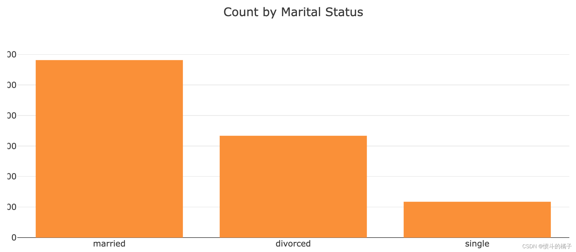
婚姻状况
在这个分析中,除了大多数 离婚的个体都很穷外,我们没有发现其他重要的见解。难怪,因为他们必须分割财产!尽管如此,由于没有发现更多的见解,我们将继续将婚姻状况与教育状况进行聚类。让我们看看在样本人群中是否可以找到其他群体。# 统计df中'marital'列的不同取值及其出现的次数
df['marital'].value_counts()
married     5815
single      3336
divorced    1174
Name: marital, dtype: int64
df['marital'].unique()
array(['married', 'divorced', 'single'], dtype=object)
# 统计df中'marital'列的各个取值出现的次数,并将结果转换为列表形式
df['marital'].value_counts().tolist()
[5815, 3336, 1174]
# 获取'marital'列的值并统计各个值的数量
vals = df['marital'].value_counts().tolist()

# 定义标签
labels = ['married', 'divorced', 'single']

# 创建柱状图数据
data = [go.Bar(
            x=labels,  # x轴数据为标签
            y=vals,  # y轴数据为各个值的数量
            marker=dict(
                color="#FE9A2E")  # 设置柱状图颜色
        )]

# 创建布局
layout = go.Layout(
    title="Count by Marital Status",  # 设置标题
)

# 创建图表
fig = go.Figure(data=data, layout=layout)

# 在Jupyter Notebook中显示图表
iplot(fig, filename='basic-bar')
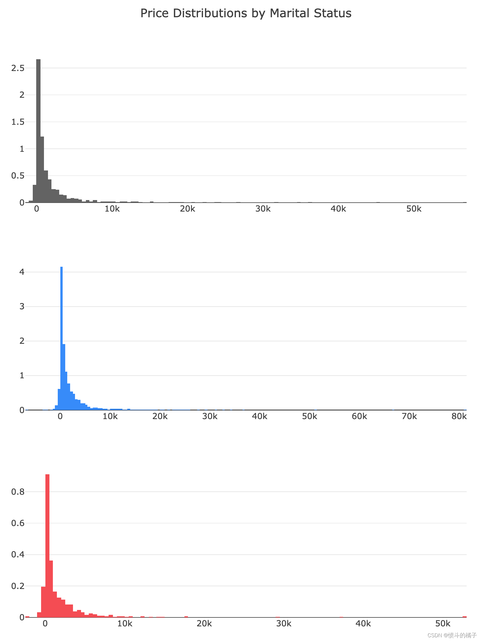
# 根据婚姻状况分布的余额数据
single = df['balance'].loc[df['marital'] == 'single'].values
married = df['balance'].loc[df['marital'] == 'married'].values
divorced = df['balance'].loc[df['marital'] == 'divorced'].values

# 创建单身人士余额分布直方图
single_dist = go.Histogram(
    x=single,
    histnorm='density',  # 设置直方图的标准化方式为密度
    name='single',  # 设置直方图的名称为'single'
    marker=dict(
        color='#6E6E6E'  # 设置直方图的颜色为灰色
    )
)

# 创建已婚人士余额分布直方图
married_dist = go.Histogram(
    x=married,
    histnorm='density',  # 设置直方图的标准化方式为密度
    name='married',  # 设置直方图的名称为'married'
    marker=dict(
        color='#2E9AFE'  # 设置直方图的颜色为蓝色
    )
)

# 创建离异人士余额分布直方图
divorced_dist = go.Histogram(
    x=divorced,
    histnorm='density',  # 设置直方图的标准化方式为密度
    name='divorced',  # 设置直方图的名称为'divorced'
    marker=dict(
        color='#FA5858'  # 设置直方图的颜色为红色
    )
)

# 创建子图对象
fig = tools.make_subplots(rows=3, print_grid=False)

# 将单身人士余额分布直方图添加到子图中的第一行第一列
fig.append_trace(single_dist, 1, 1)
# 将已婚人士余额分布直方图添加到子图中的第二行第一列
fig.append_trace(married_dist, 2, 1)
# 将离异人士余额分布直方图添加到子图中的第三行第一列
fig.append_trace(divorced_dist, 3, 1)

# 更新子图的布局设置
fig['layout'].update(showlegend=False,  # 不显示图例
                    title="Price Distributions by Marital Status",  # 设置图的标题
                    height=1000, width=800)  # 设置图的高度和宽度

# 绘制图形
iplot(fig, filename='custom-sized-subplot-with-subplot-titles')  # 在Jupyter Notebook中显示图形
# 显示DataFrame的前5行数据
df.head()
| age | job | marital | education | default | balance | housing | loan | contact | day | month | duration | campaign | pdays | previous | poutcome | deposit | balance_status | |
|---|---|---|---|---|---|---|---|---|---|---|---|---|---|---|---|---|---|---|
| 0 | 59 | management | married | secondary | no | 2343 | yes | no | unknown | 5 | may | 1042 | 1 | -1 | 0 | unknown | yes | low |
| 1 | 56 | management | married | secondary | no | 45 | no | no | unknown | 5 | may | 1467 | 1 | -1 | 0 | unknown | yes | low |
| 2 | 41 | technician | married | secondary | no | 1270 | yes | no | unknown | 5 | may | 1389 | 1 | -1 | 0 | unknown | yes | low |
| 3 | 55 | services | married | secondary | no | 2476 | yes | no | unknown | 5 | may | 579 | 1 | -1 | 0 | unknown | yes | low |
| 4 | 54 | management | married | tertiary | no | 184 | no | no | unknown | 5 | may | 673 | 2 | -1 | 0 | unknown | yes | low |
# 导入所需的库
import plotly.figure_factory as ff
from plotly.offline import iplot
# 创建一个facet grid图表
# 参数说明:
# df: 数据集
# x: x轴的数据,这里是'duration'
# y: y轴的数据,这里是'balance'
# color_name: 颜色的分类变量,这里是'marital'
# show_boxes: 是否显示箱线图,这里设置为False
# marker: 点的样式,设置大小为10,透明度为1.0
# colormap: 颜色映射,设置'single'对应的颜色为'rgb(165, 242, 242)','married'对应的颜色为'rgb(253, 174, 216)','divorced'对应的颜色为'rgba(201, 109, 59, 0.82)'
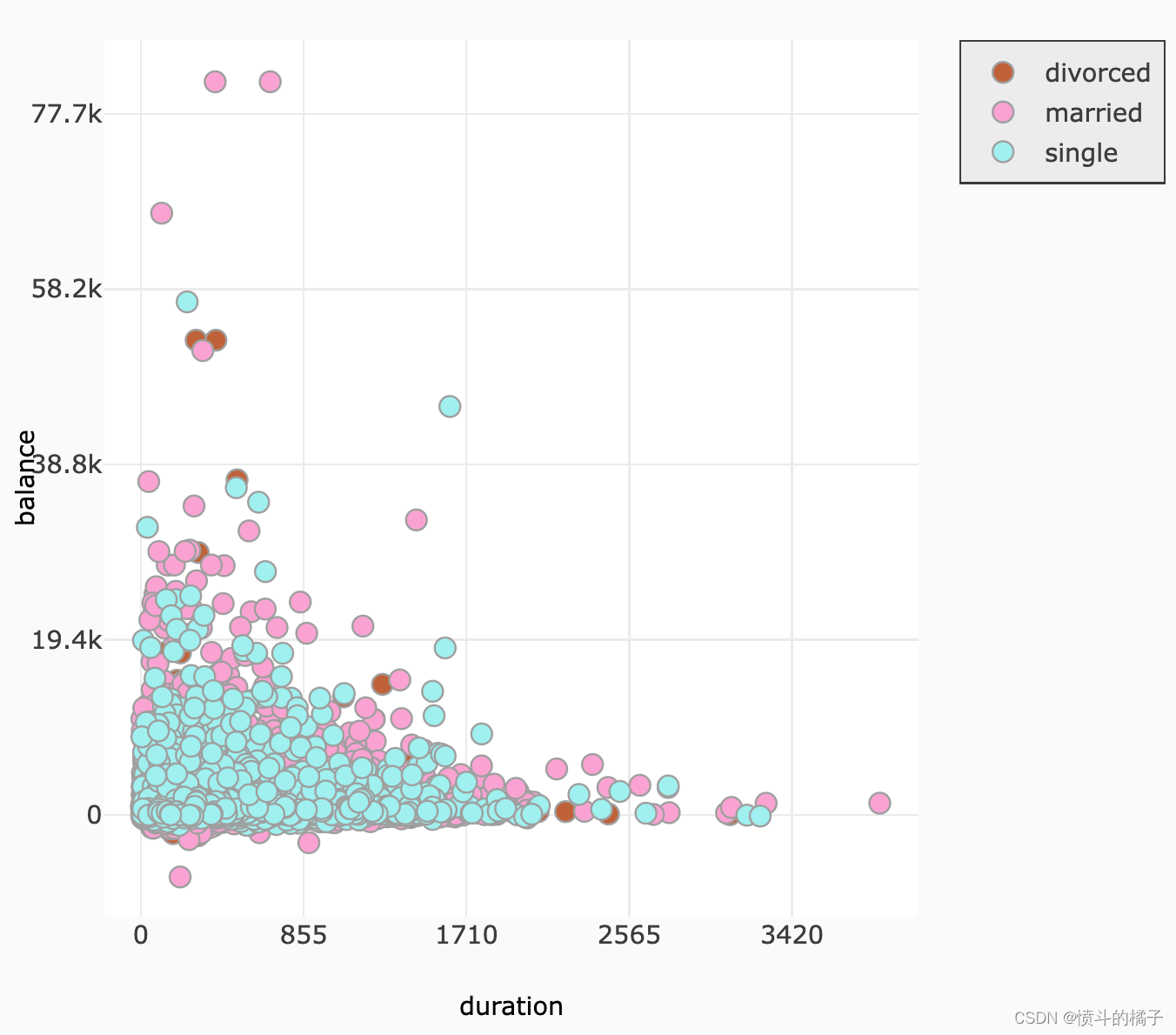
fig = ff.create_facet_grid(
df,
x='duration',
y='balance',
color_name='marital',
show_boxes=False,
marker={'size': 10, 'opacity': 1.0},
colormap={'single': 'rgb(165, 242, 242)', 'married': 'rgb(253, 174, 216)', 'divorced': 'rgba(201, 109, 59, 0.82)'}
)
# 在notebook中显示图表
iplot(fig, filename='facet - custom colormap')
# 创建一个facet grid图表
# 参数df表示数据集
# 参数y表示y轴的数据,这里是balance
# 参数facet_row表示行的分面变量,这里是marital
# 参数facet_col表示列的分面变量,这里是deposit
# 参数trace_type表示图表类型,这里是box
fig = ff.create_facet_grid(
    df,
    y='balance',
    facet_row='marital',
    facet_col='deposit',
    trace_type='box',
)

# 在notebook中显示图表
iplot(fig, filename='facet - box traces')

# 显示DataFrame的前5行数据
df.head()
| age | job | marital | education | default | balance | housing | loan | contact | day | month | duration | campaign | pdays | previous | poutcome | deposit | balance_status | |
|---|---|---|---|---|---|---|---|---|---|---|---|---|---|---|---|---|---|---|
| 0 | 59 | management | married | secondary | no | 2343 | yes | no | unknown | 5 | may | 1042 | 1 | -1 | 0 | unknown | yes | low |
| 1 | 56 | management | married | secondary | no | 45 | no | no | unknown | 5 | may | 1467 | 1 | -1 | 0 | unknown | yes | low |
| 2 | 41 | technician | married | secondary | no | 1270 | yes | no | unknown | 5 | may | 1389 | 1 | -1 | 0 | unknown | yes | low |
| 3 | 55 | services | married | secondary | no | 2476 | yes | no | unknown | 5 | may | 579 | 1 | -1 | 0 | unknown | yes | low |
| 4 | 54 | management | married | tertiary | no | 184 | no | no | unknown | 5 | may | 673 | 2 | -1 | 0 | unknown | yes | low |
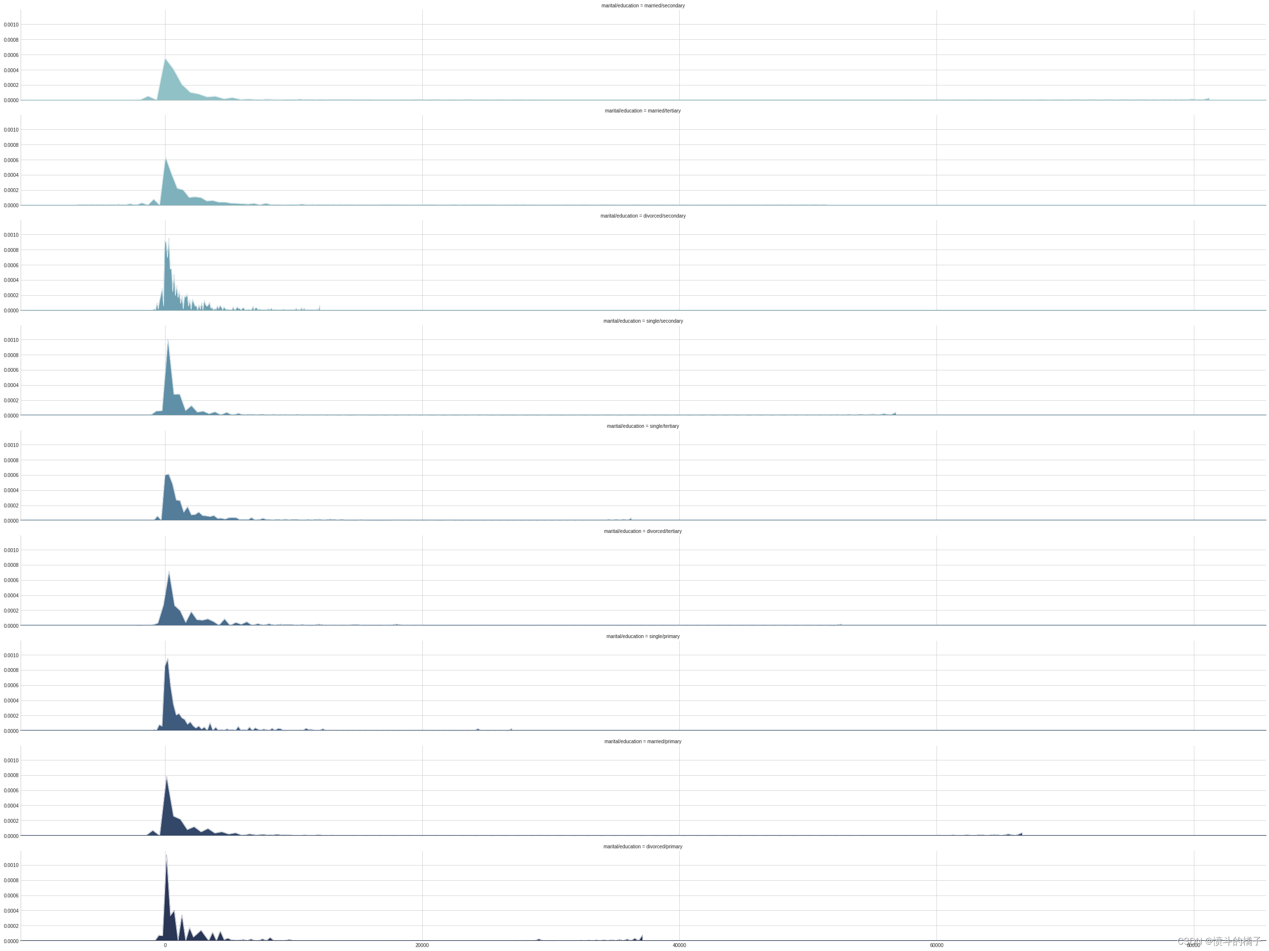
聚类婚姻状况和教育:
- 婚姻状况:如前所述,离婚对个人的平衡有重大影响。
- 教育:教育水平也对潜在客户的平衡金额有重大影响。
- 贷款:潜在客户是否有过以前的贷款对其平衡金额有重大影响。
# 删除教育程度为"unknown"的行
df = df.drop(df.loc[df["education"] == "unknown"].index)

# 打印去除"unknown"教育程度后的唯一教育程度值
print(df['education'].unique())
array(['secondary', 'tertiary', 'primary'], dtype=object)
# 给数据框添加新的列'marital/education',并将其值初始化为NaN
df['marital/education'] = np.nan

# 将数据框df放入列表lst中
lst = [df]

# 遍历列表lst中的每个数据框
for col in lst:
    # 当'marital'列的值为'single'且'education'列的值为'primary'时,将'marital/education'列的值设为'single/primary'
    col.loc[(col['marital'] == 'single') & (df['education'] == 'primary'), 'marital/education'] = 'single/primary'

    # 当'marital'列的值为'married'且'education'列的值为'primary'时,将'marital/education'列的值设为'married/primary'
    col.loc[(col['marital'] == 'married') & (df['education'] == 'primary'), 'marital/education'] = 'married/primary'

    # 当'marital'列的值为'divorced'且'education'列的值为'primary'时,将'marital/education'列的值设为'divorced/primary'
    col.loc[(col['marital'] == 'divorced') & (df['education'] == 'primary'), 'marital/education'] = 'divorced/primary'

    # 当'marital'列的值为'single'且'education'列的值为'secondary'时,将'marital/education'列的值设为'single/secondary'
    col.loc[(col['marital'] == 'single') & (df['education'] == 'secondary'), 'marital/education'] = 'single/secondary'

    # 当'marital'列的值为'married'且'education'列的值为'secondary'时,将'marital/education'列的值设为'married/secondary'
    col.loc[(col['marital'] == 'married') & (df['education'] == 'secondary'), 'marital/education'] = 'married/secondary'

    # 当'marital'列的值为'divorced'且'education'列的值为'secondary'时,将'marital/education'列的值设为'divorced/secondary'
    col.loc[(col['marital'] == 'divorced') & (df['education'] == 'secondary'), 'marital/education'] = 'divorced/secondary'

    # 当'marital'列的值为'single'且'education'列的值为'tertiary'时,将'marital/education'列的值设为'single/tertiary'
    col.loc[(col['marital'] == 'single') & (df['education'] == 'tertiary'), 'marital/education'] = 'single/tertiary'

    # 当'marital'列的值为'married'且'education'列的值为'tertiary'时,将'marital/education'列的值设为'married/tertiary'
    col.loc[(col['marital'] == 'married') & (df['education'] == 'tertiary'), 'marital/education'] = 'married/tertiary'

    # 当'marital'列的值为'divorced'且'education'列的值为'tertiary'时,将'marital/education'列的值设为'divorced/tertiary'

# 显示数据框df的前几行
df.head()
| age | job | marital | education | default | balance | housing | loan | contact | day | month | duration | campaign | pdays | previous | poutcome | deposit | balance_status | marital/education | |
|---|---|---|---|---|---|---|---|---|---|---|---|---|---|---|---|---|---|---|---|
| 0 | 59 | management | married | secondary | no | 2343 | yes | no | unknown | 5 | may | 1042 | 1 | -1 | 0 | unknown | yes | low | married/secondary |
| 1 | 56 | management | married | secondary | no | 45 | no | no | unknown | 5 | may | 1467 | 1 | -1 | 0 | unknown | yes | low | married/secondary |
| 2 | 41 | technician | married | secondary | no | 1270 | yes | no | unknown | 5 | may | 1389 | 1 | -1 | 0 | unknown | yes | low | married/secondary |
| 3 | 55 | services | married | secondary | no | 2476 | yes | no | unknown | 5 | may | 579 | 1 | -1 | 0 | unknown | yes | low | married/secondary |
| 4 | 54 | management | married | tertiary | no | 184 | no | no | unknown | 5 | may | 673 | 2 | -1 | 0 | unknown | yes | low | married/tertiary |
# 使用cubehelix_palette函数生成一个颜色调色板,参数10表示生成10种颜色,rot表示颜色的旋转角度,light表示颜色的亮度
pal = sns.cubehelix_palette(10, rot=-.25, light=.7)

# 创建一个FacetGrid对象,用于绘制多个子图,参数df表示数据集,row表示按照"marital/education"列进行分组,hue表示按照"marital/education"列进行着色,aspect表示子图的宽高比,palette表示颜色调色板
g = sns.FacetGrid(df, row="marital/education", hue="marital/education", aspect=12, palette=pal)

# 在每个子图上绘制核密度估计图,参数"balance"表示x轴的数据,clip_on表示是否裁剪超出坐标轴范围的部分,shade表示是否填充曲线下方的区域,alpha表示填充区域的透明度,lw表示曲线的线宽,bw表示核密度估计的带宽
g.map(sns.kdeplot, "balance", clip_on=False, shade=True, alpha=1, lw=1.5, bw=.2)

# 在每个子图上绘制白色的核密度估计曲线,参数"balance"表示x轴的数据,clip_on表示是否裁剪超出坐标轴范围的部分,color表示曲线的颜色,lw表示曲线的线宽,bw表示核密度估计的带宽
g.map(sns.kdeplot, "balance", clip_on=False, color="w", lw=1, bw=0)

# 在每个子图上绘制水平线,参数y表示水平线的y坐标,lw表示水平线的线宽,clip_on表示是否裁剪超出坐标轴范围的部分
g.map(plt.axhline, y=0, lw=2, clip_on=False)
<seaborn.axisgrid.FacetGrid at 0x7f0a4ac0e160>
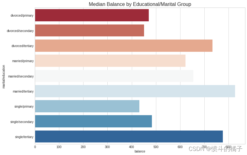
# 使用df数据框按'marital/education'列进行分组,并计算'balance'列的中位数
education_groups = df.groupby(['marital/education'], as_index=False)['balance'].median()

# 创建一个图形对象,设置图形的大小为12x8
fig = plt.figure(figsize=(12,8))

# 使用sns库的barplot函数绘制条形图,x轴为'balance'列,y轴为'marital/education'列,数据来源为education_groups数据框
# 设置标签为"Total",调色板为"RdBu"
sns.barplot(x="balance", y="marital/education", data=education_groups,
            label="Total", palette="RdBu")

# 设置图形的标题为"Median Balance by Educational/Marital Group",字体大小为16
plt.title('Median Balance by Educational/Marital Group', fontsize=16)
Text(0.5,1,'Median Balance by Educational/Marital Group')
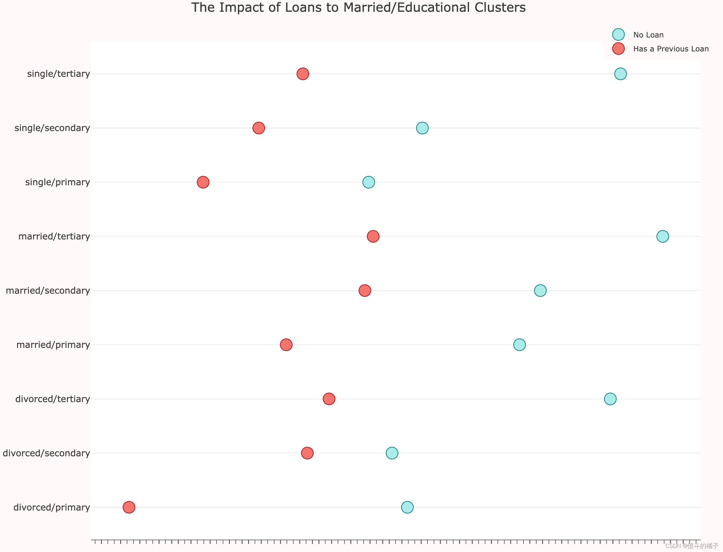
# 根据'marital/education'和'loan'对数据进行分组,并计算'balance'的中位数
loan_balance = df.groupby(['marital/education', 'loan'], as_index=False)['balance'].median()

# 获取没有贷款的组的'balance'值
no_loan = loan_balance['balance'].loc[loan_balance['loan'] == 'no'].values

# 获取有贷款的组的'balance'值
has_loan = loan_balance['balance'].loc[loan_balance['loan'] == 'yes'].values

# 获取'marital/education'的唯一值,并转换为列表形式
labels = loan_balance['marital/education'].unique().tolist()

# 创建散点图trace0,表示没有贷款的组
trace0 = go.Scatter(
    x=no_loan,
    y=labels,
    mode='markers',
    name='No Loan',
    marker=dict(
        color='rgb(175,238,238)',
        line=dict(
            color='rgb(0,139,139)',
            width=1,
        ),
        symbol='circle',
        size=16,
    )
)

# 创建散点图trace1,表示有贷款的组
trace1 = go.Scatter(
    x=has_loan,
    y=labels,
    mode='markers',
    name='Has a Previous Loan',
    marker=dict(
        color='rgb(250,128,114)',
        line=dict(
            color='rgb(178,34,34)',
            width=1,
        ),
        symbol='circle',
        size=16,
    )
)

# 将trace0和trace1添加到data列表中
data = [trace0, trace1]

# 设置图表布局
layout = go.Layout(
    title="The Impact of Loans to Married/Educational Clusters",
    xaxis=dict(
        showgrid=False,
        showline=True,
        linecolor='rgb(102, 102, 102)',
        titlefont=dict(
            color='rgb(204, 204, 204)'
        ),
        tickfont=dict(
            color='rgb(102, 102, 102)',
        ),
        showticklabels=False,
        dtick=10,
        ticks='outside',
        tickcolor='rgb(102, 102, 102)',
    ),
    margin=dict(
        l=140,
        r=40,
        b=50,
        t=80
    ),
    legend=dict(
        font=dict(
            size=10,
        ),
        yanchor='middle',
        xanchor='right',
    ),
    width=1000,
    height=800,
    paper_bgcolor='rgb(255,250,250)',
    plot_bgcolor='rgb(255,255,255)',
    hovermode='closest',
)

# 创建图表对象
fig = go.Figure(data=data, layout=layout)

# 在Jupyter Notebook中显示图表
iplot(fig, filename='lowest-oecd-votes-cast')
# 显示DataFrame的前5行数据
df.head()
| age | job | marital | education | default | balance | housing | loan | contact | day | month | duration | campaign | pdays | previous | poutcome | deposit | balance_status | marital/education | |
|---|---|---|---|---|---|---|---|---|---|---|---|---|---|---|---|---|---|---|---|
| 0 | 59 | management | married | secondary | no | 2343 | yes | no | unknown | 5 | may | 1042 | 1 | -1 | 0 | unknown | yes | low | married/secondary |
| 1 | 56 | management | married | secondary | no | 45 | no | no | unknown | 5 | may | 1467 | 1 | -1 | 0 | unknown | yes | low | married/secondary |
| 2 | 41 | technician | married | secondary | no | 1270 | yes | no | unknown | 5 | may | 1389 | 1 | -1 | 0 | unknown | yes | low | married/secondary |
| 3 | 55 | services | married | secondary | no | 2476 | yes | no | unknown | 5 | may | 579 | 1 | -1 | 0 | unknown | yes | low | married/secondary |
| 4 | 54 | management | married | tertiary | no | 184 | no | no | unknown | 5 | may | 673 | 2 | -1 | 0 | unknown | yes | low | married/tertiary |
# 导入seaborn库
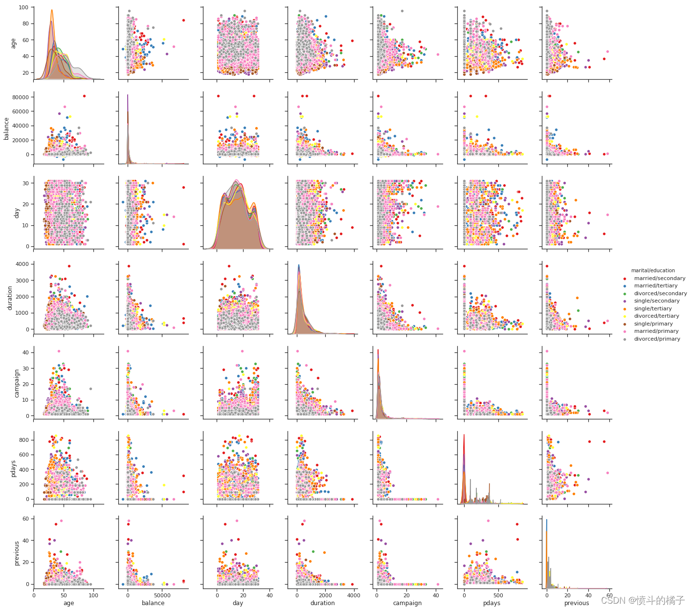
import seaborn as sns
# 设置绘图风格为ticks
sns.set(style="ticks")
# 使用pairplot函数绘制散点图矩阵
# df为数据集,hue参数指定按照"marital/education"进行分类,palette参数指定颜色调色板为"Set1"
sns.pairplot(df, hue="marital/education", palette="Set1")
# 显示图形
plt.show()
/opt/conda/lib/python3.6/site-packages/scipy/stats/stats.py:1713: FutureWarning:

Using a non-tuple sequence for multidimensional indexing is deprecated; use `arr[tuple(seq)]` instead of `arr[seq]`. In the future this will be interpreted as an array index, `arr[np.array(seq)]`, which will result either in an error or a different result.
# 显示DataFrame的前5行数据
df.head()
| age | job | marital | education | default | balance | housing | loan | contact | day | month | duration | campaign | pdays | previous | poutcome | deposit | balance_status | marital/education | |
|---|---|---|---|---|---|---|---|---|---|---|---|---|---|---|---|---|---|---|---|
| 0 | 59 | management | married | secondary | no | 2343 | yes | no | unknown | 5 | may | 1042 | 1 | -1 | 0 | unknown | yes | low | married/secondary |
| 1 | 56 | management | married | secondary | no | 45 | no | no | unknown | 5 | may | 1467 | 1 | -1 | 0 | unknown | yes | low | married/secondary |
| 2 | 41 | technician | married | secondary | no | 1270 | yes | no | unknown | 5 | may | 1389 | 1 | -1 | 0 | unknown | yes | low | married/secondary |
| 3 | 55 | services | married | secondary | no | 2476 | yes | no | unknown | 5 | may | 579 | 1 | -1 | 0 | unknown | yes | low | married/secondary |
| 4 | 54 | management | married | tertiary | no | 184 | no | no | unknown | 5 | may | 673 | 2 | -1 | 0 | unknown | yes | low | married/tertiary |
# 创建一个图形对象,设置图形的大小为12x8
fig = plt.figure(figsize=(12,8))
# 使用小提琴图绘制数据
# x轴为"balance"列的值,y轴为"job"列的值,hue为"deposit"列的值,使用"RdBu_r"调色板进行着色
# 数据来源为df数据框
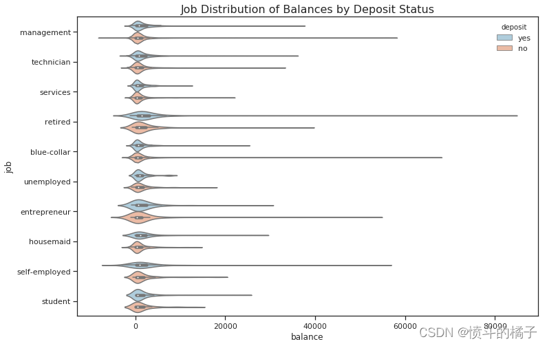
sns.violinplot(x="balance", y="job", hue="deposit", palette="RdBu_r", data=df)
# 设置图形的标题为"Job Distribution of Balances by Deposit Status",字体大小为16
plt.title("Job Distribution of Balances by Deposit Status", fontsize=16)
# 显示图形
plt.show()
/opt/conda/lib/python3.6/site-packages/scipy/stats/stats.py:1713: FutureWarning:

Using a non-tuple sequence for multidimensional indexing is deprecated; use `arr[tuple(seq)]` instead of `arr[seq]`. In the future this will be interpreted as an array index, `arr[np.array(seq)]`, which will result either in an error or a different result.
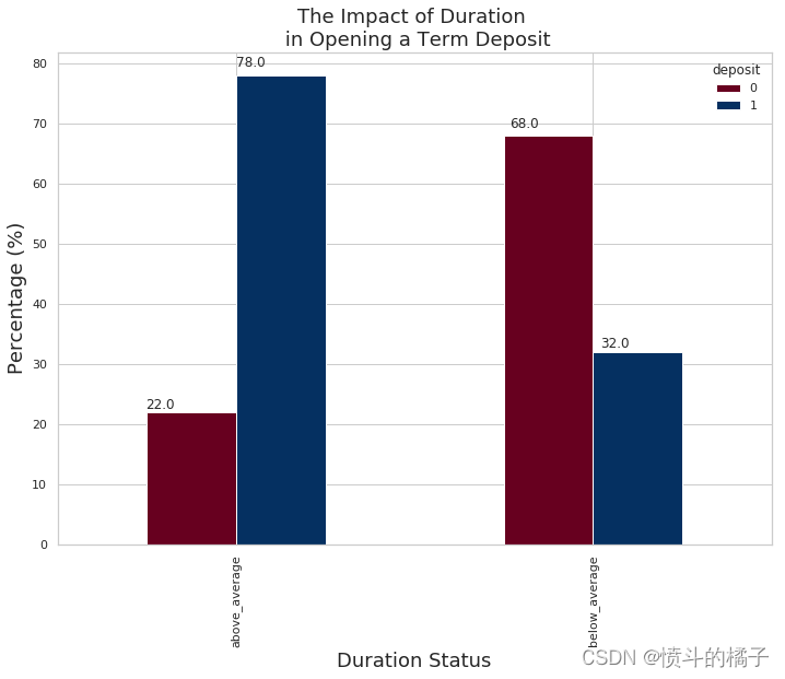
活动持续时间:
- 活动持续时间: 嗯,我们发现持续时间与定期存款之间存在很高的相关性,这意味着持续时间越长,客户开设定期存款的可能性就越大。
- 平均活动持续时间: 平均活动持续时间为374.76天,让我们看看那些超过这个平均值的客户是否更有可能开设定期存款。
- 持续时间状态: 那些超过持续时间状态的人更有可能开设定期存款。在持续时间超过平均值的群体中,有78%的人开设了定期存款,而持续时间低于平均值的群体中,只有32%的人开设了定期存款账户。这告诉我们,将目标定在持续时间高于平均值的个体上是一个好主意。
# 删除df中的'marital/education'和'balance_status'两列数据
df.drop(['marital/education', 'balance_status'], axis=1, inplace=True)
# 显示DataFrame的前几行数据,默认显示前5行
df.head()
| age | job | marital | education | default | balance | housing | loan | contact | day | month | duration | campaign | pdays | previous | poutcome | deposit | |
|---|---|---|---|---|---|---|---|---|---|---|---|---|---|---|---|---|---|
| 0 | 59 | management | married | secondary | no | 2343 | yes | no | unknown | 5 | may | 1042 | 1 | -1 | 0 | unknown | yes |
| 1 | 56 | management | married | secondary | no | 45 | no | no | unknown | 5 | may | 1467 | 1 | -1 | 0 | unknown | yes |
| 2 | 41 | technician | married | secondary | no | 1270 | yes | no | unknown | 5 | may | 1389 | 1 | -1 | 0 | unknown | yes |
| 3 | 55 | services | married | secondary | no | 2476 | yes | no | unknown | 5 | may | 579 | 1 | -1 | 0 | unknown | yes |
| 4 | 54 | management | married | tertiary | no | 184 | no | no | unknown | 5 | may | 673 | 2 | -1 | 0 | unknown | yes |
# 导入所需的库
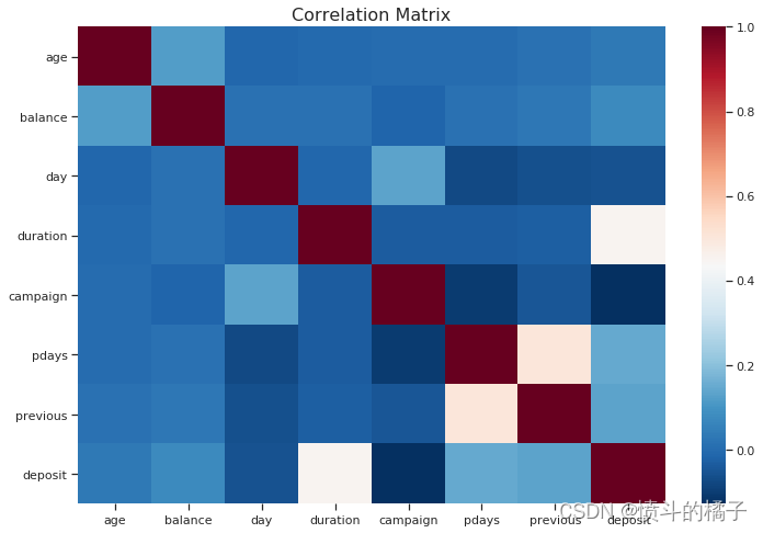
from sklearn.preprocessing import StandardScaler, OneHotEncoder, LabelEncoder
# 创建一个图形对象,设置图形大小为12x8
fig = plt.figure(figsize=(12,8))
# 将目标变量'deposit'进行标签编码
df['deposit'] = LabelEncoder().fit_transform(df['deposit'])
# 将数据集中的数值型特征和类别型特征分别提取出来
numeric_df = df.select_dtypes(exclude="object")
# categorical_df = df.select_dtypes(include="object")
# 计算数值型特征之间的相关系数矩阵
corr_numeric = numeric_df.corr()
# 使用热力图可视化相关系数矩阵
sns.heatmap(corr_numeric, cbar=True, cmap="RdBu_r")
plt.title("Correlation Matrix", fontsize=16)
plt.show()
# 设置图形的大小
sns.set(rc={'figure.figsize':(11.7,8.27)})

# 设置图形的样式为白色网格
sns.set_style('whitegrid')

# 计算平均持续时间
avg_duration = df['duration'].mean()

# 创建一个包含原始数据框的列表
lst = [df]

# 在数据框中添加一个名为"duration_status"的新列,并将其值设为NaN
df["duration_status"] = np.nan

# 对于每个数据框col in lst
for col in lst:
    # 将持续时间小于平均持续时间的行的"duration_status"列设为"below_average"
    col.loc[col["duration"] < avg_duration, "duration_status"] = "below_average"
    # 将持续时间大于平均持续时间的行的"duration_status"列设为"above_average"
    col.loc[col["duration"] > avg_duration, "duration_status"] = "above_average"

# 计算"duration_status"和"deposit"两列的交叉表,并将结果转换为百分比
pct_term = pd.crosstab(df['duration_status'], df['deposit']).apply(lambda r: round(r/r.sum(), 2) * 100, axis=1)

# 创建一个堆叠条形图,并使用RdBu颜色映射
ax = pct_term.plot(kind='bar', stacked=False, cmap='RdBu')

# 设置图形的标题、x轴标签和y轴标签
plt.title("The Impact of Duration \n in Opening a Term Deposit", fontsize=18)
plt.xlabel("Duration Status", fontsize=18);
plt.ylabel("Percentage (%)", fontsize=18)

# 在每个条形上方添加高度的注释
for p in ax.patches:
    ax.annotate(str(p.get_height()), (p.get_x() * 1.02, p.get_height() * 1.02))

# 显示图形
plt.show()
分类模型:
# 将'deposit'列的数据赋值给dep变量
dep = term_deposits['deposit']

# 在term_deposits中删除'deposit'列
term_deposits.drop(labels=['deposit'], axis=1, inplace=True)

# 在term_deposits的第一列插入'deposit'列
term_deposits.insert(0, 'deposit', dep)

# 显示term_deposits的前几行数据
term_deposits.head()

# 'housing'与'deposit'之间的相关性为-20%,让我们看看它是如何分布的
# 52%的数据属于该类别
term_deposits["housing"].value_counts() / len(term_deposits)
no     0.526877
yes    0.473123
Name: housing, dtype: float64
# 统计"loan"列中各个值的出现次数,并除以数据集的长度,得到每个值的频率
term_deposits["loan"].value_counts() / len(term_deposits)
no     0.869199
yes    0.130801
Name: loan, dtype: float64
分层抽样:
分层抽样:是在开发回归或分类模型时经常被忽视的重要概念。请记住,为了避免过拟合数据,我们必须实施交叉验证,但是我们必须确保至少对于对我们的标签(潜在客户是否会开设定期存款)有最大影响的特征是均匀分布的。我是什么意思?
个人贷款:
例如,拥有个人贷款是决定潜在客户是否会开设定期存款的重要特征。要确认它对最终输出有很大的影响,您可以查看上面的相关矩阵,您会发现它与开设存款的相关性为-11%。在实施分层抽样之前,我们应该采取哪些步骤来处理我们的训练和测试数据?
1)我们需要查看我们的数据分布情况。
2)在注意到贷款列包含87%的“否”(没有个人贷款)和13%的“是”(有个人贷款)之后。
3)我们希望确保我们的训练集和测试集包含相同比例的87%的“否”和13%的“是”。
# 导入所需的库
from sklearn.model_selection import StratifiedShuffleSplit

# 创建一个StratifiedShuffleSplit对象,用于将数据集划分为训练集和测试集,并实现分层随机划分
stratified = StratifiedShuffleSplit(n_splits=1, test_size=0.2, random_state=42)

# 使用分层随机划分将数据集划分为训练集和测试集
# term_deposits为数据集,term_deposits["loan"]为目标变量
for train_set, test_set in stratified.split(term_deposits, term_deposits["loan"]):
    stratified_train = term_deposits.loc[train_set]  # 获取训练集
    stratified_test = term_deposits.loc[test_set]  # 获取测试集

# 输出训练集中每个类别的样本数量占总样本数量的比例
stratified_train["loan"].value_counts() / len(df)

# 输出测试集中每个类别的样本数量占总样本数量的比例
stratified_test["loan"].value_counts() / len(df)
no     0.196219
yes    0.029519
Name: loan, dtype: float64
# 将标签和特征分开。
train_data = stratified_train # 复制分层训练集。
test_data = stratified_test
train_data.shape # 输出训练集的形状(行数和列数)。
test_data.shape # 输出测试集的形状(行数和列数)。
train_data['deposit'].value_counts() # 统计训练集中每个标签的数量。
no     4697
yes    4232
Name: deposit, dtype: int64
# 导入所需的库
from sklearn.base import BaseEstimator, TransformerMixin
from sklearn.utils import check_array
from sklearn.preprocessing import LabelEncoder
from scipy import sparse

# 定义CategoricalEncoder类,继承自BaseEstimator和TransformerMixin
class CategoricalEncoder(BaseEstimator, TransformerMixin):
    """将分类特征编码为数值数组。
    此转换器的输入应该是一个整数或字符串的矩阵,表示分类(离散)特征的取值。
    可以使用一种称为one-hot编码的编码方式(``encoding='onehot'``,默认方式),
    或者将其转换为序数整数(``encoding='ordinal'``)。
    这种编码方式适用于将分类数据输入到许多scikit-learn估计器中,特别是线性模型和使用标准核的SVM。
    详细信息请参阅::ref:`User Guide <preprocessing_categorical_features>`。
    参数
    ----------
    encoding : str, 'onehot', 'onehot-dense' or 'ordinal'
        要使用的编码类型(默认为'onehot'):
        - 'onehot':使用一种称为one-hot编码的编码方式(也称为“dummy”编码)。
          这为每个类别创建一个二进制列,并返回一个稀疏矩阵。
        - 'onehot-dense':与'onehot'相同,但返回一个密集数组而不是稀疏矩阵。
        - 'ordinal':将特征编码为序数整数。这将为每个特征生成一列整数(从0到n_categories - 1)。
    categories : 'auto' 或者一个值的列表/数组的列表/数组。
        每个特征的类别(唯一值):
        - 'auto':从训练数据自动确定类别。
        - 列表:``categories[i]``包含第i列中预期的类别。在编码数据之前,将对传递的类别进行排序(可以在``categories_``属性中找到使用的类别)。
    dtype : 数字类型,默认为np.float64
        输出的所需数据类型。
    handle_unknown : 'error'(默认)或'ignore'
        如果在转换过程中存在未知的分类特征,是引发错误还是忽略(默认为引发错误)。
        当将此参数设置为'ignore'并且在转换过程中遇到未知的类别时,此特征的结果one-hot编码列将全部为零。
        不支持忽略未知类别的``encoding='ordinal'``。
    属性
    ----------
    categories_ : 列表的数组
        在拟合过程中确定的每个特征的类别。当手动指定类别时,这将保存排序后的类别(与`transform`的输出相对应的顺序)。
    示例
    --------
    给定一个具有三个特征和两个样本的数据集,我们让编码器找到每个特征的最大值,并将数据转换为二进制的one-hot编码。
    >>> from sklearn.preprocessing import CategoricalEncoder
    >>> enc = CategoricalEncoder(handle_unknown='ignore')
    >>> enc.fit([[0, 0, 3], [1, 1, 0], [0, 2, 1], [1, 0, 2]])
    ... # doctest: +ELLIPSIS
    CategoricalEncoder(categories='auto', dtype=<... 'numpy.float64'>,
              encoding='onehot', handle_unknown='ignore')
    >>> enc.transform([[0, 1, 1], [1, 0, 4]]).toarray()
    array([[ 1.,  0.,  0.,  1.,  0.,  0.,  1.,  0.,  0.],
           [ 0.,  1.,  1.,  0.,  0.,  0.,  0.,  0.,  0.]])
    参见
    --------
    sklearn.preprocessing.OneHotEncoder:对整数序数特征执行one-hot编码。
      ``OneHotEncoder``假设输入特征的取值范围为``[0, max(feature)]``,而不是使用唯一值。
    sklearn.feature_extraction.DictVectorizer:对字典项执行one-hot编码(也处理字符串值特征)。
    sklearn.feature_extraction.FeatureHasher:对字典项或字符串执行近似one-hot编码。
    """

    def __init__(self, encoding='onehot', categories='auto', dtype=np.float64,
                 handle_unknown='error'):
        self.encoding = encoding
        self.categories = categories
        self.dtype = dtype
        self.handle_unknown = handle_unknown

    def fit(self, X, y=None):
        """将CategoricalEncoder拟合到X。
        参数
        ----------
        X : array-like, shape [n_samples, n_feature]
            用于确定每个特征的类别的数据。
        返回
        -------
        self
        """

        if self.encoding not in ['onehot', 'onehot-dense', 'ordinal']:
            template = ("encoding should be either 'onehot', 'onehot-dense' "
                        "or 'ordinal', got %s")
            raise ValueError(template % self.handle_unknown)

        if self.handle_unknown not in ['error', 'ignore']:
            template = ("handle_unknown should be either 'error' or "
                        "'ignore', got %s")
            raise ValueError(template % self.handle_unknown)

        if self.encoding == 'ordinal' and self.handle_unknown == 'ignore':
            raise ValueError("handle_unknown='ignore' is not supported for"
                             " encoding='ordinal'")

        X = check_array(X, dtype=np.object, accept_sparse='csc', copy=True)
        n_samples, n_features = X.shape

        self._label_encoders_ = [LabelEncoder() for _ in range(n_features)]

        for i in range(n_features):
            le = self._label_encoders_[i]
            Xi = X[:, i]
            if self.categories == 'auto':
                le.fit(Xi)
            else:
                valid_mask = np.in1d(Xi, self.categories[i])
                if not np.all(valid_mask):
                    if self.handle_unknown == 'error':
                        diff = np.unique(Xi[~valid_mask])
                        msg = ("Found unknown categories {0} in column {1}"
                               " during fit".format(diff, i))
                        raise ValueError(msg)
                le.classes_ = np.array(np.sort(self.categories[i]))

        self.categories_ = [le.classes_ for le in self._label_encoders_]

        return self

    def transform(self, X):
        """使用one-hot编码转换X。
        参数
        ----------
        X : array-like, shape [n_samples, n_features]
            要编码的数据。
        返回
        -------
        X_out : 稀疏矩阵或2维数组
            转换后的输入。
        """
        X = check_array(X, accept_sparse='csc', dtype=np.object, copy=True)
        n_samples, n_features = X.shape
        X_int = np.zeros_like(X, dtype=np.int)
        X_mask = np.ones_like(X, dtype=np.bool)

        for i in range(n_features):
            valid_mask = np.in1d(X[:, i], self.categories_[i])

            if not np.all(valid_mask):
                if self.handle_unknown == 'error':
                    diff = np.unique(X[~valid_mask, i])
                    msg = ("Found unknown categories {0} in column {1}"
                           " during transform".format(diff, i))
                    raise ValueError(msg)
                else:
                    # 将有问题的行设置为可接受的值并继续,这些行被标记为`X_mask`,稍后将被删除。
                    X_mask[:, i] = valid_mask
                    X[:, i][~valid_mask] = self.categories_[i][0]
            X_int[:, i] = self._label_encoders_[i].transform(X[:, i])

        if self.encoding == 'ordinal':
            return X_int.astype(self.dtype, copy=False)

        mask = X_mask.ravel()
        n_values = [cats.shape[0] for cats in self.categories_]
        n_values = np.array([0] + n_values)
        indices = np.cumsum(n_values)

        column_indices = (X_int + indices[:-1]).ravel()[mask]
        row_indices = np.repeat(np.arange(n_samples, dtype=np.int32),
                                n_features)[mask]
        data = np.ones(n_samples * n_features)[mask]

        out = sparse.csc_matrix((data, (row_indices, column_indices)),
                                shape=(n_samples, indices[-1]),
                                dtype=self.dtype).tocsr()
        if self.encoding == 'onehot-dense':
            return out.toarray()
        else:
            return out
# 导入所需的库
from sklearn.base import BaseEstimator, TransformerMixin

# 创建一个类来选择数值型或分类型的列
# 因为Scikit-Learn目前还不支持处理DataFrame
class DataFrameSelector(BaseEstimator, TransformerMixin):
    def __init__(self, attribute_names):
        self.attribute_names = attribute_names  # 初始化属性名列表
    def fit(self, X, y=None):
        return self  # 返回自身,不进行任何操作
    def transform(self, X):
        return X[self.attribute_names]  # 返回指定属性名的列数据
# 打印训练数据的信息
train_data.info()
<class 'pandas.core.frame.DataFrame'>
Int64Index: 8929 entries, 9867 to 9672
Data columns (total 17 columns):
deposit      8929 non-null object
age          8929 non-null int64
job          8929 non-null object
marital      8929 non-null object
education    8929 non-null object
default      8929 non-null object
balance      8929 non-null int64
housing      8929 non-null object
loan         8929 non-null object
contact      8929 non-null object
day          8929 non-null int64
month        8929 non-null object
duration     8929 non-null int64
campaign     8929 non-null int64
pdays        8929 non-null int64
previous     8929 non-null int64
poutcome     8929 non-null object
dtypes: int64(7), object(10)
memory usage: 1.2+ MB
# 导入所需的库
from sklearn.pipeline import Pipeline
from sklearn.preprocessing import StandardScaler
from sklearn.pipeline import FeatureUnion

# 创建数值特征的Pipeline
numerical_pipeline = Pipeline([
    ("select_numeric", DataFrameSelector(["age", "balance", "day", "campaign", "pdays", "previous","duration"])),  # 选择数值特征
    ("std_scaler", StandardScaler()),  # 标准化处理
])

# 创建类别特征的Pipeline
categorical_pipeline = Pipeline([
    ("select_cat", DataFrameSelector(["job", "education", "marital", "default", "housing", "loan", "contact", "month",
                                     "poutcome"])),  # 选择类别特征
    ("cat_encoder", CategoricalEncoder(encoding='onehot-dense'))  # 类别特征编码
])

# 创建预处理Pipeline,将数值特征和类别特征的Pipeline合并
preprocess_pipeline = FeatureUnion(transformer_list=[
        ("numerical_pipeline", numerical_pipeline),  # 数值特征的Pipeline
        ("categorical_pipeline", categorical_pipeline),  # 类别特征的Pipeline
    ])
# 使用preprocess_pipeline对训练数据进行预处理,并将结果赋值给X_train
X_train = preprocess_pipeline.fit_transform(train_data)
/opt/conda/lib/python3.6/site-packages/sklearn/preprocessing/data.py:645: DataConversionWarning:

Data with input dtype int64 were all converted to float64 by StandardScaler.

/opt/conda/lib/python3.6/site-packages/sklearn/base.py:464: DataConversionWarning:

Data with input dtype int64 were all converted to float64 by StandardScaler.


array([[ 1.14643868,  1.68761105,  1.69442818, ...,  0.        ,
         0.        ,  1.        ],
       [-0.86102339, -0.35066205, -0.5560058 , ...,  0.        ,
         0.        ,  1.        ],
       [-0.94466765, -0.20504785,  0.39154535, ...,  0.        ,
         0.        ,  1.        ],
       ...,
       [-0.86102339, -0.26889658, -1.02978138, ...,  0.        ,
         0.        ,  1.        ],
       [ 0.2263519 , -0.32166951,  0.50998924, ...,  0.        ,
         0.        ,  1.        ],
       [-0.61009063, -0.34740446,  1.69442818, ...,  1.        ,
         0.        ,  0.        ]])
# 从训练数据中获取目标变量
y_train = train_data['deposit']

# 从测试数据中获取目标变量
y_test = test_data['deposit']

# 输出目标变量的形状
print(y_train.shape)
(8929,)
# 导入LabelEncoder类
from sklearn.preprocessing import LabelEncoder

# 创建一个LabelEncoder对象
encode = LabelEncoder()

# 使用LabelEncoder对象对y_train进行编码
y_train = encode.fit_transform(y_train)

# 使用LabelEncoder对象对y_test进行编码
y_test = encode.fit_transform(y_test)

# 创建一个布尔数组,用于判断y_train中是否为1的元素
y_train_yes = (y_train == 1)

# 输出y_train的值
y_train

# 输出y_train_yes的值
y_train_yes
array([False, False, True, ..., True, True, False])
# 定义一个变量some_instance,并将X_train中索引为1250的实例赋值给它
some_instance = X_train[1250]
# 导入所需的库
import time
from sklearn.decomposition import PCA
from sklearn.preprocessing import StandardScaler, LabelEncoder
from sklearn.linear_model import LogisticRegression
from sklearn.svm import SVC
from sklearn.neighbors import KNeighborsClassifier
from sklearn import tree
from sklearn.neural_network import MLPClassifier
from sklearn.ensemble import GradientBoostingClassifier
from sklearn.gaussian_process.kernels import RBF
from sklearn.ensemble import RandomForestClassifier
from sklearn.naive_bayes import GaussianNB

# 定义一个字典,包含不同分类模型的名称和对应的模型对象
dict_classifiers = {
    "Logistic Regression": LogisticRegression(),  # 逻辑回归模型
    "Nearest Neighbors": KNeighborsClassifier(),  # 最近邻分类模型
    "Linear SVM": SVC(),  # 线性支持向量机模型
    "Gradient Boosting Classifier": GradientBoostingClassifier(),  # 梯度提升分类模型
    "Decision Tree": tree.DecisionTreeClassifier(),  # 决策树分类模型
    "Random Forest": RandomForestClassifier(n_estimators=18),  # 随机森林分类模型
    "Neural Net": MLPClassifier(alpha=1),  # 多层感知器神经网络模型
    "Naive Bayes": GaussianNB()  # 朴素贝叶斯分类模型
}
# 获取分类器的数量
no_classifiers = len(dict_classifiers.keys())

# 定义批量分类函数
def batch_classify(X_train, Y_train, verbose = True):
    # 创建一个空的DataFrame来存储结果
    df_results = pd.DataFrame(data=np.zeros(shape=(no_classifiers,3)), columns = ['classifier', 'train_score', 'training_time'])
    count = 0
    # 遍历分类器字典中的每个分类器
    for key, classifier in dict_classifiers.items():
        # 记录开始时间
        t_start = time.clock()
        # 使用训练数据拟合分类器
        classifier.fit(X_train, Y_train)
        # 记录结束时间
        t_end = time.clock()
        # 计算训练时间
        t_diff = t_end - t_start
        # 计算训练得分
        train_score = classifier.score(X_train, Y_train)
        # 将分类器名称、训练得分和训练时间存储到DataFrame中
        df_results.loc[count,'classifier'] = key
        df_results.loc[count,'train_score'] = train_score
        df_results.loc[count,'training_time'] = t_diff
        # 如果verbose为True,则打印训练信息
        if verbose:
            print("trained {c} in {f:.2f} s".format(c=key, f=t_diff))
        count+=1
    # 返回结果DataFrame
    return df_results
# 调用batch_classify函数,传入训练集X_train和标签y_train,得到评估结果的DataFrame
df_results = batch_classify(X_train, y_train)

# 根据训练集上的准确率对评估结果进行排序,并以降序显示
print(df_results.sort_values(by='train_score', ascending=False))
/opt/conda/lib/python3.6/site-packages/sklearn/linear_model/logistic.py:433: FutureWarning:

Default solver will be changed to 'lbfgs' in 0.22. Specify a solver to silence this warning.


trained Logistic Regression in 0.05 s
trained Nearest Neighbors in 0.13 s


/opt/conda/lib/python3.6/site-packages/sklearn/svm/base.py:196: FutureWarning:

The default value of gamma will change from 'auto' to 'scale' in version 0.22 to account better for unscaled features. Set gamma explicitly to 'auto' or 'scale' to avoid this warning.


trained Linear SVM in 6.21 s
trained Gradient Boosting Classifier in 1.50 s
trained Decision Tree in 0.08 s
trained Random Forest in 0.17 s
trained Neural Net in 13.22 s
trained Naive Bayes in 0.03 s
                     classifier  train_score  training_time
4                 Decision Tree     1.000000       0.080934
5                 Random Forest     0.995968       0.171750
1             Nearest Neighbors     0.863255       0.126915
3  Gradient Boosting Classifier     0.861463       1.501796
6                    Neural Net     0.854071      13.216751
2                    Linear SVM     0.852391       6.206555
0           Logistic Regression     0.830776       0.053495
7                   Naive Bayes     0.721693       0.033293
避免过拟合:
过拟合的简要描述?
这是建模算法中的一个错误,它考虑了拟合过程中的随机噪声,而不是模式本身。你可以看到,当模型在训练集中得到一个很好的分数时,当我们使用测试集(模型的未知数据)时,我们得到一个糟糕的分数。这很可能是因为数据过拟合(考虑了模式中的随机噪声)。我们希望我们的模型能够正确地分类出潜在客户是否会订阅定期存款,而不是考虑数据的整体模式。在上面的例子中,决策树分类器和随机森林分类器很可能是过拟合的,因为它们都给出了几乎完美的准确率(100%和99%)。
我们如何避免过拟合?
避免过拟合的最佳方法是使用交叉验证。将训练集分割。例如,如果我们将其分割为3份,2/3的数据或66%将用于训练,1/3的数据或33%将用于测试,我们将进行三次测试过程。该算法将迭代所有的训练和测试集,并且其主要目的是捕捉数据的整体模式。
# 使用交叉验证。
from sklearn.model_selection import cross_val_score

# 逻辑回归
log_reg = LogisticRegression()
log_scores = cross_val_score(log_reg, X_train, y_train, cv=3)  # 对逻辑回归模型进行交叉验证,将训练集分为3份进行训练和验证
log_reg_mean = log_scores.mean()  # 计算交叉验证得分的平均值

# 支持向量机
svc_clf = SVC()
svc_scores = cross_val_score(svc_clf, X_train, y_train, cv=3)  # 对支持向量机模型进行交叉验证
svc_mean = svc_scores.mean()

# K最近邻分类器
knn_clf = KNeighborsClassifier()
knn_scores = cross_val_score(knn_clf, X_train, y_train, cv=3)  # 对K最近邻分类器模型进行交叉验证
knn_mean = knn_scores.mean()

# 决策树
tree_clf = tree.DecisionTreeClassifier()
tree_scores = cross_val_score(tree_clf, X_train, y_train, cv=3)  # 对决策树模型进行交叉验证
tree_mean = tree_scores.mean()

# 梯度提升分类器
grad_clf = GradientBoostingClassifier()
grad_scores = cross_val_score(grad_clf, X_train, y_train, cv=3)  # 对梯度提升分类器模型进行交叉验证
grad_mean = grad_scores.mean()

# 随机森林分类器
rand_clf = RandomForestClassifier(n_estimators=18)
rand_scores = cross_val_score(rand_clf, X_train, y_train, cv=3)  # 对随机森林分类器模型进行交叉验证
rand_mean = rand_scores.mean()

# 神经网络分类器
neural_clf = MLPClassifier(alpha=1)
neural_scores = cross_val_score(neural_clf, X_train, y_train, cv=3)  # 对神经网络分类器模型进行交叉验证
neural_mean = neural_scores.mean()

# 朴素贝叶斯
nav_clf = GaussianNB()
nav_scores = cross_val_score(nav_clf, X_train, y_train, cv=3)  # 对朴素贝叶斯模型进行交叉验证
nav_mean = neural_scores.mean()

# 创建一个包含结果的数据框
d = {'Classifiers': ['Logistic Reg.', 'SVC', 'KNN', 'Dec Tree', 'Grad B CLF', 'Rand FC', 'Neural Classifier', 'Naives Bayes'],
    'Crossval Mean Scores': [log_reg_mean, svc_mean, knn_mean, tree_mean, grad_mean, rand_mean, neural_mean, nav_mean]}

result_df = pd.DataFrame(data=d)  # 创建一个包含结果的数据框
/opt/conda/lib/python3.6/site-packages/sklearn/linear_model/logistic.py:433: FutureWarning:

Default solver will be changed to 'lbfgs' in 0.22. Specify a solver to silence this warning.

/opt/conda/lib/python3.6/site-packages/sklearn/linear_model/logistic.py:433: FutureWarning:

Default solver will be changed to 'lbfgs' in 0.22. Specify a solver to silence this warning.

/opt/conda/lib/python3.6/site-packages/sklearn/linear_model/logistic.py:433: FutureWarning:

Default solver will be changed to 'lbfgs' in 0.22. Specify a solver to silence this warning.

/opt/conda/lib/python3.6/site-packages/sklearn/svm/base.py:196: FutureWarning:

The default value of gamma will change from 'auto' to 'scale' in version 0.22 to account better for unscaled features. Set gamma explicitly to 'auto' or 'scale' to avoid this warning.

/opt/conda/lib/python3.6/site-packages/sklearn/svm/base.py:196: FutureWarning:

The default value of gamma will change from 'auto' to 'scale' in version 0.22 to account better for unscaled features. Set gamma explicitly to 'auto' or 'scale' to avoid this warning.

/opt/conda/lib/python3.6/site-packages/sklearn/svm/base.py:196: FutureWarning:

The default value of gamma will change from 'auto' to 'scale' in version 0.22 to account better for unscaled features. Set gamma explicitly to 'auto' or 'scale' to avoid this warning.
# 对结果数据框进行排序,按照'Crossval Mean Scores'列的值降序排列
result_df = result_df.sort_values(by=['Crossval Mean Scores'], ascending=False)

# 返回排序后的结果数据框
result_df
| Classifiers | Crossval Mean Scores | |
|---|---|---|
| 6 | Neural Classifier | 0.847689 |
| 7 | Naives Bayes | 0.847689 |
| 4 | Grad B CLF | 0.845224 |
| 5 | Rand FC | 0.843655 |
| 1 | SVC | 0.840186 |
| 0 | Logistic Reg. | 0.828425 |
| 2 | KNN | 0.804458 |
| 3 | Dec Tree | 0.786313 |
混淆矩阵:
混淆矩阵的洞察:
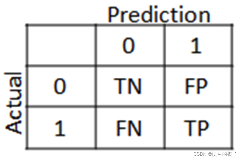
混淆矩阵的主要目的是查看我们的模型在分类可能订阅定期存款的潜在客户时的表现。在混淆矩阵中,我们将看到四个术语:真正例、假正例、真反例和假反例。
**正/负:**类别(标签)的类型[“No”, “Yes”]
**真/假:**模型正确或错误分类。
真反例(左上方的方块):这是“No”类别或不愿意订阅定期存款的潜在客户的正确分类数量。
假反例(右上方的方块):这是“No”类别或不愿意订阅定期存款的潜在客户的错误分类数量。
假正例(左下方的方块):这是“Yes”类别或愿意订阅定期存款的潜在客户的错误分类数量。
真正例(右下方的方块):这是“Yes”类别或愿意订阅定期存款的潜在客户的正确分类数量。
# 导入所需的库
from sklearn.model_selection import cross_val_predict

# 使用梯度提升分类器进行交叉验证
# cross_val_predict函数将使用梯度提升分类器grad_clf对训练集X_train进行交叉验证,并返回预测的目标变量y_train_pred
# cv参数指定交叉验证的折数,这里设置为3折交叉验证
y_train_pred = cross_val_predict(grad_clf, X_train, y_train, cv=3)
# 导入所需的库
from sklearn.metrics import accuracy_score

# 使用Gradient Boosting Classifier模型进行训练
grad_clf.fit(X_train, y_train)

# 使用训练好的模型对训练集进行预测
y_train_pred = grad_clf.predict(X_train)

# 计算并打印Gradient Boosting Classifier模型在训练集上的准确率
print ("Gradient Boost Classifier的准确率为 %2.2f" % accuracy_score(y_train, y_train_pred))
Gradient Boost Classifier accuracy is 0.85
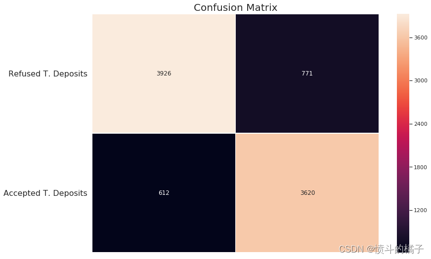
# 导入所需的库
from sklearn.metrics import confusion_matrix

# 计算混淆矩阵
conf_matrix = confusion_matrix(y_train, y_train_pred)

# 创建一个图像窗口和子图
f, ax = plt.subplots(figsize=(12, 8))

# 绘制热力图,用于可视化混淆矩阵
sns.heatmap(conf_matrix, annot=True, fmt="d", linewidths=.5, ax=ax)

# 设置图像标题
plt.title("Confusion Matrix", fontsize=20)

# 调整子图的位置
plt.subplots_adjust(left=0.15, right=0.99, bottom=0.15, top=0.99)

# 设置y轴刻度的位置和标签
ax.set_yticks(np.arange(conf_matrix.shape[0]) + 0.5, minor=False)
ax.set_yticklabels(['拒绝的交易存款', '接受的交易存款'], fontsize=16, rotation=360)

# 隐藏x轴刻度标签
ax.set_xticklabels("")

# 显示图像
plt.show()
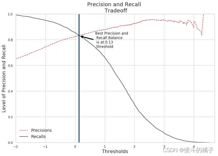
精确率和召回率:
召回率: 是数据集标签列中"是"的总数。也就是我们的模型检测到了多少个"是"标签。
精确率: 表示我们的模型对实际标签为"是"的预测有多确定。
召回率和精确率的权衡:
随着精确率的提高,召回率会降低,反之亦然。例如,如果我们将精确率从30%提高到60%,那么模型选择的预测结果是模型认为有60%的确定性。如果有一个实例,模型认为该实例有58%的可能性成为一个可能订阅定期存款的潜在客户,那么模型会将其分类为**“否”。然而,该实例实际上是一个"是"(潜在客户确实订阅了定期存款)。这就是为什么精确率越高,模型错过实际上是"是"**的实例的可能性就越大!
# 导入precision_score和recall_score函数用于计算精确率和召回率的得分
from sklearn.metrics import precision_score, recall_score

# 模型有77%的确定度认为潜在客户会订阅定期存款
# 模型只能保留60%同意订阅定期存款的客户
print('精确率得分:', precision_score(y_train, y_train_pred))

# 分类器只能检测到60%的潜在客户会订阅定期存款
print('召回率得分:', recall_score(y_train, y_train_pred))
Precision Score:  0.8244135732179458
Recall Score:  0.8553875236294896
# 导入f1_score函数
from sklearn.metrics import f1_score

# 使用f1_score函数计算训练集上的F1分数
# 参数y_train表示训练集的真实标签
# 参数y_train_pred表示训练集的预测标签
f1_score(y_train, y_train_pred)
0.8396149831845067
# 对于给定的某个实例,使用grad_clf模型的decision_function方法计算其得分
y_scores = grad_clf.decision_function([some_instance])
array([-3.65645629])
# 设置阈值为0
threshold = 0

# 对y_scores进行阈值判断,将大于阈值的值设为True,小于阈值的值设为False
y_some_digit_pred = (y_scores > threshold)
# 导入所需的库
from sklearn.model_selection import cross_val_predict

# 使用grad_clf模型对X_train进行交叉验证,并返回决策函数的预测结果
y_scores = cross_val_predict(grad_clf, X_train, y_train, cv=3, method="decision_function")

# 使用neural_clf模型对X_train进行交叉验证,并返回预测概率的结果
neural_y_scores = cross_val_predict(neural_clf, X_train, y_train, cv=3, method="predict_proba")

# 使用nav_clf模型对X_train进行交叉验证,并返回预测概率的结果
naives_y_scores = cross_val_predict(nav_clf, X_train, y_train, cv=3, method="predict_proba")
# hack to work around issue #9589 introduced in Scikit-Learn 0.19.0
# 修复Scikit-Learn 0.19.0版本引入的问题#9589的方法

# 如果y_scores的维度为2
if y_scores.ndim == 2:
    # 将y_scores的第二列赋值给y_scores
    y_scores = y_scores[:, 1]

# 如果neural_y_scores的维度为2
if neural_y_scores.ndim == 2:
    # 将neural_y_scores的第二列赋值给neural_y_scores
    neural_y_scores = neural_y_scores[:, 1]

# 如果naives_y_scores的维度为2
if naives_y_scores.ndim == 2:
    # 将naives_y_scores的第二列赋值给naives_y_scores
    naives_y_scores = naives_y_scores[:, 1]
# 给定的语料是一个变量 y_scores 的形状
y_scores.shape
(8929,)
# 导入precision_recall_curve函数用于计算精确率、召回率和阈值
from sklearn.metrics import precision_recall_curve

# 使用precision_recall_curve函数计算训练集的精确率、召回率和阈值
precisions, recalls, threshold = precision_recall_curve(y_train, y_scores)
# 定义函数 precision_recall_curve,接收三个参数:precisions(精确率列表)、recalls(召回率列表)、thresholds(阈值列表)
def precision_recall_curve(precisions, recalls, thresholds):
    # 创建一个图形和一个坐标轴对象,设置图形大小为12x8
    fig, ax = plt.subplots(figsize=(12,8))

    # 绘制精确率曲线,使用红色虚线,标签为"Precisions"
    plt.plot(thresholds, precisions[:-1], "r--", label="Precisions")

    # 绘制召回率曲线,使用"#424242"颜色,标签为"Recalls"
    plt.plot(thresholds, recalls[:-1], "#424242", label="Recalls")

    # 设置图形标题为"Precision and Recall \n Tradeoff",字体大小为18
    plt.title("Precision and Recall \n Tradeoff", fontsize=18)

    # 设置y轴标签为"Level of Precision and Recall",字体大小为16
    plt.ylabel("Level of Precision and Recall", fontsize=16)

    # 设置x轴标签为"Thresholds",字体大小为16
    plt.xlabel("Thresholds", fontsize=16)

    # 添加图例,位置为最佳,字体大小为14
    plt.legend(loc="best", fontsize=14)

    # 设置x轴范围为-2到4.7
    plt.xlim([-2, 4.7])

    # 设置y轴范围为0到1
    plt.ylim([0, 1])

    # 添加一条垂直线,x轴坐标为0.13,线宽为3,颜色为"#0B3861"
    plt.axvline(x=0.13, linewidth=3, color="#0B3861")

    # 添加一个注释,内容为"Best Precision and \n Recall Balance \n is at 0.13 \n threshold ",位置为(0.13, 0.83),偏移量为(55, -40)
    plt.annotate('Best Precision and \n Recall Balance \n is at 0.13 \n threshold ', xy=(0.13, 0.83), xytext=(55, -40),
             textcoords="offset points",
            arrowprops=dict(facecolor='black', shrink=0.05),
                fontsize=12,
                color='k')

# 调用 precision_recall_curve 函数,传入 precisions、recalls 和 threshold 参数
precision_recall_curve(precisions, recalls, threshold)

# 显示图形
plt.show()
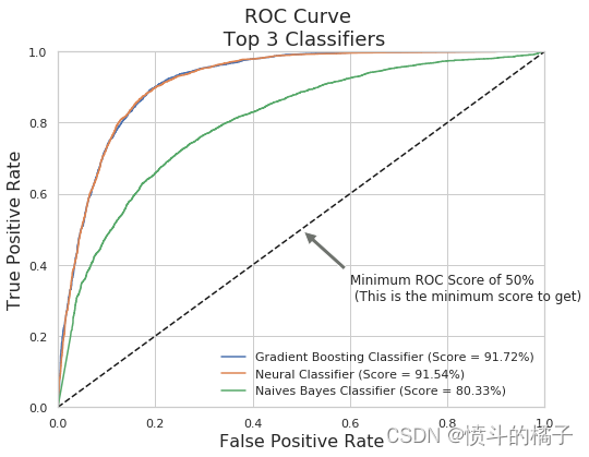
ROC曲线(接收器操作特性):
ROC曲线告诉我们我们的分类器在分类定期存款订阅(真正例)和非定期存款订阅之间的表现如何。X轴由假阳性率(特异性)表示,Y轴由真阳性率(敏感性)表示。随着曲线移动,分类的阈值也会改变,给出不同的值。曲线越接近左上角,我们的模型分离两个类别的效果就越好。
from sklearn.metrics import roc_curve

# Gradient Boosting Classifier(梯度提升分类器)
# Neural Classifier(神经网络分类器)
# Naives Bayes Classifier(朴素贝叶斯分类器)

#使用roc_curve函数计算梯度提升分类器的假正率(grd_fpr)、真正率(grd_tpr)和阈值(threshold),并将结果赋值给对应的变量。
grd_fpr, grd_tpr, thresold = roc_curve(y_train, y_scores)
#使用roc_curve函数计算神经网络分类器的假正率(neu_fpr)、真正率(neu_tpr)和阈值(neu_threshold),并将结果赋值给对应的变量。
neu_fpr, neu_tpr, neu_threshold = roc_curve(y_train, neural_y_scores)
#使用roc_curve函数计算朴素贝叶斯分类器的假正率(nav_fpr)、真正率(nav_tpr)和阈值(nav_threshold),并将结果赋值给对应的变量。
nav_fpr, nav_tpr, nav_threshold = roc_curve(y_train, naives_y_scores)
# 定义一个函数,用于绘制ROC曲线
def graph_roc_curve(false_positive_rate, true_positive_rate, label=None):
    # 创建一个图像对象,设置图像大小为10x6
    plt.figure(figsize=(10,6))
    # 设置图像标题为'ROC Curve \n Gradient Boosting Classifier',字体大小为18
    plt.title('ROC Curve \n Gradient Boosting Classifier', fontsize=18)
    # 绘制ROC曲线,横坐标为false_positive_rate,纵坐标为true_positive_rate,设置标签为label
    plt.plot(false_positive_rate, true_positive_rate, label=label)
    # 绘制一条直线,表示随机猜测的ROC曲线,横坐标范围为[0, 1],纵坐标范围为[0, 1],颜色为'#0C8EE0'
    plt.plot([0, 1], [0, 1], '#0C8EE0')
    # 设置坐标轴范围,横坐标范围为[0, 1],纵坐标范围为[0, 1]
    plt.axis([0, 1, 0, 1])
    # 设置横坐标标签为'False Positive Rate',字体大小为16
    plt.xlabel('False Positive Rate', fontsize=16)
    # 设置纵坐标标签为'True Positive Rate',字体大小为16
    plt.ylabel('True Positive Rate', fontsize=16)
    # 在图像上添加一个注释,表示ROC得分为91.73%,并说明这不是最佳得分
    plt.annotate('ROC Score of 91.73% \n (Not the best score)', xy=(0.25, 0.9), xytext=(0.4, 0.85),
            arrowprops=dict(facecolor='#F75118', shrink=0.05),
            )
    # 在图像上添加一个注释,表示最低ROC得分为50%,并说明这是最低得分
    plt.annotate('Minimum ROC Score of 50% \n (This is the minimum score to get)', xy=(0.5, 0.5), xytext=(0.6, 0.3),
                arrowprops=dict(facecolor='#F75118', shrink=0.05),
                )

# 调用函数graph_roc_curve,传入参数grd_fpr, grd_tpr, threshold,并显示图像
graph_roc_curve(grd_fpr, grd_tpr, threshold)
plt.show()
# 导入需要的库
from sklearn.metrics import roc_auc_score

# 输出梯度提升分类器的得分
print('Gradient Boost Classifier Score: ', roc_auc_score(y_train, y_scores))

# 输出神经网络分类器的得分
print('Neural Classifier Score: ', roc_auc_score(y_train, neural_y_scores))

# 输出朴素贝叶斯分类器的得分
print('Naives Bayes Classifier: ', roc_auc_score(y_train, naives_y_scores))
Gradient Boost Classifier Score:  0.9173128596743366
Neural Classifier Score:  0.9167698643666292
Naives Bayes Classifier:  0.803363959942255
# 定义一个函数,用于绘制多个分类器的ROC曲线
def graph_roc_curve_multiple(grd_fpr, grd_tpr, neu_fpr, neu_tpr, nav_fpr, nav_tpr):
    # 创建一个图形窗口,设置大小为8x6
    plt.figure(figsize=(8,6))

    # 设置图形标题为"ROC Curve \n Top 3 Classifiers",字体大小为18
    plt.title('ROC Curve \n Top 3 Classifiers', fontsize=18)

    # 绘制梯度提升分类器的ROC曲线,设置标签为"Gradient Boosting Classifier (Score = 91.72%)",并给出对应的得分
    plt.plot(grd_fpr, grd_tpr, label='Gradient Boosting Classifier (Score = 91.72%)')

    # 绘制神经网络分类器的ROC曲线,设置标签为"Neural Classifier (Score = 91.54%)",并给出对应的得分
    plt.plot(neu_fpr, neu_tpr, label='Neural Classifier (Score = 91.54%)')

    # 绘制朴素贝叶斯分类器的ROC曲线,设置标签为"Naives Bayes Classifier (Score = 80.33%)",并给出对应的得分
    plt.plot(nav_fpr, nav_tpr, label='Naives Bayes Classifier (Score = 80.33%)')

    # 绘制一条虚线,表示随机猜测的ROC曲线
    plt.plot([0, 1], [0, 1], 'k--')

    # 设置坐标轴范围为0到1
    plt.axis([0, 1, 0, 1])

    # 设置x轴标签为"False Positive Rate",字体大小为16
    plt.xlabel('False Positive Rate', fontsize=16)

    # 设置y轴标签为"True Positive Rate",字体大小为16
    plt.ylabel('True Positive Rate', fontsize=16)

    # 在图形中添加一个注释,内容为"Minimum ROC Score of 50% \n (This is the minimum score to get)",
    # 位置为(0.5, 0.5),注释箭头的位置为(0.6, 0.3),箭头颜色为'#6E726D',箭头缩小系数为0.05
    plt.annotate('Minimum ROC Score of 50% \n (This is the minimum score to get)', xy=(0.5, 0.5), xytext=(0.6, 0.3),
                arrowprops=dict(facecolor='#6E726D', shrink=0.05))

    # 添加图例
    plt.legend()

# 调用函数,绘制多个分类器的ROC曲线
graph_roc_curve_multiple(grd_fpr, grd_tpr, neu_fpr, neu_tpr, nav_fpr, nav_tpr)

# 显示图形
plt.show()
# 对某个实例进行概率预测
grad_clf.predict_proba([some_instance])
array([[0.97482622, 0.02517378]])
# 导入了一个名为grad_clf的分类器模型
grad_clf.predict([some_instance])
array([0])
y_train[1250]
0
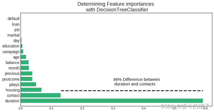
哪些特征影响了定期存款订阅的结果?
决策树分类器:
我们分类器中最重要的三个特征是**Duration(销售代表与潜在客户之间的对话持续时间),contact(在同一次营销活动中与潜在客户联系的次数),month(年份的月份)。
import numpy as np
import matplotlib.pyplot as plt
from sklearn import tree
from sklearn.model_selection import train_test_split
from sklearn.tree import DecisionTreeClassifier
plt.style.use('seaborn-white')

# 将列转换为分类变量
term_deposits['job'] = term_deposits['job'].astype('category').cat.codes
term_deposits['marital'] = term_deposits['marital'].astype('category').cat.codes
term_deposits['education'] = term_deposits['education'].astype('category').cat.codes
term_deposits['contact'] = term_deposits['contact'].astype('category').cat.codes
term_deposits['poutcome'] = term_deposits['poutcome'].astype('category').cat.codes
term_deposits['month'] = term_deposits['month'].astype('category').cat.codes
term_deposits['default'] = term_deposits['default'].astype('category').cat.codes
term_deposits['loan'] = term_deposits['loan'].astype('category').cat.codes
term_deposits['housing'] = term_deposits['housing'].astype('category').cat.codes

# 创建训练集和测试集
target_name = 'deposit'
X = term_deposits.drop('deposit', axis=1)
label = term_deposits[target_name]
X_train, X_test, y_train, y_test = train_test_split(X, label, test_size=0.2, random_state=42, stratify=label)

# 使用3个信息特征构建分类任务
tree = tree.DecisionTreeClassifier(
    class_weight='balanced',
    min_weight_fraction_leaf=0.01
)

# 使用训练集进行训练
tree = tree.fit(X_train, y_train)
importances = tree.feature_importances_
feature_names = term_deposits.drop('deposit', axis=1).columns
indices = np.argsort(importances)[::-1]

# 打印特征重要性排序
print("Feature ranking:")
for f in range(X_train.shape[1]):
    print("%d. feature %d (%f)" % (f + 1, indices[f], importances[indices[f]]))

# 绘制特征重要性图
def feature_importance_graph(indices, importances, feature_names):
    plt.figure(figsize=(12,6))
    plt.title("Determining Feature importances \n with DecisionTreeClassifier", fontsize=18)
    plt.barh(range(len(indices)), importances[indices], color='#31B173',  align="center")
    plt.yticks(range(len(indices)), feature_names[indices], rotation='horizontal',fontsize=14)
    plt.ylim([-1, len(indices)])
    plt.axhline(y=1.85, xmin=0.21, xmax=0.952, color='k', linewidth=3, linestyle='--')
    plt.text(0.30, 2.8, '46% Difference between \n duration and contacts', color='k', fontsize=15)

# 调用函数绘制特征重要性图
feature_importance_graph(indices, importances, feature_names)
plt.show()
Feature ranking:
1. feature 11 (0.591310)
2. feature 8 (0.129966)
3. feature 6 (0.067020)
4. feature 13 (0.049923)
5. feature 15 (0.038138)
6. feature 14 (0.037830)
7. feature 10 (0.026646)
8. feature 5 (0.025842)
9. feature 0 (0.017757)
10. feature 12 (0.007889)
11. feature 3 (0.005280)
12. feature 9 (0.002200)
13. feature 2 (0.000147)
14. feature 1 (0.000050)
15. feature 7 (0.000000)
16. feature 4 (0.000000)
GradientBoosting分类器胜出!
Gradient Boosting分类器是预测潜在客户是否会订阅定期存款的最佳模型。准确率达到84%!
# 导入所需的库
from sklearn.ensemble import VotingClassifier

# 创建一个投票分类器,其中包含三个分类器:grad_clf、nav_clf和neural_clf
voting_clf = VotingClassifier(
    estimators=[('gbc', grad_clf), ('nav', nav_clf), ('neural', neural_clf)],
    voting='soft'
)

# 使用训练数据集(X_train, y_train)对投票分类器进行训练
voting_clf.fit(X_train, y_train)
VotingClassifier(estimators=[('gbc', GradientBoostingClassifier(criterion='friedman_mse', init=None,
              learning_rate=0.1, loss='deviance', max_depth=3,
              max_features=None, max_leaf_nodes=None,
              min_impurity_decrease=0.0, min_impurity_split=None,
              min_samples_leaf=1,...=True, solver='adam', tol=0.0001,
       validation_fraction=0.1, verbose=False, warm_start=False))],
         flatten_transform=None, n_jobs=None, voting='soft', weights=None)
# 导入需要的库
from sklearn.metrics import accuracy_score

# 对于每个分类器进行以下操作
for clf in (grad_clf, nav_clf, neural_clf, voting_clf):
    # 使用训练集对分类器进行训练
    clf.fit(X_train, y_train)
    # 使用训练好的分类器对测试集进行预测
    predict = clf.predict(X_test)
    # 输出分类器的名称和预测准确率
    print(clf.__class__.__name__, accuracy_score(y_test, predict))
GradientBoostingClassifier 0.8463949843260188
GaussianNB 0.7514554411106136
MLPClassifier 0.7787729511867443
VotingClassifier 0.8213166144200627
银行应考虑哪些行动?
下一次营销活动的解决方案(结论):
-
营销活动的月份: 我们发现,营销活动最活跃的月份是五月。然而,这个月份潜在客户倾向于拒绝定期存款的提供(最低有效率:-34.49%)。对于下一次营销活动,银行应该在三月、九月、十月和十二月这几个月份集中进行营销活动。(十二月应该考虑在内,因为它是营销活动最低的月份,可能有某种原因导致十二月份最低。)
-
季节性: 潜在客户选择在秋季和冬季订阅定期存款。下一次营销活动应该在这些季节集中进行活动。
-
营销电话: 应该实施一项政策,规定对同一潜在客户最多只能进行3次电话联系,以节省时间和精力来获取新的潜在客户。记住,我们给同一潜在客户打电话次数越多,他们拒绝开立定期存款的可能性就越大。
-
年龄类别: 银行的下一次营销活动应该针对20岁或以下和60岁或以上的潜在客户。最年轻的类别有60%的机会订阅定期存款,而最年长的类别有76%的机会订阅定期存款。如果银行在下一次活动中针对这两个类别进行推广,将有助于增加更多定期存款的订阅机会。
-
职业: 毫不奇怪,学生或退休人员是最有可能订阅定期存款的潜在客户。退休人员倾向于拥有更多的定期存款,以通过利息支付获得一些现金。记住,定期存款是一种短期贷款,个人(在这种情况下是退休人员)同意在个人和金融机构之间约定的某个日期之前不从银行提取现金。在那个时间之后,个人会拿回本金和贷款所产生的利息。退休人员倾向于不大量花费现金,因此更有可能将现金通过借给金融机构来运作。学生是另一群通常订阅定期存款的人群。
-
房屋贷款和余额: 低余额和无余额类别的潜在客户更有可能拥有房屋贷款,而平均余额和高余额类别的人群则不太可能拥有房屋贷款。拥有房屋贷款意味着潜在客户有财务义务偿还房屋贷款,因此没有现金可以用于订阅定期存款账户。然而,我们看到平均余额和高余额的潜在客户不太可能有房屋贷款,因此更有可能开立定期存款。最后,下一次营销活动应该针对平均余额和高余额的个人,以增加订阅定期存款的可能性。
-
在电话中开展问卷调查: 由于通话持续时间是与潜在客户是否开立定期存款最正相关的特征,通过为潜在客户在电话中提供有趣的问卷调查,可以增加对话的长度。当然,这并不能保证潜在客户会订阅定期存款!然而,通过实施一项能够增加潜在客户参与度的策略,从而增加订阅定期存款的概率,从而提高银行下一次营销活动的有效性,我们不会失去任何东西。
-
针对持续时间较长的个体(超过375)进行定位: 针对持续时间高于平均水平的目标群体进行定位,这个目标群体开立定期存款账户的可能性非常高。这个群体开立定期存款账户的可能性为78%,非常高。这将使得下一次营销活动的成功率非常高。
通过结合所有这些策略并简化市场受众,下一次银行的营销活动很可能比当前的活动更有效。


 1万+
1万+


 被折叠的 条评论
为什么被折叠?
被折叠的 条评论
为什么被折叠?
 到【灌水乐园】发言


