


前面介绍过的基本雷达图,只能表示一类事物的维度变量。当想要同时表现几类不同事物的维度变量时,就需要使用多雷达图进行展示。利用某软件的性能、小米与苹果手机的功能、降水量与蒸发量的数据展示出3类数据中的不同维度变量
代码
<!DOCTYPE html>
<html lang="en">

<head>
    <meta charset="UTF-8">
    <meta name="viewport" content="width=device-width, initial-scale=1.0">
    <title>4-13 多雷达图</title>
    <script src="echarts.js"></script>
</head>

<body>
    <!---为ECharts准备一个具备大小(宽高)的DOM--->
    <div id="main" style="width: 700px; height: 600px"></div>

    <script type="text/javascript">
        //基于准备好的DOM,初始化ECharts图表
        var myChart = echarts.init(document.getElementById('main'));

        //指定图表的配置项和数据
        var option = {  //指定图表的配置项和数据
            color: ["red", 'green', 'blue', '#660099', '#FA8072', 'grey'],  //使用自己预定义的颜色
            backgroundColor: 'rgba(128, 128, 128, 0.1)',  //rgba设置透明度0.1
            title: {  //配置标题组件
                text: '多雷达图',
                top: 15,
                left: 240,
                textStyle: {
                    color: 'green'
                }
            },
            tooltip: {
                trigger: 'axis'
            },
            //配置图例组件
            legend: {
                top: 560,
                left: 140,
                data: ['某软件', '小米', '苹果', '降水量', '蒸发量']
            },
            radar: [  //设置雷达图坐标系组件,只适用于雷达图
                {
                    nameGap: 3,
                    shape: 'polygon',  //'polygon'|'circle'
                    name: {
                        textStyle: {
                            fontSize: 12,
                            color: '#fff',
                            backgroundColor: 'green',
                            borderRadius: 3,
                            padding: [2, 2]
                        }
                    },
                    indicator: [  //设置雷达图指示器,指定雷达图中的多个变量,跟data中value对应
                        { text: '品牌', max: 100 },
                        { text: '内容', max: 100 },
                        { text: '可用性', max: 100 },
                        { text: '功能', max: 100 }
                    ],
                    center: ['25%', '30%'],
                    radius: 80  //指定第1个雷达图的位置
                },
                {
                    nameGap: 3,
                    shape: 'polygon',  //'polygon'|'circle'
                    name: {
                        textStyle: {
                            fontSize: 12,
                            color: '#fff',
                            backgroundColor: 'blue',
                            borderRadius: 3,
                            padding: [2, 2]
                        }
                    },
                    //设置雷达图指示器,指定雷达图中的多个变量
                    indicator: [
                        { text: '外观', max: 100 },
                        { text: '拍照', max: 100 },
                        { text: '系统', max: 100 },
                        { text: '性能', max: 100 },
                        { text: '屏幕', max: 100 }],
                    center: ['60%', '30%'],
                    radius: 80  //指定第2个雷达图的位置
                },
                {
                    nameGap: 3,
                    shape: 'polygon',  //'polygon'和'circle'
                    name: {
                        textStyle: {
                            fontSize: 12,
                            color: 'red',
                            backgroundColor: 'lightblue',
                            borderRadius: 3,
                            padding: [2, 2]
                        }
                    },
                    //设置雷达图指示器,指定雷达图中的多个变量
                    indicator: (function () {
                        let res = [];
                        for (let i = 1; i <= 12; i++) {
                            res.push({ text: i + '月', max: 100 });
                        }
                        return res;
                    })(),
                    center: ['41%', '67%'], //指定第3个雷达图的位置
                    radius: 80,
                }
            ],
            series: [  //配置数据系列
                {   //设置第1个数据项:某软件
                    type: 'radar',
                    tooltip: {
                        trigger: 'item'
                    },
                    itemStyle: {
                        normal: {
                            areaStyle: {
                                type: 'default'
                            }
                        }
                    },
                    //设置第1个数据项的具体数据
                    data: [{
                        value: [65, 72, 88, 80],
                        name: '某软件'
                    }]
                },
                {   //设置第2个数据项:小米与苹果
                    type: 'radar',
                    radarIndex: 1,
                    tooltip: {
                        trigger: 'item'
                    },
                    data: [  //设置第2个数据项的具体数据
                        {
                            value: [85, 90, 90, 95, 95],
                            name: '小米'
                        },
                        {
                            value: [95, 80, 95, 90, 93],
                            name: '苹果'
                        }]
                },
                {   //设置第3个数据项:降水量与蒸发量
                    type: 'radar',
                    radarIndex: 2,
                    tooltip: {
                        trigger: 'item'
                    },
                    itemStyle: {
                        normal: {
                            areaStyle: {
                                type: 'default'
                            }
                        }
                    },
                    data: [  //设置第3个数据项的具体数据
                        {
                            name: '降水量',
                            value: [5, 6, 9, 56, 69, 73, 77, 88, 50, 22, 7, 5]
                        },
                        {
                            name: '蒸发量',
                            value: [3, 5, 8, 34, 45, 77, 68, 65, 36, 23, 7, 4]
                        }
                    ]
                }]
        };
        //使用刚指定的配置项和数据显示图表
        myChart.setOption(option);
    </script>
</body>

</html>
结果
注意一下: 后缀名 .html
<!DOCTYPE html>
<html lang="en">
<head>
<meta charset="UTF-8">
<meta name="viewport" content="width=device-width, initial-scale=1.0">
<title>4-13 多雷达图</title>
<script src="echarts.js"></script>
</head>
<body>
<!---为ECharts准备一个具备大小(宽高)的DOM--->
<div id="main" style="width: 700px; height: 600px"></div>
<script type="text/javascript">
//基于准备好的DOM,初始化ECharts图表
var myChart = echarts.init(document.getElementById('main'));
//指定图表的配置项和数据
var option = { //指定图表的配置项和数据
color: ["red", 'green', 'blue', '#660099', '#FA8072', 'grey'], //使用自己预定义的颜色
backgroundColor: 'rgba(128, 128, 128, 0.1)', //rgba设置透明度0.1
title: { //配置标题组件
text: '多雷达图',
top: 15,
left: 240,
textStyle: {
color: 'green'
}
},
tooltip: {
trigger: 'axis'
},
//配置图例组件
legend: {
top: 560,
left: 140,
data: ['某软件', '小米', '苹果', '降水量', '蒸发量']
},
radar: [ //设置雷达图坐标系组件,只适用于雷达图
{
nameGap: 3,
shape: 'polygon', //'polygon'|'circle'
name: {
textStyle: {
fontSize: 12,
color: '#fff',
backgroundColor: 'green',
borderRadius: 3,
padding: [2, 2]
}
},
indicator: [ //设置雷达图指示器,指定雷达图中的多个变量,跟data中value对应
{ text: '品牌', max: 100 },
{ text: '内容', max: 100 },
{ text: '可用性', max: 100 },
{ text: '功能', max: 100 }
],
center: ['25%', '30%'],
radius: 80 //指定第1个雷达图的位置
},
{
nameGap: 3,
shape: 'polygon', //'polygon'|'circle'
name: {
textStyle: {
fontSize: 12,
color: '#fff',
backgroundColor: 'blue',
borderRadius: 3,
padding: [2, 2]
}
},
//设置雷达图指示器,指定雷达图中的多个变量
indicator: [
{ text: '外观', max: 100 },
{ text: '拍照', max: 100 },
{ text: '系统', max: 100 },
{ text: '性能', max: 100 },
{ text: '屏幕', max: 100 }],
center: ['60%', '30%'],
radius: 80 //指定第2个雷达图的位置
},
{
nameGap: 3,
shape: 'polygon', //'polygon'和'circle'
name: {
textStyle: {
fontSize: 12,
color: 'red',
backgroundColor: 'lightblue',
borderRadius: 3,
padding: [2, 2]
}
},
//设置雷达图指示器,指定雷达图中的多个变量
indicator: (function () {
let res = [];
for (let i = 1; i <= 12; i++) {
res.push({ text: i + '月', max: 100 });
}
return res;
})(),
center: ['41%', '67%'], //指定第3个雷达图的位置
radius: 80,
}
],
series: [ //配置数据系列
{ //设置第1个数据项:某软件
type: 'radar',
tooltip: {
trigger: 'item'
},
itemStyle: {
normal: {
areaStyle: {
type: 'default'
}
}
},
//设置第1个数据项的具体数据
data: [{
value: [65, 72, 88, 80],
name: '某软件'
}]
},
{ //设置第2个数据项:小米与苹果
type: 'radar',
radarIndex: 1,
tooltip: {
trigger: 'item'
},
data: [ //设置第2个数据项的具体数据
{
value: [85, 90, 90, 95, 95],
name: '小米'
},
{
value: [95, 80, 95, 90, 93],
name: '苹果'
}]
},
{ //设置第3个数据项:降水量与蒸发量
type: 'radar',
radarIndex: 2,
tooltip: {
trigger: 'item'
},
itemStyle: {
normal: {
areaStyle: {
type: 'default'
}
}
},
data: [ //设置第3个数据项的具体数据
{
name: '降水量',
value: [5, 6, 9, 56, 69, 73, 77, 88, 50, 22, 7, 5]
},
{
name: '蒸发量',
value: [3, 5, 8, 34, 45, 77, 68, 65, 36, 23, 7, 4]
}
]
}]
};
//使用刚指定的配置项和数据显示图表
myChart.setOption(option);
</script>
</body>
</html>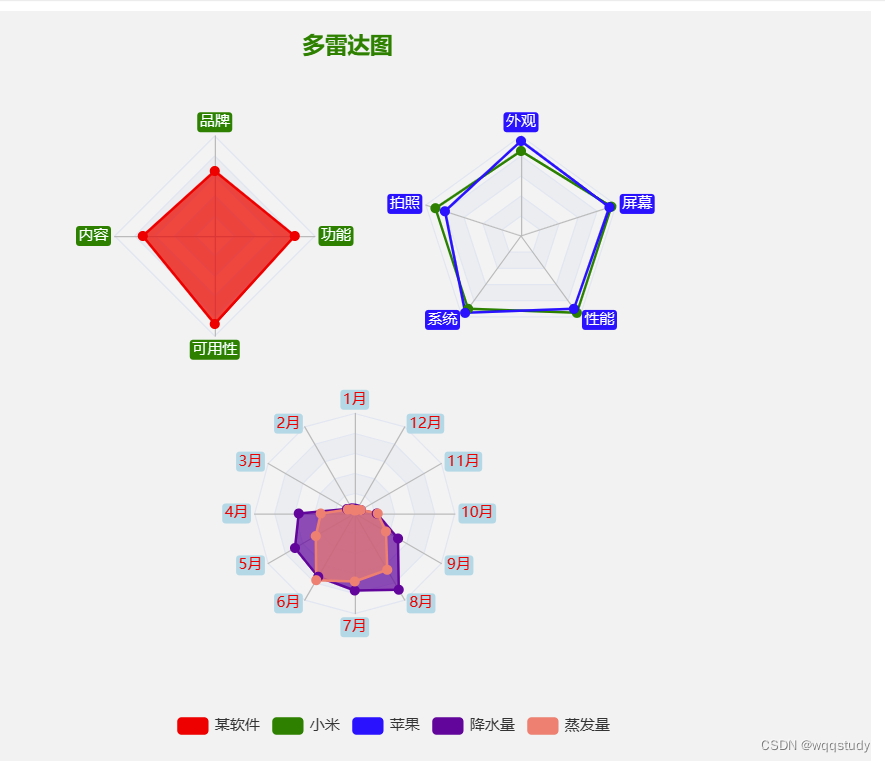


 4万+
4万+


 被折叠的 条评论
为什么被折叠?
被折叠的 条评论
为什么被折叠?
 到【灌水乐园】发言


