


效果图:

依赖引入:
implementation 'com.google.android.material:material:1.5.0'代码如下:
class MainActivity : ComponentActivity() {
override fun onCreate(savedInstanceState: Bundle?) {
super.onCreate(savedInstanceState)
setContent {
ComposedrawerTheme {
Surface(
modifier = Modifier.fillMaxSize(),
color = MaterialTheme.colors.background
) {
MainPage()
}
}
}
}
}
@SuppressLint("UnusedMaterialScaffoldPaddingParameter")
@Composable
fun MainPage() {
val scaffoldState = rememberScaffoldState()
val coroutineScope = rememberCoroutineScope()// 定义协程作用域
Scaffold(
topBar = {
TopAppBar(
navigationIcon = {
IconButton(
onClick = {
coroutineScope.launch {
scaffoldState.drawerState.open()
}
}
) {
Icon(Icons.Filled.Menu, null)
}
},
title = {
Text("首页")
},
actions = {
IconButton(
onClick = {}
) {
Icon(Icons.Filled.Share, null)
}
IconButton(
onClick = {}
) {
Icon(Icons.Filled.Settings, null)
}
},
)
},
drawerContent = { DrawerContent() },
drawerGesturesEnabled = true,
scaffoldState = scaffoldState,
) {
}
}
@Composable
fun DrawerContent() {
Text(text = "DrawerContent")
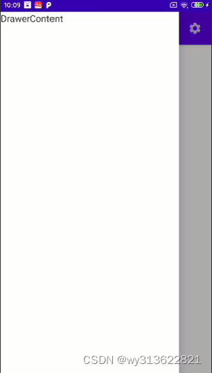
}如果要设置侧边栏宽度,代码如下:
/**
 * 设置抽屉的宽度
 */
@Composable
fun CustomDrawerShape(): Shape = object : Shape {
    override fun createOutline(
        size: Size,
        layoutDirection: LayoutDirection,
        density: Density
    ): Outline {
        return Outline.Rectangle(Rect(0f, 0f, 600f, size.height))
    }
}
在Scaffold里设置属性:
drawerShape = CustomDrawerShape(),


 880
880


 被折叠的 条评论
为什么被折叠?
被折叠的 条评论
为什么被折叠?
 到【灌水乐园】发言


