


1.首先使用Matlab画一个简单的图
如下:
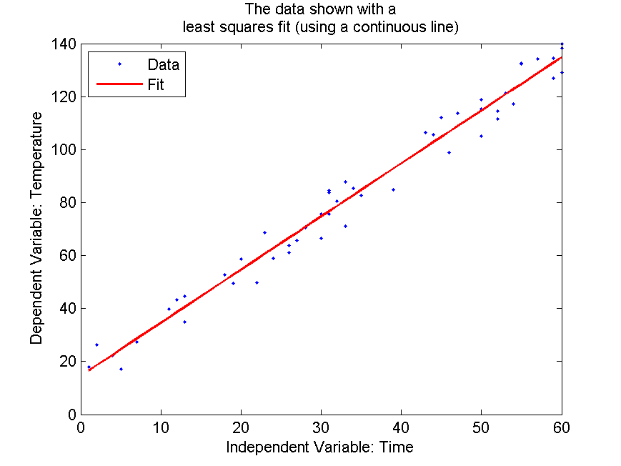
针对这幅图;
对于x,y坐标系的标签,title.我们很容易写出,
%% Label
xlabel(['Independent Variable: ' headerLabels{1}]);
ylabel(['Dependent Variable: ' headerLabels{2}]);
Title
title({'The linear least squares fit',...
    'overlaid on scatter plot view of sorted data'});
其中headerLabels是cell数组,用于存放x,y坐标系的标签,
红色线条和蓝色点是拟合线和数据点,可以通过
plotfit,polyval函数获得,最后通过plot画出。
左上角的小方框是用legend画出来的, 很简单。
numericData是50*2的数组,headerLabels是1*2 cell
代码如下:
%% Read data in from an excel spreadsheet
[numericData headerLabels]=xlsread('TemperatureXL.xls');
%% Sort data to aid in its visualization (on the independent variable)
[sortedResults I] = sort(numericData(:,1));
%% Plot data
plot(numericData(I,1), numericData(I,2),'.');
set(gcf,'Paperpositionmode','auto','Color',[1 1 1]);
%% Label
xlabel(['Independent Variable: ' headerLabels{1}]);
ylabel(['Dependent Variable: ' headerLabels{2}]);
title('Scatter plot view of sorted data');

%% Hold axes to overlay more data
hold on;
%% Obtain a linear fit for this data using polyfit (polynomial of degree 1)
p = polyfit(numericData(I,1),numericData(I,2),1);
y = polyval(p,numericData(I,1));
%% Plot the linear fit in red
plot(numericData(I,1),y,'r--');
%% Title, legend and print
legend({'Data','Fit'},'Location','NorthWest');
title({'The linear least squares fit',...
    'overlaid on scatter plot view of sorted data'});


 6762
6762

 被折叠的 条评论
为什么被折叠?
被折叠的 条评论
为什么被折叠?
 到【灌水乐园】发言


