


先看图!

点击图例之后 如下图所示 :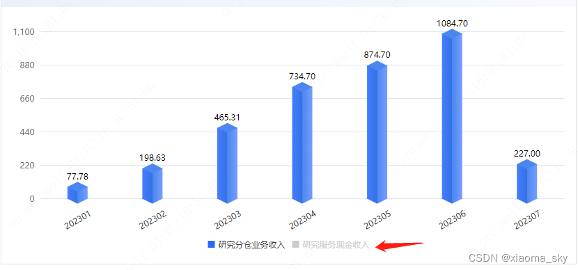
两个、三个、四个堆叠都可如此.......
用vue + echarts 做
上代码!!!
get3dEchartsData(){
const _this = this;
let backArr = []; // 背景色数据
let yMax = 100; // 遍历data找到最大值赋予特殊符号
let data = []; // 柱状图所有数据平坦化
var barWidth = 29; // 柱体宽度
var serierData = [];
let lengedData = []; // 图例颜色
let sumData = []; // 求和数据
let xAxisData = []; // X轴数据
let topData = []; // 顶盖数据(位置)
this.titleArr.forEach((e, i) => {
// 阶梯求和 用于立体图绘制
if (i === 0) {
sumData.push(
this.initData[i][e.indicatorName]?.map((m, n) => m.value || "")
);
} else {
let arr = this.initData[i][e.indicatorName]?.map((m, n) => {
return Number(m.value || 0) + Number(sumData[i - 1][n] || 0);
});
sumData.push(arr);
}
lengedData.push({
icon: "rect",
name: e.indicatorName,
itemStyle: {
color: e.color,
},
});
// 处理y轴数据 使用求和后数据计算y轴最大值
sumData.forEach((e) => {
e?.forEach((c) => {
data.push(c);
});
});
xAxisData = this.initData[i][e.indicatorName]?.map((e) => {
return e.statisticsTime;
});
topData = this.initData[i][e.indicatorName]?.map((e, num) => {
if (e.value !== "") {
return sumData[i][num];
} else {
return "";
}
});
let bottomData = this.initData[i][e.indicatorName]?.map((e, num) => {
if (e.value !== "") {
if (i > 0) {
return sumData[i - 1][num] || 0;
} else {
return 0;
}
} else {
return "";
}
});
serierData.push(
// 三面数据
{
z: i + 1,
name: e.indicatorName || "",
stack: "stack",
type: "bar",
barWidth: barWidth,
data: this.initData[i][e.indicatorName],
itemStyle: {
normal: {
color: {
type: "linear",
x: 0,
x2: 1,
y: 0,
y2: 0,
colorStops: [
{ offset: 0, color: this.colorArr[i][e.indicatorName][0] },
{
offset: 0.5,
color: this.colorArr[i][e.indicatorName][1],
},
{
offset: 0.5,
color: this.colorArr[i][e.indicatorName][2],
},
{ offset: 1, color: this.colorArr[i][e.indicatorName][3] },
],
},
},
},
},
{
z: 4 + i,
type: "pictorialBar",
symbolPosition: "end",
data: topData,
symbol: "diamond",
symbolOffset: ["0%", "-50%"],
symbolSize: [barWidth, barWidth * 0.5],
itemStyle: {
normal: {
color: this.colorArr[i][e.indicatorName][2],
},
},
tooltip: {
show: false,
},
},
{
z: 3 + i,
type: "pictorialBar",
symbolPosition: "end",
data: bottomData,
symbol: "diamond",
symbolOffset: ["0%", "-50%"],
symbolSize: [barWidth, barWidth * 0.5],
itemStyle: {
normal: {
color: {
type: "linear",
x: 0,
x2: 1,
y: 0,
y2: 0,
colorStops: [
{ offset: 0, color: this.colorArr[i][e.indicatorName][0] },
{
offset: 0.5,
color: this.colorArr[i][e.indicatorName][1],
},
{
offset: 0.5,
color: this.colorArr[i][e.indicatorName][2],
},
{ offset: 1, color: this.colorArr[i][e.indicatorName][3] },
],
},
},
},
tooltip: {
show: false,
},
}
);
});
// 计算数据(展示数据)最大值
var maxVal = Math.max.apply(Math, data);
if (maxVal < 1) {
// 最大值小于1 设置阴影1
yMax = 1;
} else if (maxVal < 10) {
// 最大值小于10 设置阴影10
yMax = 10;
} else if (maxVal < 50) {
// 最大值小于50 设置阴影50
yMax = 50;
} else if (maxVal < 100) {
// 最大值小于100 设置阴影100
yMax = 100;
} else {
// 最大值大于100 按前两位数+1取整计算阴影
let maxvalue = Number(`${Math.ceil(maxVal)}`.slice(0, 2)) + 1;
let i = `${Math.ceil(maxVal)}`.length - 2;
for (let e = 0; e < i; e++) {
maxvalue = maxvalue * 10;
}
yMax = maxvalue;
}
for (let i = 0; i < _this.titleArr.length; i++) {
backArr.push(yMax);
}
function showGrid() {
let object = {
left: "2%", //图表距边框的距离
right: "2%",
top: "10%",
bottom: _this.isrotate ? "15px" : "40px",
containLabel: true,
};
return object;
}
function showLegend() {
let object = {
selectedMode: true,
bottom: "0",
data: lengedData,
itemWidth: 10,
itemHeight: 10,
};
return object;
}
// 追加最上方累加数据
serierData.push({
z: 1,
name: "",
type: "bar",
stack: "",
barGap: "-100%", // 左移100%,stack不再与上面两个在一列
barWidth: 29,
label: {
normal: {
show: true,
distance: 10,
position: "top", // 位置设为top
textStyle: { color: "#000" },
formatter: function (item) {
if (item.value) {
return item.value;
} else {
return "";
}
},
},
},
tooltip: {
show: false,
},
itemStyle: {
normal: {
color: "rgba(128, 128, 128, 0)", // 仍为透明
},
},
data: sumData[sumData.length - 1]?.map((e) => {
return e ? e.toFixed(2) : e;
}),
});
// 柱体背影数据
// serierData.push({
// name: "",
// type: "bar",
// stack: "data",
// data: backArr,
// barWidth: 30,
// itemStyle: {
// normal: {
// color: "#376DDB",
// opacity: 0.1,
// label: {
// show: false,
// },
// },
// },
// label: {
// show: false,
// },
// });
return {
tooltip: {
trigger: "axis",
backgroundColor: "rgba(0,0,0,0.55)",
boxShadow: "3px 3px 9px 0px rgba(106,106,106,0.3)",
backdropFilter: "blur(4px)",
borderWidth: 0,
className: "tooltips-box",
textStyle: {
fontSize: "12",
color: "#ffffff",
},
axisPointer: {
type: "shadow",
shadowStyle: {
opacity: 0,
},
},
// 鼠标悬浮显示的数据样式
formatter: function (params) {
var str = params[0].data.statisticsTime;
// 排序
let seriesIndex = params.sort((a, b) => a.seriesIndex - b.seriesIndex );
for (let i = 0; i < seriesIndex.length; i++) {
str += `
<div style="display: flex; justify-content: space-between">
<div style=" margin-right: 12px">
<span style="display:inline-block;margin-right:4px;width:10px;height:10px;border:1px solid #FFFFFF;background-color:${
params[i]?.color?.colorStops?.[0]?.color
}"></span>
${params?.[i]?.seriesName}
</div>
<div>${
params[i]?.value != ""
? handleQfNumberStr(params[i]?.value, 2)
: "--"
} ${_this.indicatorUnit}</div>
</div>`;
}
return str;
},
},
legend: showLegend(),
grid: showGrid(),
xAxis: {
axisLine: {
show: false, //不显示坐标轴轴线
},
axisTick: {
show: false, //不显示坐标轴刻度
},
data: xAxisData,
axisLabel: {
show: true,
interval: 0,
color: "#232323",
margin: _this.isrotate ? 30 : 25,
rotate: _this.isrotate ? 30 : 0, //横坐标是否倾斜
align: "center",
},
type: "category",
},
yAxis: {
max: yMax,
interval: yMax / 5,
axisTick: {
show: false,
},
axisLine: {
show: false,
},
axisLabel: {
show: true,
},
},
series: serierData,
};
}
代码里面重点关注 serierData的加参数、sumData的计算逻辑

setOption() 配置项的第二个参数 可以自己百度查一下什么意思
------------------------------------------------------------------------------------------------------
最关键的代码来了!!!

给echarts 实例绑定图例点击事件、每次点击都要修改initData 的数据
注意的是copy_data 是页面第一次传值过来时 initData的备份数据,一定不能漏掉
大致意思就是,
被点击的图例对应的数据会进行置空,反之则赋原来最开始的值
(这就是copy_data的作用!!!)
最后,传进来的值,initData,titleArr,colorArr 都有严格的数据格式要求(这个可以各位大佬再细细研究)
例如我上面图例所示的数据格式就是:
initData:[
{ 研究分仓业务收:[value:123,statisticsTime:202301]},
{ 研究服务现金收入:[value:123,statisticsTime:202301]}
]
其中:value 是柱体数据,statisticsTime 是X轴的数据
--------------------------------------------------------------
titleArr:[
{indicatorName:研究分仓业务收,color:''},
{indicatorName:研究服务现金收入,color:''}
]
titleArr是图例信息,其中:中文名字要和initData完全匹配,color 代表图例的颜色
--------------------------------------------------------------
colorArr:[
{研究分仓业务收:['颜色1','颜色2','颜色3','颜色4']},
{研究服务现金收入:['颜色1','颜色2','颜色3','颜色4']}
]
colorArr 是柱状体的颜色 顶盖 下盖 和柱体
这个立体效果是通过颜色差来呈现立体效果的 并不是真正的3D效果
注意的是,中文和数组的顺序都要一一对应
--------------------------------------------------------------
以上数据之所以用中文进行一一匹配,是因为点击图例那个方法 参数中只有图例信息和图例状态
(其实不用中文一一匹配,用数字或者其他东西也可以,我懒得换了)
大概就这样 研究了一段时间 就封装好了这个公共组件..........


 1149
1149


 被折叠的 条评论
为什么被折叠?
被折叠的 条评论
为什么被折叠?
 到【灌水乐园】发言


