


http://blog.csdn.net/pipisorry/article/details/37766161
远程绘图,在matplotlib中的一个坐标轴上画一条直线光标,绘制LaTeX数学公式,对数坐标轴。
远程绘图
Python使用ssh进行远程解释器绘图时出错:RuntimeError: Invalid DISPLAY variable
主要原因:
By default, matplotlib will use something like the TkAgg backend. This requires an X-server to be running.
解决1:
import matplotlib
matplotlib.use('Agg') # Must be before importing matplotlib.pyplot or pylab!
import matplotlib.pyplot as plt[How to save a figure remotely with pylab? [duplicate]]
解决2:
[How do you plot a graph when developing on a remote machine through ssh only]
[Matplotlib: display plot on a remote machine]
解决3:代码在远程执行,而在本地绘图
There are a few possibilities
-
If your remote machine is somehow unixish, you may use the X Windows (then your session is on the remote machine and display on the local machine)
-
mpld3
-
bokeh and iPython notebook
-
nbagg backend of matplotlib.¨
Alternative #1 requires you to have an X server on your machine and a connection between the two machines (possibly tunneled through ssh, etc.) So, this is OS dependent, and the performance depends on the connection between the two machines.
Alternatives #2 and #3 are very new but promising. They have quite different approaches, mpl3d enables the use of standard matplotlib plotting commands, but with large datasets bokeh may be more useful.
Alternative #4 is probably the ultimate solution (see tcaswell's comments), but not yet available without using a development version of matplotlib (i.e. there may be some installation challenges). On the other hand, if you can hold your breath for a week, 1.4.0 will be out.
The upcoming release (1.4.0, should be out by end of August 2014, release candidates are available) will ship with the nbagg backend which provides interactive figures with out needing to Go to native clients or resorting to using d3. All you need to do in your note book is:
import matplotlib
matplotlib.use('nbagg')
from matplotlib import pyplot as plt
And then to plot
plt.plot(range(3))
plt.show()
[how to display matplotlib plots on local machine?]
1) on remote host (VPS, Ubuntu 16.04) I had to install X11 server, which I did by:
sudo apt-get install xorg
sudo apt-get install openbox
2) On remote host I had to make sure that X11Forwarding is enabled in /etc/ssh/sshd_config
3) On local Win10 machine I had to install Xming server and launch it with default settings.
4) On local Win10 machine I had to configure Putty to use X11 forwarding (Connection-> SSH -> X11 Forwarding) with default settings and keep connection open while running PyCharm (it seems there is no option in PyCharm to enable x11 forwarding, so putty must be running in the background)
5) On remote machine I had to check Display number (echo $DISPLAY) - this can be different for everyone. For me it was localhost:10.0
6) In PyCharm Run configuration -> Environment variables I had to add DISPLAY=localhost:10.0
After all these steps and Putty+Xming running in backgroud, I was able to execute remote code and bring graphic back to my Windows 10 PC!
[ Python plotting on remote server using PyCharm]
在matplotlib中的一个坐标轴上画一条直线光标
matplotlib.widgets.Cursor
# set useblit = True on gtkagg for enhanced performance
# horizOn=True时,两个坐标都有显示光标
示例
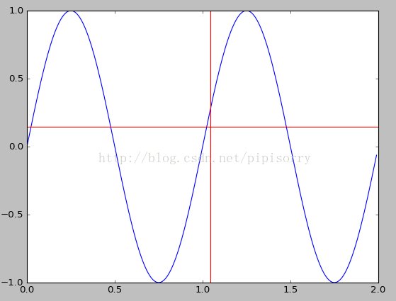
import numpy as np
import matplotlib.pyplot as plt
from matplotlib.widgets import Cursor

t = np.arange(0.0, 2.0, 0.01)
s1 = np.sin(2 * np.pi * t)
plt.plot(t, s1)

cursor = Cursor(plt.gca(), horizOn=True, color='r', lw=1)
plt.show()
Note: 一个神奇的事情就是,Cursor()必须有一个赋值给cursor,否则并不会显示光标(ubuntu16.04下)。之前在windows下绘制时不用赋值也是会有光标显示的。
结果示图(随着光标的移动,在图中x坐标上会画一条竖线,并在下方显示坐标):
同时在两个子图的两个坐标轴之间画一条直线光标
import numpy as np
import matplotlib.pyplot as plt
from matplotlib.widgets import MultiCursor

t = np.arange(0.0, 2.0, 0.01)
s1 = np.sin(2*np.pi*t)
s2 = np.sin(4*np.pi*t)
fig = plt.figure()
ax1 = fig.add_subplot(211)
ax1.plot(t, s1)


ax2 = fig.add_subplot(212, sharex=ax1)
ax2.plot(t, s2)

multi = MultiCursor(fig.canvas, (ax1, ax2), color='r', lw=1)
plt.show()

[widgets example code: multicursor.py]
绘制LaTeX数学公式
1. matplotlib.rcParams属性字典,想要它正常工作,在matplotlibrc配置文件中需要设置text.markup = "tex"。
2. 如果你希望图表中所有的文字(包括坐标轴刻度标记)都是LaTeX'd,需要在matplotlibrc中设置text.usetex = True。如果你使用LaTeX撰写论文,那么这一点对于使图表和论文中其余部分保持一致是很有用的。
Matlplotlib对LaTeX有一定的支持,如果记得使用raw字符串语法会很自然:xlabel(r" x2y4 ")书写数学公式
You can use a subset TeX markup in any matplotlib text string byplacing it inside a pair of dollar signs ($).mathtext开始和结束的字符都要是 $ 。
Note that you do not need to have TeX installed, since matplotlibships its own TeX expression parser, layout engine and fonts.
在matplotlib里面,可以使用LaTex的命令来编辑公式,只需要在字符串前面加一个“r”即可。(在python raw string需要r‘’,表示不转义)Any text element can use math text. You should use raw strings(precede the quotes with an 'r'), and surround the math text withdollar signs ($)
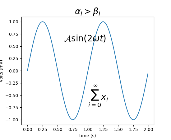
Here is a simple example: plt.title('alpha > beta')
produces “alpha > beta”.
Whereas this:
plt.title(r'$\alpha > \beta$')
produces " ".
".
Subscripts and superscripts
To make subscripts and superscripts, use the '_' and '^' symbols:
r'$\alpha_i > \beta_i$'
符号表示及参考[Writing mathematical expressions]
示例
1
import numpy as np
import matplotlib.pyplot as plt
t = np.arange(0.0, 2.0, 0.01)
s = np.sin(2*np.pi*t)

plt.plot(t,s)
plt.title(r'$\alpha_i > \beta_i$', fontsize=20)
plt.text(1, -0.6, r'$\sum_{i=0}^\infty x_i$', fontsize=20)
plt.text(0.6, 0.6, r'$\mathcal{A}\mathrm{sin}(2 \omega t)$',
         fontsize=20)
plt.xlabel('time (s)')
plt.ylabel('volts (mV)')
plt.show()
2
In [6]: ax.text(2, 8, r"$ \mu \alpha \tau \pi \lambda \omega \tau \lambda \iota \beta $");
In [7]: ax.text(2, 6, r"$ \lim_{x \rightarrow 0} \frac{1}{x} $");
In [8]: ax.text(2, 4, r"$ a \ \leq \ b \ \leq \ c \ \Rightarrow \ a \ \leq \ c$");
In [9]: ax.text(2, 2, r"$ \sum_{i=1}^{\infty}\ x_i^2$");
In [10]: ax.text(4, 8, r"$ \sin(0) = \cos(\frac{\pi}{2})$");
In [11]: ax.text(4, 6, r"$ \sqrt[3]{x} = \sqrt{y}$");
In [12]: ax.text(4, 4, r"$ \neg (a \wedge b) \Leftrightarrow \neg a \vee \neg b$");
In [13]: ax.text(4, 2, r"$ \int_a^b f(x)dx$");

[Matplotlib for Python Developers]
对数坐标轴
在实际中,我们可能经常会用到对数坐标轴,这时可以用下面的三个函数来实现
ax.semilogx(x,y) #x轴为对数坐标轴
ax.semilogy(x,y) #y轴为对数坐标轴
ax.loglog(x,y) #双对数坐标轴
from:http://blog.csdn.net/pipisorry/article/details/37766161
ref:


 4765
4765

 被折叠的 条评论
为什么被折叠?
被折叠的 条评论
为什么被折叠?
 到【灌水乐园】发言


