


css3
1. 选择器
1.1 属性选择器 []
具有属性的选择器被选中
选择器[属性]{
	。。。
}
具有属性=指定值的选择器被选中
选择器[属性=指定值]{
	。。。
}

模糊匹配
^ 以谁开头
$ 以谁结尾
* 含有谁的

类选择器 属性选择器 伪类选择器 的权重10
1.2 结构伪类选择器
:伪类选择器
根据父级选择器里面的子元素
父元素:
first-child ;
last-child;
nth-child(n)这里可以制定n为几,如果直接n就是从0开始逐步加1进行变色,只能是n,
nth-child(even)偶数 或者2n,
nth-child(odd)奇数或者2n+1
first-of-type ;
last-of-type;
nth-of-type(n)
nth-child会把所有盒子排列序号
然后再找对应的序号,然后再看:前面的标签,若是标签不符合,则就是没有选中
nth-of-type会把指定元素的盒子排列序号,执行时先去看标签,然后再找对应的序号。
/*权重为12 1+ 1+ 10*/
section div: nth-of-type(1){
background-color:aque;
}
1.3 伪元素选择器
利用css3创建新标签元素,而不需要html标签
::after
::before
    <div class="box">
        <p>123</p>
    </div>
        *{
            margin: 0;
            padding: 0;
        }
        .box:after{
            content: '>';
            display: inline-block;
            position: absolute;
            right: 0;
            top: 0;
        }
        .box{
            width: 50px;
            height: 50px;
            position: relative;
        }
        p{
            float: left;
        }
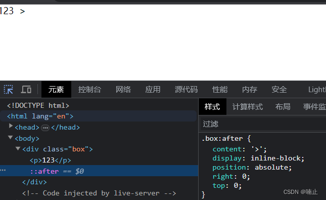
before和after创建的是行内元素。
新创建的元素在文档中找不到,所以称为伪元素
属性中一定要有content属性
before和after都是再父元素里面的开始和结尾创建元素
伪元素选择器和标签选择器的权重1
2. 盒子模型
2.1 box-sizing
box-sizing = content-box = width +padding+border
box-sizing = border-box = width (不会撑大盒子)
2.2 模糊处理
<div class="demo"></div>
        .demo{
            width: 285px;
            height: 185px;
            background-image: url(./images/tb.jpg);
            background-repeat: no-repeat;
            filter: blur(15px);
        }
        .demo:hover{
            filter: blur(0px);
        }
2.3 css3过渡
transition :要过度的属性 花费时间s 运行曲线ease(可省略  何时开始默认0s
谁做过渡给谁加
        .box{
            width: 50px;
            height: 50px;
            background-color: #a4a4a4;
            /* 多个属性 逗号隔开 */
            transition: width 1.2s, height 1.s;
        }
        .box:hover{
            width: 100px;
            height: 100px;
        }
    </style
案例:进度条
    <div class="demo">
        <div class="in"></div>
    </div>
        .demo{
            width: 100px;
            height: 10px;
            border-radius: 10px;
            border: 1px solid red;
            background-color: #fff;
        }
        .in{
            padding: 1px;
            width: 48px;
            height: 8px;
            background-color: red;
            border-radius: 10px;
            transition: width 2s;
        }
        .in:hover{
            width: 98px;
        }
3.transform 转换
可以做到移动 translate、旋转rotate、移动scale
3.1 translate 移动
移动盒子的位置的方式
- position ,四个方位值
- 盒子的外边距
- 2d转换移动
transform: translate(x,y);
or
transform: translateX(n);
transform: translateY(n);
优点
- 不会影响其他元素的位置。移动自身后,原来位置保留,然后 其他的元素也不会跟着移动。
- 百分数移动是指移动自身大小的百分值,xx px是指真实大小。
- 对行内元素没有效果
    <div>
        <p></p>
    </div>
<style>
        div{
            position: relative;
            width: 500px;
            height: 500px;
            background-color: pink;
        }
        p{
            width: 200px;
            height: 200px;
            background-color: red;
            /* 将盒子移动中间 */
            /* 方式1 用定位 */
            position: absolute;
            top: 50%;
            left: 50%;  /*父级元素的百分制*/
            /* margin-left: -100px;
            margin-top: -100px; */
            /* 用转化 */
            transform: translate(-50%,-50%);/*自身的百分制*/
        }
    </style>
3.2 rotate 旋转
transform:rotate(度数deg)
制作三角
<div class="box"></div>
        *{
            margin: 0;
            padding: 0;
        }
        div{
            position: relative;
            width: 289px;
            height: 30px;
            border: 1px solid #000;
            margin: 50px
            auto;
        }
        .box::after{
            content: '';
            position: absolute;
            top: 10px;
            right: 10px;
            width: 10px;
            height: 10px;
            transform: rotate(135deg);
            border-top: 1px solid #000;
            border-right: 1px solid #000;
            transition: transform 0.3s;
        }
        .box:hover::after {
            transform: rotate(315deg);
        }
设置转化的中心点
transform-origin: x y;or transform-origin: left bottom right top center;
默认中心 transform-origin: 50% 50%; transform-origin:center center
旋转与中心点案例
    <div class="demo">
    </div>
        .demo{
            position: relative;
            margin: 100px auto;
            width: 100px;
            height: 100px;
            background-color: pink;
            overflow: hidden;
        }
        .demo::after{
            content: 'hello';
            position: absolute;
            top: 0;
            left: 0;
            width: 100px;
            height: 100px;
            background-color: red;
            transform-origin: left bottom;
            transform: rotate(180deg);
            transition: all 1s;
        }
        .demo:hover::after{
            transform: rotate(0deg);
        }
3.3 scale 缩放
transform:scale(x,y)
x y 为不带单位的正数 大于1 的是放大 小于1 的是缩小。
直接改变height和weight来实现缩放的时候,会改变其他盒子的位置。改变的时候最上面的边不懂,横向两个方向变化,竖向向下变化。
scale不会影响其他盒子的大小,缩放的中心也是transform-origin来设定的
        <div class="nav">
            <img src="../1.png" alt="">
        </div>
        .nav{
            width: 500px;
            height: 600px;
            background-color: antiquewhite;
            overflow: hidden;
        }
        img{
            width: 100%;
        }
        img:hover{
            transform: scale(1.5);
        }
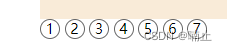
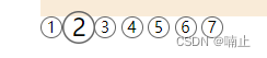
分页按钮放缩
            <ul>
                <li>1</li>
                <li>2</li>
                <li>3</li>
                <li>4</li>
                <li>5</li>
                <li>6</li>
                <li>7</li>
            </ul>
        li{
            list-style: none;
            float: left;
            height: 20px;
            width: 20px;
            border: 1px solid #666;
            border-radius: 20px;
            text-align: center;
            line-height: 20px;
            margin-right: 5px;
            transition: all 0.5s;
        }
        li:hover{
            transform: scale(1.5);
        }
3.4 综合
transform : translate(x,y)rotate(deg) scale()
        div{
            width: 300px;
            height: 300px;
            background-color: rebeccapurple;
            transition: all 0.5s;
        }
        div:hover{
            transform: translate(50%,50%) rotate(45deg) scale(1.5);
        }
    </styl
4.动画
- 定义动画
@keyframes name{
	0%{}|from{}
	100%{}|to{}
}
- 调用动画
div{
	animation-name: name;
	animation-duration: 5s;
}
        @keyframes move {
            0%{
                transform: translate(0,0);
            }
            25%{
                transform: translate(1280px,0);
            }
            50%{
                transform: translate(1280px,500px);
            }
            75%{
                transform: translate(0,500px);
            }
            100%{
                transform: translate(0,0);
            }
        }
        div{
            width: 300px;
            height: 300px;
            background-color: aqua;
            animation-name: move;
            animation-duration: 3s;
        }
4.1 动画相关的属性
animation-fill-mode 规定动画结束后状态 forward 保持状态 backwords 回到起始
animation-play-state 规定动画正在运行还是暂停 running paused
animation-iteration-count 规定播放次数 1 inifinite 无限次数播放
animation-timing-function: linear 匀速 ease 先慢后快

案例
    <div class="box">
        去去去去去去去去去去去
    </div>
        .box{
            height: 20px;
            width: 0;
            animation: speede 4s steps(11) forwards;
            background-color: aqua;
        }
        @keyframes speede {
            from{
                width: 0;
            }
            to{
                width: 200px;
            }
        }
5. 3D转换
3D位移 translate3d(x,y,z)
3D旋转 rotate3d(x,y,z)
透视:perspective
3D呈现 transform-style


 239
239


 被折叠的 条评论
为什么被折叠?
被折叠的 条评论
为什么被折叠?
 到【灌水乐园】发言


