


1、虚线平均温度
import matplotlib.pyplot as plt
import numpy as np
x = np.arange(4,19)
y_max = np.array([32,33,34,34,33,31,30,29,30,29,26,23,21,25,31])
y_min = np.array([19,19,20,22,22,21,22,16,18,18,17,14,15,16,16])
y_med = (y_max + y_min) /2
plt.plot(x,y_med,'r--')
plt.plot(x,y_max)
plt.plot(x,y_min)
plt.show()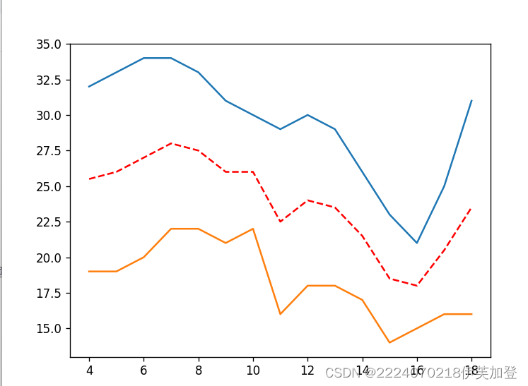 2、柱形图
2、柱形图
import matplotlib.pyplot as plt
import numpy as np

x = np.arange(5)
yl = np.array([10,8,7,11,13])
y2 = np.array([9,6,5,10,12])

bar_width = 0.3

plt.bar(x,yl, tick_label=['a','b','c','d','e'], width=bar_width)
plt.bar(x+bar_width, y2, width=bar_width)


plt.show()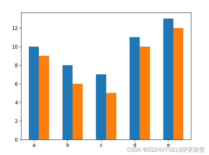
3、带误差棒的堆积柱形图
import matplotlib.pyplot as plt
import numpy as np

x = np.arange(5)
yl = np.array([10,8,7,11,13])
y2 = np.array([9,6,5,10,12])

bar_width = 0.3
erroe = [2,1,2.5,2,1.5]

plt.bar(x,yl, tick_label=['a','b','c','d','e'], width=bar_width)
plt.bar(x, y2, bottom=yl, width=bar_width, yerr=erroe)


plt.show()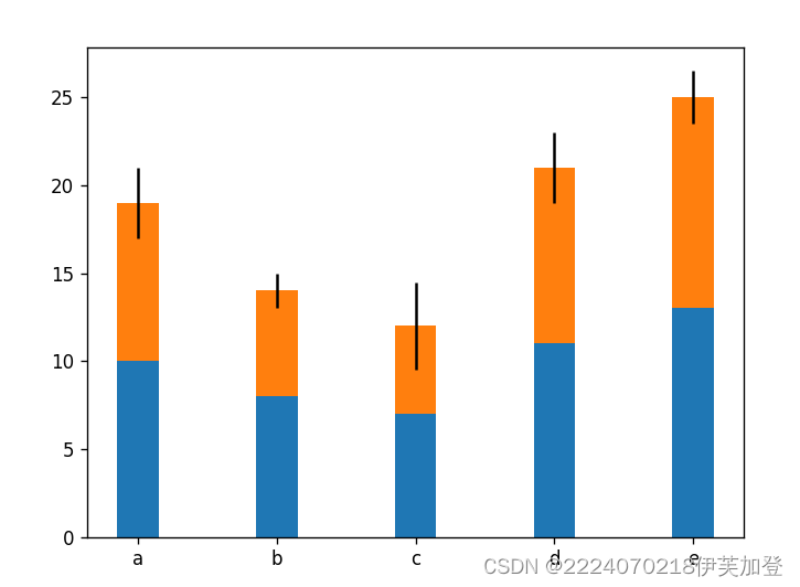
4、多组条形图
import matplotlib.pyplot as plt
import numpy as np

y = np.arange(5)
xl = np.array([10,8,7,11,13])
x2 = np.array([9,6,5,10,12])

bar_height = 0.3

plt.barh(y,xl, tick_label=['a','b','c','d','e'], height=bar_height)
plt.barh(y+bar_height, x2, height=bar_height)


plt.show() 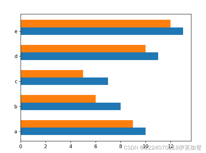
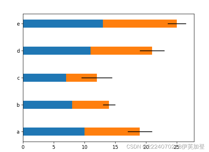
5、带误差棒的条形图
import matplotlib.pyplot as plt
import numpy as np

y = np.arange(5)
xl = np.array([10,8,7,11,13])
x2 = np.array([9,6,5,10,12])

bar_height = 0.3
erroe = [2,1,2.5,2,1.5]

plt.barh(y,xl, tick_label=['a','b','c','d','e'], height=bar_height)
plt.barh(y, x2, left=xl, height=bar_height, xerr=erroe)


plt.show()
6、堆积面积图
import matplotlib.pyplot as plt
import numpy as np


x = np.arange(6)
y1 = np.array([1,4,3,5,6,7])
y2 = np.array([1,3,4,2,7,6])
y3 = np.array([3,4,3,6,5,5])


plt.stackplot(x,y1,y2,y3)

plt.show()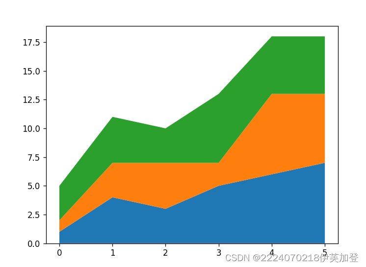
7、中文代码
plt.rcParams['font.sans-serif'] = ['SimHei']
plt.rcParams['axes.unicode_minus'] = False


 1250
1250


 被折叠的 条评论
为什么被折叠?
被折叠的 条评论
为什么被折叠?
 到【灌水乐园】发言


