


一. 简述
clip-path CSS 属性可以创建一个只有元素的部分区域可以显示的剪切区域(不改变这个裁剪区域在整张图中的位置),区域内的部分显示,区域外的隐藏。clip-path属性代替了现在已经弃用的剪切 clip属性。clip-path的属性值可以是以下几种:
- clip-path属性值为inset;
inset是将元素剪切为一个矩形,如clip-path:inset(10px),括号内的值类似于margin、padding值的写法,可以写一个值,也可以写多个值。 - clip-path属性值为circle;
circle是将元素剪切为一个圆形,如clip-path: circle(100px at 50% 50%),100px表示圆的直径,50% 50%表示圆心。 - clip-path属性值为ellipse;
circle是将元素剪切为一个椭形,如ellipse(150px 100px at 50% 50%),150px 表示椭圆的水平半径,100px表示椭圆的垂直半径,50% 50%表示圆心。 - …
clip-path还可以有多种,如polygon、path、svg等。更多参考:clip-path;
二. 例子
例如: 绘制三角形
.main {
			width: 60px;
			height: 60px;
			background: red;
			clip-path: polygon(50% 0,0 100%, 100% 100%);
		}

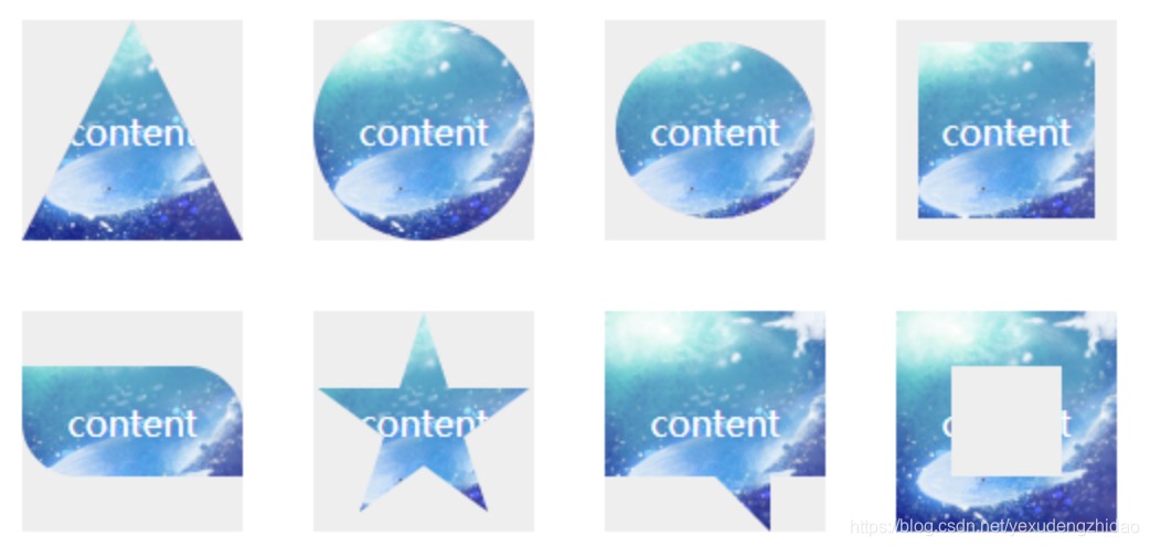
当然,我们还可以借助clip-path生成器来获取更多更好玩的裁剪图形,如下图:
三. clip-path过渡动画
clip-path 另外一个强大之处在于可以进行 CSS transtion 与 CSS animation配合使用
例:多边形图形动画
<!DOCTYPE html>
<html lang="en">
    <head>
        <meta charset="utf-8">
            <title>
                clip-path动画-多边形
            </title>
            <style>
                .polygon-animate {
				    position: absolute;
				    width: 200px;
				    height: 200px;
				    top: 50%;
				    left: 50%;
				    transform: translate(-50%, -50%);
				    background-color: crimson;
				    animation: polygon-ani 5s linear infinite;
				}
				@keyframes polygon-ani {
					0% {
						clip-path: polygon(
				        50% 0%,
				        0% 100%,
				        100% 100%,
				        100% 100%,
				        100% 100%,
				        100% 100%,
				        100% 100%,
				        100% 100%,
				        100% 100%
				    );
					}
				    20% {
				        background-color: darkorange;
				        clip-path: polygon(
				            50% 0%,
				            100% 50%,
				            50% 100%,
				            0% 50%,
				            0% 50%,
				            0% 50%,
				            0% 50%,
				            0% 50%,
				            0% 50%
				        );
				    }
				    40% {
				        clip-path: polygon(
				            50% 0%,
				            100% 38%,
				            82% 100%,
				            18% 100%,
				            0% 38%,
				            0% 38%,
				            0% 38%,
				            0% 38%,
				            0% 38%
				        );
				    }
				    60% {
				        background-color: lemonchiffon;
				        clip-path: polygon(
				            50% 0%,
				            100% 25%,
				            100% 75%,
				            50% 100%,
				            0% 75%,
				            0% 25%,
				            0% 25%,
				            0% 25%,
				            0% 25%
				        );
				    }
				    80%,100% {
				        clip-path: polygon(
				            50% 0%,
				            90% 20%,
				            100% 60%,
				            75% 100%,
				            25% 100%,
				            0% 60%,
				            10% 20%,
				            10% 20%,
				            10% 20%
				        );
				    }
				}
            </style>
        </meta>
    </head>
    <body>
        <div class="polygon-animate">
        </div>
    </body>
</html>

例如:图形变换动画
<!DOCTYPE doctype html>
<html lang="en">
    <head>
        <meta charset="utf-8">
            <title>
                clip-path
            </title>
            <style type="text/css">
                .triangle2rect {
				    position: absolute;
				    width: 100px;
				    height: 100px;
				    top: 50%;
				    left: 50%;
				    transform: translate(-50%, -50%);
				    animation: aniContainer 2s infinite alternate;
				}
				.triangle2rect div {
				    position: absolute;
				    top: 0;
				    left: 0;
				    width: 100%;
				    height: 100%;
				}
				.a {
				    background: #cccccc;
				    clip-path: polygon(0% 0%, 0% 100%, 50% 50%);
				    animation: a 2s infinite alternate;
				}
				.b {
				    background: #9999cc;
				    clip-path: polygon(0% 0%, 100% 0%, 50% 50%);
				    animation: b 2s infinite alternate;
				}
				.c {
				    background: #99cccc;
				    clip-path: polygon(100% 0%, 100% 100%, 50% 50%);
				    animation: c 2s infinite alternate;
				}
				.d {
				    background: #99cccc;
				    clip-path: polygon(100% 100%, 0% 100%, 50% 50%);
				    animation: d 2s infinite alternate;
				}
				@keyframes a {
				    0%, 10% {
				        background: #99cccc;
				        clip-path: polygon(0% 0%, 0% 100%, 50% 50%);
				    }
				    90%, 100% {
				        background: #000;
				        clip-path: polygon(0% 100%, 25% 100%, 12.5% 0%);
				    }
				}
				@keyframes b {
				    0%, 10% {
				        background: #99cccc;
				        clip-path: polygon(0% 0%, 100% 0%, 50% 50%);
				    }
				    90%, 100% {
				        background: #000;
				        clip-path: polygon(25% 0%, 50% 0%, 37.5% 100%);
				    }
				}
				@keyframes c {
				    0%, 10% {
				        background: #99cccc;
				        clip-path: polygon(100% 0%, 100% 100%, 50% 50%);
				    }
				    90%, 100% {
				        background: #000;
				        clip-path: polygon(62.5% 0%, 75% 100%, 50% 100%);
				    }
				}
				@keyframes d {
				    0%, 10% {
				        background: #99cccc;
				        clip-path: polygon(100% 100%, 0% 100%, 50% 50%);
				    }
				    90%, 100% {
				        background: #000;
				        clip-path: polygon(100% 0%, 87.5% 100%, 75% 0%);
				    }
				}
				@keyframes aniContainer {
				    0%, 10% {
				        width: 100px;
				        height: 100px;
				    }
				    90%, 100% {
				        width: 250px;
				        height: 60px;
				    }
				}
            </style>
        </meta>
    </head>
    <body>
        <div class="triangle2rect">
            <div class="a">
            </div>
            <div class="b">
            </div>
            <div class="c">
            </div>
            <div class="d">
            </div>
        </div>
    </body>
</html>

四. clip-path 动画的局限
clip-path 动画虽然美好,但是存在一定的局限性,那就是进行过渡的两个状态,坐标顶点的数量必须一致。也就是如果我希望从三角形过渡到矩形。假设三角形和矩形的 clip-path 分别为:
三角形:clip-path: polygon(50% 0, 0 100%, 100% 0)
矩形: clip-path: polygon(0 0, 100% 0, 100% 100%, 0 100%)
进行过渡动画时候,直接从 polygon(50% 0, 0 100%, 100% 0) --> polygon(0 0, 100% 0, 100% 100%, 0 100%) 是不行的,因为是从 3 个坐标点变换到 4 个坐标点。
因此这里需要这用一个讨巧的办法,在三角形的表示方法中,使用四个坐标点表示,其中两个坐标点进行重合即可。也就是:
三角形:clip-path: polygon(50% 0, 0 100%, 100% 0) -> clip-path: polygon(50% 0, 50% 0, 0 100%, 100% 0)


 1108
1108


 被折叠的 条评论
为什么被折叠?
被折叠的 条评论
为什么被折叠?
 到【灌水乐园】发言


