


1.CSS的盒子模型
按照我的理解就是网页的模块化设计。当想要修改网页的一些布局的时候,就不用去改html代码了,只需要修改css代码即可
(1)边框
示例
<html>
    <head>
        <meta http-equiv="Content-Type" content="text/html; charset=utf-8" />
        <title>
            hello world
        </title>
        <style>
            div{
                width: 300px;
                height: 100px;

                border: 2px solid blue;
            }
            #a2{
                border-top: 2px solid yellow;
                border-left: 2px dashed red;
                border-bottom: 2px dashed green;
                border-right: 2px dashed gray;
            }
        </style>
    </head>
    <body>
        <div id="a1">世界上没有奇迹,有的只是必然和偶然,还有谁做了什么</div>
        <div id="a2">世界上没有奇迹,有的只是必然和偶然,还有谁做了什么</div>
        <div id="a3">世界上没有奇迹,有的只是必然和偶然,还有谁做了什么</div>
    </body>
</html>
显示效果
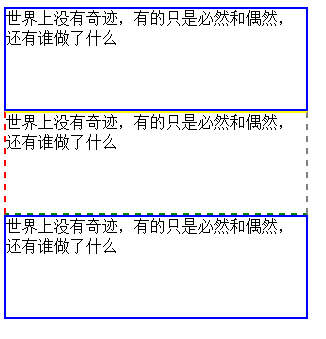
当使用边框时,可以将所有边框一起定义,也可以通过选择器来定义单个边框;
边框中的一些属性
width边框的宽度
hight边框的高度
border用来设置边框的线条粗细,线条风格(上面使用到的solid实心线,dashed虚线),和线条颜色;总共3个变量
当直接使用border来设置的时候,将会同时设置边框的4条边。
也可以使用border-top,border-left,border-right,border-bottom来分别设置条边。使用方法和border一样
(2)内边距
示例
<html>
    <head>
        <meta http-equiv="Content-Type" content="text/html; charset=utf-8" />
        <title>
            hello world
        </title>
        <style>
            div{
                width: 300px;
                height: 100px;

                border: 2px solid blue;
            }
            #a2{
                border-top: 2px solid yellow;
                border-left: 2px dashed red;
                border-bottom: 2px dashed green;
                border-right: 2px dashed gray;
            }
            #a3{
                padding: 20px;
            }
        </style>
    </head>
    <body>
        <div id="a1">世界上没有奇迹,有的只是必然和偶然,还有谁做了什么</div>
        <div id="a2">世界上没有奇迹,有的只是必然和偶然,还有谁做了什么</div>
        <div id="a3">世界上没有奇迹,有的只是必然和偶然,还有谁做了什么</div>
    </body>
</html>
具体改变看head->style中的#a3项
具体效果
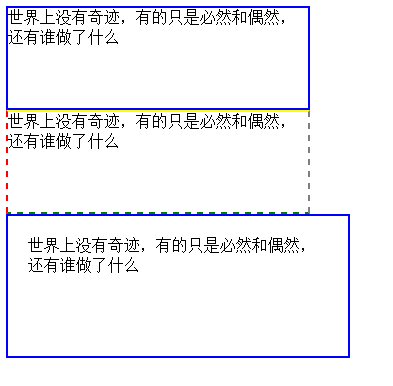
可以看到第三个边框内的文字都距离边框有一段距离(20px),不像前2个边框那样文字贴着边框了。
当然,如果直接使用padding的话就会同时设置4条边;也可以使用padding-top,padding-left,padding-right,padding-bottom来设置每一条边。
(3)外边距
其实和内边距的性质是一样的
示例
<html>
    <head>
        <meta http-equiv="Content-Type" content="text/html; charset=utf-8" />
        <title>
            hello world
        </title>
        <style>
            div{
                width: 300px;
                height: 100px;

                border: 2px solid blue;
            }
            #a2{
                border-top: 2px solid yellow;
                border-left: 2px dashed red;
                border-bottom: 2px dashed green;
                border-right: 2px dashed gray;

                margin: 40px;
            }
            #a3{
                padding: 20px;
            }
        </style>
    </head>
    <body>
        <div id="a1">世界上没有奇迹,有的只是必然和偶然,还有谁做了什么</div>
        <div id="a2">世界上没有奇迹,有的只是必然和偶然,还有谁做了什么</div>
        <div id="a3">世界上没有奇迹,有的只是必然和偶然,还有谁做了什么</div>
    </body>
</html>
具体改变看head->style中的#a2项的下面部分
网页效果
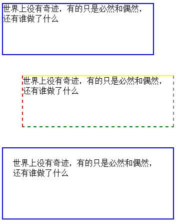
可以看到边框2和原来的相比,和其他边框间出现了一些距离(40px)
同样的,margin可以同时设置4条边;也可以使用top,left,right,bottom来分别设置4条边。
2.CSS的布局
盒子模型可以说是CSS布局的基础和核心。
(1)CSS的布局漂移
示例
<html>
    <head>
        <meta http-equiv="Content-Type" content="text/html; charset=utf-8" />
        <title>
            hello world
        </title>
        <style>
            div{
                width: 300px;
                height: 100px;

                border: 2px solid blue;
            }
            #a1{
                float: left;
            }
        </style>
    </head>
    <body>
        <div id="a1">世界上没有奇迹,有的只是必然和偶然,还有谁做了什么</div>
        <div id="a2">世界上没有奇迹,有的只是必然和偶然,还有谁做了什么</div>
        <div id="a3">世界上没有奇迹,有的只是必然和偶然,还有谁做了什么</div>
    </body>
</html>
float属性,有3个可选变量none,left,right。
none为默认
left为将文本刘移动到对象的右边(没错就是右边,简单来说就是将你当前设置这个属性的对象的 后一个对象移到当前对象的右边)
right和left方向相反
很像java中的流式布局,然而对象的位置太难固定,所以这种方法一般是不会用的
(2)CSS布局定位
position属性可取值
static默认值,无特殊定位,按照html定位规则
absolute:将对象从文档流中拖出,使用left,right,top,bottom等属性相对于其进行绝对定位
relative:对象不可重叠,使用left,right,top,bottom属性来偏移位置
示例1(absolute)
<html>
<head>
<meta http-equiv="Content-Type" content="text/html; charset=utf-8" />
<title>
hello world
</title>
<style>
div{
width: 300px;
height: 100px;
border: 2px solid blue;
}
#a1{
background-color: red;
position: absolute;
}
#a2{
background-color: green;
width: 350px;
}
#a3{
background-color: blue;
}
</style>
</head>
<body>
<div id="a1">世界上没有奇迹,有的只是必然和偶然,还有谁做了什么</div>
<div id="a2">世界上没有奇迹,有的只是必然和偶然,还有谁做了什么</div>
<div id="a3">世界上没有奇迹,有的只是必然和偶然,还有谁做了什么</div>
</body>
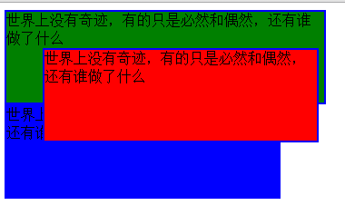
</html>为了使得效果更加直观,所以这里把第二个边框的宽度改为了350px;
页面效果如下
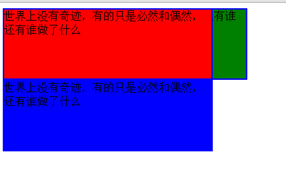
边框一就像是悬浮在了边框2之上,是的,使用absolute值之后,对象就会像是悬浮在页面上,能够把其下的对象遮挡掉。同时,由于边框一不在原来的层面了,所以位置空了出来,边框2就向上移动了一格
示例2(absolute)
<html>
<head>
<meta http-equiv="Content-Type" content="text/html; charset=utf-8" />
<title>
hello world
</title>
<style>
div{
width: 300px;
height: 100px;
border: 2px solid blue;
}
#a1{
background-color: red;
position: absolute;
top: 50px;
left: 50px;
}
#a2{
background-color: green;
width: 350px;
}
#a3{
background-color: blue;
}
</style>
</head>
<body>
<div id="a1">世界上没有奇迹,有的只是必然和偶然,还有谁做了什么</div>
<div id="a2">世界上没有奇迹,有的只是必然和偶然,还有谁做了什么</div>
<div id="a3">世界上没有奇迹,有的只是必然和偶然,还有谁做了什么</div>
</body>
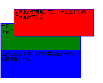
</html>效果如下
这样漂浮的感觉就更加直观了。简单来说,边框一就像是脱离了原来的层次,进入了一个更高的层次
示例3(relative)
<html>
    <head>
        <meta http-equiv="Content-Type" content="text/html; charset=utf-8" />
        <title>
            hello world
        </title>
        <style>
            div{
                width: 300px;
                height: 100px;

                border: 2px solid blue;
            }
            #a1{
                background-color: red;
                position: relative;

                top: 50px;
                left: 50px;
            }
            #a2{
                background-color: green;
            }
            #a3{
                background-color: blue;
            }
        </style>
    </head>
    <body>
        <div id="a1">世界上没有奇迹,有的只是必然和偶然,还有谁做了什么</div>
        <div id="a2">世界上没有奇迹,有的只是必然和偶然,还有谁做了什么</div>
        <div id="a3">世界上没有奇迹,有的只是必然和偶然,还有谁做了什么</div>
    </body>
</html>
显示效果
可以看到其和absolute的区别,对象还是会留在原来的层次,但是可以改变位置


 863
863


 被折叠的 条评论
为什么被折叠?
被折叠的 条评论
为什么被折叠?
 到【灌水乐园】发言


