


1、新建shape文件
首先在res/drawable文件夹下,新建一个文件,命名为:shape_radius.xml
内容是这样的:(先不需要理解,先看shape怎么用)
- <?xml version="1.0" encoding="utf-8"?>
- <shape xmlns:android="http://schemas.android.com/apk/res/android" >
- <corners android:radius="20dip"/>
- <solid android:color="#ff00ff"/>
- </shape>
2、添加到控件中
在定义好shape文件后,下一步就是将其添加到控件中,添加到控件中,一般是使用设置background属性,将其为控件背景,下面,我们将其设置为MainActivity对应的布局中(activity_main.xml),将其设为TextView的背景,看显示出来 是什么样子的。
- <RelativeLayout xmlns:android="http://schemas.android.com/apk/res/android"
- xmlns:tools="http://schemas.android.com/tools"
- android:layout_width="match_parent"
- android:layout_height="match_parent"
- tools:context="com.harvic.tryshape.MainActivity" >
- <TextView
- android:layout_width="wrap_content"
- android:layout_height="wrap_content"
- android:layout_margin="50dip"
- android:text="@string/hello_world"
- android:background="@drawable/shape_radius"/>
- </RelativeLayout>
shape里的属性
3、Corners
- <corners //定义圆角
- android:radius="dimension" //全部的圆角半径
- android:topLeftRadius="dimension" //左上角的圆角半径
- android:topRightRadius="dimension" //右上角的圆角半径
- android:bottomLeftRadius="dimension" //左下角的圆角半径
- android:bottomRightRadius="dimension" /> //右下角的圆角半径
<corners    //定义圆角
    android:radius="dimension"      //全部的圆角半径
    android:topLeftRadius="dimension"   //左上角的圆角半径
    android:topRightRadius="dimension"  //右上角的圆角半径
    android:bottomLeftRadius="dimension"    //左下角的圆角半径
    android:bottomRightRadius="dimension" />    //右下角的圆角半径
Corners标签是用来字义圆角的,其中radius与其它四个并不能共同使用。
android:radius:定义四个角的的圆角半径。
其它四个是逐个字义每个角的圆角半径。
实例:
- <?xml version="1.0" encoding="utf-8"?>
- <shape xmlns:android="http://schemas.android.com/apk/res/android" >
- <corners android:radius="20dip"/>
- <solid android:color="#ffff00"/>
- </shape>
2、solid
solid用以指定内部填充色
只有一个属性:
- <solid android:color="color" />
<solid android:color="color" /> 在上面的例子中,我们就将填充色指定为#ffff00了,如果我们不加圆角,只使用填充色,即将shape变成这样子:
- <?xml version="1.0" encoding="utf-8"?>
- <shape xmlns:android="http://schemas.android.com/apk/res/android" >
- <solid android:color="#ffff00"/>
- </shape>
3、gradient
gradient用以定义渐变色,可以定义两色渐变和三色渐变,及渐变样式,它的属性有下面几个:
- <gradient
- android:type=["linear" | "radial" | "sweep"] //共有3中渐变类型,线性渐变(默认)/放射渐变/扫描式渐变
- android:angle="integer" //渐变角度,必须为45的倍数,0为从左到右,90为从上到下
- android:centerX="float" //渐变中心X的相当位置,范围为0~1
- android:centerY="float" //渐变中心Y的相当位置,范围为0~1
- android:startColor="color" //渐变开始点的颜色
- android:centerColor="color" //渐变中间点的颜色,在开始与结束点之间
- android:endColor="color" //渐变结束点的颜色
- android:gradientRadius="float" //渐变的半径,只有当渐变类型为radial时才能使用
- android:useLevel=["true" | "false"] /> //使用LevelListDrawable时就要设置为true。设为false时才有渐变效果
<gradient
    android:type=["linear" | "radial" | "sweep"]    //共有3中渐变类型,线性渐变(默认)/放射渐变/扫描式渐变
    android:angle="integer"     //渐变角度,必须为45的倍数,0为从左到右,90为从上到下
    android:centerX="float"     //渐变中心X的相当位置,范围为0~1
    android:centerY="float"     //渐变中心Y的相当位置,范围为0~1
    android:startColor="color"   //渐变开始点的颜色
    android:centerColor="color"  //渐变中间点的颜色,在开始与结束点之间
    android:endColor="color"    //渐变结束点的颜色
    android:gradientRadius="float"  //渐变的半径,只有当渐变类型为radial时才能使用
    android:useLevel=["true" | "false"] />  //使用LevelListDrawable时就要设置为true。设为false时才有渐变效果
首先有三种渐变类型,分别是:linear(线性渐变)、radial(放射性渐变)、sweep(扫描式渐变)
(1)先看看这几个属性的使用方法:
- android:type=["linear" | "radial" | "sweep"]
- android:startColor="color" //渐变开始点的颜色
- android:centerColor="color" //渐变中间点的颜色,在开始与结束点之间
- android:endColor="color" //渐变结束点的颜色
- android:gradientRadius="float" //渐变的半径,只有当渐变类型为radial时才能使用
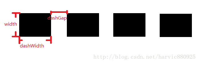
4、stroke
这是描边属性,可以定义描边的宽度,颜色,虚实线等
- <stroke
- android:width="dimension" //描边的宽度
- android:color="color" //描边的颜色
- // 以下两个属性设置虚线
- android:dashWidth="dimension" //虚线的宽度,值为0时是实线
- android:dashGap="dimension" /> //虚线的间隔
<stroke
    android:width="dimension"   //描边的宽度
    android:color="color"   //描边的颜色
    // 以下两个属性设置虚线
    android:dashWidth="dimension"   //虚线的宽度,值为0时是实线
    android:dashGap="dimension" />      //虚线的间隔
上面各个属性的意义如下:
5、size和padding
这两个基本上不怎么用,因为他们所具有的功能,控件本身也能实现。 size:是用来定义图形的大小的。
- <size
- android:width="dimension"
- android:height="dimension" />
<size
    android:width="dimension"
    android:height="dimension" />
padding:用来定义内部边距
- <padding
- android:left="dimension"
- android:top="dimension"
- android:right="dimension"
- android:bottom="dimension" />
三、Shape的属性(rectangle、oval、line、ring)
我们使用的形状,当我们不指定shape属性时,默认就是矩形的。
shape代码:
- <?xml version="1.0" encoding="utf-8"?>
- <shape xmlns:android="http://schemas.android.com/apk/res/android"
- android:shape="rectangle">
- <solid android:color="#ff00ff"/>
- </shape>
2、oval(椭圆)
3、line(线形)
4、ring(环形)
- android:innerRadius 尺寸,内环的半径。
- android:thickness 尺寸,环的厚度
- android:innerRadiusRatio 浮点型,以环的宽度比率来表示内环的半径,
- 例如,如果android:innerRadiusRatio,表示内环半径等于环的宽度除以5,这个值是可以被覆盖的,默认为9.
- android:thicknessRatio 浮点型,以环的宽度比率来表示环的厚度,例如,如果android:thicknessRatio="2",
- 那么环的厚度就等于环的宽度除以2。这个值是可以被android:thickness覆盖的,默认值是3.
- android:useLevel boolean值,如果当做是LevelListDrawable使用时值为true,否则为false.
详情请看
http://www.cnblogs.com/MianActivity/p/5867776.html


 扫一扫
扫一扫


 322
322

 被折叠的 条评论
为什么被折叠?
被折叠的 条评论
为什么被折叠?
 到【灌水乐园】发言


