Android 基础知识4-3.7 ProgressBar(进度条)详解

一、简介

        ProgressBar(进度条)是UI界面中一种非常实用的组件,通常用于向用户像是某个耗时操作完成的百分比。进度条可动态地显示进度,因此避免长时间地执行某个操作时,让用户感觉程序失去了响应,从而更好地提高用户界面的友好性。也是为数不多的直接继承于View类的控件,直接子类有AbsSeekBar和ContentLoadingProgressBar,其中AbsSeekBar的子类有SeekBar和RatingBar。

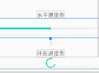
        Android系统提供了两大类进度条样式,长形进度条(progressBarStyleHorizontal)和圆形进度条(progressBarStyleLarge)如图所示:几乎所有的花样的进度条都主要为这两种类型。

在这里插入图片描述

 二、常用属性和方法

属性名 含义
style 设置进度条的风格
max 设置该进度条的最大值
maxHeight 进度Widget最大高
miniHeight 进度Widget最小高
maxWidth 进度Widget最大宽
minWidth 进度Widget最小宽
progress 设置该进度条的已完成进度值
progressDrawable 自定义drawable显示
indeteminateDrawable 设置绘制不显示进度的进度条的Drawable对象
indeterminate 该属性设为true,设置进度条不精确显示进度
indeteminateDuration 设置不精确显示进度的持续时间
secondaryProgress 定义二级进度值,值介于0到max。该进度在主进度和背景之间。比如用于网络播放视频时,二级进度用于表示缓冲进度,主进度用于表示播放进度。
interpolator 设置动画速度
indeterminateBehavior 定义当进度达到最大时,不确定模式的表现;该值必须为repeat或者cycle,repeat表示进度从0重新开始;cycle表示进度保持当前值,并且回到0

2.1、style属性:

  • @android:
  • 0
    点赞
  • 7
    收藏
    觉得还不错? 一键收藏
  • 打赏
    打赏
  • 1
    评论
实现圆弧进度条的自定义ProgressBar,可以使用Canvas和Paint来绘制。 首先,创建一个自定义的ProgressBar类,继承自ProgressBar类,并实现构造方法和onDraw方法: ``` public class CircleProgressBar extends ProgressBar { private Paint paint; // 画笔 private int roundColor; // 圆环颜色 private int progressColor; // 进度条颜色 private int textColor; // 文字颜色 private float textSize; // 文字大小 private float roundWidth; // 圆环宽度 private int max; // 最大进度 private boolean textIsDisplayable; // 是否显示进度文字 private int style; // 进度条样式 public static final int STROKE = 0; public static final int FILL = 1; public CircleProgressBar(Context context) { this(context, null); } public CircleProgressBar(Context context, AttributeSet attrs) { this(context, attrs, 0); } public CircleProgressBar(Context context, AttributeSet attrs, int defStyle) { super(context, attrs, defStyle); // 获取自定义属性的值 TypedArray mTypedArray = context.obtainStyledAttributes(attrs, R.styleable.CircleProgressBar); roundColor = mTypedArray.getColor(R.styleable.CircleProgressBar_roundColor, Color.RED); progressColor = mTypedArray.getColor(R.styleable.CircleProgressBar_progressColor, Color.GREEN); textColor = mTypedArray.getColor(R.styleable.CircleProgressBar_textColor, Color.GREEN); textSize = mTypedArray.getDimension(R.styleable.CircleProgressBar_textSize, 15); roundWidth = mTypedArray.getDimension(R.styleable.CircleProgressBar_roundWidth, 5); max = mTypedArray.getInteger(R.styleable.CircleProgressBar_max, 100); textIsDisplayable = mTypedArray.getBoolean(R.styleable.CircleProgressBar_textIsDisplayable, true); style = mTypedArray.getInt(R.styleable.CircleProgressBar_style, 0); mTypedArray.recycle(); // 初始化画笔 paint = new Paint(); } @Override protected synchronized void onDraw(Canvas canvas) { super.onDraw(canvas); // 获取圆心坐标和半径 int centerX = getWidth() / 2; int centerY = getHeight() / 2; int radius = (int) (centerX - roundWidth / 2); // 绘制圆环 paint.setColor(roundColor); paint.setStyle(Paint.Style.STROKE); paint.setStrokeWidth(roundWidth); paint.setAntiAlias(true); canvas.drawCircle(centerX, centerY, radius, paint); // 绘制进度条 paint.setStrokeWidth(roundWidth); paint.setColor(progressColor); RectF oval = new RectF(centerX - radius, centerY - radius, centerX + radius, centerY + radius); switch (style) { case STROKE: paint.setStyle(Paint.Style.STROKE); canvas.drawArc(oval, 0, 360 * getProgress() / getMax(), false, paint); break; case FILL: paint.setStyle(Paint.Style.FILL_AND_STROKE); if (getProgress() != 0) canvas.drawArc(oval, 0, 360 * getProgress() / getMax(), true, paint); break; } // 绘制文字 paint.setStrokeWidth(0); paint.setColor(textColor); paint.setTextSize(textSize); paint.setTypeface(Typeface.DEFAULT_BOLD); int percent = (int) (((float) getProgress() / (float) getMax()) * 100); if (textIsDisplayable && percent >= 0) { String text = percent + "%"; float textWidth = paint.measureText(text); canvas.drawText(text, centerX - textWidth / 2, centerY + textSize / 2, paint); } } } ``` 在这个类中,我们定义了几个自定义属性,包括圆环颜色、进度条颜色、文字颜色、文字大小、圆环宽度、最大进度、是否显示进度文字、进度条样式等。在构造方法中,我们获取了这些属性的值,并初始化了画笔。在onDraw方法中,我们首先获取了圆心坐标和半径,然后使用画笔绘制了圆环和进度条,最后绘制了进度文字。 接下来,在布局文件中使用这个自定义ProgressBar: ``` <com.example.circleprogressbar.CircleProgressBar android:id="@+id/circle_progressbar" android:layout_width="wrap_content" android:layout_height="wrap_content" android:layout_centerInParent="true" app:roundColor="#cccccc" app:roundWidth="5dp" app:progressColor="#FF4081" app:textColor="#FF4081" app:textSize="20sp" app:textIsDisplayable="true" app:style="STROKE" /> ``` 最后,在Java代码中设置进度值即可: ``` CircleProgressBar circleProgressBar = findViewById(R.id.circle_progressbar); circleProgressBar.setProgress(50); // 设置进度为50% ``` 这样就完成了自定义的圆弧进度条的实现。

“相关推荐”对你有帮助么?

  • 非常没帮助
  • 没帮助
  • 一般
  • 有帮助
  • 非常有帮助
提交
评论 1
添加红包

请填写红包祝福语或标题

红包个数最小为10个

红包金额最低5元

当前余额3.43前往充值 >
需支付:10.00
成就一亿技术人!
领取后你会自动成为博主和红包主的粉丝 规则
hope_wisdom
发出的红包

打赏作者

yyxhzdm

你的鼓励是我创作的最大动力!!

¥1 ¥2 ¥4 ¥6 ¥10 ¥20
扫码支付:¥1
获取中
扫码支付

您的余额不足,请更换扫码支付或充值

打赏作者

实付
使用余额支付
点击重新获取
扫码支付
钱包余额 0

抵扣说明:

1.余额是钱包充值的虚拟货币,按照1:1的比例进行支付金额的抵扣。
2.余额无法直接购买下载,可以购买VIP、付费专栏及课程。

余额充值