


1、WPF简介
WPF(Windows Presentation Foundation)是微软的一个用户界面框架,用于创建 Windows 桌面应用程序。它是 .NET Framework 的一部分,并且可与 C#、VB.NET、C++/CLI 等编程语言一起使用。
WPF 使用 XAML(Extensible Application Markup Language)来定义用户界面,可以创建各种元素,如窗口、按钮、文本框、图像等。它还提供了许多高级功能,如动画、数据绑定、样式和模板等,使得创建富客户端应用程序变得更加容易和灵活。
WPF 还支持 2D 和 3D 图形渲染,可用于创建各种视觉效果和交互式体验。它具有优秀的分辨率独立性和可扩展性,可以在不同大小和分辨率的屏幕上提供相同的用户体验。
总之,WPF 是一个强大的用户界面框架,为开发人员提供了许多工具和功能,以创建漂亮、交互式的 Windows 应用程序。
2、WPF控件
WPF(Windows Presentation Foundation)控件是用于构建用户界面的基本元素,类似于 WinForms 中的控件或者 Web 开发中的 HTML 标签。在 WPF 中,控件是一种特殊的 UI 元素,可以响应用户交互、显示数据、布局和格式化内容等。
WPF控件可以分为布局控件、内容控件、条目控件、特殊控件等,下面为详细介绍和分类。
2.1 布局控件(Panel Controls)

(1)Grid(网格):Grid 是一个二维表格布局控件,可以将子控件放置在行和列的交叉点上,通过行和列定义来控制布局。
<Window x:Class="wpf_learn07.MainWindow"
        xmlns="http://schemas.microsoft.com/winfx/2006/xaml/presentation"
        xmlns:x="http://schemas.microsoft.com/winfx/2006/xaml"
        xmlns:d="http://schemas.microsoft.com/expression/blend/2008"
        xmlns:mc="http://schemas.openxmlformats.org/markup-compatibility/2006"
        xmlns:local="clr-namespace:wpf_learn07"
        mc:Ignorable="d"
        Title="MainWindow" Height="450" Width="800">
    <Grid ShowGridLines="True">
        <Grid.RowDefinitions>
            <RowDefinition></RowDefinition>
            <RowDefinition></RowDefinition>
        </Grid.RowDefinitions>
        <Grid.ColumnDefinitions>
            <ColumnDefinition Width="Auto"></ColumnDefinition>
            <ColumnDefinition Width="*"> </ColumnDefinition>
            <ColumnDefinition Width="2*"></ColumnDefinition>
        </Grid.ColumnDefinitions>
        <Button Content="LeftTop" Grid.Row="0" Grid.Column="0" Margin="3"/>
        <Button Content="CenterTop" Grid.Row="0" Grid.Column="1" Margin="32"/>
        <Button Content="RightTop" Grid.Row="0" Grid.Column="2" />
        <Button Content="LeftBottom" Grid.Row="1" Grid.Column="0" Margin="55" />

    </Grid>
</Window>

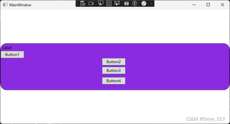
(2)StackPanel(堆栈面板):StackPanel 沿着一个方向(水平或垂直)依次排列子控件,可以按照添加的顺序进行布局。
<Window x:Class="wpf_learn05.MainWindow"
        xmlns="http://schemas.microsoft.com/winfx/2006/xaml/presentation"
        xmlns:x="http://schemas.microsoft.com/winfx/2006/xaml"
        xmlns:d="http://schemas.microsoft.com/expression/blend/2008"
        xmlns:mc="http://schemas.openxmlformats.org/markup-compatibility/2006"
        xmlns:local="clr-namespace:wpf_learn05"
        mc:Ignorable="d"
        Title="MainWindow" Height="404" Width="751">
    <Border BorderBrush="Black" BorderThickness="1" Height="150" Background="BlueViolet" CornerRadius="20">
    <StackPanel Name="StackPanel1" Orientation="Vertical" Margin="0,0,9,-43">
        <Label Content="Label" Height="23" Width="75" Name="Label1" HorizontalAlignment="Left"/>
        <Button Content="Button1" Height="23" Width="75" Name="button1" HorizontalAlignment="Left"/>
        <Button Content="Button2" Height="23" Width="75" Name="button2" VerticalAlignment="Center"/>
        <Button Content="Button3" Height="23" Width="75" Name="button3" Margin="10,5,10,10"/>
        <Button Content="Button4" Height="23" Width="75" Name="button4"/>
    </StackPanel>
    </Border>

</Window>
(3)WrapPanel(自动换行面板):WrapPanel 类似于 StackPanel,但会在空间不足时自动换行。
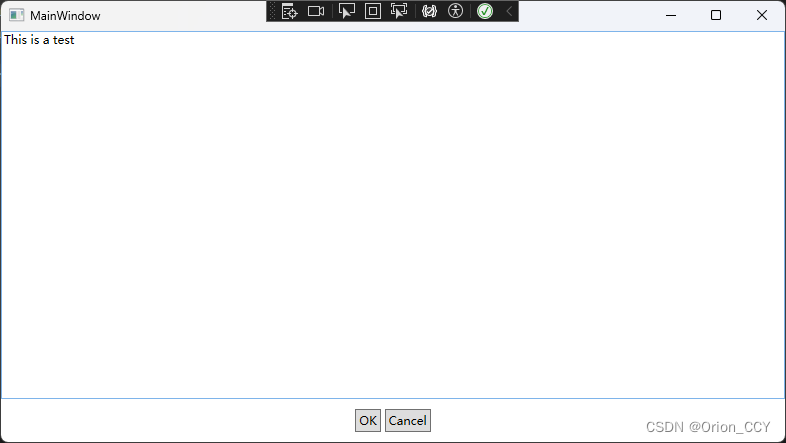
(4)DockPanel(停靠面板):DockPanel 将子控件停靠在面板的四个边缘或中央位置,可以根据需要设置停靠顺序。
<Window x:Class="wpf_learn06.MainWindow"
        xmlns="http://schemas.microsoft.com/winfx/2006/xaml/presentation"
        xmlns:x="http://schemas.microsoft.com/winfx/2006/xaml"
        xmlns:d="http://schemas.microsoft.com/expression/blend/2008"
        xmlns:mc="http://schemas.openxmlformats.org/markup-compatibility/2006"
        xmlns:local="clr-namespace:wpf_learn06"
        mc:Ignorable="d"
        Title="MainWindow" Height="450" Width="800">
    <DockPanel LastChildFill="True">
        <StackPanel DockPanel.Dock="Bottom" Orientation="Horizontal" HorizontalAlignment="Center">
            <Button Content="OK" Margin="10,10,2,10" Padding="3"/>
            <Button Content="Cancel" Margin="2,10,10,10" Padding="3"/>
        </StackPanel>
        <TextBox TextWrapping="Wrap" Text="This is a test" DockPanel.Dock="Top"/>
    </DockPanel>
</Window>
(5)Canvas(画布):Canvas 允许开发人员自由定位子控件的位置,可以使用绝对坐标或相对位置进行布局。
(6)UniformGrid(均匀网格):UniformGrid 将子控件实现均匀分布在网格中,可以指定行数和列数。
(7)WrapGrid(自动换行网格):WrapGrid 类似于 UniformGrid,但可以在空间不足时自动换行。
(8)GridSplitter(网格分隔器):GridSplitter 用于在 Grid 中创建可调整大小的区域,可用于实现用户可以调整大小的界面布局。
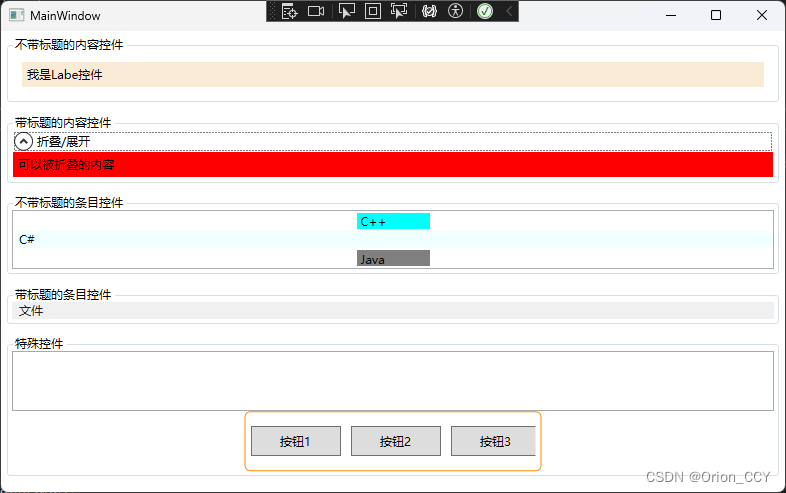
2.2 内容控件\条目控件\特殊控件

2.3 控件综合示例
<Window x:Class="wpf_learn06.MainWindow"
        xmlns="http://schemas.microsoft.com/winfx/2006/xaml/presentation"
        xmlns:x="http://schemas.microsoft.com/winfx/2006/xaml"
        xmlns:d="http://schemas.microsoft.com/expression/blend/2008"
        xmlns:mc="http://schemas.openxmlformats.org/markup-compatibility/2006"
        xmlns:local="clr-namespace:wpf_learn06"
        mc:Ignorable="d"
        Title="MainWindow" Height="500" Width="800">
    <StackPanel Margin="5">
        <GroupBox Header="不带标题的内容控件">
            <Label Content="我是Labe控件" Margin="10,10,10,10" Background="AntiqueWhite"/>
        </GroupBox>
        <GroupBox Header="带标题的内容控件" Margin="0,10,0,0">
            <Expander Header="折叠/展开">
                <Label Content="可以被折叠的内容" VerticalAlignment="Center" Background="Red"/>
            </Expander>
        </GroupBox>
        <GroupBox Header="不带标题的条目控件" Margin="0,10,0,0">
            <ListBox>
                <ListBoxItem Content="C++" Height="18" Width="75" Background="Aqua"/>
                <ListBoxItem Content="C#"  Background="Azure"/>
                <ListBoxItem Content="Java" Height="18" Width="75" Background="Gray"/>
            </ListBox>
        </GroupBox>
        <GroupBox Header="带标题的条目控件" Margin="0,10,0,0">
            <Menu>
                <MenuItem Header="文件">
                    <MenuItem Header="新建"/>
                    <Separator/>
                    <MenuItem Header="保存"/>
                    <MenuItem Header="另存为"/>
                </MenuItem>
            </Menu>
        </GroupBox>
        <GroupBox Header="特殊控件" Margin="0,10,0,0">
            <StackPanel>
                <TextBox Height="60" BorderBrush="DarkGray"/>
                <Image Source="/uires/icon.png" Stretch="None" HorizontalAlignment="Left"/>
                <Border BorderBrush="DarkOrange" BorderThickness="1" CornerRadius="5" Height="60" HorizontalAlignment="Center" Padding="5" Width="297" >
                    <StackPanel Orientation="Horizontal" VerticalAlignment="Center" Height="30">
                        <Button Width="90">
                            按钮1
                        </Button>
                        <Button Width="90" Margin="10,0,0,0">
                            按钮2
                        </Button>
                        <Button Width="90" Margin="10,0,0,0">
                            按钮3
                        </Button>
                    </StackPanel>
                </Border>
            </StackPanel>
        </GroupBox>
    </StackPanel>
</Window>


 153
153

 被折叠的 条评论
为什么被折叠?
被折叠的 条评论
为什么被折叠?
 到【灌水乐园】发言


