


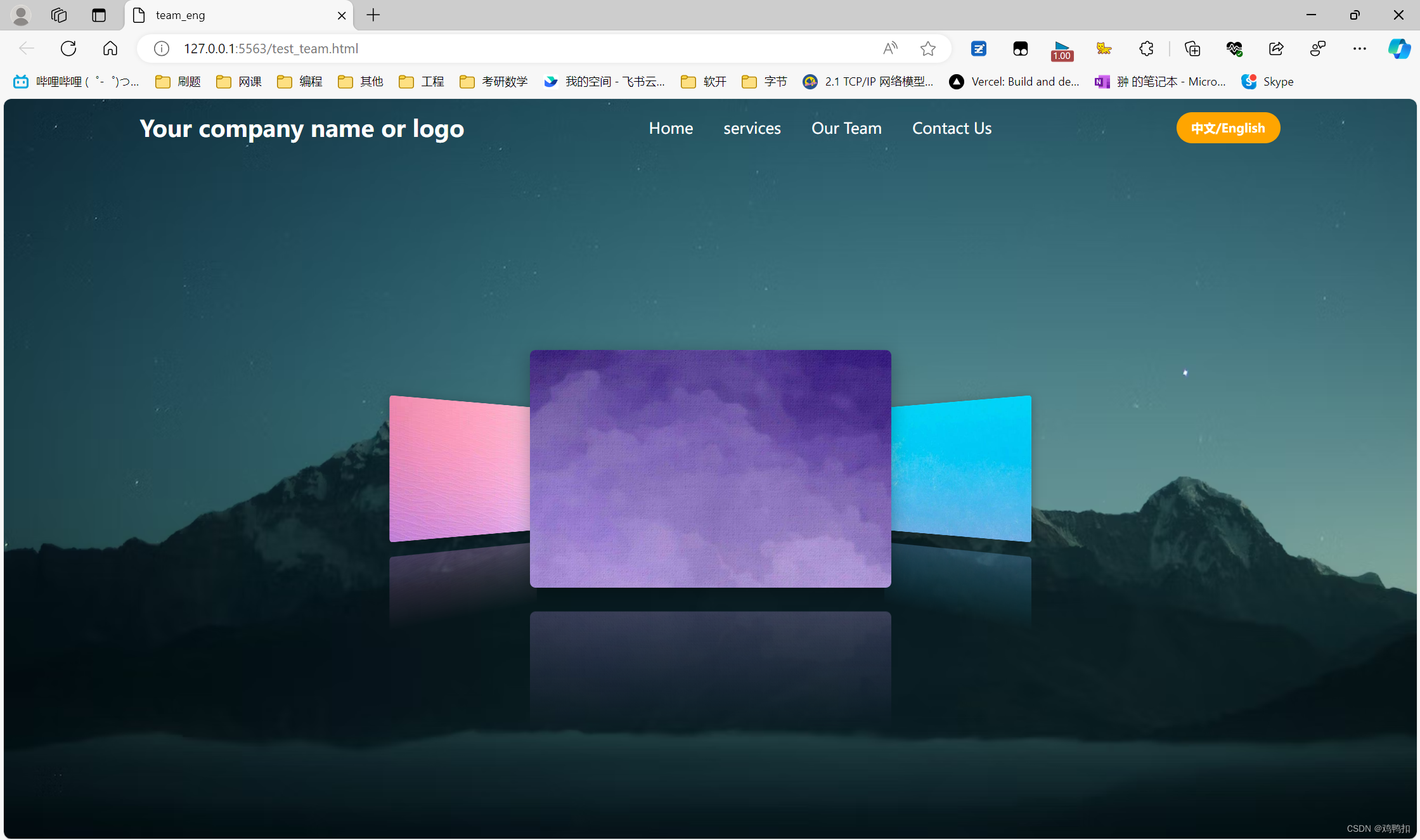
效果
代码
team.html
<head>
    <meta charset="UTF-8">
    <meta http-equiv="X-UA-Compatible" content="IE=edge">
    <meta name="viewport" content="width=device-width, initial-scale=1.0">
    <link rel="stylesheet" href="https://cdnjs.cloudflare.com/ajax/libs/font-awesome/6.5.1/css/all.min.css"
        integrity="sha512-DTOQO9RWCH3ppGqcWaEA1BIZOC6xxalwEsw9c2QQeAIftl+Vegovlnee1c9QX4TctnWMn13TZye+giMm8e2LwA=="
        crossorigin="anonymous" referrerpolicy="no-referrer" />
    <link rel="stylesheet" href="team.css" />
    <link rel="stylesheet" href="navbar.css" />
    <title>team_eng</title>
</head>

<body>
    <header>
        <div include-html="navbar_eng.html"></div>
    </header>
    <div class="shell">
        <div class="content">
            <div class="item"></div>
            <div class="item"></div>
            <div class="item"></div>
        </div>
    </div>
</body>
<script src="navbar.js"></script>

</html>
navbar.html
<div class="navbar">
    <div class="logo"><a href="#">深圳市淮亚之光科技创新有限公司</a></div>
    <ul class="links">
        <li><a href="index">首页</a></li>
        <li><a href="services">合作案例</a></li>
        <li><a href="team">服务团队</a></li>
        <li><a href="contact">联系我们</a></li>
    </ul>
    <a href="#" class="action_btn">中文/English</a>
    <div class="toggle_btn">
        <i class="fa-solid fa-bars"></i>
    </div>
</div>

<div class="dropdown_menu">
    <li><a href="index">首页</a></li>
    <li><a href="services">合作案例</a></li>
    <li><a href="team">服务团队</a></li>
    <li><a href="contact">联系我们</a></li>
    <li><a href="#" class="action_btn">中文/English</a></li>
</div>
navbar.css
* {
    margin: 0;
    padding: 0;
    box-sizing: border-box;
    font-family: 'Open Sans', sans-serif;
}

li {
    list-style: none;
}

a {
    text-decoration: none;
    color: #fff;
    font-size: 1rem;
}

a:hover {
    color: orange;
}

/* 导航栏 */
header {
    position: relative;
    padding: 0 2rem;
}

.navbar {
    width: 100%;
    height: 60px;
    max-width: 1200px;
    margin: 0 auto;
    display: flex;
    align-items: center;
    justify-content: space-between;
}

.navbar .logo a {
    font-size: 1.5rem;
    font-weight: bold;
}

.navbar .links {
    display: flex;
    gap: 2rem;
}

.navbar .toggle_btn {
    color: #fff;
    font-size: 1.5rem;
    cursor: pointer;
    display: none;
}


.action_btn {
    background-color: orange;
    color: #fff;
    padding: 0.5rem 1rem;
    border: none;
    outline: none;
    border-radius: 20px;
    font-size: 0.8rem;
    font-weight: bold;
    cursor: pointer;
    transition: scale 0.2 ease;
}

.action_btn:hover {
    scale: 1.05;
    color: #fff;
}

.action_btn:active {
    scale: 0.95;
}


/* 下拉式菜单 */
.dropdown_menu {
    display: none;
    position: absolute;
    right: 2rem;
    top: 60px;
    height: 0;
    width: 300px;
    background: rgba(255, 255, 255, 0.1);
    backdrop-filter: blur(15px);
    border-radius: 10px;
    overflow: hidden;
    transition: height 0.2s cubic-bezier(0.175, 0.885, 0.32, 1.275);
}

.dropdown_menu.open {
    height: 240px;
}


.dropdown_menu li {
    padding: 0.7rem;
    display: flex;
    align-items: center;
    justify-content: center;
}

.dropdown_menu .action_btn {
    width: 100%;
    display: flex;
    justify-content: center;
}
team.css
* {
    margin: 0;
    padding: 0;
    box-sizing: border-box;
    font-family: 'Open Sans', sans-serif;
}

body {
    /* display: flex; */
    align-items: center;
    height: 100vh;
    background-color: #000;
    background-image: url('https://images.unsplash.com/photo-1485470733090-0aae1788d5af?ixlib=rb-4.0.3&ixid=MnwxMjA3fDB8MHxwaG90by1wYWdlfHx8fGVufDB8fHx8&auto=format&fit=crop&w=1517&q=80');
    background-size: cover;
    background-position: center;
}


.shell {
    position: absolute;
    top: 0;
    bottom: 0;
    left: 0;
    right: 0;
    width: 100vw;
    height: 200vh;
    max-width: 484px;
    max-height: 422px;
    margin: auto;
    color: white;
    perspective: 1000px;
    transform-origin: center;
    display: flex;
    justify-content: center;
    align-items: center;
}


.content {
    display: flex;
    justify-content: center;
    align-items: center;
    width: 100%;
    height: 100%;
    margin: auto;
    transform-origin: center;
    transform-style: preserve-3d;
    transform: translateZ(-30vw) rotateY(0);
    animation: carousel 9s infinite cubic-bezier(0.77, 0, 0.175, 1) forwards;

}

.item {
    position: absolute;
    width: 60vw;
    height: 40vw;
    max-width: 380px;
    max-height: 250px;
    box-shadow: 0 5px 20px rgba(0, 0, 0, 0.3);
    border-radius: 6px;
    background-size: cover;
    -webkit-box-reflect: below 25px -webkit-linear-gradient(transparent 50%, rgba(255, 255, 255, 0.3));
}

.item:nth-child(1) {
    background-image: url("assets/1.jpg");
    transform: rotateY(0) translateZ(35vw);
}

.item:nth-child(2) {
    background-image: url("assets/4.jpg");
    transform: rotateY(120deg) translateZ(35vw);
}


.item:nth-child(3) {
    background-image: url("assets/3.jpg");
    transform: rotateY(240deg) translateZ(35vw);
}

@keyframes carousel {

    0%,
    17.5% {
        transform: translateZ(-35vw) rotateY(0);
    }

    27.5%,
    45% {
        transform: translateZ(-35vw) rotateY(-120deg);
    }

    55%,
    72.5% {
        transform: translateZ(-35vw) rotateY(-240deg);
    }

    82.5%,
    100% {
        transform: translateZ(-35vw) rotateY(-360deg);
    }
}
注意以上源码改编自https://www.bilibili.com/video/BV14z4y1w7cg,建议商用等行为先询问下原作者。


 99
99


 被折叠的 条评论
为什么被折叠?
被折叠的 条评论
为什么被折叠?
 到【灌水乐园】发言


