


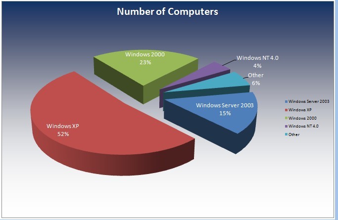
1、在当前激活的sheet数据上画图,数据区域为A2:B6,运行效果如下:
2、源代码
Sub AddChart()

    '画饼图
    ActiveSheet.Shapes.AddChart.Select

    ActiveChart.ChartType = xlPie

    ActiveChart.SetSourceData Source:=Range("A2:B6")

    Set objChart = ActiveChart

    objChart.ChartType = 70

    objChart.Elevation = 30

    objChart.Rotation = 80

    objChart.ApplyDataLabels Type:=xlDataLabelsShowLabelAndPercent  '名称和百分比

    'xlDataLabelsShowPercent  '显示在整体中所占百分比的标签

   '去掉绘图区域或图表区域

    objChart.PlotArea.Fill.Visible = False

    objChart.PlotArea.Border.LineStyle = -4142

   '数据标签的大小、颜色、字体样式以及其它属性

    objChart.SeriesCollection(1).DataLabels.Font.Size = 10

    objChart.SeriesCollection(1).DataLabels.Font.ColorIndex = 6

    objChart.ChartArea.Fill.ForeColor.SchemeColor = 48

    objChart.ChartArea.Fill.BackColor.SchemeColor = 50

    objChart.ChartArea.Fill.TwoColorGradient 1, 1

    objChart.Legend.Shadow = True


End Sub


 1360
1360

 被折叠的 条评论
为什么被折叠?
被折叠的 条评论
为什么被折叠?
 到【灌水乐园】发言


