


鸿蒙(HarmonyOS)项目方舟框架(ArkUI)之Stepper组件
一、操作环境
操作系统: Windows 10 专业版、IDE:DevEco Studio 3.1、SDK:HarmonyOS 3.1+

二、Stepper组件
鸿蒙(HarmonyOS)仅能包含子组件StepperItem。
子组件
无。
接口
Stepper(value?: { index?: number })
参数
| 参数名 | 参数类型 | 必填 | 参数描述 |
|---|---|---|---|
| index | number | 否 | 设置步骤导航器当前显示StepperItem的索引值。 默认值:0 |
事件
| 名称 | 描述 |
|---|---|
| onFinish(callback: () => void) | 步骤导航器最后一个StepperItem的nextLabel被点击时,并且ItemState属性为Normal时,触发该回调 。 |
| onSkip(callback: () => void) | 当前显示的StepperItem状态为ItemState.Skip时,nextLabel被点击时触发该回调。 |
| onChange(callback: (prevIndex?: number, index?: number) => void) | 点击当前StepperItem的prevLabel进行步骤切换时触发该回调;或点击当前StepperItem的nextLabel,当前页面不为步骤导航器最后一个StepperItem且ItemState属性为Normal时,触发该回调。 - prevIndex:切换前的步骤页索引值。 - index:切换后的步骤页(前一页或者下一页)索引值。 |
| onNext(callback: (index?: number, pendingIndex?: number) => void) | 点击StepperItem的nextLabel切换下一步骤时,当前页面不为步骤导航器最后一个StepperItem且ItemState属性为Normal时,触发该回调。 - index:当前步骤页索引值。 - pendingIndex:下一步骤页索引值。 |
| onPrevious(callback: (index?: number, pendingIndex?: number) => void) | 点击StepperItem的prevLabel切换上一步骤时触发该回调。 - index:当前步骤页索引值。 - pendingIndex:上一步骤页索引值。 |
示例
代码
// xxx.ets
@Styles function itemStyle () {
.width(336)
.height(621)
.margin({ top: 48, left: 12 })
.borderRadius(24)
.backgroundColor('#FFFFFF')
}
@Extend(Text) function itemTextStyle () {
.fontColor('#182431')
.fontSize(36)
.fontWeight(500)
.opacity(0.4)
.margin({ top: 82, bottom: 40 })
}
@Entry
@Component
struct StepperExample {
@State currentIndex: number = 0
@State firstState: ItemState = ItemState.Normal
@State secondState: ItemState = ItemState.Normal
@State thirdState: ItemState = ItemState.Normal
build() {
Stepper({
index: this.currentIndex
}) {
// 第一个步骤页
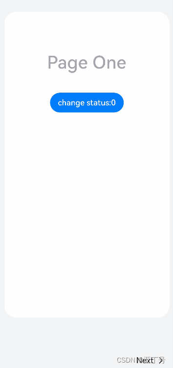
StepperItem() {
Column() {
Text('Page One')
.itemTextStyle()
Button('change status:' + this.firstState)
.backgroundColor('#007dFF')
.onClick(() => {
this.firstState = this.firstState === ItemState.Skip ? ItemState.Normal : ItemState.Skip
})
}.itemStyle()
}
.nextLabel('Next')
.status(this.firstState)
// 第二个步骤页
StepperItem() {
Column() {
Text('Page Two')
.itemTextStyle()
Button('change status:' + this.secondState)
.backgroundColor('#007dFF')
.onClick(() => {
this.secondState = this.secondState === ItemState.Disabled ? ItemState.Normal : ItemState.Disabled
})
}.itemStyle()
}
.nextLabel('Next')
.prevLabel('Previous')
.status(this.secondState)
// 第三个步骤页
StepperItem() {
Column() {
Text('Page Three')
.itemTextStyle()
Button('change status:' + this.thirdState)
.backgroundColor('#007dFF')
.onClick(() => {
this.thirdState = this.thirdState === ItemState.Waiting ? ItemState.Normal : ItemState.Waiting
})
}.itemStyle()
}
.status(this.thirdState)
// 第四个步骤页
StepperItem() {
Column() {
Text('Page Four')
.itemTextStyle()
}.itemStyle()
}
}
.backgroundColor('#F1F3F5')
.onFinish(() => {
// 此处可处理点击最后一页的Finish时的逻辑,例如路由跳转等
console.info('onFinish')
})
.onSkip(() => {
// 此处可处理点击跳过时的逻辑,例如动态修改Stepper的index值使其跳转到某一步骤页等
console.info('onSkip')
})
.onChange((prevIndex: number, index: number) => {
this.currentIndex = index
})
}
}图例
你有时间常去我家看看我在这里谢谢你啦...
我家地址:亚丁号
最后送大家一首诗:
山高路远坑深,
大军纵横驰奔,
谁敢横刀立马?
惟有点赞加关注大军。


 803
803


 被折叠的 条评论
为什么被折叠?
被折叠的 条评论
为什么被折叠?
 到【灌水乐园】发言


