


浮动
浮动是css里面布局用到最多的属性
<!DOCTYPE html>
<html lang="en">
<head>
	<meta charset="UTF-8">
	<title>Document</title>
	<style type="text/css">
		.box1{
			width: 100px;
			height: 200px;
			background-color: yellowgreen;
		}

		.box2{
			width: 200px;
			height: 200px;
			background-color: skyblue;
		}

	</style>
</head>
<body>
	<div class="box1"></div>
	<div class="box2"></div>
</body>
</html>
浏览器显示:
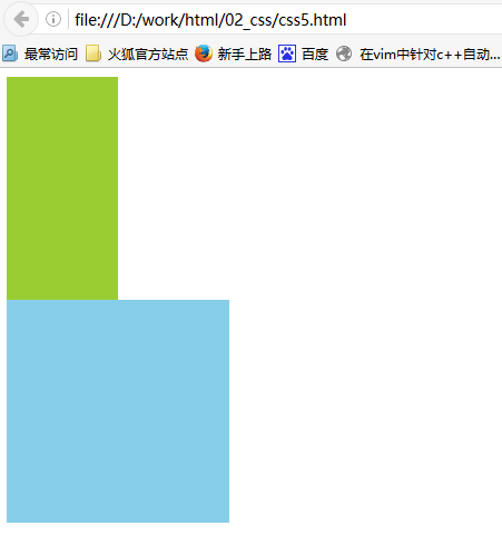
由于两个div都是块级元素,独占一行所以看到的是上下对齐的
float: left;float就是浮动的关键字,而left就是左对齐
<!DOCTYPE html>
<html lang="en">
<head>
	<meta charset="UTF-8">
	<title>Document</title>
	<style type="text/css">
		.box1{
			float: left;
			width: 100px;
			height: 200px;
			background-color: yellowgreen;
		}

		.box2{
			float: left;
			width: 200px;
			height: 200px;
			background-color: skyblue;
		}

	</style>
</head>
<body>
	<div class="box1"></div>
	<div class="box2"></div>
</body>
</html>
浏览器显示:
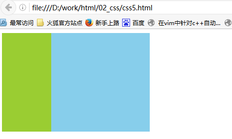
两个div都是左浮动:float:left
上面两个元素并排,并且两个元素都可以设置宽高(这在标准流中是不能实现的),学好浮动,必须了解三个性质
浮动的元素脱标(脱离标准流,或者说与不受标准流约束)
浮动元素脱标证明01:
只给第一个div浮动,另一个div不设置成浮动,我们看一下现象
<!DOCTYPE html>
<html lang="en">
<head>
	<meta charset="UTF-8">
	<title>Document</title>
	<style type="text/css">
		.box1{
			float: left;
			width: 100px;
			height: 200px;
			background-color: yellowgreen;
		}

		.box2{
			width: 200px;
			height: 300px;
			background-color: skyblue;
		}

	</style>
</head>
<body>
	<div class="box1"></div>
	<div class="box2"></div>
</body>
</html>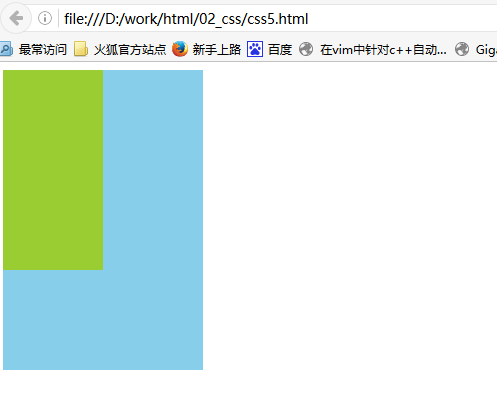
绿颜色的盒子脱离了标准文档流,而蓝颜色的盒子就以为自己是标准流中的第一个盒子,于是蓝颜色的盒子就渲染在最上方,从而形成了上面的效果
浮动元素脱标证明02:
由于span是一个行内标签,他们只能显示到一行上,不能设置他们的长宽
<!DOCTYPE html>
<html lang="en">
<head>
	<meta charset="UTF-8">
	<title>Document</title>
	<style type="text/css">
	span{
		width: 300px;
		height: 400px;
		background-color: skyblue;
	}
	</style>
</head>
<body>
	<span>这是span</span>
	<span>这是span</span>
	<span>这是span</span>
	<span>这是span</span>
</body>
</html>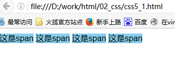
由于span是行内标签,他们会显示在一行,而且你设置的长宽对span是没有影响的
如果我们将span设成浮动?
<!DOCTYPE html>
<html lang="en">
<head>
	<meta charset="UTF-8">
	<title>Document</title>
	<style type="text/css">
	span{
		float: left;
		width: 100px;
		height: 200px;
		background-color: skyblue;
	}
	</style>
</head>
<body>
	<span>这是span</span>
	<span>这是span</span>
	<span>这是span</span>
	<span>这是span</span>
</body>
</html>
浏览器运行的结果:
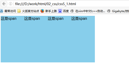
这是我们发现,span的长宽发生了变化。
原因是,浮动让span脱离了标准文档流的约束,使得span不在受标准文档流的约束,所以可以对span设置宽高了
浮动的元素可以互相贴靠
<!DOCTYPE html>
<html lang="en">
<head>
	<meta charset="UTF-8">
	<title>Document</title>
	<style type="text/css">
		body{
			font-size: 60px;
		}
		.box1{
			width:100px;
			height: 200px;
			background-color: yellowgreen;
		}
		.box2{
			width:120px;
			height: 220px;
			background-color: gold;
		}
		.box3{
			width:140px;
			height: 160px;
			background-color: skyblue;
		}3
	</style>
</head>
<body>
	<div class="box1">1</div>
	<div class="box2">2</div>
	<div class="box3">3</div>
</body>
</html>
浏览器显示结果:
如果我们给1、2、3都加上浮动,会是怎样呢?
<!DOCTYPE html>
<html lang="en">
<head>
	<meta charset="UTF-8">
	<title>Document</title>
	<style type="text/css">
		body{
			font-size: 60px;
		}
		.box1{
			float: left;
			width:100px;
			height: 200px;
			background-color: yellowgreen;
		}
		.box2{
			float: left;
			width:120px;
			height: 220px;
			background-color: gold;
		}
		.box3{
			float: left;
			width:140px;
			height: 160px;
			background-color: skyblue;
		}3
	</style>
</head>
<body>
	<div class="box1">1</div>
	<div class="box2">2</div>
	<div class="box3">3</div>
</body>
</html>
浏览器显示:
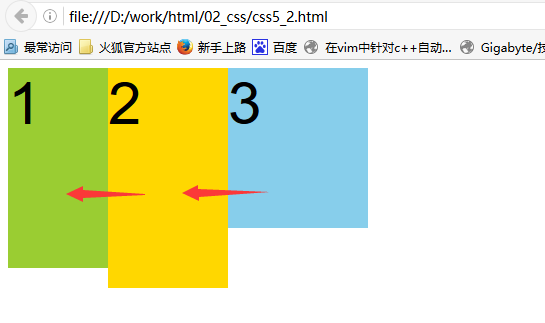
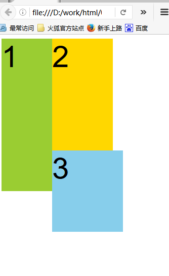
注意:如果我们缩小浏览器,你会发现3会滑动靠齐:

缩小浏览器:
浮动的元素有字围绕效果
<!DOCTYPE html>
<html lang="en">
<head>
	<meta charset="UTF-8">
	<title>Document</title>
	<style type="text/css">

		.box1{
			float: left;
			width:100px;
			height: 100px;
			background-color: yellowgreen;
		}

	</style>
</head>
<body>
	<div class="box1">1</div>
	<p>123字字字字字字字字字字字字字字字字字字字字字字
	字字字字字字字字字字字字字字字字字字字字字字字字字
	字字字字字字字字字字字字字字字字字字字字字字字字字
	字字字字字字字字字字字字字字字字字字字字字字字字字
	字字字字字字字字字字字字字字字字字字字字字字字字字
	字字字字字字字字字字字字字字字字字字字字字字字字字
	字字字字字字字字字字字字字字字字字字字字字字字字字
	字字字字字字字字字字字字字字字字字字字字字字字字字
	字字字字字字字字字字字字字字字字字字字字字字字字字
	字字字字字字字字字字字字字字字字字字字字字字字字字
	字字字字字字字字字字字字字字字字字字字字字字字字字
	字字字字字字字字字字字字字字字字字字字字字字字字字
	</p>
</body>
</html>
浏览器显示:
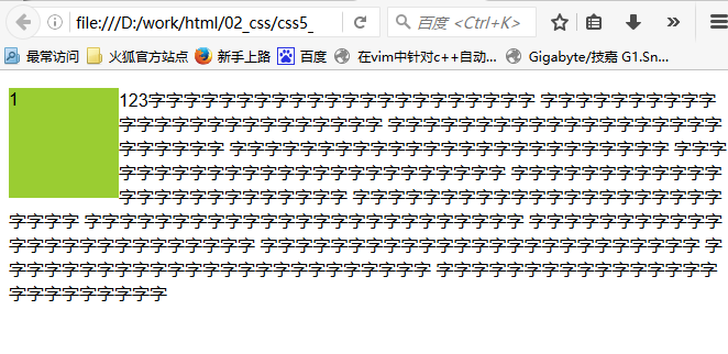
绿色盒子脱标不会覆盖p中的文本


 扫一扫
扫一扫
 241
241

 被折叠的 条评论
为什么被折叠?
被折叠的 条评论
为什么被折叠?
 到【灌水乐园】发言


