


关于PyPlot的安装:建议先装一下Python2.7版本环境,这样会有利于在PyPlot.jl库上顺利的安装,这样会大大提高成功率。另外,如果原先已经装好,但更新有问题,建议先删除原有的库(Pkg.rm),后再重新装。
最近在用PyPlot,所以整理了一些现成的PyPlot画图的资源,做个记号,便于随手使用。
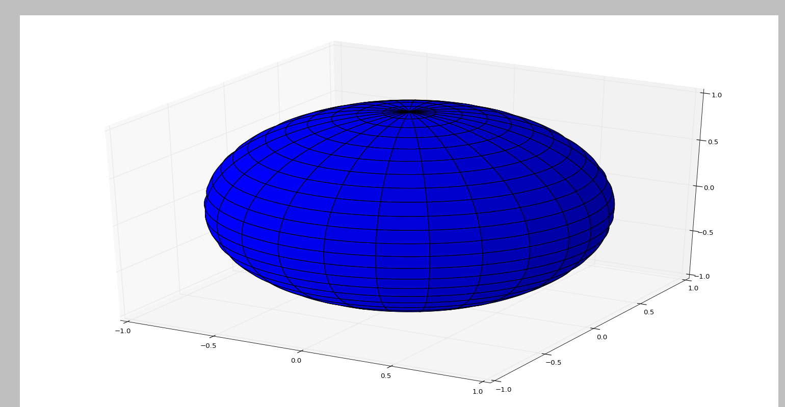
一、画一个立体球
http://stackoverflow.com/questions/34821061/plot-sphere-with-julia-and-pyplot
using PyPlot
n = 100
u = linspace(0,2*π,n);
v = linspace(0,π,n);

x = cos(u) * sin(v)';
y = sin(u) * sin(v)';
z = ones(n) * cos(v)';

# The rstride and cstride arguments default to 10
surf(x,y,z, rstride=4, cstride=4)
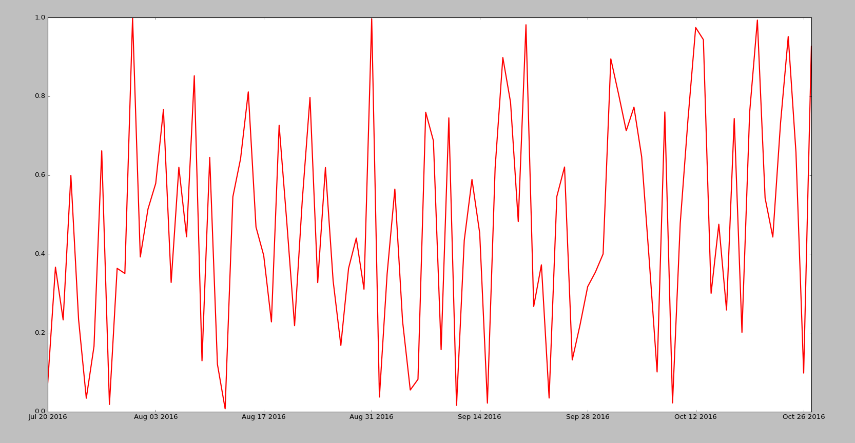
二、画曲/线
画一个日期图,思考:日期的X轴需要重新设置成(2016-05-06格式)?
using PyPlot;
clf();
close();
x = [Date(now()) + Dates.Day(i) for i in collect(1:100)] # 日期图
y = rand(100)
PyPlot.plot(x,y, color="red", linewidth=2.0, linestyle="-") # 日期默认格式  Aug 01 2016
也可以写成:
using PyPlot;
clf();
close();
fig =figure();
ax = fig[:add_subplot](111)  # 或 fig, ax = PyPlot.subplots()
x = [Date(now()) + Dates.Day(i) for i in collect(1:100)] # 日期图
y = rand(100)
ax[:plot](x,y, color="red", linewidth=2.0, linestyle="-")
https://github.com/stevengj/PyPlot.jl
using PyPlot
x = linspace(0,2*pi,1000); y = sin(3*x + 4*cos(2*x));
PyPlot.plot(x, y, color="red", linewidth=2.0, linestyle="--")
title("A sinusoidally modulated sinusoid")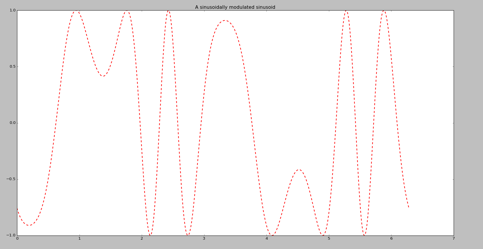
http://stackoverflow.com/questions/22041461/julia-pyplot-from-script-not-interactive
using PyCall
@pyimport matplotlib.pyplot as plt
x = linspace(0,2*pi,1000); y = sin(3*x + 4*cos(2*x));
plt.plot(x, y, color="red", linewidth=2.0, linestyle="--")
plt.title("A sinusoidally modulated sinusoid")
plt.show()
三、散点图
http://stackoverflow.com/questions/35432999/gridlines-in-julia-pyplot
using PyPlot

fig=figure(figsize=[6,3])
ax1=subplot(1,1,1) # creates a subplot with just one graphic

ax1[:xaxis][:set_ticks](collect(1:4))  # configure x ticks from 1 to 4
ax1[:yaxis][:set_ticks](collect(4:7))  # configure y ticks from 4 to 7

grid("on")
PyPlot.scatter([1,2,3,4],[4,5,6,7])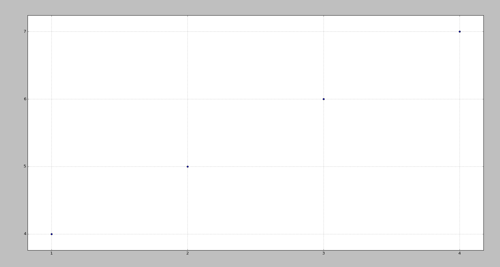
或
using PyPlot
fig=figure("Name")
grid("on")
xticks(1:4)
yticks(4:7)
scatter([1,2,3,4],[4,5,6,7])
带彩色散点图:
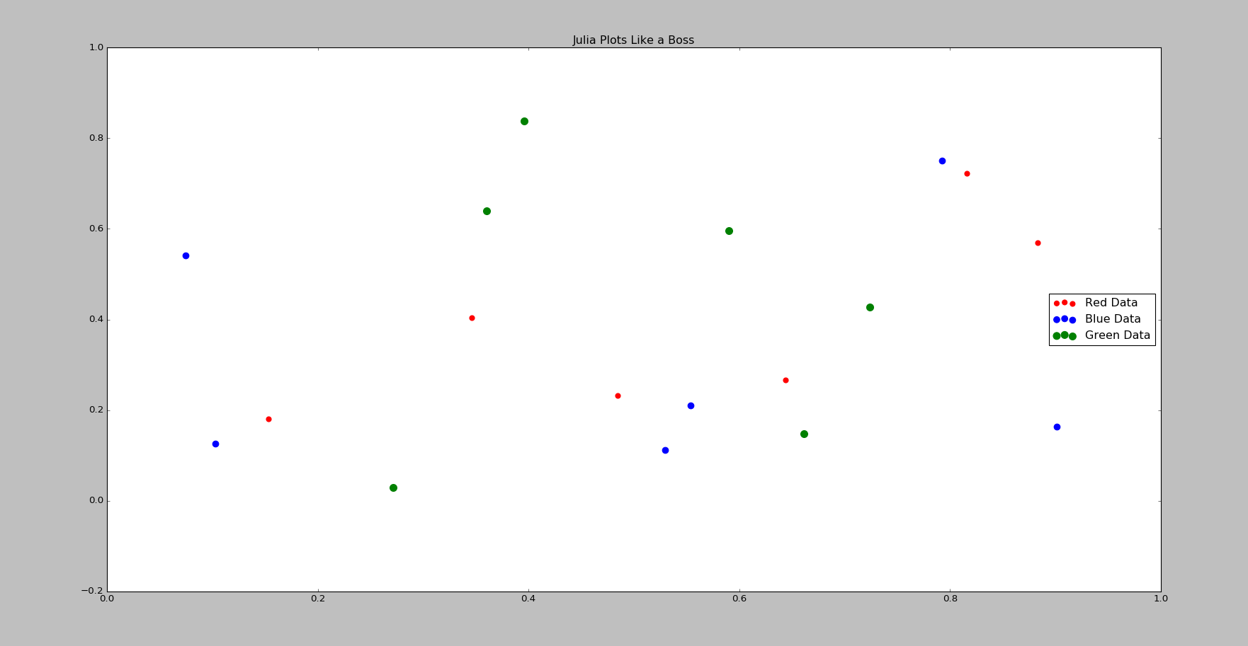
using PyPlot
(X1, Y1) = (rand(6), rand(6));
(X2, Y2) = (rand(6), rand(6));
(X3, Y3) = (rand(6), rand(6));

fig = figure(figsize=(10,10))
# xlabel("My X Label")  # optional x label
# ylabel("My Y Label")  # optional y label
title("Julia Plots Like a Boss")
R = scatter(X1,Y1,color="red", label = "Red Data", s = 40)
G = scatter(X2,Y2,color="blue", label = "Blue Data", s = 60)
B = scatter(X3,Y3,color="green", label = "Green Data", s = 80)
legend(loc="right")
savefig("/path/to/pca1_2_fam.pdf")  ## optional command to save results.
四、热图
http://stackoverflow.com/questions/33855111/julia-real-time-varying-heatmap-using-pyplot
using PyPlot
PyPlot.ion()
fig = figure()
ax = fig[:add_subplot](111)
img = ax[:imshow](rand(50,50))
#PyPlot.show()
 # draw some data in loop
for i in 1:10
  # wait for a second
  sleep(1)
  # replace the image contents
  img[:set_array](rand(50,50))
  # redraw the figure
  fig[:canvas][:draw]
end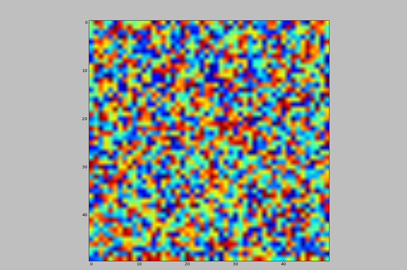
五、设定Legend的字体
using PyPlot
fig, ax = PyPlot.subplots()
ax[:plot](rand(10), rand(10), label = "Data")
ax[:legend](loc="best", fontsize=20)
或
@pyimport  matplotlib.pyplot as plt
@pyimport matplotlib.font_manager as fm
prop = fm.FontProperties(size=9)
fig, ax = PyPlot.subplots()
ax[:plot](rand(10), rand(10), label = "Data")
ax[:legend](loc="best", prop=prop)
六、画动画
这个还有点问题,需要进一步修订。
http://stackoverflow.com/questions/35142199/implementing-an-iterator-in-julia-for-an-animation-with-pyplot
using PyCall
using PyPlot
pygui(true)
@pyimport matplotlib.animation as animation
function simData()
    t_max = 10.0
    dt = 0.05
    x = 0.0
    t = -dt

    function it()
        while t < t_max
            x = sin(pi * t)
            t = t + dt
            produce(x, t)
        end
    end

    Task(it)
end

function simPoints()
    task = simData()
    function points(frame_number)
        x, t = consume(task)
        line[:set_data](t, x)
        return(line, "")
    end
    points
end

figure =plt.figure()
axis = figure[:add_subplot](111)
line = axis[:plot]([], [], "bo", ms = 10)[1]
axis[:set_ylim](-1, 1)
axis[:set_xlim](0, 10)
ani = animation.FuncAnimation(figure, simPoints(), blit=false, interval=10, frames=200, repeat=false)
plt.show()
七、polar plot
http://stackoverflow.com/questions/29921611/how-to-change-radial-ticks-in-julia-pyplot-polar-plot
using PyPlot ;

theta = 0:0.02:1 * pi ;
n = length(theta) ;

U = cos( theta ).^2 ;
V = zeros( size(U) ) ;

for i = 1:n
   v = log10( U[i] ) ;
   if ( v < -50/10 )
      v = 0 ;
   else
      v = v/5 + 1 ;
   end

   V[i] = v ;
end

f1 = figure("p2Fig1",figsize=(10,10)) ; # Create a new figure
ax1 = axes( polar="true" ) ; # Create a polar axis

pl1 = PyPlot.plot( theta, V, linestyle="-", marker="None" ) ;

dtheta = 30 ;
ax1[:set_thetagrids]([0:dtheta:360-dtheta]) ;
ax1[:set_theta_zero_location]("E") ;
ax1[:set_yticks]([0.2,0.4,0.6,0.8,1.0])
ax1[:set_yticklabels](["-40dB","-30dB","-20dB","-10dB","0dB"])
f1[:canvas][:draw]() ;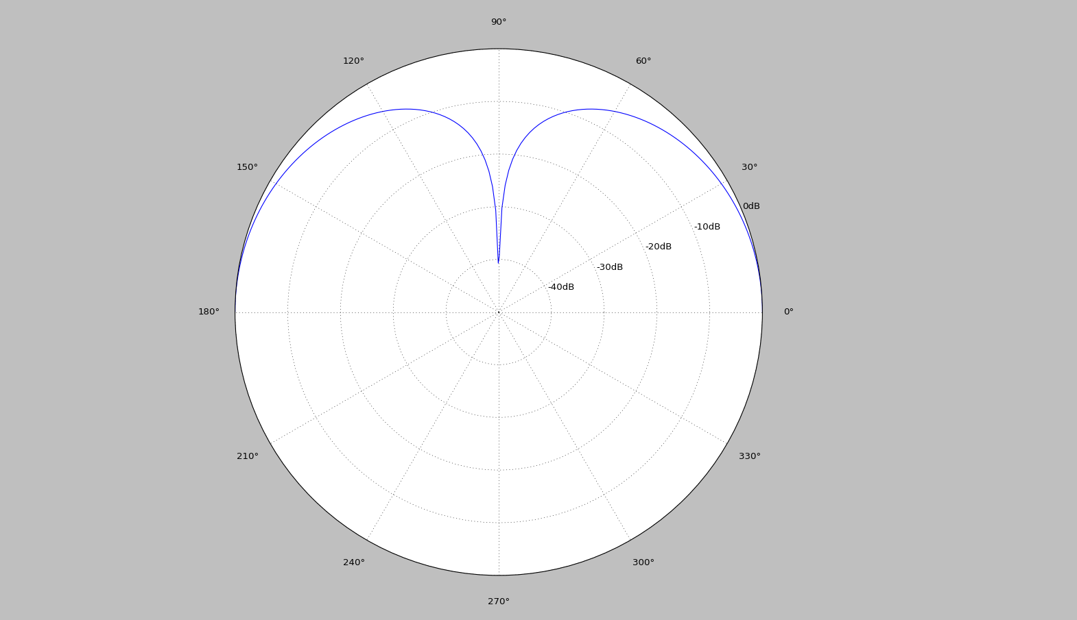
八 、Plot portfolio composition map
http://stackoverflow.com/questions/33135676/plot-portfolio-composition-map-in-julia-or-matlab
using PyPlot
using PyCall

@pyimport matplotlib.patches as patch
clf();
close()
N = 10
D = 4

weights = Array(Float64, N,D)

for i in 1:N
    w = rand(D)
    w = w/sum(w)
    weights[i,:] = w
end
weights = [zeros(Float64, N) weights]
weights = cumsum(weights,2)
returns = sort!([linspace(1,N, N);] + D*randn(N))

##########
#  Plot  #
##########
polygons = Array(PyObject, 4)
colors = ["red","blue","green","cyan"]
labels = ["IBM", "Google", "Apple", "Intel"]
fig, ax = subplots()
fig[:set_size_inches](5, 7)
title("Problem 2.5 part 2")
xlabel("Weights")
ylabel("Return (%)")
ax[:set_autoscale_on](false)
ax[:axis]([0,1,minimum(returns),maximum(returns)])

for i in 1:(size(weights,2)-1)
    xy=[weights[:,i] returns;
        reverse(weights[:,(i+1)]) reverse(returns)]
    polygons[i] = matplotlib[:patches][:Polygon](xy, true, color=colors[i], label = labels[i])
    ax[:add_artist](polygons[i])
end

legend(polygons, labels, bbox_to_anchor=(1.02, 1), loc=2, borderaxespad=0)

show()
# savefig("CompositionMap.png",bbox_inches="tight")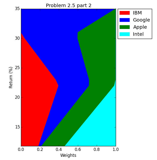
九、多图
using PyPlot;

w = 0.9
w2 = 0.4

x = 1:3
y1 = [1,2,3]
y2 = [2,2,2]
y3 = [2,3,1]

fig = plt[:figure]()
plt[:bar](x.-(w/2), y1, log=true, width=w, color="#BFBFBF", label="y1")
plt[:bar](x.-(w2/2), y2, log=true, width=w2, color="k", label="y2")
plt[:scatter](x, y3, color="orange", edgecolors="k",s=40, label="y3")


 1015
1015

 被折叠的 条评论
为什么被折叠?
被折叠的 条评论
为什么被折叠?
 到【灌水乐园】发言


