


最近在看国家气象局绘制的天气图时,对天气图的绘制起了兴趣,于是就想用python尝试复刻一下。以下我将以500hpa的温度场,高度场和风场作为例子。由于站点数据导入和下载比较麻烦一些,就并未还原比如温度露点差,站点温度等等一些其他的气象要素。
官网查看天气图
官网查看天气图的地址如下:
天气实况_天气图_中国_地面_基本天气分析 (nmc.cn)
数据资料与下载
这里我使用ECMWF(European Centre for Medium-Range Weather Forecasts)的再分析资料ECMWF Reanalysis v5(ERA5)数据进行可视化。选择了2024年9月21日的24h的500hpa位势高度(m**2/s**2)、经纬向风分量(m/s)和温度(K)。
再分析资料的下载地址:ERA5 hourly data on pressure levels from 1940 to present (copernicus.eu)
代码部分
首先是对库包和数据的导入:
import numpy as np
import matplotlib.pyplot as plt
import cartopy.crs as ccrs
import cartopy.feature as cfeature
import matplotlib.ticker as mticker
import metpy.calc as mpcalc
from metpy.units import units
import xarray as xr
from scipy.ndimage import gaussian_filter,maximum_filter,minimum_filter
#-----库包的导入-----

ds=xr.open_dataset(r"D:\Pangu-Weather-ReadyToGo\Z-T-U-V-2024.9.21-24h.nc")
#-------选取需要的数据和经纬度、时间段--------
sel_time='2024-09-21T00:00:00.000000000'
geop=ds.z.loc[sel_time,500,60:0,50:150]
tem=ds.t.loc[sel_time,500,60:0,50:150]
uwnd=ds.u.loc[sel_time,500,60:0,50:150]
vwnd=ds.v.loc[sel_time,500,60:0,50:150]
这里选取需要的变量后,我们再对数据的单位进行换算。
#-----单位换算-----
tem-=273.15#摄氏度单位换算
lon,lat=tem.longitude,tem.latitude
#dagpm(位势什米)单位换算
uni_geo=geop*units('m ** 2 / s ** 2')
geop=mpcalc.geopotential_to_height(uni_geo)/10#也可以直接近似/9.8
然后开始绘图,这里我们使用兰伯特投影和国家气象局给的一致。
#------开始绘图-------
fig =plt.figure(figsize=[10,8],dpi=500)
#设置投影方式
proj=ccrs.LambertConformal(central_latitude=90,central_longitude=104)
# proj=ccrs.PlateCarree()#其他投影方式
ax = plt.axes(projection=proj)
ax.add_feature(cfeature.LAND.with_scale('50m'), facecolor='white',edgecolor='gray')  # 白色陆地
ax.add_feature(cfeature.OCEAN.with_scale('50m'), facecolor='#e7ffff')  # 浅蓝色海洋
# 添加加粗边框
ax.spines['geo'].set_linewidth(1.5)  # 边框加粗
#添加标识
plt.title('UTC '+sel_time+ ' Tem(C$^o$) Height(dagpm)',loc='left',c='blue',fontname='SimSun',fontsize=15)
# 在左下角添加标题
plt.text(0.0, -0.03, 'ECMWF Reanalysis v5(ERA5)', transform=ax.transAxes,
         fontsize=12, color='blue', ha='left', va='bottom', fontname='SimHei')
同时使用以下网站给出的shp数据绘制省界国界 。
CN-border: 中国国界省界数据 — GMT 中文手册 (gmt-china.org)
#读取shp数据
with open(r"china-geospatial-data-GB2312\CN-border-La.gmt") as src:
    context = src.read()
    blocks = [cnt for cnt in context.split('>') if len(cnt) > 0]
    borders = [np.fromstring(block,dtype=float,sep=' ')for block in blocks]

#绘制省界国界
for line in borders:
    ax.plot(line[0::2],line[1::2],'-',color='#9b9f91',lw=1,transform=ccrs.Geodetic())
接下来对地图的一些细节进行修改.
# 设置地图的显示范围(经纬度范围)
ax.set_extent([75, 132, 13, 55.5], crs=ccrs.PlateCarree())
# 添加网格线
gl = ax.gridlines(draw_labels=False, linewidth=0.5, color='k', alpha=0.6, linestyle='--')

# 手动设置经纬度标签
x_ticks = np.arange(80, 130 + 1, 10)
y_ticks = np.arange(10, 50 + 1, 10)
gl.xlocator = mticker.FixedLocator(x_ticks)
gl.ylocator = mticker.FixedLocator(y_ticks)

#绘制经纬度标签
for xtick in x_ticks:
    ax.text(xtick, 15 - 3, f'{xtick}°E', horizontalalignment='center',
            transform=ccrs.PlateCarree(), color='k', fontsize=10)
for ytick in y_ticks:
    ax.text(80 - 2, ytick, f'{ytick}°N', verticalalignment='center',
            transform=ccrs.PlateCarree(), color='k', fontsize=10)
再进行数据的可视化
#绘制等温线等高线
contour_lines = ax.contour(lon, lat, geop, 25, colors="blue", linewidths=1,
                           transform=ccrs.PlateCarree())
contour_lines1 = ax.contour(lon, lat, tem, 8, colors="red", linewidths=1,
                           transform=ccrs.PlateCarree())
# 标出值
ax.clabel(contour_lines, fmt="%2.0f", fontsize=10, colors="blue")
ax.clabel(contour_lines1, fmt="%2.0f", fontsize=10, colors="red")

a2 = ax.contour(lon, lat, geop, 25, levels=[588], linewidths=1.5, colors='blue',
                transform=ccrs.PlateCarree())  # 画出特定等值线,levels[588]函数画出588线

# 找到局部最大值和最小值
def plot_maxmin_points(ax, lon, lat, data, minmax, n_size, symbol, color='k',transform=None):
    # outline_effect = [patheffects.withStroke(linewidth=2.5, foreground='w')]
    if (minmax == 'max'):
        dat = maximum_filter(data, n_size, mode='nearest')
    elif (minmax == 'min'):
        dat = minimum_filter(data, n_size, mode='nearest')
    else:
        raise ValueError('No MinMax Input')
    m_xy, m_xx = np.where(dat == np.array(data))
    lon, lat = np.meshgrid(lon, lat)
    for i in range(len(m_xy)):
        A = ax.text(lon[m_xy[i], m_xx[i]], lat[m_xy[i], m_xx[i]], symbol,
                    color=color, size=12,font='Times New Roman',
                    clip_on=True, clip_box=ax.bbox,
                    horizontalalignment='center', verticalalignment='center',
                    transform=transform)
geop_filtered=gaussian_filter(geop,sigma=3)#sigma越大越平滑
tem_filtered=gaussian_filter(tem,sigma=3)
trans_crs=ccrs.PlateCarree()

#取数据局部最大最小进行标注,nsize越大越平滑
plot_maxmin_points(ax, lon, lat, geop_filtered, 'max', 50,
                   symbol='H', color='b', transform=trans_crs)
plot_maxmin_points(ax, lon, lat, geop_filtered, 'min', 50,
                   symbol='L', color='r', transform=trans_crs)
plot_maxmin_points(ax, lon, lat, tem_filtered, 'max', 50,
                   symbol='W', color='r', transform=trans_crs)
plot_maxmin_points(ax, lon, lat, tem_filtered, 'min', 50,
                   symbol='C', color='b', transform=trans_crs)
#----绘制风羽图----
uwnd,vwnd=np.array(uwnd),np.array(vwnd)
slice=16#减少数据密度 0.25*16=4°

barb=ax.barbs(lon[::slice],lat[::slice],uwnd[::slice,::slice],vwnd[::slice,::slice],barbcolor='k',
              lw=0.5,length=5,barb_increments=dict(half=2,full=4,flag=20)
              ,transform=ccrs.PlateCarree())#风羽图设置,半个2m,整个4m,20m三角形
最后再对图进行调整与保存:
# 调整边距
plt.subplots_adjust(left=0.0, right=1, top=0.9, bottom=0.1)
plt.tight_layout()
# plt.show()
outputfilename=f'中国天气图-{str(sel_time)[:-16]}-500hpa.png'
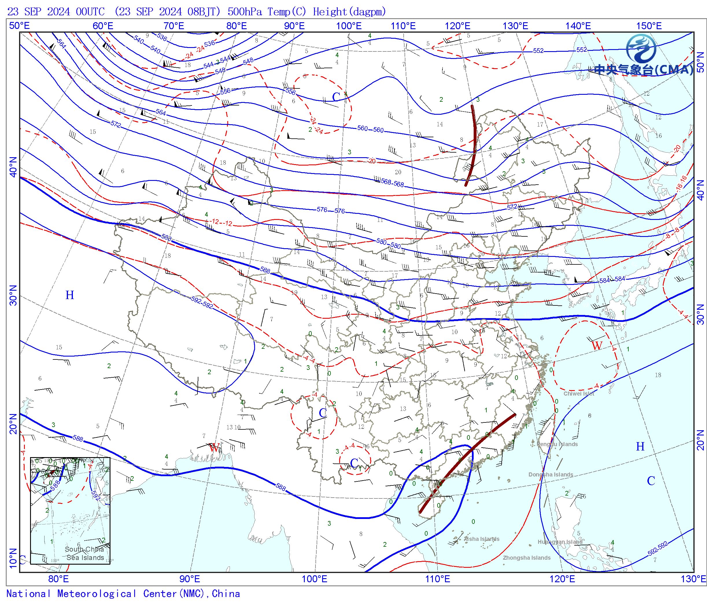
fig.savefig(outputfilename)结果
结果如下:

以下是全部代码:
import numpy as np
import matplotlib.pyplot as plt
import cartopy.crs as ccrs
import cartopy.feature as cfeature
import matplotlib.ticker as mticker
import metpy.calc as mpcalc
from metpy.units import units
import xarray as xr
from scipy.ndimage import gaussian_filter,maximum_filter,minimum_filter
#-----库包的导入-----

ds=xr.open_dataset(r"D:\Pangu-Weather-ReadyToGo\Z-T-U-V-2024.9.21-24h.nc")
#-------选取需要的数据和经纬度、时间段--------
sel_time='2024-09-21T00:00:00.000000000'
geop=ds.z.loc[sel_time,500,60:0,50:150]
tem=ds.t.loc[sel_time,500,60:0,50:150]
uwnd=ds.u.loc[sel_time,500,60:0,50:150]
vwnd=ds.v.loc[sel_time,500,60:0,50:150]
#-----单位换算-----
tem-=273.15#摄氏度单位换算
lon,lat=tem.longitude,tem.latitude
#dagpm(位势什米)单位换算
uni_geo=geop*units('m ** 2 / s ** 2')
geop=mpcalc.geopotential_to_height(uni_geo)/10#也可以直接近似/9.8

#------开始绘图-------
fig =plt.figure(figsize=[10,8],dpi=500)
#设置投影方式
proj=ccrs.LambertConformal(central_latitude=90,central_longitude=104)
# proj=ccrs.PlateCarree()#其他投影方式
ax = plt.axes(projection=proj)
ax.add_feature(cfeature.LAND.with_scale('50m'), facecolor='white',edgecolor='gray')  # 白色陆地
ax.add_feature(cfeature.OCEAN.with_scale('50m'), facecolor='#e7ffff')  # 浅蓝色海洋
# 添加加粗边框
ax.spines['geo'].set_linewidth(1.5)  # 边框加粗
#添加标识
plt.title('UTC '+sel_time+ ' Tem(C$^o$) Height(dagpm)',loc='left',c='blue',fontname='SimSun',fontsize=15)
# 在左下角添加标题
plt.text(0.0, -0.03, 'ECMWF Reanalysis v5(ERA5)', transform=ax.transAxes,
         fontsize=12, color='blue', ha='left', va='bottom', fontname='SimHei')
#读取shp数据
with open(r"china-geospatial-data-GB2312\CN-border-La.gmt") as src:
    context = src.read()
    blocks = [cnt for cnt in context.split('>') if len(cnt) > 0]
    borders = [np.fromstring(block,dtype=float,sep=' ')for block in blocks]

#绘制省界国界
for line in borders:
    ax.plot(line[0::2],line[1::2],'-',color='#9b9f91',lw=1,transform=ccrs.Geodetic())
# 设置地图的显示范围(经纬度范围)
ax.set_extent([75, 132, 13, 55.5], crs=ccrs.PlateCarree())
# 添加网格线
gl = ax.gridlines(draw_labels=False, linewidth=0.5, color='k', alpha=0.6, linestyle='--')

# 手动设置经纬度标签
x_ticks = np.arange(80, 130 + 1, 10)
y_ticks = np.arange(10, 50 + 1, 10)
gl.xlocator = mticker.FixedLocator(x_ticks)
gl.ylocator = mticker.FixedLocator(y_ticks)

#绘制经纬度标签
for xtick in x_ticks:
    ax.text(xtick, 15 - 3, f'{xtick}°E', horizontalalignment='center',
            transform=ccrs.PlateCarree(), color='k', fontsize=10)
for ytick in y_ticks:
    ax.text(80 - 2, ytick, f'{ytick}°N', verticalalignment='center',
            transform=ccrs.PlateCarree(), color='k', fontsize=10)

#绘制等温线等高线
contour_lines = ax.contour(lon, lat, geop, 25, colors="blue", linewidths=1,
                           transform=ccrs.PlateCarree())
contour_lines1 = ax.contour(lon, lat, tem, 8, colors="red", linewidths=1,
                           transform=ccrs.PlateCarree())
# 标出值
ax.clabel(contour_lines, fmt="%2.0f", fontsize=10, colors="blue")
ax.clabel(contour_lines1, fmt="%2.0f", fontsize=10, colors="red")

a2 = ax.contour(lon, lat, geop, 25, levels=[588], linewidths=1.5, colors='blue',
                transform=ccrs.PlateCarree())  # 画出特定等值线,levels[588]函数画出588线

# 找到局部最大值和最小值
def plot_maxmin_points(ax, lon, lat, data, minmax, n_size, symbol, color='k',transform=None):
    # outline_effect = [patheffects.withStroke(linewidth=2.5, foreground='w')]
    if (minmax == 'max'):
        dat = maximum_filter(data, n_size, mode='nearest')
    elif (minmax == 'min'):
        dat = minimum_filter(data, n_size, mode='nearest')
    else:
        raise ValueError('No MinMax Input')
    m_xy, m_xx = np.where(dat == np.array(data))
    lon, lat = np.meshgrid(lon, lat)
    for i in range(len(m_xy)):
        A = ax.text(lon[m_xy[i], m_xx[i]], lat[m_xy[i], m_xx[i]], symbol,
                    color=color, size=12,font='Times New Roman',
                    clip_on=True, clip_box=ax.bbox,
                    horizontalalignment='center', verticalalignment='center',
                    transform=transform)
geop_filtered=gaussian_filter(geop,sigma=3)#sigma越大越平滑
tem_filtered=gaussian_filter(tem,sigma=3)
trans_crs=ccrs.PlateCarree()

#取数据局部最大最小进行标注,nsize越大越平滑
plot_maxmin_points(ax, lon, lat, geop_filtered, 'max', 50,
                   symbol='H', color='b', transform=trans_crs)
plot_maxmin_points(ax, lon, lat, geop_filtered, 'min', 50,
                   symbol='L', color='r', transform=trans_crs)
plot_maxmin_points(ax, lon, lat, tem_filtered, 'max', 50,
                   symbol='W', color='r', transform=trans_crs)
plot_maxmin_points(ax, lon, lat, tem_filtered, 'min', 50,
                   symbol='C', color='b', transform=trans_crs)
#----绘制风羽图----
uwnd,vwnd=np.array(uwnd),np.array(vwnd)
slice=16#减少数据密度 0.25*16=4°

barb=ax.barbs(lon[::slice],lat[::slice],uwnd[::slice,::slice],vwnd[::slice,::slice],barbcolor='k',
              lw=0.5,length=5,barb_increments=dict(half=2,full=4,flag=20)
              ,transform=ccrs.PlateCarree())#风羽图设置,半个2m,整个4m,20m三角形
# 调整边距
plt.subplots_adjust(left=0.0, right=1, top=0.9, bottom=0.1)
plt.tight_layout()
# plt.show()
outputfilename=f'中国天气图-{str(sel_time)[:-16]}-500hpa.png'
fig.savefig(outputfilename)


 281
281

 被折叠的 条评论
为什么被折叠?
被折叠的 条评论
为什么被折叠?
 到【灌水乐园】发言


