


移动端开发选择
移动端主流方案:
- 单独制作移动端页面
- 京东商城手机版
- 淘宝触屏版
- 苏宁易购手机版
- 响应式页面兼容移动端
- 三星手机官网
单独制作移动端页面
通常情况下,网址域名前面加**m(mobile)**可以打开移动端。通过判断设备,如果是移动设备打开,则跳转移动端页面。
响应式页面兼容移动端
三星电子官网:www.samsung.com/cn/ ,通过判断屏幕宽度来改变样式,以适应不同终端。
缺点:制作麻烦,需要花很大精力去调兼容性问题。
移动端技术解决方案
移动端浏览器
移动端浏览器基本以webkit内核为主,因此我们就考虑webkit兼容性问题。
我们可以放心使用H5标签和CSS3样式。
同时我们浏览器的私有前缀我们只需要考虑添加webkit即可。

CSS初始化 normalize.css
移动端CSS初始化推荐使用normalize.css/
- Normalize.css:保护了有价值的默认值
- Normalize.css:修复了浏览器的bug
- Normalize.css:是模块化的
- Normalize.css:拥有详细的文档
官网地址:http://necolas.github.io/normalize.css/
CSS3盒子模型box-sizing
- 传统模式宽度计算:盒子的宽度 = CSS中设置的width + border + padding
- CSS4盒子模型:盒子的宽度 = CSS中设置的宽度width里面包含了border和padding。也就是说,我们的CSS3中的盒子模型,border和padding不会撑大盒子
/ * CSS3盒子模型 * /
box-sizing: border-box;
/* 传统盒子模型 */
box-sizing: content-box;
- 移动端可以全部CSS3盒子模型
- PC端如果要完全兼容,用传统模式
特殊样式
/* CSS3盒子模型 */
box-sizing: border-box;
-webkit-box-sizing: border-box;
/ * 去除点击高亮 * /
-webkit-tap-highlight-color: transparent;
/ * 在移动端浏览器默认的外观在ios上加上这个属性才能给按钮和输入框自定义样式 * /
-webkit-appearance: none;
/ * 禁用长按页面时的弹出菜单 * /
img,a{-webkit-touch-callout: none;}
移动端常见布局
-
单独制作移动端页面
- 流式布局(百分比布局)
- flex弹性布局
- less+rem+媒体查询布局
- 混合布局
-
响应式页面兼容移动端
- 媒体查询
- bootstarp
流式布局(百分比布局)
流式布局,就是百分比布局,也成为非固定像素布局。
通过将盒子的宽高设置成百分比来根据屏幕的宽度进行伸缩,不受固定像素的限制,内容向两侧填充。
流式布局方式是移动web开发使用的比较常见的布局方式。
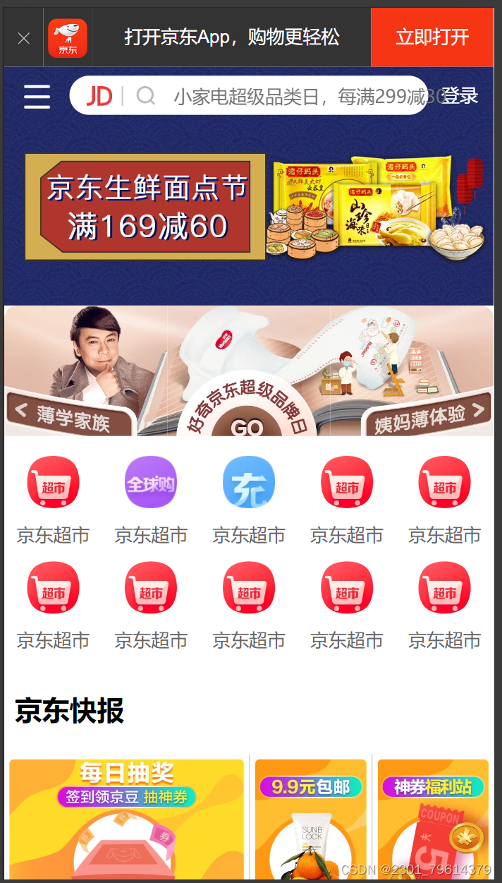
例子:京东首页(不完全)
<!DOCTYPE html>
<html lang="en">
<head>
    <meta charset="UTF-8">
    <meta name="viewport" content="width=device-width, initial-scale=1.0,user-scalable=no,maximum-scale=1.0,minimum-scale=1.0">
    <title>Document</title>
    <link rel="stylesheet" href="./normalize.css">
    <link rel="stylesheet" href="./index.css">
</head>
<body>
    <header class="app">
        <ul>
            <li><img src="./imge/close.png" alt=""></li>
            <li><img src="./imge/logo.png" alt=""></li>
            <li>打开京东App,购物更轻松</li>
            <li>立即打开</li>
        </ul>
    </header>
    <div class="search">
        <div class="left"></div>
        <div class="right">登录</div>
        <div class="middle">
            <div class="jd"></div>
            <div class="sou"></div>
            <input type="text" placeholder="小家电超级品类日,每满299减30">
        </div>
    </div>
    <div class="content">
        <div class="slider">
            <a href="">
                <img src="./upload/banner.dpg" alt="">
            </a>
        </div>
        <div class="brand">
            <div>
                <a href="">
                    <img src="./upload/pic1.dpg" alt="">
                </a>
            </div>
            <div>
                <a href="">
                   <img src="./upload/pic2.dpg" alt="">
                </a>
            </div>
            <div>
                <a href="">
                    <img src="./upload/pic3.dpg" alt="">
                </a>
            </div>
        </div>
        <nav>
            <a href="">
                <img src="./upload/nav1.webp" alt="">
                <span>京东超市</span>
            </a>
            <a href="">
                <img src="./upload/nav2.webp" alt="">
                <span>京东超市</span>
            </a>
            <a href="">
                <img src="./upload/nav3.webp" alt="">
                <span>京东超市</span>
            </a>
            <a href="">
                <img src="./upload/nav1.webp" alt="">
                <span>京东超市</span>
            </a>
            <a href="">
                <img src="./upload/nav1.webp" alt="">
                <span>京东超市</span>
            </a>
            <a href="">
                <img src="./upload/nav1.webp" alt="">
                <span>京东超市</span>
            </a>
            <a href="">
                <img src="./upload/nav1.webp" alt="">
                <span>京东超市</span>
            </a>
            <a href="">
                <img src="./upload/nav1.webp" alt="">
                <span>京东超市</span>
            </a>
            <a href="">
                <img src="./upload/nav1.webp" alt="">
                <span>京东超市</span>
            </a>
            <a href="">
                <img src="./upload/nav1.webp" alt="">
                <span>京东超市</span>
            </a>
        </nav>
        <div class="news">
            <h2>京东快报</h2>
            <a href="">
                <img src="./upload/new1.dpg" alt="">
            </a>
            <a href="">
                <img src="./upload/new2.dpg" alt="">
            </a>
            <a href="">
                <img src="./upload/new3.dpg" alt="">
            </a>
        </div>
body{
    width: 100%;
    min-width: 320px;
    max-width: 640px;
    margin: 0 auto;
    font-size: 14px;
    font-family: -apple-system,Helvetica,sans-serif;
    color: #666;
    line-height: 1.5;
    background-color: #fff;
    /* height: 2000px; */
}
img,a{
    -webkit-touch-callout: none;
    -webkit-tap-highlight-color: transparent;
}
input{
    border: none;
    outline: none;
    outline-offset: 0;
    background: none;
    padding: 0;
}
html{
    background-color: #eee;
}
ul{
    margin: 0;
    padding: 0;
    list-style: none;
}
a{
    color: #666;
    text-decoration: none;
}
img{
    vertical-align: middle;
}
.app{
    height: 45px;
}
.app ul li{
    float: left;
    height: 45px;
    background-color: #333;
    text-align: center;
    line-height: 45px;
    font-size: 14px;
    color: #fff;
}
.app ul li:nth-child(1){
    width: 8%;
}
.app ul li:nth-child(1) img{
    width: 10px;
}
.app ul li:nth-child(2){
    width: 10%;
}
.app ul li:nth-child(2) img{
    width: 30px;
    vertical-align: middle;
}
.app ul li:nth-child(3){
    width: 57%;
}
.app ul li:nth-child(4){
    width: 25%;
    background-color: #f63515;
}
.search{
    height: 44px;
    position: fixed;
    overflow: hidden;
    min-width: 320px;
    max-width: 640px;
    width: 100%;
}
.search .left{
    position: absolute;
    top: 0;
    left: 0;
    width: 40px;
    height: 44px;
}
.search .left::before{
    content: "";
    display: block;
    width: 20px;
    height: 18px;
    background: url(./imge/s-btn.png);
    background-size: 20px 18px;
    margin: 14px 0 0 15px;
}
.search .right{
    position: absolute;
    top: 0;
    right: 0;
    width: 40px;
    height: 44px;
    line-height: 44px;
    color: #fff;
}
.search .middle{
    margin: 0 50px;
    background-color: #fff;
    height: 30px;
    margin: 0 50px;
    border-radius: 15px;
    margin-top: 7px;
    position: relative;
}
.search .middle .jd{
    width: 20px;
    height: 15px;
    background: url(./imge/jd.png);
    position: absolute;
    top: 8px;
    left: 13px;
    background-size: 20px 15px;
}
.search .middle .jd::after{
    content: "";
    display: block;
    width: 1px;
    height: 15px;
    background-color: #ccc;
    position: absolute;
    right: -8px;
    top: 0;
}
.search .middle .sou{
    position: absolute;
    top: 8px;
    left: 50px;
    width: 18px;
    height: 15px;
    background: url(./imge/jd-sprites.png) no-repeat -82px 0;
    background-size: 200px auto;
}
.search .middle input{
    position: absolute;
    top: 7px;
    left: 80px;
    width: calc(80%);
}
.slider img{
    width: 100%;
}
.brand{
    border-radius: 10px 10px 0 0;
    overflow: hidden;
}
.brand div{
    width: 33.333333%;
    float: left;
}
.brand div img{
    width: 100%;
}
nav{
    padding-top: 5px;
    overflow: hidden;
}
nav a{
    float: left;
    width: 20%;
    text-align: center;
}
nav a img{
    width: 40px;
    margin: 10px 0;
}
nav a span{
    display: block;
}
.news{
    margin-top: 10px;
    overflow: hidden;
    color: black;
}
.news h2{
    padding-left: 8px;
}
.news img{
    width: 100%;
}
.news a{
    float: left;
    box-sizing: border-box;
}
.news a:nth-child(2){
    width: 50%;
}
.news a:nth-child(n+3){
    width: 25%;
    border-left: 1px solid #ccc;
}
效果如下:
flex弹性布局
传统布局与flex布局
传统布局:
- 兼容性好
- 布局繁琐
- 有局限性,不能在移动端很好的布局
flex弹性布局:
- 操作方便,布局极为简单,移动端应用很广泛
- PC端浏览器支持情况较差
- IE 11或更低版本,不支持或仅部分支持
建议:
- 如果是PC端的页面布局,还是使用传统布局
- 如果是移动端或者不考虑兼容性问题的PC端页面布局,我hezhuangmoxing们还是使用flex弹性布局
布局原理
flex是flexible Box的缩写,意为“弹性布局”,用来为盒模型提供最大的灵活性,任何一个容器都可以指定为flex布局。
- 当我们将父盒子设为flex布局以后,子元素的float、clear和vertical-align属性将失效。
- 伸缩布局 = 弹性布局 = 伸缩盒布局 = 弹性盒布局 = flex布局
采用flex布局的元素,称为flex容器(flex container),简称“容器”。它的所有子元素自动成为容器成员,称为flex项目(flex item),简称“项目”。
- 体验中div就是flex的父容器
- 体验中span就是子容器flex项目
- 子容器可以横向排列也可以纵向排列
总结flex布局原理:通过给父盒子添加flex属性,来控制子盒子的位置和排列方式
flex布局父项常见属性
- flex-direction :设置主轴的方向
- justify-content :设置主轴上的子元素排列方式
- flex-wrap :设置元素是否换行
- align-content :设置侧轴上的子元素的排列方式(多行)
- align-item :设置侧轴上的子元素的排列方式(单行)
- flex-flow :复合属性,相当于同时设置了flex-direction和flex-wrap
flex-direction 设置主轴的方向
在flex布局中,是分为主轴和侧轴两个方向,叫法同样的有:行和列、x轴和y轴
- 默认主轴方向就是x轴方向,水平向右
- 默认侧轴方向就是y轴方向,水平向下

flex-direction的属性决定主轴的方向(即项目的排列方向)
注意:主轴和侧轴是会变化的,就看flex-direction设置谁为主轴,剩下的就是侧轴。而我们的子元素就是跟着主轴来排列的
- row :默认值,从左到右
- row-reverse :从右到左
- column :从上到下
- column-reverse :从下到上
justify-content设置主轴上的子元素排列方式
justify-content属性定义了项目在主轴上的对齐方式。
- flex-start :默认值,从头部开始(如果主轴是x轴,则是从左到右)
- flex-end :从尾部开始排列
- center :在主轴中居中对齐
- space-around :平分剩余空间
- space-between :先两边贴边,再平分剩余空间
flex-wrap设置子元素是否换行
在flex布局中,默认子元素是不换行的,如果装不开,就会缩小子元素的宽度,强行放在一行。
align-items设置侧轴上的子元素排列方式(单行)
该属性是控制子项在侧轴(默认是y轴)上的排列方式,在子项为单项的时候使用。
- flex-start :从上到下
- flex-end :从下到上
- center :挤在一起居中
- stretch :拉伸(默认值)
align-content设置侧轴上的子元素的排列方式(多行)
设置子项在侧轴上的排列方式并且只能用于子项出现换行的情况,在单行下没有效果。
- flex-start :默认值,从侧轴头部开始排列
- flex-end :在侧轴尾部开始排列
- center :在侧轴中居中对齐
- space-around :子项在侧轴平分剩余空间
- space-between :先在侧轴两边贴边,再平分剩余空间
- stretch :设置子项元素高度平分父元素高度
align-content和align-items的区别:
- align-items适用于单行情况下,只有上对齐、下对齐、居中和拉伸。
align-content适用于换行(多行)的情况下(单行情况下无效),可以设置上对齐、下对齐、居中、拉伸以及平均分配剩余空间等属性值。
flex-flow
flex-flow属性是flex-direction和flex-wrap属性的复合属性。
flex-flow: row wrap;
flex布局子项常见属性
- flex子项目占的份数
- align-self控制子项自己在侧轴的排列方式
- order属性定义子项的排列顺序(前后顺序)
flex属性
flex属性定义子项目分配剩余空间,用flex来表示占多少份数。
例子:三栏布局
<!DOCTYPE html>
<html lang="en">
<head>
    <meta charset="UTF-8">
    <meta name="viewport" content="width=device-width, initial-scale=1.0">
    <title>Document</title>
    <style>
        section{
            display: flex;
            width: 600px;
            height: 150px;
            background-color: tomato;
            margin: 0 auto;
        }
        section div:nth-child(1){
            width: 100px;
            height: 150px;
            background-color: brown;
        }
        section div:nth-child(2){
            flex: 1;
            background-color: burlywood;
        }
        section div:nth-child(3){
            width: 100px;
            height: 150px;
            background-color: crimson;
        }
    </style>
</head>
<body>
    <section>
        <div></div>
        <div></div>
        <div></div>
    </section>
</body>
</html>
align-self控制子项自己在侧轴上的排列方式
align-self属性允许单个项目由与其他项目不一样的对齐方式,可覆盖align-items属性。
默认值为auto,表示继承父元素的align-items属性,如果没有父元素,则等同于stretch。
例子:让一行中最后一个盒子从下往上排列。
代码如下:
<!DOCTYPE html>
<html lang="en">
<head>
    <meta charset="UTF-8">
    <meta name="viewport" content="width=device-width, initial-scale=1.0">
    <title>Document</title>
    <style>
        section{
            display: flex;
            width: 600px;
            height: 300px;
            background-color: beige;
            margin: 0 auto;
        }
        section div{
            width: 100px;
            height: 150px;
            margin: 5px;
            background-color: brown;
        }
        section div:nth-child(3){
            align-self: flex-end;
        }
    </style>
</head>
<body>
    <section>
        <div></div>
        <div></div>
        <div></div>
    </section>
</body>
</html>
结果如图:

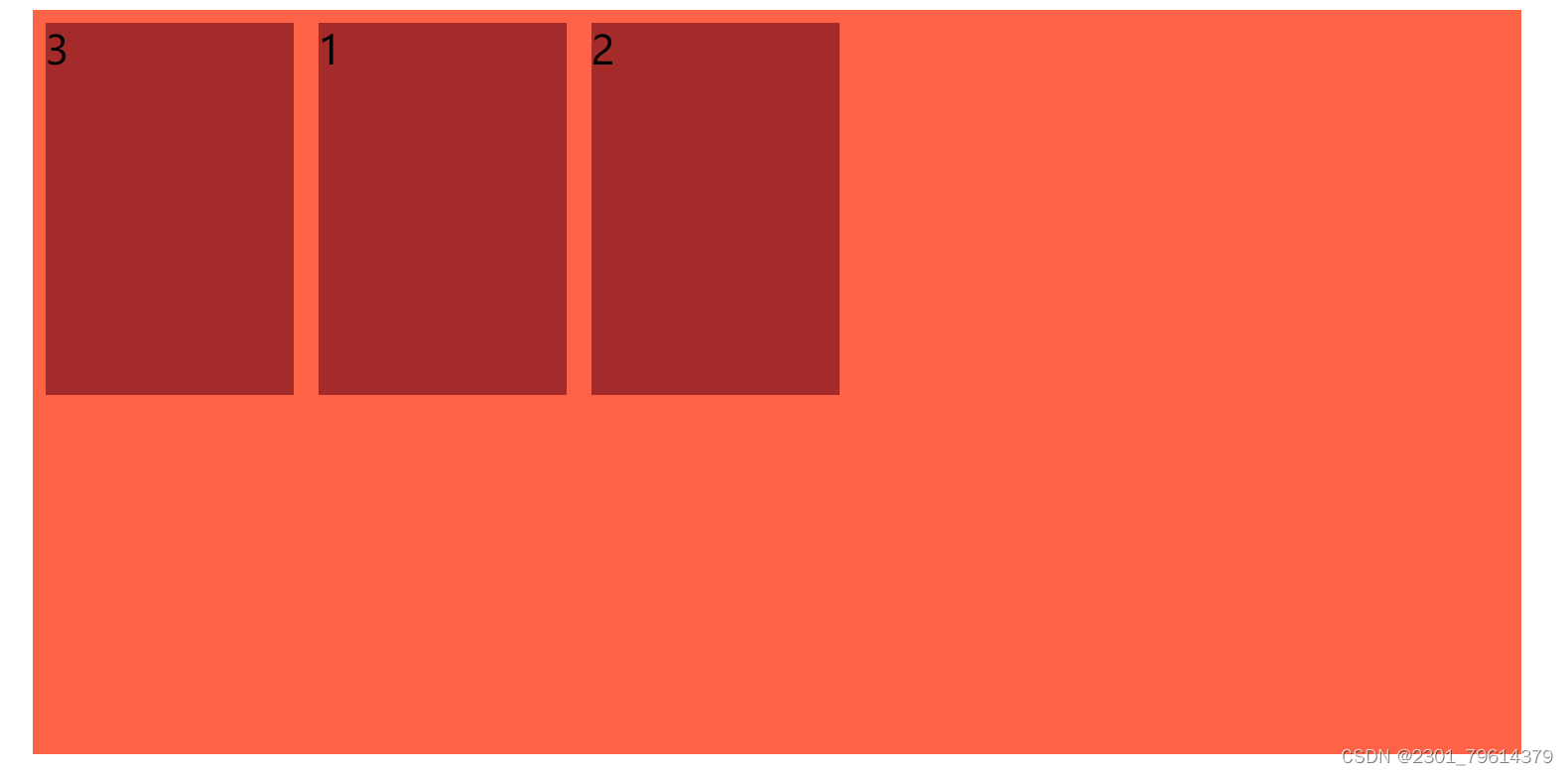
order属性定义项目的排列顺序
数值越小,排列越靠前。
注意:和z-index不一样。
例子代码如下:
<!DOCTYPE html>
<html lang="en">
<head>
    <meta charset="UTF-8">
    <meta name="viewport" content="width=device-width, initial-scale=1.0">
    <title>Document</title>
    <style>
        section{
            display: flex;
            width: 600px;
            height: 300px;
            background-color: tomato;
            margin: 0 auto;
        }
        section div{
            width: 100px;
            height: 150px;
            margin: 5px;
            background-color: brown;
        }
        section div:nth-child(3){
            order: -1;
        }
    </style>
</head>
<body>
    <section>
        <div>1</div>
        <div>2</div>
        <div>3</div>
    </section>
</body>
</html>
效果如图:


 171
171


 被折叠的 条评论
为什么被折叠?
被折叠的 条评论
为什么被折叠?
 到【灌水乐园】发言


