
# matplotlib中文网 https://www.matplotlib.org
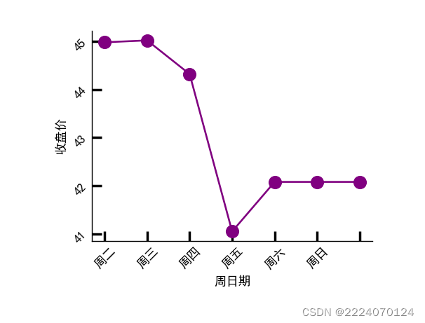
# 需求一:绘制某股票一周内收盘价折线图(见运行结果展示图)
%matplotlib notebook
import numpy as np
import matplotlib.pyplot as plt
# 0.设置中文黑体
plt.rcParams["font.sans-serif"] = ["SimHei"]
plt.rcParams["axes.unicode_minus"] = False
# 1.准备数据
x_data = np.arange(1,8,1)
y_data = [44.98, 45.02, 44.32, 41.05, 42.08, 42.08, 42.08] # 周末休市
# 2.创建画布和坐标系
fig=plt.figure()
ax = fig.add_axes((0.2,0.2,0.5,0.5))
# 3.绘图
ax.plot(x_data, y_data, 'm-o',color='purple', markersize='10')
# 4.定制刻度 方向朝内,宽度为2,长度为8,标签旋转角度
ax.tick_params(direction = 'in',width = 2,length = 8,labelrotation = 45)
# 5.设置轴标签
ax.set_xlabel('周日期')
ax.set_ylabel('收盘价')
ax.set_xticklabels(['周一', '周二', '周三', '周四', '周五', '周六', '周日'])
# 6.隐藏上轴脊和右轴脊
ax.spines['top'].set_color('none')
ax.spines['right'].set_color('none')
# # 7.展示图表
plt.show()


 562
562


 被折叠的 条评论
为什么被折叠?
被折叠的 条评论
为什么被折叠?
 到【灌水乐园】发言


