


# Drop rows (5 in total) with NaN values
df = df.dropna()
df
一、雷达图
1、一个雷达图
# Libraries
import matplotlib.pyplot as plt
import pandas as pd
from math import pi

plt.rcParams['font.sans-serif'] = ['SimHei']  # 指定默认字体为SimHei
plt.rcParams['axes.unicode_minus'] = False  # 解决保存图像时负号'-'显示为方块的问题

# Set data
df = pd.DataFrame({
'group': ['A','B','C','D'],
'专业知识': [38, 1.5, 30, 4],
'社交能力': [29, 10, 9, 34],
'领导能力': [15, 39, 23, 24],
'自我管理': [35, 31, 33, 14],
'学习能力': [32, 15, 32, 14]
})

# number of variable
categories=list(df)[1:]
N = len(categories)

# We are going to plot the first line of the data frame.
# But we need to repeat the first value to close the circular graph:
values=df.loc[0].drop('group').values.flatten().tolist()
values += values[:1]
values

# What will be the angle of each axis in the plot? (we divide the plot / number of variable)
angles = [n / float(N) * 2 * pi for n in range(N)]
angles += angles[:1]

# Initialise the spider plot
ax = plt.subplot(111, polar=True)

# Draw one axe per variable + add labels
plt.xticks(angles[:-1], categories, color='grey', size=8)

# Draw ylabels
ax.set_rlabel_position(0)
plt.yticks([10,20,30], ["10","20","30"], color="grey", size=7)
plt.ylim(0,40)

# Plot data
ax.plot(angles, values, linewidth=1, linestyle='solid')

# Fill area
ax.fill(angles, values, 'b', alpha=0.1)

# Show the graph
plt.show()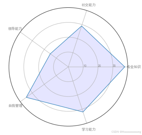
使用Python中的`matplotlib`库绘制一个雷达图,用于展示不同组在多个维度上的表现。
首先,代码导入了所需的库,包括`matplotlib.pyplot`用于绘图,`pandas`用于数据处理,以及`math.pi`用于计算角度。为了在图表中正确显示中文字符,代码设置了默认字体为`SimHei`,并解决了负号显示为方块的问题。这是通过修改`matplotlib`的全局参数实现的,确保中文字符和负号能够正常显示。
接下来,代码使用`pandas`的`DataFrame`创建了一个包含四组数据的数据框。每组数据代表一个组(A、B、C、D),并在五个维度上进行了评分,包括专业知识、社交能力、领导能力、自我管理和学习能力。这些数据将被用于绘制雷达图。为了绘制雷达图,代码提取了第一个组(A组)的数据,并将其转换为列表形式。为了闭合雷达图,列表的第一个值被添加到列表的末尾,确保图形的闭合性。
然后,代码计算了每个维度对应的角度。雷达图的每个维度均匀分布在圆周上,因此需要通过公式计算每个维度的角度值。计算完成后,第一个角度被添加到列表的末尾,以确保图形的闭合性。这些角度值将用于确定雷达图中每个维度的位置。
在初始化雷达图时,代码使用`plt.subplot`创建了一个雷达图,并设置了雷达图的基本属性。`plt.xticks`用于设置每个维度的标签,`ax.set_rlabel_position`用于设置径向标签的位置,`plt.yticks`用于设置径向刻度标签,而`plt.ylim`则用于设置径向刻度的范围。这些设置确保了雷达图的坐标轴和刻度能够正确显示。
绘制数据时,代码使用`ax.plot`绘制了雷达图的轮廓,并使用`ax.fill`填充了轮廓内的区域。填充区域的颜色为蓝色,并设置了透明度,使得图形更加美观和易于观察。最后,代码使用`plt.show()`显示了绘制好的雷达图。
2、一个包含四个雷达图的图表
# Libraries
import matplotlib.pyplot as plt
import pandas as pd
from math import pi

# Set data
df = pd.DataFrame({
'group': ['A','B','C','D'],
'var1': [38, 1.5, 30, 4],
'var2': [29, 10, 9, 34],
'var3': [8, 39, 23, 24],
'var4': [7, 31, 33, 14],
'var5': [28, 15, 32, 14]
})

# ------- PART 1: Define a function that do a plot for one line of the dataset!

def make_spider( row, title, color):

    # number of variable
    categories=list(df)[1:]
    N = len(categories)

    # What will be the angle of each axis in the plot? (we divide the plot / number of variable)
    angles = [n / float(N) * 2 * pi for n in range(N)]
    angles += angles[:1]

    # Initialise the spider plot
    ax = plt.subplot(2,2,row+1, polar=True, )

    # If you want the first axis to be on top:
    ax.set_theta_offset(pi / 2)
    ax.set_theta_direction(-1)

    # Draw one axe per variable + add labels labels yet
    plt.xticks(angles[:-1], categories, color='grey', size=8)

    # Draw ylabels
    ax.set_rlabel_position(0)
    plt.yticks([10,20,30], ["10","20","30"], color="grey", size=7)
    plt.ylim(0,40)

    # Ind1
    values=df.loc[row].drop('group').values.flatten().tolist()
    values += values[:1]
    ax.plot(angles, values, color=color, linewidth=2, linestyle='solid')
    ax.fill(angles, values, color=color, alpha=0.4)

    # Add a title
    plt.title(title, size=12, color=color, y=1.1)


# ------- PART 2: Apply the function to all individuals
# initialize the figure
my_dpi=96
plt.figure(figsize=(1000/my_dpi, 1000/my_dpi), dpi=my_dpi)

# Create a color palette:
my_palette = plt.cm.get_cmap("Set2", len(df.index))

# Loop to plot
for row in range(0, len(df.index)):
    make_spider( row=row, title='group '+df['group'][row], color=my_palette(row))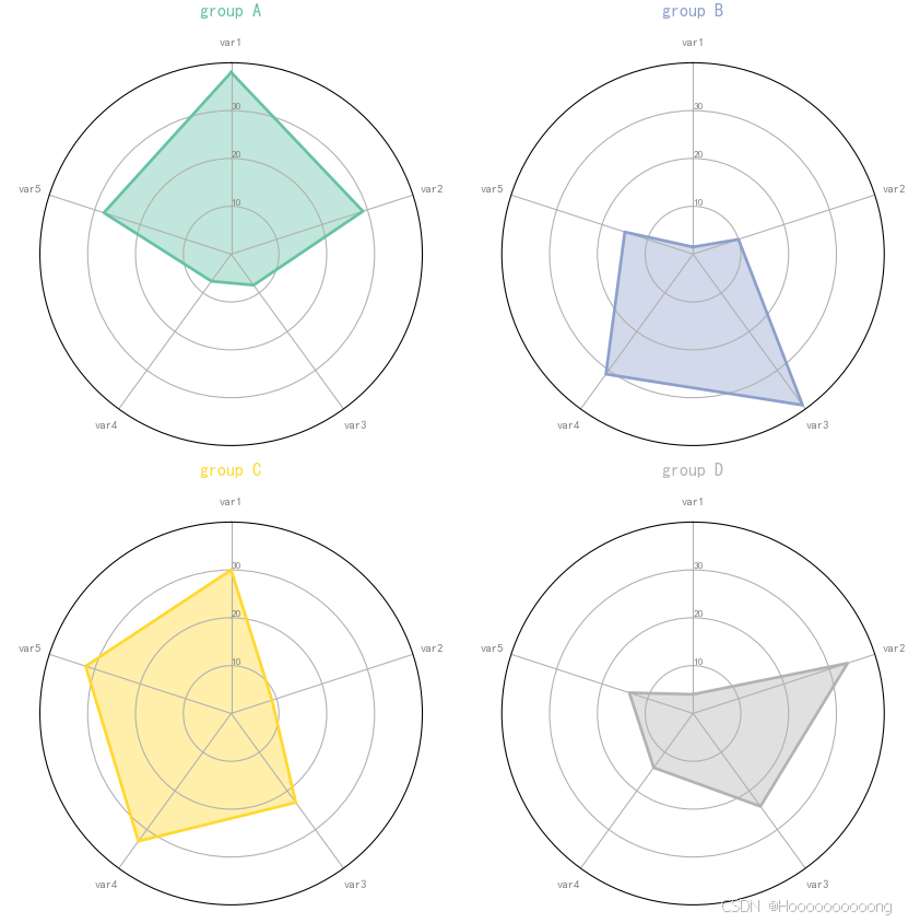
使用Python中的matplotlib库绘制多个雷达图,用于展示不同组在多个维度上的表现。与之前的代码不同,这段代码通过定义一个函数make_spider来实现模块化绘图,并支持同时绘制多个雷达图。
导入所需库后,使用`pandas`的`DataFrame`创建了一个包含四组数据的数据框。每组数据代表一个组(A、B、C、D),并在五个维度上进行了评分(`var1` 到 `var5`)。
定义了一个名为`make_spider`的函数,用于绘制单个雷达图。该函数接受三个参数:
- `row`:数据框中行的索引,用于提取对应组的数据。
- `title`:雷达图的标题。
- `color`:雷达图的颜色。
在函数内部,首先提取变量名并计算其数量 N,然后计算每个轴的角度以适应雷达图的形状。接着,初始化一个极坐标子图,通过`ax.set_theta_offset`和`ax.set_theta_direction`调整极坐标的起始位置和方向,使第一个轴位于顶部。通过 plt.xticks() 设置每个轴的标签,并用 ax.set_rlabel_position(0) 和 plt.yticks() 设置径向标签的位置和刻度线。从数据框中提取对应行的数据,重复第一个值以闭合图形,然后绘制折线并填充区域。最后,为每个雷达图添加标题。
在绘制所有个体的雷达图部分,首先使用 plt.figure() 初始化整个图形的大小和分辨率。然后,使用 plt.cm.get_cmap("Set2", len(df.index)) 创建一个颜色调色板(`Set2`),颜色数量与数据框的行数一致。接下来,遍历数据框中的每一行,调用 make_spider 函数绘制对应的雷达图。
通过极坐标系的设置,雷达图能够直观地展示多维数据,便于比较不同组在各个维度上的差异。这种图表形式特别适合用于多维数据的对比分析,能够清晰地呈现每个维度的表现情况。
代码的核心优势在于其模块化设计,通过定义`make_spider`函数,可以轻松扩展和复用代码,支持更多组或更多维度的数据展示。
二、箱线图
1、一个包含五个不同分布的箱线图
import matplotlib.pyplot as plt
import numpy as np
from matplotlib.patches import Polygon

random_dists = ['Normal(1, 1)', 'Lognormal(1, 1)', 'Exp(1)', 'Gumbel(6, 4)',
                'Triangular(2, 9, 11)']
N = 500

norm = np.random.normal(1, 1, N)
logn = np.random.lognormal(1, 1, N)
expo = np.random.exponential(1, N)
gumb = np.random.gumbel(6, 4, N)
tria = np.random.triangular(2, 9, 11, N)

# Generate some random indices that we'll use to resample the original data
# arrays. For code brevity, just use the same random indices for each array
bootstrap_indices = np.random.randint(0, N, N)
data = [
    norm, norm[bootstrap_indices],
    logn, logn[bootstrap_indices],
    expo, expo[bootstrap_indices],
    gumb, gumb[bootstrap_indices],
    tria, tria[bootstrap_indices],
]

fig, ax1 = plt.subplots(figsize=(10, 6))
fig.canvas.manager.set_window_title('A Boxplot Example')
fig.subplots_adjust(left=0.075, right=0.95, top=0.9, bottom=0.25)

bp = ax1.boxplot(data, notch=False, sym='+', vert=True , whis=1.5)
plt.setp(bp['boxes'], color='black')
plt.setp(bp['whiskers'], color='black')
plt.setp(bp['fliers'], color='red', marker='+')

# Add a horizontal grid to the plot, but make it very light in color
# so we can use it for reading data values but not be distracting
ax1.yaxis.grid(True, linestyle='-', which='major', color='lightgrey',
               alpha=0.5)

ax1.set(
    axisbelow=True,  # Hide the grid behind plot objects
    title='Comparison of IID Bootstrap Resampling Across Five Distributions',
    xlabel='Distribution',
    ylabel='Value',
)

# Now fill the boxes with desired colors
box_colors = ['darkkhaki', 'royalblue']
num_boxes = len(data)
medians = np.empty(num_boxes)
for i in range(num_boxes):
    box = bp['boxes'][i]
    box_x = []
    box_y = []
    for j in range(5):
        box_x.append(box.get_xdata()[j])
        box_y.append(box.get_ydata()[j])
    box_coords = np.column_stack([box_x, box_y])
    # Alternate between Dark Khaki and Royal Blue
    ax1.add_patch(Polygon(box_coords, facecolor=box_colors[i % 2]))
    # Now draw the median lines back over what we just filled in
    med = bp['medians'][i]
    median_x = []
    median_y = []
    for j in range(2):
        median_x.append(med.get_xdata()[j])
        median_y.append(med.get_ydata()[j])
        ax1.plot(median_x, median_y, 'k')
    medians[i] = median_y[0]
    # Finally, overplot the sample averages, with horizontal alignment
    # in the center of each box
    ax1.plot(np.average(med.get_xdata()), np.average(data[i]),
             color='w', marker='*', markeredgecolor='k')

# Set the axes ranges and axes labels
ax1.set_xlim(0.5, num_boxes + 0.5)
top = 40
bottom = -5
ax1.set_ylim(bottom, top)
ax1.set_xticklabels(np.repeat(random_dists, 2),
                    rotation=45, fontsize=8)

# Due to the Y-axis scale being different across samples, it can be
# hard to compare differences in medians across the samples. Add upper
# X-axis tick labels with the sample medians to aid in comparison
# (just use two decimal places of precision)
pos = np.arange(num_boxes) + 1
upper_labels = [str(round(s, 2)) for s in medians]
weights = ['bold', 'semibold']
for tick, label in zip(range(num_boxes), ax1.get_xticklabels()):
    k = tick % 2
    ax1.text(pos[tick], .95, upper_labels[tick],
             transform=ax1.get_xaxis_transform(),
             horizontalalignment='center', size='x-small',
             weight=weights[k], color=box_colors[k])

# Finally, add a basic legend
fig.text(0.80, 0.08, f'{N} Random Numbers',
         backgroundcolor=box_colors[0], color='black', weight='roman',
         size='x-small')
fig.text(0.80, 0.045, 'IID Bootstrap Resample',
         backgroundcolor=box_colors[1],
         color='white', weight='roman', size='x-small')
fig.text(0.80, 0.015, '*', color='white', backgroundcolor='silver',
         weight='roman', size='medium')
fig.text(0.815, 0.013, ' Average Value', color='black', weight='roman',
         size='x-small')

plt.show()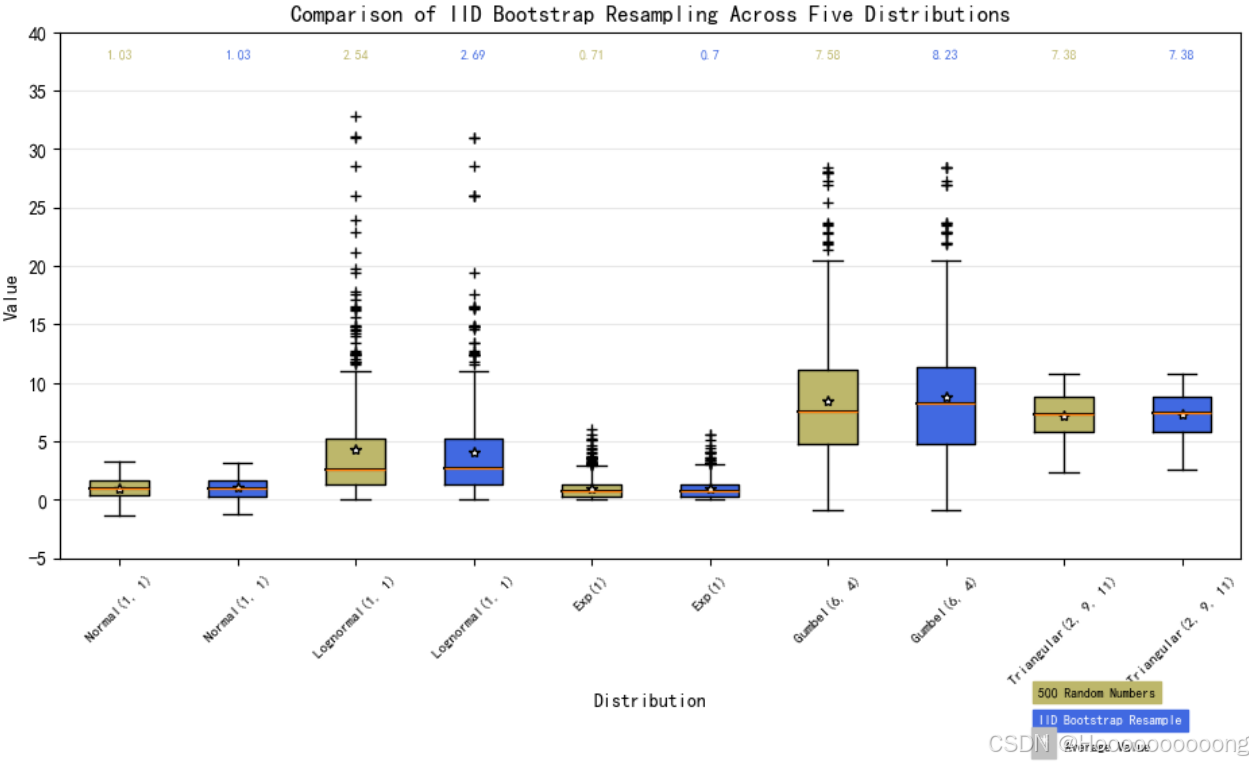
使用 matplotlib 库生成了一个包含五个不同分布(正态分布、对数正态分布、指数分布、古贝尔分布和三角分布)的箱线图,并进行了详细的自定义设置以提高可视化效果。
首先,导入了所需的库:matplotlib.pyplot 用于绘图、numpy 用于数值计算以及 matplotlib.patches.Polygon 用于绘制多边形。
接下来,定义了五个不同的随机分布及其参数(`random_dists`),并使用 `numpy` 的随机数生成函数为每个分布生成了 500 个样本数据。
- `np.random.normal(1, 1, N)`:生成均值为 1,标准差为 1 的正态分布数据。
- `np.random.lognormal(1, 1, N)`:生成对数均值为 1,对数标准差为 1 的对数正态分布数据。
- `np.random.exponential(1, N)`:生成率参数为 1 的指数分布数据。
- `np.random.gumbel(6, 4, N)`:生成位置参数为 6,尺度参数为 4 的古贝尔分布数据。
- `np.random.triangular(2, 9, 11, N)`:生成左边界为 2,模式为 9,右边界为 11 的三角分布数据。
为了模拟自助法重采样(Bootstrap Resampling),生成了一组随机索引(bootstrap_indices),并使用这些索引来重采样原始数据数组。最终,data 列表包含了每个分布的原始数据和重采样后的数据。
创建了一个图形对象 fig 和一个子图对象 ax1,并设置了图形的标题和布局调整参数。使用 ax1.boxplot() 方法绘制箱线图,并通过 plt.setp() 设置箱子、须线和异常点的颜色。为了增强图表的可读性,添加了一条水平网格线,并将其颜色设置为浅灰色。
随后,通过循环遍历每个箱子,提取其顶点坐标并使用 Polygon 类填充箱子的不同颜色(交替使用“暗卡其”和“皇家蓝”)。接着,重新绘制中位线以确保其可见性,并在每个箱子的中心位置绘制样本平均值,标记为白色星号,边缘颜色为黑色。
设置了 x 轴和 y 轴的范围及标签,并将 x 轴的刻度标签旋转 45 度以便更好地显示。此外,在每个箱子上方添加了样本中位值的文本标签,使用两种不同的字体粗细来区分不同的箱子。
最后,添加了一个基本的图例,说明了样本数量、采样方法以及平均值的表示方式。通过 plt.show() 显示最终的图表。
2、多个箱线图
import matplotlib.pyplot as plt
import numpy as np

from matplotlib.patches import Polygon

# Fixing random state for reproducibility
np.random.seed(19680801)

# fake up some data
spread = np.random.rand(50) * 100
center = np.ones(25) * 50
flier_high = np.random.rand(10) * 100 + 100
flier_low = np.random.rand(10) * -100
data = np.concatenate((spread, center, flier_high, flier_low))

fig, axs = plt.subplots(2, 3)

# basic plot
axs[0, 0].boxplot(data)
axs[0, 0].set_title('basic plot')

# notched plot
axs[0, 1].boxplot(data, 1)
axs[0, 1].set_title('notched plot')

# change outlier point symbols
axs[0, 2].boxplot(data, 0, 'gD')
axs[0, 2].set_title('change outlier\npoint symbols')

# don't show outlier points
axs[1, 0].boxplot(data, 0, '')
axs[1, 0].set_title("don't show\noutlier points")

# horizontal boxes
axs[1, 1].boxplot(data, 0, 'rs', 0)
axs[1, 1].set_title('horizontal boxes')

# change whisker length
axs[1, 2].boxplot(data, 0, 'rs', 0, 0.75)
axs[1, 2].set_title('change whisker length')

fig.subplots_adjust(left=0.08, right=0.98, bottom=0.05, top=0.9,
                    hspace=0.4, wspace=0.3)

# fake up some more data
spread = np.random.rand(50) * 100
center = np.ones(25) * 40
flier_high = np.random.rand(10) * 100 + 100
flier_low = np.random.rand(10) * -100
d2 = np.concatenate((spread, center, flier_high, flier_low))
# Making a 2-D array only works if all the columns are the
# same length.  If they are not, then use a list instead.
# This is actually more efficient because boxplot converts
# a 2-D array into a list of vectors internally anyway.
data = [data, d2, d2[::2]]

# Multiple box plots on one Axes
fig, ax = plt.subplots()
ax.boxplot(data)

plt.show()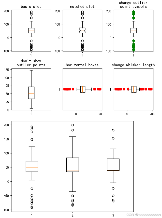
使用 `matplotlib` 库生成了多个箱线图,并展示了不同参数设置下的箱线图样式。
导入所需库后,为了确保结果的可重复性,设置了随机种子为 19680801。然后生成了一组示例数据,包括在 0 到 100 之间均匀分布的随机数、值为 50 的常数、高异常值和低异常值,并将这些数据拼接成一个包含 90 个元素的数组。
接下来,创建了一个 2x3 的子图布局,共 6 个子图。在第一个子图中绘制基本的箱线图,并设置标题为“basic plot”。在第二个子图中绘制凹槽箱线图(`notch=True`),并设置标题为“notched plot”。在第三个子图中绘制箱线图,并将异常点标记为绿色菱形(`sym='gD'`),并设置标题为“change outlier\npoint symbols”。在第四个子图中绘制箱线图,并不显示异常点(`sym=''`),并设置标题为"don't show\noutlier points"。在第五个子图中绘制水平箱线图(`vert=False`),并将异常点标记为红色方形(`sym='rs'`),并设置标题为“horizontal boxes”。在第六个子图中绘制箱线图,并将须线长度设置为四分位距的 0.75 倍(`whis=0.75`),并将异常点标记为红色方形(`sym='rs'`),并设置标题为“change whisker length”。
为了确保子图不会被裁剪或重叠,调整了图形的布局参数。
接着,生成了另一组示例数据 `d2`,结构与之前的 `data` 相同,并将 `data`、`d2` 和 `d2` 的每隔一个元素组合成一个新的列表 `data`。最后,在一个新的图形对象 `fig` 和一个子图对象 `ax` 中绘制这三个箱线图,并显示最终的图表。
通过这些步骤,代码展示了不同参数设置下的箱线图样式,包括基本箱线图、凹槽箱线图、改变异常点符号、不显示异常点、水平箱线图和改变须线长度等。
3、读取 CSV 文件并绘制自定义颜色的箱线图
import pandas as pd

# Path to the local CSV file
file_path = "D:/大数据处理与可视化/trentino_temperature.csv"

try:
    # Read the CSV file into a DataFrame
    df = pd.read_csv(file_path)
    print("File read successfully.")
    print(df.head())  # Display the first few rows of the DataFrame
except FileNotFoundError:
    print(f"File not found: {file_path}")
except Exception as e:
    print(f"An error occurred: {e}")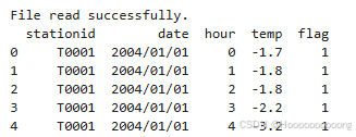
从本地文件系统中读取一个 CSV 文件,并将其加载到一个 pandas DataFrame 中,并进行异常值处理。
df = pd.read_csv("trentino_temperature.csv")
df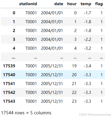
# Drop rows (5 in total) with NaN values
df = df.dropna()
df
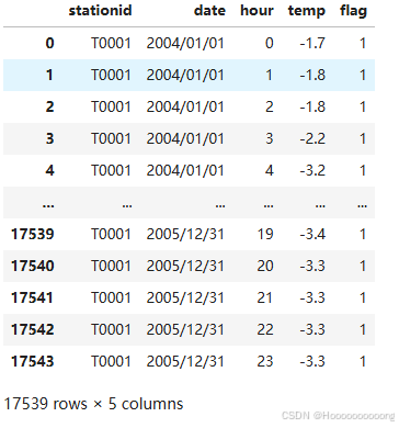
删除包含 NaN 值的行
# Create a figure and axis
fig, ax = plt.subplots(figsize=(8,6))

# Create a boxplot for the desired column with custom colors
boxplot = ax.boxplot(df['temp'], patch_artist=True)

# Set custom colors
box_color = 'lightblue'
whisker_color = 'blue'
cap_color = 'gold'
flier_color = 'red'
median_color = 'red'

# Add the right color for each part of the box
plt.setp(boxplot['boxes'], color=box_color)
plt.setp(boxplot['whiskers'], color=whisker_color)
plt.setp(boxplot['caps'], color=cap_color)
plt.setp(boxplot['fliers'], markerfacecolor=flier_color)
plt.setp(boxplot['medians'], color=median_color)

# Set labels and title
ax.set_xlabel('Column')
ax.set_ylabel('Values')
ax.set_title('Boxplot')

# Show the plot
plt.show()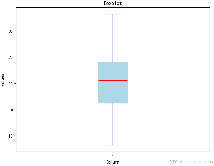
使用 `matplotlib` 库创建了一个自定义颜色的箱线图,用于可视化 DataFrame 中某一列的数据分布。
首先,通过 `plt.subplots(figsize=(8, 6))` 创建一个图形对象 `fig` 和一个子图对象 `ax`,并设置图形的大小为 8 英寸宽、6 英寸高。
接下来,使用 `ax.boxplot(df['temp'], patch_artist=True)` 在子图 `ax` 上绘制箱线图,并将 `patch_artist` 设置为 `True`,以便可以自定义箱子的颜色。这里假设 DataFrame `df` 中有一列名为 `'temp'`,其中包含温度数据。
然后,定义了各种部分的颜色(箱子、须线、端帽、异常点、中位数线),并使用 `plt.setp` 函数设置每个部分的具体颜色。例如,箱子的颜色设置为浅蓝色 (`lightblue`),须线的颜色设置为蓝色 (`blue`),端帽的颜色设置为金色 (`gold`),异常点的颜色设置为红色 (`red`),中位数线的颜色也设置为红色 (`red`)。
之后,使用 `ax.set_xlabel('Temperature Data')`、`ax.set_ylabel('Temperature (°C)')` 和 `ax.set_title('Boxplot of Temperature Data')` 设置 x 轴标签、y 轴标签和图形标题,使图表更具可读性。
最后,使用 `plt.show()` 显示生成的自定义颜色的箱线图,呈现温度数据的分布情况。
通过这些步骤,可以从 CSV 文件中读取数据,删除缺失值,并生成一个带有自定义颜色的箱线图以可视化温度数据的分布情况。


 1935
1935

 被折叠的 条评论
为什么被折叠?
被折叠的 条评论
为什么被折叠?
 到【灌水乐园】发言


