


第十一周调研技能学习(上)——python绘图
Part1 Python绘图学习(一)
1使用pandas读取Excel文件并绘制相关函数图像
调用pandas相关函数并验证是否读取
import pandas as pd
import matplotlib.pyplot as plt
import numpy as np

df = pd.read_excel('C:/Users/14913/Desktop/week12/data.xlsx' , sheet_name='Sheet1')
print(df)
运行一下程序

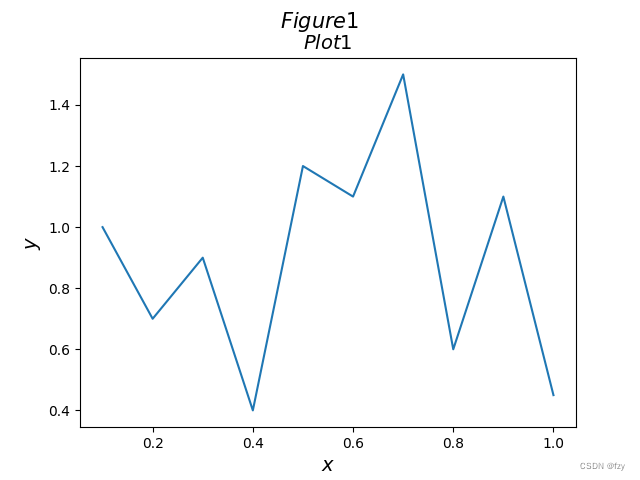
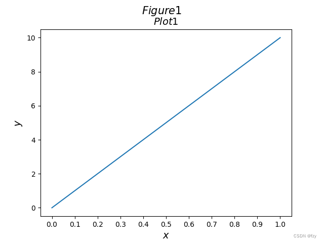
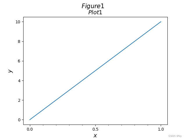
绘制相关数据的函数图像
import pandas as pd
import matplotlib.pyplot as plt
import numpy as np

df = pd.read_excel('C:/Users/14913/Desktop/week12/data.xlsx' , sheet_name='Sheet1')
# print(df)

# plot

fig = plt.figure()
sub = fig.add_subplot(111)
sub.plot(df['x'],df['y'] , linewidth = 3)

sub.set_xlabel(r'$x$',fontsize = 14)
sub.set_ylabel(r'$y$',fontsize = 14)
sub.set_title(r'$Plot1$',fontsize = 14)
fig.suptitle(r'$Figure1$' , fontsize = 15)

plt.show()
plt.close(fig)
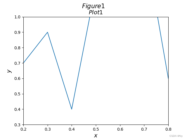
利用xlim和ylim绘制在某一特定区域的函数图像
sub.set_xlim([0.2 , 0.8])
sub.set_ylim([0.3 , 1.0])
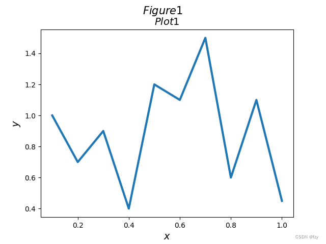
plot中一些参数设置
linewidth参数:改变线条粗细
sub.plot(df['x'],df['y'] ,linewidth = 3)
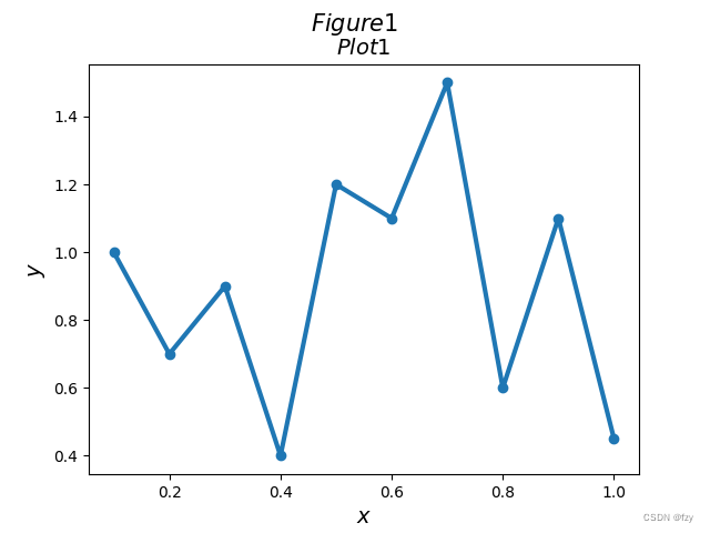
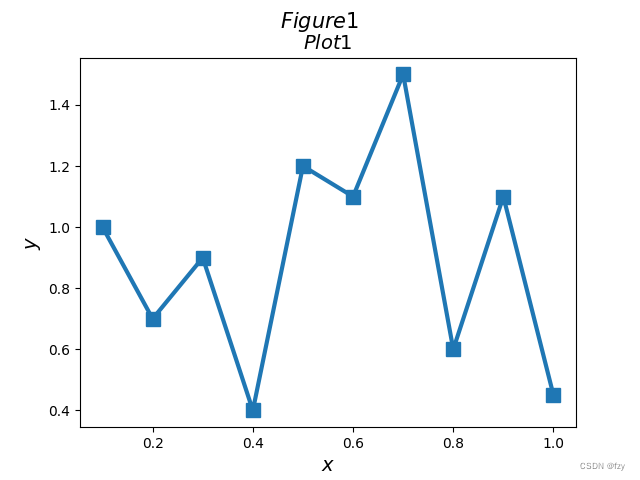
marker参数:可以设置marker来改变点的形状
sub.plot(df['x'],df['y'] ,linewidth = 3 , marker = 'o')
marker=‘s’表示square,markersize设置marker大小:
sub.plot(df['x'],df['y'] ,linewidth = 3 , marker = 's' ,markersize = 10)
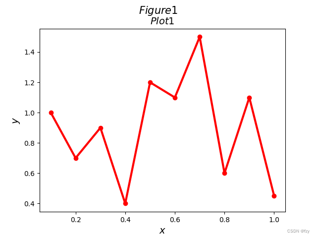
color参数:改变线条颜色
sub.plot(df['x'],df['y'] ,linewidth = 3 , marker = 'o' , color = 'red')
2改变坐标轴的比例尺
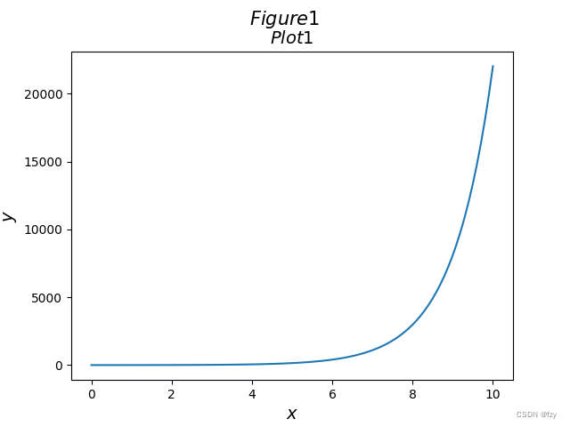
普通对数函数图像在x较大处难以分析,设置垂直轴为对数刻度
x = np.linspace(0,10,100)
y = np.exp(x)

fig = plt.figure()
sub = fig.add_subplot(111)
#sub.plot(df['x'],df['y'] ,linewidth = 3 , marker = 's' ,markersize = 10)
sub.plot(x,y)
sub.set_xlabel(r'$x$',fontsize = 14)
sub.set_ylabel(r'$y$',fontsize = 14)
sub.set_title(r'$Plot1$',fontsize = 14)
fig.suptitle(r'$Figure1$' , fontsize = 15)

plt.show()
采用对数刻度:
sub.set_yscale('log')

3在坐标纸上画出刻度,标签与网格
设置刻度的参数
x = np.linspace(0,1,100)
y = 10*x

fig = plt.figure()
sub = fig.add_subplot(111)
#sub.plot(df['x'],df['y'] ,linewidth = 3 , marker = 's' ,markersize = 10)
sub.plot(x,y)
sub.set_xlabel(r'$x$',fontsize = 14)
sub.set_ylabel(r'$y$',fontsize = 14)

sub.set_xticks(np.arange(0,1.01,0.1))
sub.set_title(r'$Plot1$',fontsize = 14)
fig.suptitle(r'$Figure1$' , fontsize = 15)

plt.show()
也可传入自定义数组,设置刻度间隔
添加minor=ture,设置分刻度,可以看到[0,0.5]中间有0.1间隔的分刻度
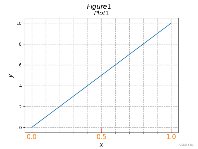
sub.set_xticks([0,0.5,1.0])
sub.set_xticks(np.arange(0,1.01,0.1),minor=True)
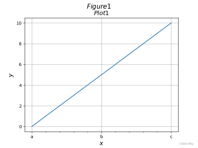
自定义刻度名称:
sub.set_xticks([0,0.5,1.0])
sub.set_xticks(np.arange(0,1.01,0.1),minor=True)
sub.set_xticklabels(['a', 'b', 'c'])

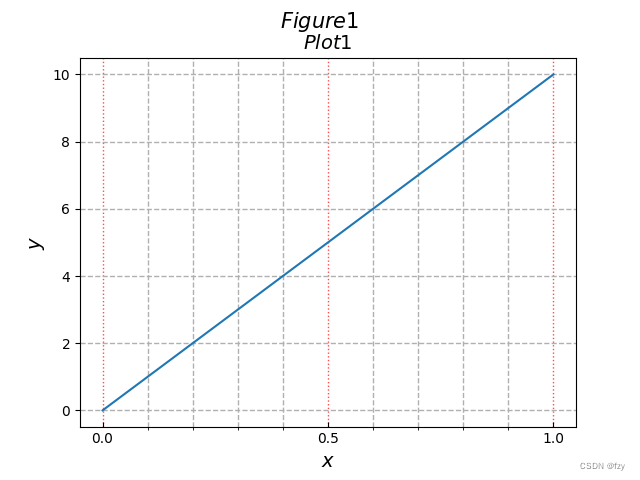
绘制网格属性
利用grid函数,默认x,y均添加刻度:
sub.grid()
可单独设置x轴或y轴
sub.grid(axis = 'x')

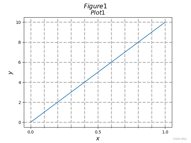
上图中默认只画了主刻度的网格线,可以通过设置which=’both‘,使其对分刻度也添加网格线:
sub.grid(which = 'both')

通过linestyle和linewidth设置线性和粗细:
sub.grid(which = 'both',linestyle = '--',linewidth=2)
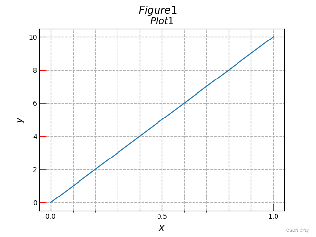
tick_params函数用于设置标签和刻度的相关参数
可以看到上图中的刻度均在表格外,可通过direction设置其朝向
sub.tick_params(axis='x',which='major',direction='in')

可以看到上图中0,0.5.1.0刻度朝内。
设置刻度颜色和宽度:
sub.tick_params(which='major', direction='in', length=10 ,color='red')
设置刻度大小字体及颜色:
sub.tick_params(axis ='x', direction='in', length=10 ,color='red' ,labelsize=15, labelcolor ='C1')
设置网格线的颜色、样式、透明度:
sub.tick_params(axis ='x', direction='in', grid_color='red',grid_linestyle =':',grid_alpha=0.7)
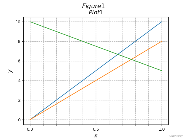
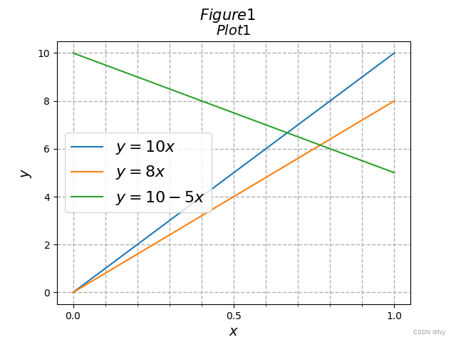
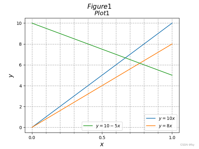
4绘制多条曲线并展现出相应的图例
多次使用plot函数,结合show可绘制出不同颜色的曲线
x = np.linspace(0,1,100)
y = 10*x
y2 = 8*x
y3 = 10 - 5*x

fig = plt.figure()
sub = fig.add_subplot(111)
#sub.plot(df['x'],df['y'] ,linewidth = 3 , marker = 's' ,markersize = 10)
sub.plot(x,y)
sub.plot(x,y2)
sub.plot(x,y3)
sub.set_xlabel(r'$x$',fontsize = 14)
sub.set_ylabel(r'$y$',fontsize = 14)
sub.set_xticks([0,0.5,1.0])
sub.set_xticks(np.arange(0,1.01,0.1),minor=True)

sub.grid(which='both', linestyle='--',linewidth=1)
sub.set_title(r'$Plot1$',fontsize = 14)
fig.suptitle(r'$Figure1$' , fontsize = 15)

plt.show()
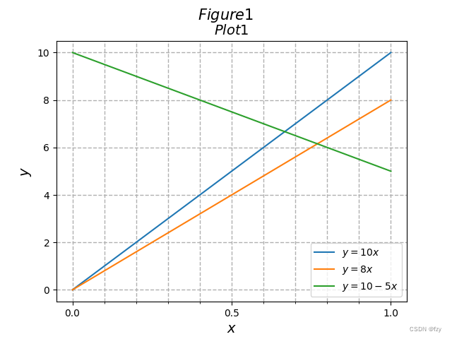
使用legend来在特定位置添加图例
添加标签label,并调用legend函数:
sub.plot(x,y,label='$y=10x$')
sub.plot(x,y2,label='$y=8x$')
sub.plot(x,y3,label='$y=10-5x$')
sub.legend()
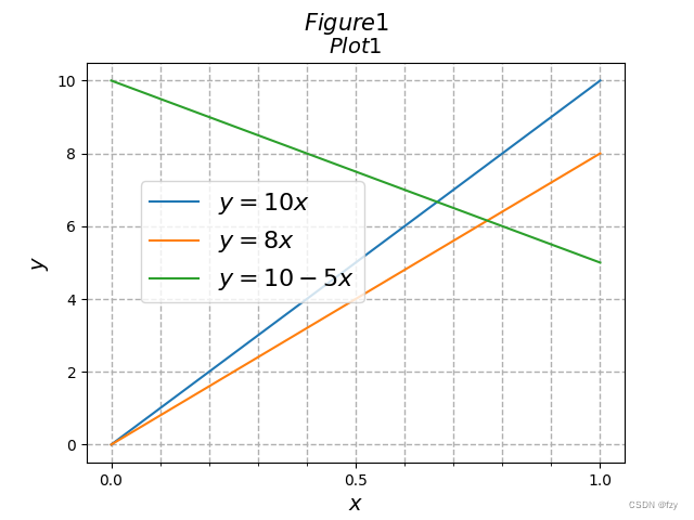
调整图例大小和位置:
sub.legend(fontsize=16, loc='center left')
也可以传数组表示位置
sub.legend(fontsize=16, loc=[0.1, 0.4])
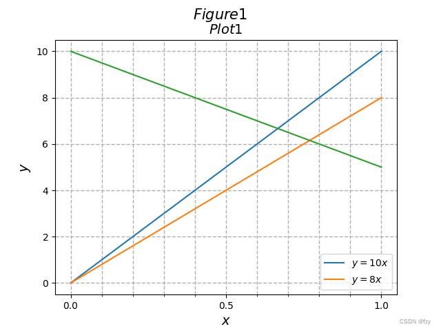
只给特定的线条对象添加图例
'line1,‘中’ , '表示取列表的第一个元素
line1, = sub.plot(x,y,label='$y=10x$')
line2, = sub.plot(x,y2,label='$y=8x$')
line3, = sub.plot(x,y3,label='$y=10-5x$')
sub.legend(handles=[line1,line2])
将line 1,line 3和line 2的图例分隔开,分别绘制两组图例
若想分开绘制图例,如果运行下面代码,只能得到后面line3图例:
sub.legend(handles=[line1,line2])
sub.legend(handles=[line3])
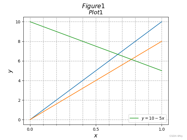
多次调用legend会将之前的图例覆盖,因此先保存之前的图例为静态,再绘制下一个图例
修改为:
line1, = sub.plot(x,y,label='$y=10x$')
line2, = sub.plot(x,y2,label='$y=8x$')
line3, = sub.plot(x,y3,label='$y=10-5x$')
leg1= sub.legend(handles=[line1,line2])
sub.add_artist(leg1)
sub.legend(handles=[line3],loc='lower center')
Part2 Python绘图学习(二)
Python时间操作包–datetime快速上手攻略
1.datetime和timedelta数据类型
首先在一开始先引入datetime库。
import datetime
datetime中的datetime函数,它按顺序接受一系列整数,分别是年、月、日、时、分、秒以及微秒。datetime有七个参数,分别是year,month,day,hour,minute,second,microsecond。
dt=datetime.datetime(2024,5,10,21,30,45,10000)
dt0=datetime.datetime(2020,9,1)
print(dt)  #输出dt,输出为"2024-05-10 21:30:45.010000"
print(dt.year)  #输出dt的参数year,输出为"2024"
两个datetime相减得到timedelta类型的数据,用来表示一段时间的长度,可以很方便的得到两个日期之间的天数。timedelta有三个参数,分别是days,seconds,microseconds。
delta_t=dt-dt0
print(delta_t)  #输出delta_t,输出为"1347 days, 21:30:45.010000"
print(delta_t.days)  #输出delta_t的day参数,输出为"1347"
print(delta_t.total_seconds())   #函数total_seconds,表示一共几秒
当然我们也可以直接创建一个timedelta对象,方法就是调用timedelta函数,参数分别是days,hours,minutes,seconds,microseconds。
delta_t0=datetime.timedelta(hours=50,minutes=49)
另外,两个datetime对象是可以比大小的,timedelta也可以。
2.datetime数据类型和字符串之间的相互转化
接下来我们来看看如何由datetime生成一个格式化的字符串,方法就是调用dt的一个内置函数strftime。strftime(格式):按照格式生成字符串。它接收一个字符串,表示要生成的字符串的格式。
str_dt=dt.strftime('%Y/%d/%m, %H:%M:%S')
#格式可以在matplotlib官网上查
print(str_dt)  #输出为:2024/10/05, 21:30:45
那么有了由datetime生成一个格式化的字符串的函数,同样有将字符串转化为datetime的逆函数,这个函数就是datetime.strptime(str,格式),它可以将一个字符串按照格式生成一个datetime类型。
dt_str='05/10/20--20:45:51.010000'
dt1=datetime.datetime.strptime(dt_str,'%m/%d/%y--%H:%M:%S.%f')
print(dt1)  #输出"2020-05-10 20:45:51.010000"
3.创建datetime类型的Numpy数组
对于datetime类型,我们仍可以调用numpy的arange函数来创建数组。
dt0=datetime.datetime(2020,5,10,0,0)
dt1=dt0+datetime.timedelta(days=1,minutes=0)
dt_arr = (np.arange(dt0,dt1,datetime.timedelta(hours=1),dtype=object))
#从dt0到dt1,步长为一个小时
由此就创建了一个长度为24的数组。默认情况下,numpy会把数据类型转化为numpy内置的时间类型datetime64,为了一致性,可以将数据类型转变为object。(注意:对于datetime类型,不能使用linspace创建数组。)
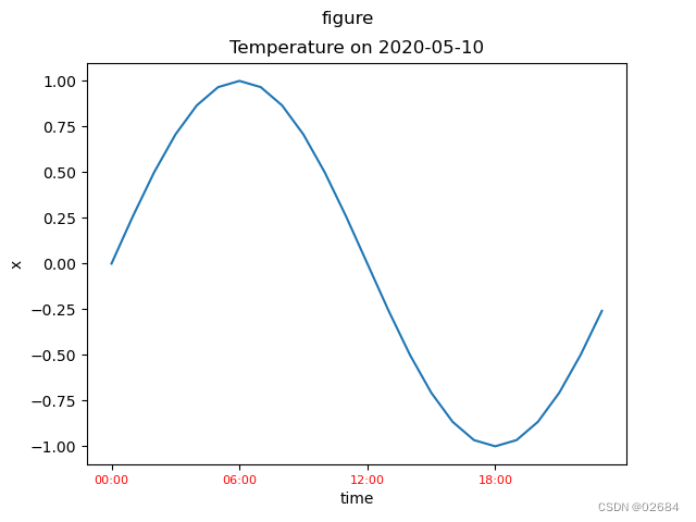
4.利用datetime数组画图
创建好datetime类型的Numpy数组后,我们就可以利用datetime数组画图了!
import numpy as np
import matplotlib.pyplot as plt
import datetime

#创建x数组
x=np.sin(2*np.pi*np.arange(0,24)/24)

#创建datetime类型的Numpy数组
dt0=datetime.datetime(2020,5,10,0,0)
dt1=dt0+datetime.timedelta(days=1,minutes=0)
dt_arr = (np.arange(dt0,dt1,datetime.timedelta(hours=1),dtype=object))

#创建图形,详见之前的博客
fig=plt.figure()
fig.suptitle('figure')
sub=fig.add_subplot(111)
sub.set_title(r'Temperature on ' + dt0.strftime('%Y-%m-%d'))
sub.set_xlabel('time')
sub.set_ylabel('x')
sub.plot(dt_arr,x)

#设置x轴标签
xticks = np.arange(dt0,dt1,datetime.timedelta(hours=6)).astype(object)
sub.set_xticks(xticks)
xticklabels = np.zeros(len(xticks), dtype=object)
for i in range(len(xticks)):
 xticklabels[i] = xticks[i].strftime('%H:%M')
sub.set_xticklabels(xticklabels,fontsize=8,color='r')

plt.show()
Matplotlib实用技巧:多坐标轴设置,阴影与文本
====
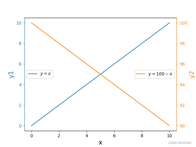
1. 创建共享x轴但拥有独立y轴的subplot
首先我们先运行一下下面的代码(详见之前博客)
import numpy as np
import matplotlib.pyplot as plt
import pandas as pd

x=np.linspace(0,10,1001)
y1=x
y2=100-x
fig=plt.figure()
sub=fig.add_subplot(111)
sub.set_xlabel('x',fontsize=15)
sub.set_ylabel('y1',fontsize=15,color='C0')
sub.tick_params(which='both',axis='y',color='C0',labelcolor='C0')
sub.plot(x,y1,label='$y=x$')
sub.plot(x,y2,label='$y=100-x$',color='C1')
sub.legend(loc='center left')
plt.show()
得到这样的图片
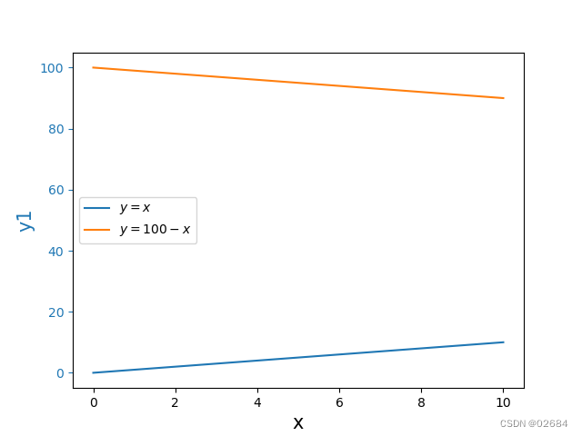
可以看到,每条曲线只占据了很小的范围,画出来的图不方便阅读。而在数据可视化中,我们要保证图线尽可能的占据图片的大部分区域。那么,我们该怎么处理呢?我们可以通过让这两条线有相同的x轴,但有各自独立的y轴解决问题。方式就是利用sub.twinx() 函数,这个函数可以创建另一个与sub共享x轴的subplot。然后将x,y2的图像改成sub2的subplot,这样就可以画出两个在中间的图啦!
#创建共享x轴的sub2
sub2=sub.twinx()
sub2.plot(x,y2,label='$y=100-x$')
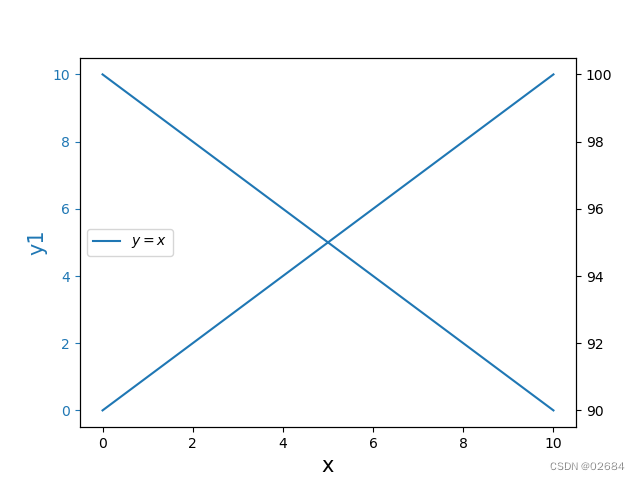
但是要注意的是,因为这是两个不同的subplot图,因此两个图线颜色一样,图例也会覆盖。要解决这两个问题,只需要分别在他们的函数中改变图线颜色和图例位置就可以了。
#分别设置两个图线的颜色以及图例位置
sub.plot(x,y1,label='$y=x$',color='C0')
sub.legend(loc='center left')
sub2.plot(x,y2,label='$y=100-x$',color='C1')
sub2.legend(loc='center right')
另外,为了让两个图像更具有区分度,还可以分别设置两个y轴以及刻度的样式和颜色。
sub.set_ylabel('y1',fontsize=15,color='C0')
sub.tick_params(which='both',axis='y',color='C0',labelcolor='C0')
sub2.set_ylabel('y2',fontsize=15,color='C1')
sub2.tick_params(which='both',axis='y',color='C1',labelcolor='C1')
sub2.spines['right'].set_color('C1')
sub2.spines['left'].set_color('C0')
画出图来,就是下面这样啦!
2. 添加一块竖直或水平方向的条形阴影区域
接下来我们学习一个辅助功能axvspan()函数来添加一块竖直方向的条形阴影区域。
首先依照下面代码我们重新画一个图。
import numpy as np
import matplotlib.pyplot as plt
import pandas as pd
x=np.linspace(0,1,101)
y=np.cos(2*np.pi*x)
fig=plt.figure()
sub=fig.add_subplot(111)
sub.set_xlabel('x',fontsize=15)
sub.set_ylabel('y1',fontsize=15,color='C0')
sub.tick_params(which='both',axis='y',color='C0',labelcolor='C0')
sub.plot(x,y,color='C0')
plt.show()
画出来这样的图:
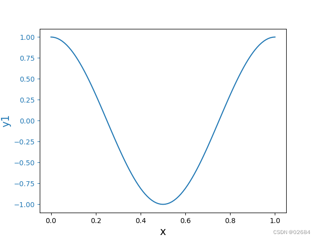
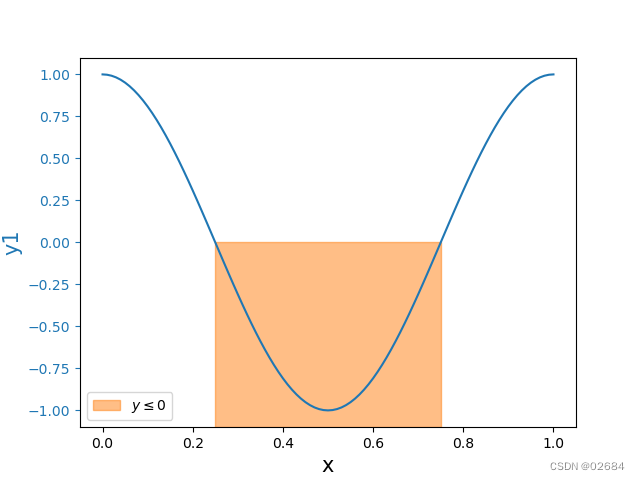
下面我想在x轴上0.25到0.75范围内添加一个阴影。我们该怎么做呢?发方法就是使用axvspan()函数。
sub.axvspan(0.25,0.75,0,0.5,color='C1',alpha=0.5,label=r'$y\leq0$')
sub.legend()
在·axvspan函数中可以设置阴影的范围,颜色,透明度以及标签等。在这里需要说明一点,axvspan接受的前两个参数是x的坐标值,而后两个参数相当于在y轴的比例位置(有点像晶胞参数,范围是0~1)。
这样我们就可以画出来带阴影的图啦!
添加一块水平方向的条形阴影区域则需要使用axhspan()函数,与axvspan()非常相似,这里就不再赘述,大家举一反三吧。
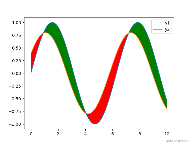
3. 用颜色填充两条曲线之间的区域
fill_between 是 Matplotlib 库中的一个函数,用于在两个曲线之间填充颜色。这个函数非常适用于可视化某些区间或者表示不确定性的范围。
import matplotlib.pyplot as plt
import numpy as np

x = np.linspace(0, 10, 100)
y1 = np.sin(x)
y2 = 0.8 * np.sin(x + 0.5)

fig=plt.figure()
sub=fig.add_subplot(111)
sub.plot(x, y1, label='y1')
sub.plot(x, y2, label='y2')

# 填充 y1 和 y2 之间的区域
sub.fill_between(x, y1, y2, where=(y1>y2), facecolor='green', interpolate=True)
sub.fill_between(x, y1, y2, where=(y1<y2), facecolor='red', interpolate=True)

plt.legend()
plt.show()
fill_between 函数用于填充 y1 和 y2 曲线之间的区域。
fill_between 函数通常接收三个主要的参数,它们通常是数组:
x:一维数组或数组序列,表示 x 轴上的值。
y1:一维数组或数组序列,表示第一条 y 轴上的值,用于确定填充区域的底部。
y2:一维数组或数组序列,表示第二条 y 轴上的值,用于确定填充区域的顶部。
这三个参数共同定义了填充区域的边界。
where 参数用于指定填充的条件,facecolor 参数用于设置填充的颜色,interpolate参数用于确保填充区域在数据点之间平滑过渡。
利用fill_between函数我们就可以画出像下面这样好看的图啦!
4. 在图片中添加文本框
下面我们来学习本期的最后一部分内容:利用text函数往图片里添加文本。
在Matplotlib中,text函数用于在图表的任意位置添加文本。这个函数非常灵活,允许你指定文本的位置、旋转、对齐方式、颜色、字体大小等属性。
text函数基本用法如下:
matplotlib.pyplot.text(x, y, s, kwargs)
参数说明:
x, y:文本的位置坐标,其中x是水平位置,y是垂直位置。(默认情况下,输入的是位置坐标,若要想输入百分比,可以在函数参数列表中指出transform=sub.transAxes)
s:要添加的文本字符串。
**kwargs:其他关键字参数,用于控制文本的样式,如fontsize、color、horizontalalignment(水平对齐方式,默认是左对齐)、verticalalignment(垂直对齐方式)、bbox等。
着重讲一下bbox参数:
bbox参数接受一个字典,其中可以包含多个用于自定义边框属性的键值对。
以下是一些常用的bbox字典键:
facecolor:边框的背景色。
edgecolor:边框的边缘颜色。
boxstyle:边框的样式,如 ‘round’, ‘square’, ‘round4’, ‘roundtoon’, ‘circle’ 等。
alpha:边框的透明度,取值范围从 0(完全透明)到 1(完全不透明)。
linewidth:边框线的宽度。
pad:文本和边框之间的填充距离。
下面是一个实例
sub.text(0.5,0.75, r'$y=\sin (x)$',fontsize=15,
color='C0',horizontalalignment='center',verticalalignment='center', transform=sub.transAxes,
rotation = 45, bbox = dict(edgecolor='C2',
facecolor='None',linestyle='--',linewidth=2))
sub.text(2,-0.5, r'$y=0.8\sin(x+0.5)$',fontsize=15,
color='C1',horizontalalignment='center',verticalalignment='center',
rotation = 315, bbox = dict(edgecolor='C2',
facecolor='None',linestyle='-',linewidth=2))
输出后
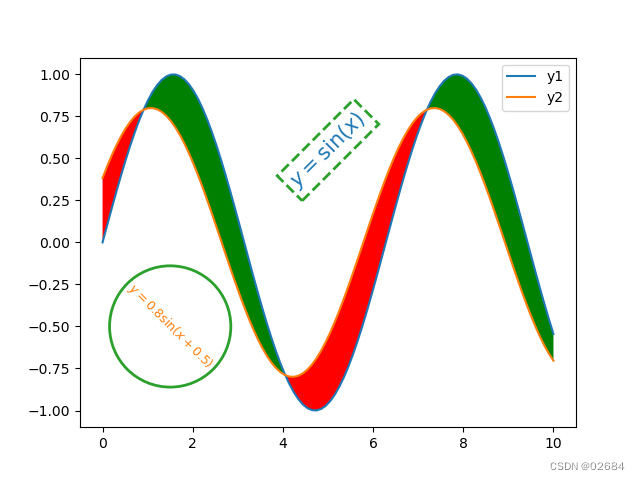
盒盒盒,虽然有点丑,但是可以比较清晰的演示。
用text函数可以在图中添加文本和文本框,是不是很方便呢?
好了,这就是本期的全部内容了,下期再见!!


 5967
5967

 被折叠的 条评论
为什么被折叠?
被折叠的 条评论
为什么被折叠?
 到【灌水乐园】发言


