


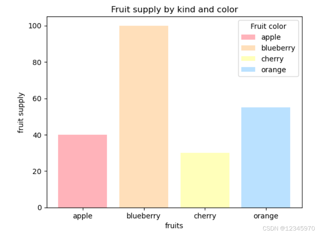
柱形图
示例1:
import matplotlib.pyplot as plt

# 创建一个图形对象和一组子图
fig, ax = plt.subplots()

# 定义水果种类列表
fruits = ['apple', 'blueberry', 'cherry', 'orange']
# 定义对应水果的数量列表
counts = [40, 100, 30, 55]

# 定义每个柱状图的标签,这里使用水果名称作为标签
bar_labels = ['apple', 'blueberry', 'cherry', 'orange']

# 定义每个柱状图的颜色,使用十六进制颜色码
bar_colors = ['#FFB3BA', '#FFDFBA', '#FFFFBA', '#BAE1FF']

# 绘制条形图,传入水果名称、数量、标签和颜色
ax.bar(fruits, counts, label=bar_labels, color=bar_colors)

# 设置y轴标签为“fruit supply”
ax.set_ylabel('fruit supply')
# 设置x轴标签为“fruits”
ax.set_xlabel('fruits')
# 设置图表标题为“Fruit supply by kind and color”
ax.set_title('Fruit supply by kind and color')
# 添加图例,并设置图例标题为“Fruit color”
ax.legend(title='Fruit color')

# 显示图表
plt.show()
这段代码使用matplotlib库创建了一个简单的条形图,展示了不同水果的数量及其对应的颜色。
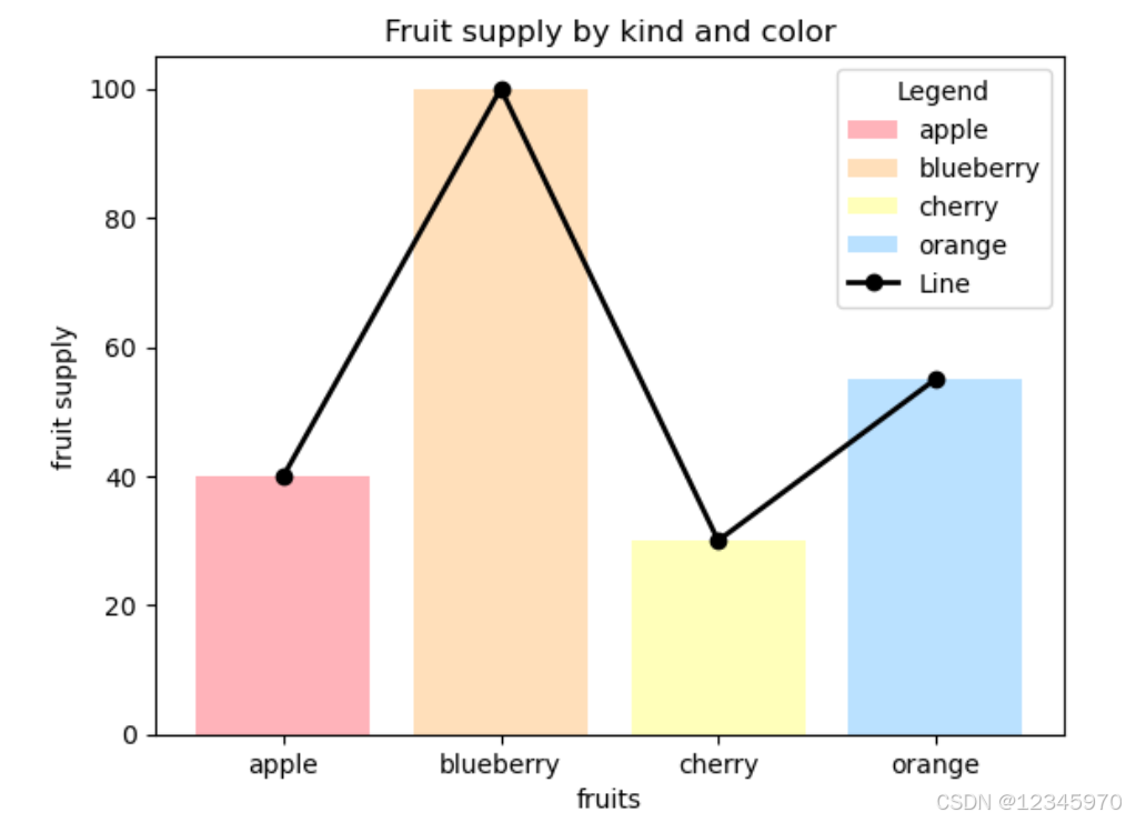
示例2:
在柱状图的基础上添加了一条折线图,每个柱状图的中心点连接起来,并且每个数据点都有一个标记(marker)
import matplotlib.pyplot as plt
# 创建一个图形对象和一组子图
fig, ax = plt.subplots()

# 定义水果种类列表
fruits = ['apple', 'blueberry', 'cherry', 'orange']
# 定义对应水果的数量列表
counts = [40, 100, 30, 55]

# 定义每个柱状图的标签,这里使用水果名称作为标签
bar_labels = ['apple', 'blueberry', 'cherry', 'orange']
# 定义每个柱状图的颜色,使用十六进制颜色码
bar_colors = ['#FFB3BA', '#FFDFBA', '#FFFFBA', '#BAE1FF']

# 绘制条形图,传入水果名称、数量、标签和颜色
ax.bar(fruits, counts, label=bar_labels, color=bar_colors)

# 计算折线的数据点位置(每个条形的中心)
x_positions = range(len(fruits))
line_values = counts

# 绘制折线,使用圆形标记、实线样式、黑色线条,并设置线宽为2
ax.plot(x_positions, line_values, marker='o', linestyle='-', color='black', linewidth=2, label='Line')

# 设置y轴标签为“fruit supply”
ax.set_ylabel('fruit supply')
# 设置x轴标签为“fruits”
ax.set_xlabel('fruits')
# 设置图表标题为“Fruit supply by kind and color”
ax.set_title('Fruit supply by kind and color')
# 添加图例,并设置图例标题为“Legend”
ax.legend(title='Legend')

# 显示图表
plt.show()
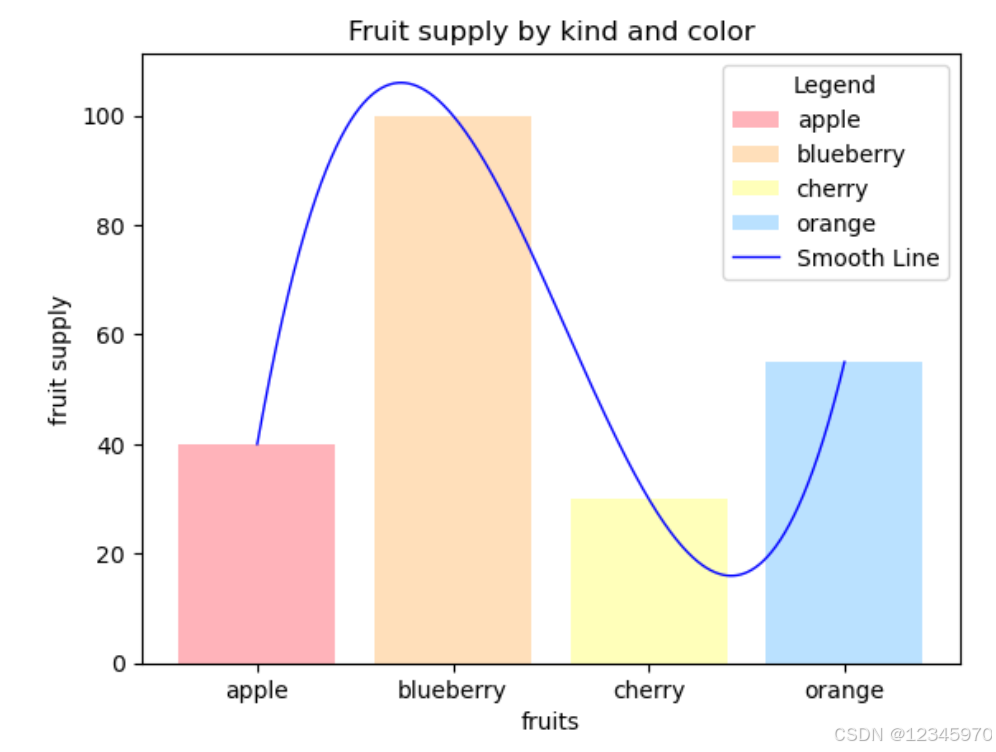
示例3:
在柱状图的基础上添加了一条光滑曲线,每个柱状图的中心点连接起来
import matplotlib.pyplot as plt
import numpy as np
from scipy.interpolate import make_interp_spline

fig, ax = plt.subplots()

fruits = ['apple', 'blueberry', 'cherry', 'orange']
counts = [40, 100, 30, 55]

bar_labels = ['apple', 'blueberry', 'cherry', 'orange']
bar_colors = ['#FFB3BA', '#FFDFBA', '#FFFFBA', '#BAE1FF']

# 绘制条形图
# ax.bar(fruits, counts, label='Fruit Supply', color=bar_colors)
ax.bar(fruits, counts, label=bar_labels, color=bar_colors)

# 计算折线的数据点位置(每个条形的中心)
x_positions = np.arange(len(fruits))
line_values = counts

# 使用样条插值生成平滑曲线
x_smooth = np.linspace(x_positions.min(), x_positions.max(), 3000)
spl = make_interp_spline(x_positions, line_values, k=3)  # k=3 表示三次样条插值
y_smooth = spl(x_smooth)

# 绘制平滑折线
# ax.plot(x_smooth, y_smooth, marker='o', linestyle='-', color='blue', linewidth=1, label='Smooth Line')
ax.plot(x_smooth, y_smooth, linestyle='-', color='blue', linewidth=1, label='Smooth Line')

# 设置坐标轴标签和标题
ax.set_ylabel('fruit supply')
ax.set_xlabel('fruits')
ax.set_title('Fruit supply by kind and color')
ax.legend(title='Legend')

plt.xticks(x_positions, fruits)  # 确保x轴标签与条形对齐
plt.show()
折线图
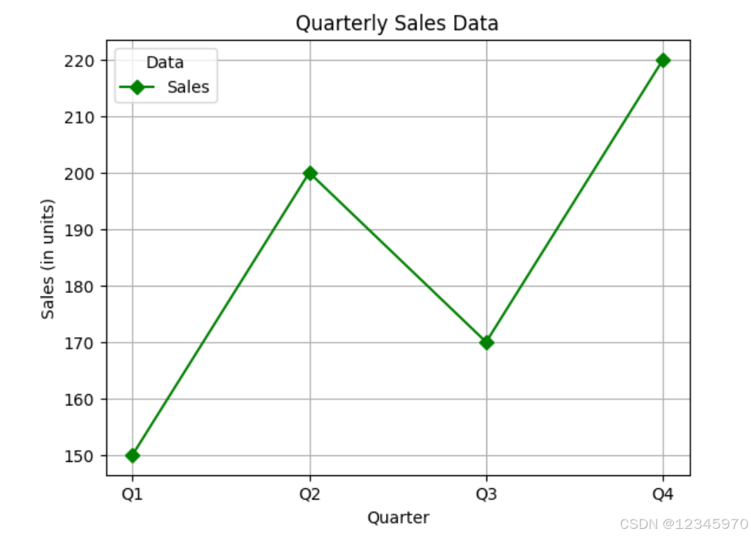
示例1:
这个图表将包含四个季度的销售额,并添加了一些基本的标签和标题。
import matplotlib.pyplot as plt

# 定义季度
quarters = ['Q1', 'Q2', 'Q3', 'Q4']
# 定义对应的销售额
sales = [150, 200, 170, 220]

# 创建一个图形对象和一组子图
fig, ax = plt.subplots()

# 在子图上绘制折线图,标记为 'Sales'
ax.plot(quarters, sales, label='Sales', color='green', linestyle='-', marker='D')

# 设置x轴标签、y轴标签和图表标题
ax.set(xlabel='Quarter', ylabel='Sales (in units)',
       title='Quarterly Sales Data')

# 添加网格线
ax.grid()

# 添加图例
ax.legend(title='Data')

# 显示图表
plt.show()
示例2:
这个图表是一个简单的折线图,展示了两个不同数据集随时间变化的趋势。具体来说,它绘制了正弦函数 (sin(x)) 和余弦函数 (cos(x)) 在时间范围从0到10秒内的变化情况。
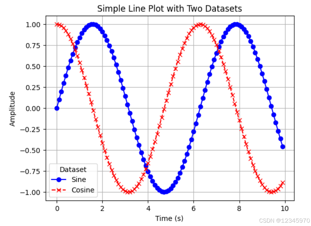
import matplotlib.pyplot as plt
import numpy as np

# 生成从0到10(不包括10),步长为0.1的时间点数组
x = np.arange(0.0, 10.0, 0.1)
# 计算对应时间点上的第一个数据集 y1
y1 = np.sin(x)
# 计算对应时间点上的第二个数据集 y2
y2 = np.cos(x)

# 创建一个图形对象和一组子图
fig, ax = plt.subplots()

# 在子图上绘制第一条折线图,标记为 'sine'
ax.plot(x, y1, label='Sine', color='blue', linestyle='-', marker='o')
# 在子图上绘制第二条折线图,标记为 'cosine'
ax.plot(x, y2, label='Cosine', color='red', linestyle='--', marker='x')

# 设置x轴标签、y轴标签和图表标题
ax.set(xlabel='Time (s)', ylabel='Amplitude',
       title='Simple Line Plot with Two Datasets')

# 添加网格线
ax.grid()

# 添加图例
ax.legend(title='Dataset')

# 显示图表
plt.show()
饼图
示例1:
下图为一个展示不同水果销售量的饼图
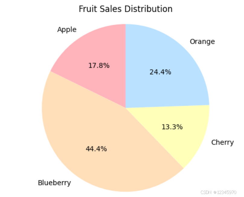
import matplotlib.pyplot as plt
# 数据集:水果名称和对应的销售量
fruits = ['Apple', 'Blueberry', 'Cherry', 'Orange']
sales = [40, 100, 30, 55]

# 颜色设置
colors = ['#FFB3BA', '#FFDFBA', '#FFFFBA', '#BAE1FF']

# 创建图形对象和一组子图
fig, ax = plt.subplots()

# 绘制饼图
ax.pie(sales, labels=fruits, colors=colors, autopct='%1.1f%%', startangle=90)

# 设置图表标题
ax.set_title('Fruit Sales Distribution')

# 确保饼图为圆形
ax.axis('equal')

# 显示图表
plt.show()
示例2:
下面的饼图展示了四种动物(青蛙、野猪、狗、木头)的比例分布。每个扇区代表一种动物及其占总比例的一部分,并且其中一个扇区(野猪)被突出显示(爆炸效果)。
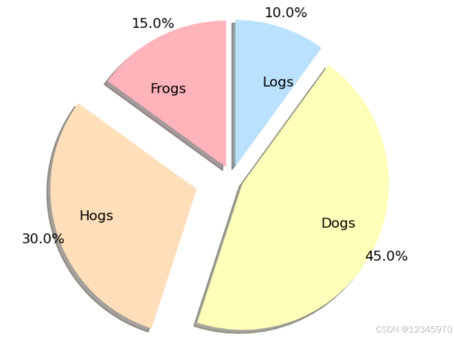
import matplotlib.pyplot as plt

# 数据集:动物名称和对应的大小
labels = 'Frogs', 'Hogs', 'Dogs', 'Logs'
sizes = [15, 30, 45, 10]

# 创建图形对象和一组子图
fig, ax = plt.subplots()

# 设置爆炸效果,只突出显示第二个扇区('Hogs')
explode = (0.1, 0.3, 0.1, 0.1)

# 绘制饼图
ax.pie(sizes, explode=explode, labels=labels, autopct='%1.1f%%',
       colors=['#FFB3BA', '#FFDFBA', '#FFFFBA', '#BAE1FF'], pctdistance=1.1, labeldistance=0.6,
       shadow=True, startangle=90, textprops={'size': 'larger'}, radius=1.2)

# 显示图表
plt.show()


 1853
1853

 被折叠的 条评论
为什么被折叠?
被折叠的 条评论
为什么被折叠?
 到【灌水乐园】发言


