


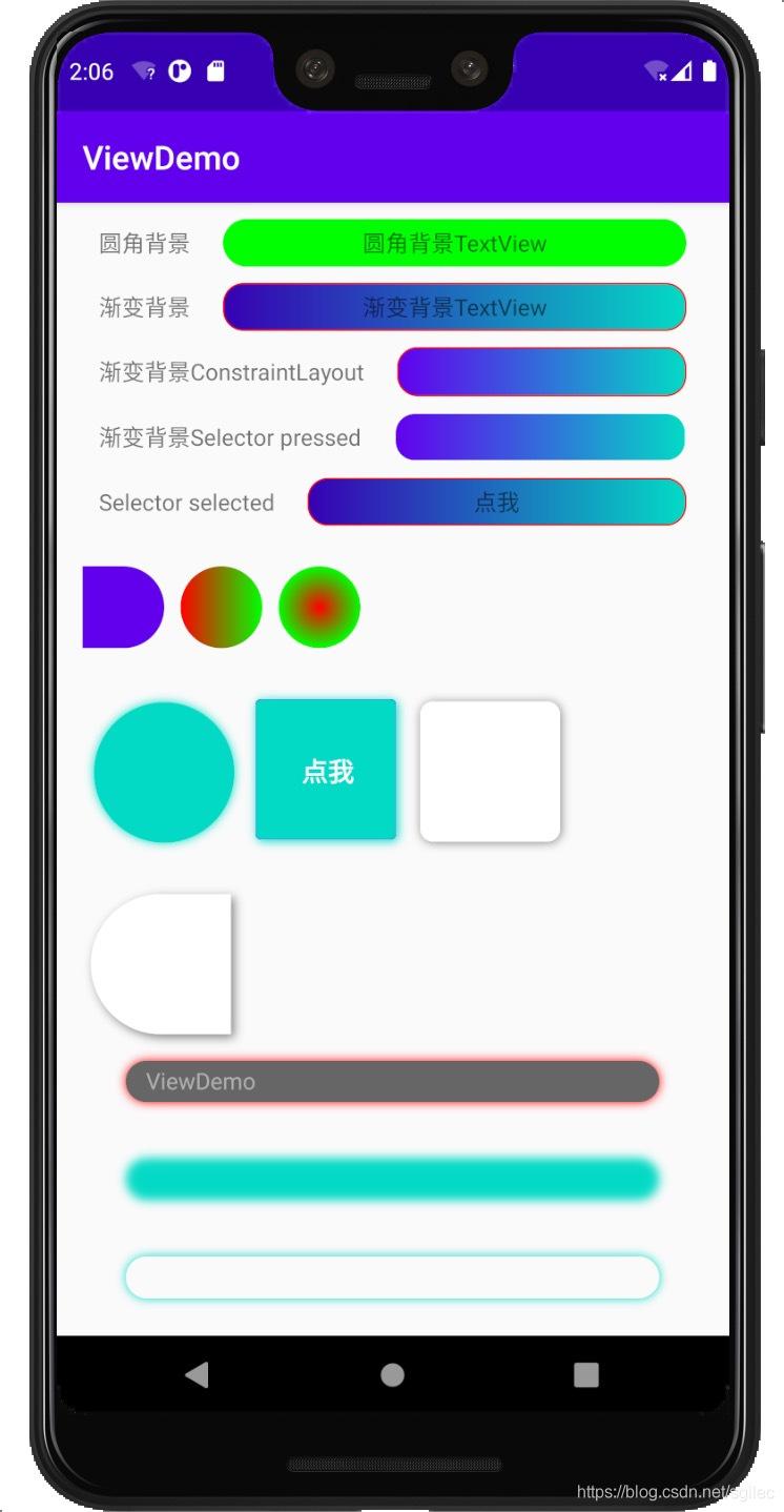
| 属性名称 | 示例 |
| — | — |
| XButtonCustom_corner | 圆角度数 |
| XButtonCustom_corner_type | 圆角类型,默认 all。left_top,left_bottom,right_top,right_bottom |
| XButtonCustom_solid_color | 背景填充颜色,当没有设置渐变填充时生效 |
| XButtonCustom_shadow_color | 外阴影色值 |
| XButtonCustom_shadow_radius | 外阴影半径 |
| XButtonCustom_shadow_dx | 外阴影x方向偏移 |
| XButtonCustom_shadow_dy | 外阴影y方向偏移 |
| XButtonCustom_solid_gradient | 渐变类型,linear, radial, sweep |
| XButtonCustom_gradient_start_color | 渐变起始颜色 |
| XButtonCustom_gradient_center_color | 渐变中间颜色 |
| XButtonCustom_gradient_end_color | 渐变结束颜色 |
| XButtonCustom_gradient_orientation | 渐变的方向 |
| XButtonCustom_gradient_radius | 渐变角度 |
| XButtonCustom_stroke_color | 描边颜色 |
| XButtonCustom_stroke_border | 描边宽度 |
| XButtonCustom_blur_type | 模糊类型,默认为normal。outer,solid,inner |
| XButtonCustom_blur_radius | 模糊半径 |
| XButtonCustom_blur_color | 模糊颜色 |
| XButtonCustom_state | selector类型,默认none。pressed, selected, checked。选定上述状态时,触发state前缀的属性 |
| XButtonCustom_stated_corner | state触发的圆角 |
| XButtonCustom_corner_type | state触发时的圆角类型,默认 all。left_top,left_bottom,right_top,right_bottom |
| XButtonCustom_stated_solid_color | state出发时背景填充颜色,当没有设置渐变填充时生效 |
| XButtonCustom_stated_shadow_color | 外阴影色值 |
| XButtonCustom_stated_shadow_radius | 外阴影半径 |
| XButtonCustom_stated_shadow_dx | 外阴影x方向偏移 |
| XButtonCustom_stated_shadow_dy | 外阴影y方向偏移 |
| XButtonCustom_stated_blur_type | 模糊类型,默认为normal。outer,solid,inner |
| XButtonCustom_stated_blur_radius | 模糊半径 |
| XButtonCustom_stated_blur_color | 模糊颜色 |
| XButtonCustom_stated_solid_gradient | 渐变类型,linear, radial, sweep |
| XButtonCustom_stated_gradient_start_color | 渐变起始颜色 |
| XButtonCustom_stated_gradient_center_color | 渐变中间颜色 |
| XButtonCustom_stated_gradient_end_color | 渐变结束颜色 |
| XButtonCustom_stated_gradient_orientation | 渐变的方向 |
| XButtonCustom_stated_gradient_radius | 渐变角度 |
| XButtonCustom_stated_stroke_color | 描边颜色 |
| XButtonCustom_stated_stroke_border | 描边宽度 |
| XButtonCustom_drawable | 正常情况下显示的drawable |
| XButtonCustom_stated_drawable | 在特定状态下显示的drawable, 如: selector |
上述的字段在代码中的修改方式,支持的修改的字段在
IDrawableEditTransition接口中定义
// 获取IDrawableEditTransition
XWidgetParser.getDrawableEditTransition(v)
?.beginNormalTransition
?.setCorner(10)
?.commit()
示例
集成
- 在project build.gradle 中加入
allprojects {
repositories {
maven { url ‘https://jitpack.io’ }
}
}
- 在要使用的module 的 build.gradle 中加入
implementation ‘com.github.shilec:XWidget:1.2.2’
- 添加混淆
-keep public class com.scott.xwidget.parser.**{*;}
扩展
最后,面试前该准备哪些资源复习?
其实客户端开发的知识点就那么多,面试问来问去还是那么点东西。所以面试没有其他的诀窍,只看你对这些知识点准备的充分程度。so,出去面试时先看看自己复习到了哪个阶段就好。
这里再分享一下我面试期间的复习路线:(以下体系的复习资料是我从各路大佬收集整理好的)
《Android开发七大模块核心知识笔记》


《960全网最全Android开发笔记》

《379页Android开发面试宝典》
历时半年,我们整理了这份市面上最全面的安卓面试题解析大全
包含了腾讯、百度、小米、阿里、乐视、美团、58、猎豹、360、新浪、搜狐等一线互联网公司面试被问到的题目。熟悉本文中列出的知识点会大大增加通过前两轮技术面试的几率。
《507页Android开发相关源码解析》
只要是程序员,不管是Java还是Android,如果不去阅读源码,只看API文档,那就只是停留于皮毛,这对我们知识体系的建立和完备以及实战技术的提升都是不利的。
真正最能锻炼能力的便是直接去阅读源码,不仅限于阅读各大系统源码,还包括各种优秀的开源库。
《Android学习笔记总结+移动架构视频+大厂面试真题+项目实战源码》,点击传送门,即可获取!
读源码,只看API文档,那就只是停留于皮毛,这对我们知识体系的建立和完备以及实战技术的提升都是不利的。
真正最能锻炼能力的便是直接去阅读源码,不仅限于阅读各大系统源码,还包括各种优秀的开源库。
《Android学习笔记总结+移动架构视频+大厂面试真题+项目实战源码》,点击传送门,即可获取!


 375
375


 被折叠的 条评论
为什么被折叠?
被折叠的 条评论
为什么被折叠?
 到【灌水乐园】发言


