


gif演示:

上图第一个固定模式(tabMode:fixed),下面是滚动模式(tabMode:scrollable),可以看到,所有Tab下方的线(即Indicator)是一样长的,不管Tab的内容是长还是短。Tab indicator的长度与最长的Tab保持一致。
TabLayout提供了tabIndicatorHeight 属性来设置indicator的高度,但是没有提供设置宽度的的api,要想改变indicator的宽度,就得去看看源码indicator是怎么实现的。简单的看一下源码:

如上思维导图,其中有两个重点的东西, TabView 和 SlidingTabStrip,TabView就是我们所看到的Tab,SlidingTabStrip是TabView的父容器,继承自LinearLayout,用来处理Tab滑动相关操作,如动画,绘制Indicator等。
我们要研究indicator是怎么添加的,重点就在SlidingTabStrip 里了,这里我们看到了mSelectedIndicatorHeight,这就是我们设置Indicator的高度,在draw方法里有如下代码:
@Override
public void draw(Canvas canvas) {
super.draw(canvas);
// Thick colored underline below the current selection
if (mIndicatorLeft >= 0 && mIndicatorRight > mIndicatorLeft) {
canvas.drawRect(mIndicatorLeft, getHeight() - mSelectedIndicatorHeight,
mIndicatorRight, getHeight(), mSelectedIndicatorPaint);
}
}
这就是绘制的选中Tab的Indicator,高度是mSelectedIndicatorHeight,宽是mIndicatorRight - mIndicatorLeft 。那么者两个值是从哪儿来的呢?在updateIndicatorPosition方法中:
private void updateIndicatorPosition() {
// 选中的TabView
final View selectedTitle = getChildAt(mSelectedPosition);
int left, right;
if (selectedTitle != null && selectedTitle.getWidth() > 0) {
// left 和right 的值
left = selectedTitle.getLeft();
right = selectedTitle.getRight();
if (mSelectionOffset > 0f && mSelectedPosition < getChildCount() - 1) {
// Draw the selection partway between the tabs
View nextTitle = getChildAt(mSelectedPosition + 1);
left = (int) (mSelectionOffset * nextTitle.getLeft() +
(1.0f - mSelectionOffset) * left);
right = (int) (mSelectionOffset * nextTitle.getRight() +
(1.0f - mSelectionOffset) * right);
}
} else {
left = right = -1;
}
// 设置mIndicatorLeft和mIndicatorRight
setIndicatorPosition(left, right);
}
void setIndicatorPosition(int left, int right) {
if (left != mIndicatorLeft || right != mIndicatorRight) {
// If the indicator’s left/right has changed, invalidate
mIndicatorLeft = left;
mIndicatorRight = right;
ViewCompat.postInvalidateOnAnimation(this);
}
}
**从上面的代码就可以看出,Indicator(Tab选中下划线)的宽度其实就是TabView的宽度,那么TabView的宽度是多少呢?在SlidingTabStrip的onMeasure方法中,为TabView设置了宽度。**请看代码:
@Override
protected void onMeasure(final int widthMeasureSpec, final int heightMeasureSpec) {
super.onMeasure(widthMeasureSpec, heightMeasureSpec);
…
//以上省略
if (mMode == MODE_FIXED && mTabGravity == GRAVITY_CENTER) {
final int count = getChildCount();
// First we’ll find the widest tab
//google的工程师注释写的非常清楚:第一步,找出宽度最长的Tab
int largestTabWidth = 0;
for (int i = 0, z = count; i < z; i++) {
View child = getChildAt(i);
if (child.getVisibility() == VISIBLE) {
largestTabWidth = Math.max(largestTabWidth, child.getMeasuredWidth());
}
}
if (largestTabWidth <= 0) {
// If we don’t have a largest child yet, skip until the next measure pass
return;
}
final int gutter = dpToPx(FIXED_WRAP_GUTTER_MIN);
boolean remeasure = false;
if (largestTabWidth * count <= getMeasuredWidth() - gutter * 2) {
// If the tabs fit within our width minus gutters, we will set all tabs to have
// the same width
// 第二步:将所有Tab的宽度都设置为largestTabWidth
for (int i = 0; i < count; i++) {
final LinearLayout.LayoutParams lp =
(LayoutParams) getChildAt(i).getLayoutParams();
if (lp.width != largestTabWidth || lp.weight != 0) {
lp.width = largestTabWidth;
lp.weight = 0;
remeasure = true;
}
}
} else {
// If the tabs will wrap to be larger than the width minus gutters, we need
// to switch to GRAVITY_FILL
mTabGravity = GRAVITY_FILL;
updateTabViews(false);
remeasure = true;
}
…
//以下省略
}
}
这个方法很简单,一看就明白,有两个步骤:
1, 一个for循环,找出宽度最大的一个TabView
2, 再一个for 循环,设置所有TabView的宽度为最长那个TabView的宽度,即largestTabWidth
这就知道为什么前面提到的所有Tab 一样宽,不管长的还是短的。
另外一个点: 上面的
onMeasure中,执行的条件是mMode == MODE_FIXED && mTabGravity == GRAVITY_CENTER,如果是其他条件,请看updateTabViews:
void updateTabViews(final boolean requestLayout) {
for (int i = 0; i < mTabStrip.getChildCount(); i++) {
View child = mTabStrip.getChildAt(i);
child.setMinimumWidth(getTabMinWidth());
updateTabViewLayoutParams((LinearLayout.LayoutParams) child.getLayoutParams());
if (requestLayout) {
child.requestLayout();
}
}
}
private void updateTabViewLayoutParams(LinearLayout.LayoutParams lp) {
if (mMode == MODE_FIXED && mTabGravity == GRAVITY_FILL) {
lp.width = 0;
lp.weight = 1;
} else {
lp.width = LinearLayout.LayoutParams.WRAP_CONTENT;
lp.weight = 0;
}
}
如果是MODE_FIXED,并且GRAVITY_FILL,则设置weight=1,所有TabView平分屏幕宽度,MODE_SCROLLABLE ,设置的WRAP_CONTENT 。
反射改变下划线宽度
思路:知道了绘制Indicator的宽度是根据TabView的宽度来决定的,那么我们设置TabView的宽度就能改变indicator的宽,TabView的宽由其中的mTextView决定,因此,通过反射得到mTextView,设置它的宽度,就能改变Indicator的宽度,这也是网上看到的大多数的解决方法。
上代码:
public static void setTabWidth(final TabLayout tabLayout, final int padding){
tabLayout.post(new Runnable() {
@Override
public void run() {
try {
//拿到tabLayout的mTabStrip属性
LinearLayout mTabStrip = (LinearLayout) tabLayout.getChildAt(0);
for (int i = 0; i < mTabStrip.getChildCount(); i++) {
View tabView = mTabStrip.getChildAt(i);
//拿到tabView的mTextView属性 tab的字数不固定一定用反射取mTextView
Field mTextViewField = tabView.getClass().getDeclaredField(“mTextView”);
mTextViewField.setAccessible(true);
TextView mTextView = (TextView) mTextViewField.get(tabView);
tabView.setPadding(0, 0, 0, 0);
//因为我想要的效果是 字多宽线就多宽,所以测量mTextView的宽度
int width = 0;
width = mTextView.getWidth();
if (width == 0) {
mTextView.measure(0, 0);
width = mTextView.getMeasuredWidth();
}
//设置tab左右间距 注意这里不能使用Padding 因为源码中线的宽度是根据 tabView的宽度来设置的
LinearLayout.LayoutParams params = (LinearLayout.LayoutParams) tabView.getLayoutParams();
params.width = width ;
params.leftMargin = padding;
params.rightMargin = padding;
tabView.setLayoutParams(params);
tabView.invalidate();
}
} catch (NoSuchFieldException e) {
e.printStackTrace();
} catch (IllegalAccessException e) {
e.printStackTrace();
}
}
});
}
效果图如下:

提醒:这种方式改变Indicator最短也就Tab内容的宽度,如果设置很短,Tab内容就显示不下,如下图:

二、通过TabLayout setCustomView 的方式
第一种通过反射的方式设置Indicator宽度,最短只能Tab内容的宽度,如果设计师要所有选中的Tab下的Indicator都设置一个指定的宽度,这种就不行了。TabLayout可以设置自定义View,可以通过这种方法来达到目的。
1, 将TabLayout 的tabIndicatorHeight 设置为0
2,通过TabLayout 的setCustomView方式添加Tab
3, 在onTabSelected 回调种,处理Tab选中和未选中的状态;
4,为了方便使用,封装成一个通用的View
首先看布局:
enhance_tab_layout.xml:
<android.support.design.widget.TabLayout
android:id=“@+id/enhance_tab_view”
android:layout_width=“match_parent”
android:layout_height=“wrap_content”
app:tabIndicatorHeight=“0dp”
</android.support.design.widget.TabLayout>
Tab item 布局:tab_item_layout.xml
如上,TextView显示Tab内容,下面的View就是Tab下面的Indicator(下划线)。
自己定义的View,宽度随便你改。
添加Tab的时候使用setCustomView 方法:
/**
- 添加tab
- @param tab
*/
public void addTab(String tab){
mTabList.add(tab);
View customView = getTabView(getContext(),tab,mIndicatorWidth,mIndicatorHeight,mTabTextSize);
mCustomViewList.add(customView);
mTabLayout.addTab(mTabLayout.newTab().setCustomView(customView));
}
/**
- 获取Tab 显示的内容
- @param context
- @param
- @return
*/
public static View getTabView(Context context,String text,int indicatorWidth,int indicatorHeight,int textSize) {
View view = LayoutInflater.from(context).inflate(R.layout.tab_item_layout, null);
TextView tabText = (TextView) view.findViewById(R.id.tab_item_text);
if(indicatorWidth>0){
View indicator = view.findViewById(R.id.tab_item_indicator);
ViewGroup.LayoutParams layoutParams = indicator.getLayoutParams();
layoutParams.width = indicatorWidth;
layoutParams.height = indicatorHeight;
indicator.setLayoutParams(layoutParams);
}
tabText.setTextSize(textSize);
tabText.setText(text);
return view;
}
然后在onTabSelected中处理状态:
@Override
public void onTabSelected(TabLayout.Tab tab) {
mViewPager.setCurrentItem(tab.getPosition());
EnhanceTabLayout mTabLayout = mTabLayoutRef.get();
if(mTabLayoutRef!=null){
List customViewList = mTabLayout.getCustomViewList();
if(customViewList == null || customViewList.size() ==0){
return;
}
for (int i=0;i<customViewList.size();i++){
View view = customViewList.get(i);
if(view == null){
return;
}
TextView text = (TextView) view.findViewById(R.id.tab_item_text);
View indicator = view.findViewById(R.id.tab_item_indicator);
if(i == tab.getPosition()){ // 选中状态
text.setTextColor(mTabLayout.mSelectTextColor);
indicator.setBackgroundColor(mTabLayout.mSelectIndicatorColor);
indicator.setVisibility(View.VISIBLE);
}else{// 未选中状态
text.setTextColor(mTabLayout.mUnSelectTextColor);
indicator.setVisibility(View.INVISIBLE);
}
}
}
}
代码其实挺简单的,但是如果项目中多处使用到,都这样来处理的话,就显得麻烦,因此,我们通过自定义View的方式将这些代码疯转成1个通用的TabLayoutView。如下:
EnhanceTabLayout.java
/**
- 对 support Design 包中的TabLayout包装
- 主要实现功能:更改indicator 的长度
- Created by zhouwei on 2018/5/18.
*/
public class EnhanceTabLayout extends FrameLayout {
private TabLayout mTabLayout;
private List mTabList;
private List mCustomViewList;
private int mSelectIndicatorColor;
private int mSelectTextColor;
private int mUnSelectTextColor;
private int mIndicatorHeight;
private int mIndicatorWidth;
private int mTabMode;
private int mTabTextSize;
public EnhanceTabLayout(@NonNull Context context) {
super(context);
init(context,null);
}
public EnhanceTabLayout(@NonNull Context context, @Nullable AttributeSet attrs) {
super(context, attrs);
init(context,attrs);
}
public EnhanceTabLayout(@NonNull Context context, @Nullable AttributeSet attrs, int defStyleAttr) {
super(context, attrs, defStyleAttr);
init(context,attrs);
}
@RequiresApi(api = Build.VERSION_CODES.LOLLIPOP)
public EnhanceTabLayout(@NonNull Context context, @Nullable AttributeSet attrs, int defStyleAttr, int defStyleRes) {
super(context, attrs, defStyleAttr, defStyleRes);
init(context,attrs);
}
private void readAttr(Context context,AttributeSet attrs){
TypedArray typedArray = context.obtainStyledAttributes(attrs,R.styleable.EnhanceTabLayout);
mSelectIndicatorColor = typedArray.getColor(R.styleable.EnhanceTabLayout_tabIndicatorColor,context.getResources().getColor(R.color.colorAccent));
mUnSelectTextColor = typedArray.getColor(R.styleable.EnhanceTabLayout_tabTextColor, Color.parseColor(“#666666”));
mSelectTextColor = typedArray.getColor(R.styleable.EnhanceTabLayout_tabSelectTextColor,context.getResources().getColor(R.color.colorAccent));
mIndicatorHeight = typedArray.getDimensionPixelSize(R.styleable.EnhanceTabLayout_tabIndicatorHeight,1);
mIndicatorWidth = typedArray.getDimensionPixelSize(R.styleable.EnhanceTabLayout_tabIndicatorWidth,0);
mTabTextSize = typedArray.getDimensionPixelSize(R.styleable.EnhanceTabLayout_tabTextSize,13);
mTabMode = typedArray.getInt(R.styleable.EnhanceTabLayout_tab_Mode,2);
typedArray.recycle();
}
private void init(Context context,AttributeSet attrs){
readAttr(context,attrs);
mTabList = new ArrayList<>();
mCustomViewList = new ArrayList<>();
View view = LayoutInflater.from(getContext()).inflate(R.layout.enhance_tab_layout,this,true);
mTabLayout = view.findViewById(R.id.enhance_tab_view);
// 添加属性
mTabLayout.setTabMode(mTabMode == 1 ? TabLayout.MODE_FIXED:TabLayout.MODE_SCROLLABLE);
mTabLayout.addOnTabSelectedListener(new TabLayout.OnTabSelectedListener() {
@Override
public void onTabSelected(TabLayout.Tab tab) {
// onTabItemSelected(tab.getPosition());
// Tab 选中之后,改变各个Tab的状态
for (int i=0;i<mTabLayout.getTabCount();i++){
View view = mTabLayout.getTabAt(i).getCustomView();
if(view == null){
return;
}
TextView text = (TextView) view.findViewById(R.id.tab_item_text);
View indicator = view.findViewById(R.id.tab_item_indicator);
if(i == tab.getPosition()){ // 选中状态
text.setTextColor(mSelectTextColor);
indicator.setBackgroundColor(mSelectIndicatorColor);
indicator.setVisibility(View.VISIBLE);
}else{// 未选中状态
text.setTextColor(mUnSelectTextColor);
indicator.setVisibility(View.INVISIBLE);
}
}
}
@Override
public void onTabUnselected(TabLayout.Tab tab) {
}
@Override
public void onTabReselected(TabLayout.Tab tab) {
}
});
}
public List getCustomViewList(){
return mCustomViewList;
}
public void addOnTabSelectedListener (TabLayout.OnTabSelectedListener onTabSelectedListener){
mTabLayout.addOnTabSelectedListener(onTabSelectedListener);
}
/**
- 与TabLayout 联动
- @param viewPager
*/
public void setupWithViewPager(@Nullable ViewPager viewPager) {
mTabLayout.addOnTabSelectedListener(new ViewPagerOnTabSelectedListener(viewPager,this));
}
/**
- retrive TabLayout Instance
- @return
*/
public TabLayout getTabLayout(){
return mTabLayout;
}
/**
- 添加tab
- @param tab
*/
public void addTab(String tab){
mTabList.add(tab);
View customView = getTabView(getContext(),tab,mIndicatorWidth,mIndicatorHeight,mTabTextSize);
mCustomViewList.add(customView);
mTabLayout.addTab(mTabLayout.newTab().setCustomView(customView));
}
public static class ViewPagerOnTabSelectedListener implements TabLayout.OnTabSelectedListener{
private final ViewPager mViewPager;
private final WeakReference mTabLayoutRef;
public ViewPagerOnTabSelectedListener(ViewPager viewPager,EnhanceTabLayout enhanceTabLayout) {
mViewPager = viewPager;
mTabLayoutRef = new WeakReference(enhanceTabLayout);
}
@Override
public void onTabSelected(TabLayout.Tab tab) {
mViewPager.setCurrentItem(tab.getPosition());
EnhanceTabLayout mTabLayout = mTabLayoutRef.get();
if(mTabLayoutRef!=null){
List customViewList = mTabLayout.getCustomViewList();
if(customViewList == null || customViewList.size() ==0){
return;
}
for (int i=0;i<customViewList.size();i++){
View view = customViewList.get(i);
if(view == null){
return;
}
TextView text = (TextView) view.findViewById(R.id.tab_item_text);
View indicator = view.findViewById(R.id.tab_item_indicator);
if(i == tab.getPosition()){ // 选中状态
text.setTextColor(mTabLayout.mSelectTextColor);
indicator.setBackgroundColor(mTabLayout.mSelectIndicatorColor);
indicator.setVisibility(View.VISIBLE);
}else{// 未选中状态
text.setTextColor(mTabLayout.mUnSelectTextColor);
indicator.setVisibility(View.INVISIBLE);
}
}
}
自我介绍一下,小编13年上海交大毕业,曾经在小公司待过,也去过华为、OPPO等大厂,18年进入阿里一直到现在。
深知大多数初中级Android工程师,想要提升技能,往往是自己摸索成长或者是报班学习,但对于培训机构动则近万的学费,着实压力不小。自己不成体系的自学效果低效又漫长,而且极易碰到天花板技术停滞不前!
因此收集整理了一份《2024年Android移动开发全套学习资料》,初衷也很简单,就是希望能够帮助到想自学提升又不知道该从何学起的朋友,同时减轻大家的负担。
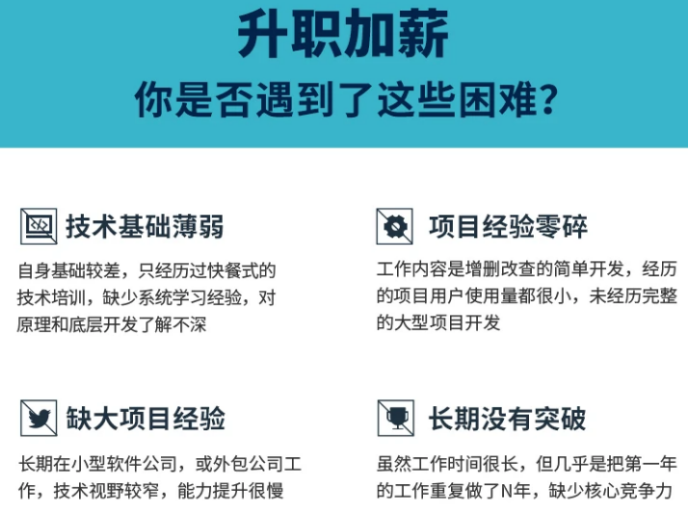
既有适合小白学习的零基础资料,也有适合3年以上经验的小伙伴深入学习提升的进阶课程,基本涵盖了95%以上Android开发知识点,真正体系化!
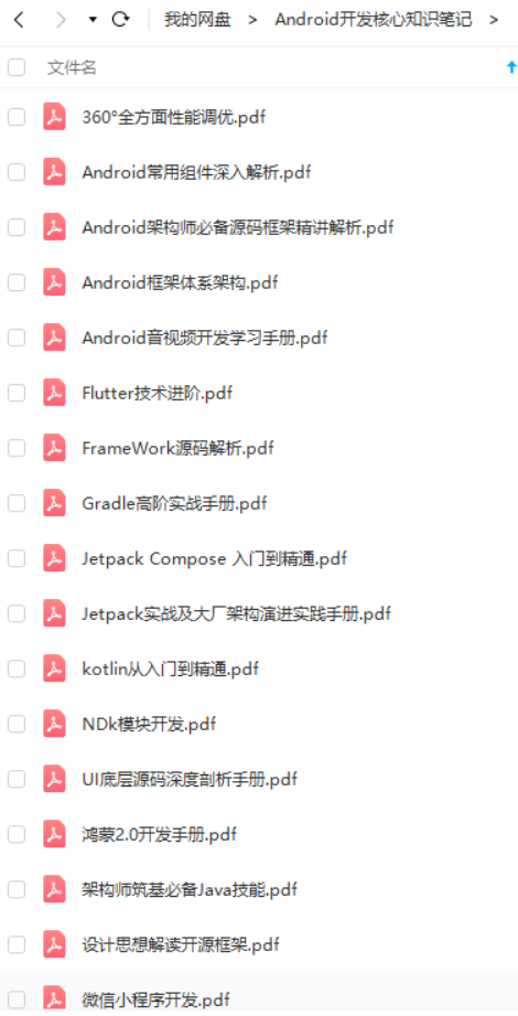
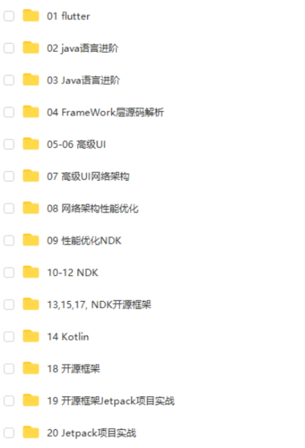
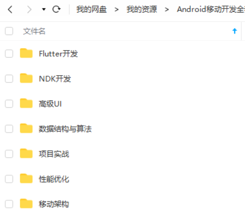
由于文件比较大,这里只是将部分目录截图出来,每个节点里面都包含大厂面经、学习笔记、源码讲义、实战项目、讲解视频,并且会持续更新!
如果你觉得这些内容对你有帮助,可以扫码获取!!(备注:Android)

最后:学习总结——Android框架体系架构知识脑图(纯手绘xmind文档)
学完之后,若是想验收效果如何,其实最好的方法就是可自己去总结一下。比如我就会在学习完一个东西之后自己去手绘一份xmind文件的知识梳理大纲脑图,这样也可方便后续的复习,且都是自己的理解,相信随便瞟几眼就能迅速过完整个知识,脑补回来。
下方即为我手绘的Android框架体系架构知识脑图,由于是xmind文件,不好上传,所以小编将其以图片形式导出来传在此处,细节方面不是特别清晰。但可给感兴趣的朋友提供完整的Android框架体系架构知识脑图原件(包括上方的面试解析xmind文档)

除此之外,前文所提及的Alibaba珍藏版 Android框架体系架构 手写文档以及一本 《大话数据结构》 书籍等等相关的学习笔记文档,也皆可分享给认可的朋友!
——感谢大家伙的认可支持,请注意:点赞+点赞+点赞!!!
《互联网大厂面试真题解析、进阶开发核心学习笔记、全套讲解视频、实战项目源码讲义》点击传送门即可获取!
最后:学习总结——Android框架体系架构知识脑图(纯手绘xmind文档)
学完之后,若是想验收效果如何,其实最好的方法就是可自己去总结一下。比如我就会在学习完一个东西之后自己去手绘一份xmind文件的知识梳理大纲脑图,这样也可方便后续的复习,且都是自己的理解,相信随便瞟几眼就能迅速过完整个知识,脑补回来。
下方即为我手绘的Android框架体系架构知识脑图,由于是xmind文件,不好上传,所以小编将其以图片形式导出来传在此处,细节方面不是特别清晰。但可给感兴趣的朋友提供完整的Android框架体系架构知识脑图原件(包括上方的面试解析xmind文档)
[外链图片转存中…(img-pLh2FHUT-1713447026944)]
除此之外,前文所提及的Alibaba珍藏版 Android框架体系架构 手写文档以及一本 《大话数据结构》 书籍等等相关的学习笔记文档,也皆可分享给认可的朋友!
——感谢大家伙的认可支持,请注意:点赞+点赞+点赞!!!
《互联网大厂面试真题解析、进阶开发核心学习笔记、全套讲解视频、实战项目源码讲义》点击传送门即可获取!


 5万+
5万+


 被折叠的 条评论
为什么被折叠?
被折叠的 条评论
为什么被折叠?
 到【灌水乐园】发言


