


height: 20px;
width: 20px;
left: 130px;
top: 20px;
}
.sunshine-bottom-left {
height: 30px;
width: 30px;
left: -20px;
top: 120px;
}
.sunshine-bottom-right {
height: 10px;
width: 10px;
left: 110px;
top: 120px;
}
再调用即可:

### 2.2 添加粽子
#### 2.2.1 粽子 body
粽子的话就是里面的白花花的米和外面两块叶子和简单的四肢:

做起来是挺简单的,叶子的话纹路我没有添加,可以简便加上去就好了,首先我们制作里面白花花的糯米和绿油油的叶子部分。
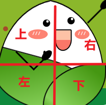
其实这个部分我是分为了上、右、下、左四个部分制作的:
并且再考虑这些部分都是同一个物体,所以也需要一个容器对其进行包裹,首先给予一个容器样式:
.rice-dumplings {
height: 400px;
width: 400px;
position: absolute;
transform: scale(0.5);
left: 0;
}
接着先制作粽子的左半部分,其实左半部分也就是一个半圆进行变换而来, 左右两边的样式本质上是一致的,所以直接给予粽子上部分左右两边相同的样式:
.rice-dumplings-body-left-top,
.rice-dumplings-body-right-top {
position: absolute;
background-color: #ffffff;
height: 300px;
width: 300px;
border-top-left-radius: 100%;
border: 4px black solid;
border-right: 0px;
}
在上面的样式中,由于右边编剧是有边框线的,直接去掉即可,所以使用了代码 `border-right: 0px;`。


接着给予左右两边不一样的变换以及位置信息:
.rice-dumplings-body-left-top {
left: 25px;
top: 25px;
transform: rotateY(30deg) rotate(-10deg);
}
.rice-dumplings-body-right-top {
left: 235px;
top: 25px;
transform: rotateY(210deg) rotate(-10deg);
}
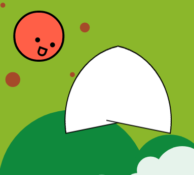
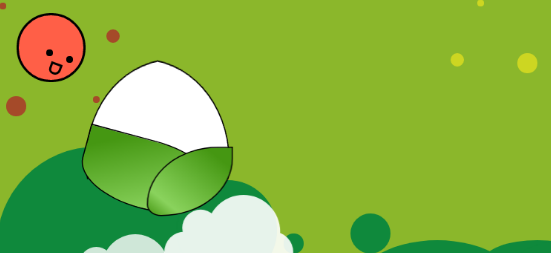
这个时候就应该给这个目前来说像半个饭团的东西一点“遮羞布”了,也就是两张叶子。
这两张叶子的制作方式相似,也就是给圆角然后进行旋转即可,在这里需要注意的是不同大小、角度的叶子变换效果不一样,可以适当的调整效果,并且其内部的叶子纹路也可以通过渐变制作,在这里我是用了渐变色,也可以使用阴影为其添加层次感:
.rice-dumplings-body-left-bottom,
.rice-dumplings-body-right-bottom {
position: absolute;
background: linear-gradient(to bottom right, #459712 15%, #8ad35d 80%, #459712 100%);
border-top-left-radius: 0%;
border: 4px black solid;
}
.rice-dumplings-body-left-bottom {
height: 200px;
width: 400px;
top: 240px;
left: 50px;
border-bottom-left-radius: 100%;
border-bottom-right-radius: 100%;
border-top-right-radius: 100%;
transform: rotate(15deg);
}
.rice-dumplings-body-right-bottom {
height: 200px;
width: 250px;
top: 260px;
left: 250px;
border-bottom-left-radius: 100%;
border-bottom-right-radius: 20%;
border-top-right-radius: 100%;
transform: rotateY(180deg);
}
接着在代码中进行调用:
此时效果如下:
#### 2.2.2 粽子 face
接着咱们开始制作这个粽子的脸部,这个脸部也需要在一个容器之内,所以继续设置一个父容器:
.rice-dumplings-face {
position: absolute;
}
接着制作这个脸部的眼睛,这个眼睛可以看到其内部还有一个亮点:

这个亮点制作其实就是一个缩小版的白色圆点而已,所以现在就知道这个怎么做了,直接设置两个黑点和两个白点,使其在近似的位置就解决了:
.rice-dumplings-face {
position: absolute;
}
.rice-dumplings-eye {
position: absolute;
height: 30px;
width: 30px;
border-radius: 100%;
background-color: black;
}
.eye-left {
left: 250px;
top: 80px;
}
.eye-right {
left: 350px;
top: 70px;
}
.rice-dumplings-eye>.light {
position: absolute;
height: 10px;
width: 10px;
border-radius: 100%;
background-color: white;
}
.rice-dumplings-eye>.postion {
right: 20%;
top: 10%;
}
.rice-dumplings-eye>.right {
right: 20%;
top: 10%;
}
以上样式中 light 为亮点,创建一个基础样式后再创建左右样式进行调用就可以了:

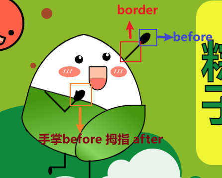
接着制作两个小脸蛋,也就是一个宽度大于高度的椭圆,设置其 before 文本为“///” 颜色为白就完美解决:
/*脸颊*/
.cheek {
position: absolute;
top: 120px;
background-color: #fd8373;
border-radius: 100%;
}
.cheek::before {
position: absolute;
content: “/ / /”;
color: white;
left: 23%;
top: 13%;
}
.cheek-left {
height: 40px;
width: 80px;
left: 190px;
}
.cheek-right {
height: 40px;
width: 60px;
left: 380px;
}
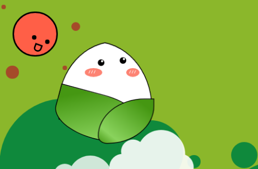
接着嘴巴的样式跟太阳的一样,在这里只需要设置对应的渐变色一半为红色一半为粉红色即可:
.smile {
position: absolute;
width: 60px;
height: 80px;
background: linear-gradient( #fdc2a6 50%, #fa7768 50%);
top: 120px;
left: 300px;
border: 4px black solid;
border-top-left-radius: 8%;
border-top-right-radius: 16%;
border-bottom-left-radius: 80%;
border-bottom-right-radius: 90%;
}

由于其本身太阳也是相同样式,所以背景色也应用到了太阳嘴巴之中,都是同一款嘴型。
#### 2.2.3 粽子四肢
粽子的四肢制作那就更简单了,直接设置一个 div 留有边框,去掉其他边框之后使用 before 或者 after 做手掌或者脚掌部分就可以了:
此时我们给予样式,调整好位置即可:
/*四肢*/
.arm-left {
position: absolute;
height: 100px;
width: 100px;
border: 6px black solid;
border-top: 0px;
border-left: 0px;
transform: rotate(45deg);
left: 160px;
top: 160px;
}
.arm-left::before {
position: absolute;
content: “”;
height: 50px;
width: 30px;
right: -15%;
border-radius: 100%;
background-color: black;
}
.arm-left::after {
position: absolute;
content: “”;
height: 20px;
width: 10px;
right: 8%;
top: 15%;
border-radius: 100%;
background-color: black;
transform: rotate(-45deg);
}
.arm-right {
position: absolute;
height: 130px;
width: 100px;
border-right: 6px black solid;
left: 390px;
top: -52px;
transform: rotate(45deg);
}
.arm-right::before {
position: absolute;
content: “”;
height: 50px;
width: 30px;
right: -15%;
border-radius: 100%;
background-color: black;
}
.leg-left {
position: absolute;
height: 50px;
width: 50px;
border: 6px black solid;
border-top: 0px;
border-left: 0px;
left: 160px;
top: 435px;
}
.leg-left::before {
position: absolute;
content: “”;
height: 30px;
width: 15px;
left: -15%;
bottom: -30px;
border-radius: 100%;
background-color: black;
}
.leg-right {
position: absolute;
height: 100px;
width: 50px;
border-right: 6px black solid;
left: 250px;
top: 463px;
}
.leg-right::before {
position: absolute;
content: “”;
height: 30px;
width: 15px;
right: -35%;
bottom: -10px;
border-radius: 100%;
background-color: black;
transform: rotate(-90deg);
}
四肢位置代码比较简单,就是给予不同的边框位置并且旋转即可,然后 before 和 after 就是一个圆嘛,拿上背景色放到合适位置就可以了。


粽子角色该部分 html 如下:
## 三、所有内容
最后加上文字后效果如下:

由于文字部分其样式就是很基础了,在此没必要赘述了,在最后我祝各位考生 **金榜高粽**!
最后在这里附加上所有代码:
完整代码:
.demo-area {
height: 400px;
width: 1200px;
position: relative;
background-color: #8bb72b;
overflow: hidden;
}
body {
display: flex;
justify-content: center;
align-items: center;
height: 100vh;
width: 100vw;
}
.rice-dumplings {
height: 400px;
width: 400px;
position: absolute;
transform: scale(0.5);
left: 0;
}
.rice-dumplings-body-left-top,
.rice-dumplings-body-right-top {
position: absolute;
background-color: #ffffff;
height: 300px;
width: 300px;
border-top-left-radius: 100%;
border: 4px black solid;
border-right: 0px;
}
.rice-dumplings-body-left-top {
left: 25px;
top: 25px;
transform: rotateY(30deg) rotate(-10deg);
}
.rice-dumplings-body-right-top {
left: 235px;
top: 25px;
transform: rotateY(210deg) rotate(-10deg);
}
.rice-dumplings-body-left-bottom,
.rice-dumplings-body-right-bottom {
position: absolute;
background: linear-gradient(to bottom right, #459712 15%, #8ad35d 80%, #459712 100%);
border-top-left-radius: 0%;
border: 4px black solid;
}
.rice-dumplings-body-left-bottom {
height: 200px;
width: 400px;
top: 240px;
left: 50px;
border-bottom-left-radius: 100%;
border-bottom-right-radius: 100%;
border-top-right-radius: 100%;
transform: rotate(15deg);
}
.rice-dumplings-body-right-bottom {
height: 200px;
width: 250px;
top: 260px;
left: 250px;
border-bottom-left-radius: 100%;
border-bottom-right-radius: 20%;
border-top-right-radius: 100%;
transform: rotateY(180deg);
}
.rice-dumplings-face {
position: absolute;
}
.rice-dumplings-eye {
position: absolute;
height: 30px;
width: 30px;
border-radius: 100%;
background-color: black;
}
.eye-left {
left: 250px;
top: 80px;
}
.eye-right {
left: 350px;
top: 70px;
}
.rice-dumplings-eye>.light {
position: absolute;
height: 10px;
width: 10px;
border-radius: 100%;
background-color: white;
}
.rice-dumplings-eye>.postion {
right: 20%;
top: 10%;
}
.rice-dumplings-eye>.right {
right: 20%;
top: 10%;
}
.smile {
position: absolute;
width: 60px;
height: 80px;
background: linear-gradient( #fdc2a6 50%, #fa7768 50%);
top: 120px;
left: 300px;
border: 4px black solid;
border-top-left-radius: 8%;
border-top-right-radius: 16%;
border-bottom-left-radius: 80%;
border-bottom-right-radius: 90%;
}
.cheek {
position: absolute;
top: 120px;
background-color: #fd8373;
border-radius: 100%;
}
.cheek::before {
position: absolute;
content: “/ / /”;
color: white;
left: 23%;
top: 13%;
}
.cheek-left {
height: 40px;
width: 80px;
left: 190px;
}
.cheek-right {
height: 40px;
width: 60px;
left: 380px;
}
.arm-left {
position: absolute;
height: 100px;
width: 100px;
border: 6px black solid;
border-top: 0px;
border-left: 0px;
transform: rotate(45deg);
left: 160px;
top: 160px;
}
.arm-left::before {
position: absolute;
content: “”;
height: 50px;
width: 30px;
right: -15%;
border-radius: 100%;
background-color: black;
}
.arm-left::after {
position: absolute;
content: “”;
height: 20px;
width: 10px;
right: 8%;
top: 15%;
border-radius: 100%;
background-color: black;
transform: rotate(-45deg);
}
.arm-right {
position: absolute;
height: 130px;
width: 100px;
border-right: 6px black solid;
left: 390px;
top: -52px;
transform: rotate(45deg);
}
.arm-right::before {
position: absolute;
content: “”;
height: 50px;
width: 30px;
right: -15%;
border-radius: 100%;
background-color: black;
}
.leg-left {
position: absolute;
height: 50px;
width: 50px;
border: 6px black solid;
border-top: 0px;
border-left: 0px;
left: 160px;
top: 435px;
}
.leg-left::before {
position: absolute;
content: “”;
height: 30px;
width: 15px;
left: -15%;
bottom: -30px;
border-radius: 100%;
background-color: black;
}
.leg-right {
position: absolute;
height: 100px;
width: 50px;
border-right: 6px black solid;
left: 250px;
top: 463px;
}
.leg-right::before {
position: absolute;
content: “”;
height: 30px;
width: 15px;
right: -35%;
bottom: -10px;
border-radius: 100%;
background-color: black;
transform: rotate(-90deg);
}
/*太阳*/
.sun {
position: absolute;
height: 150px;
width: 150px;
}
.sun-body {
position: absolute;
height: 95px;
width: 95px;
background-color: #ff5f47;
border-radius: 100%;
border: 4px black solid;
left: 30px;
top: 30px;
}
.sun-eye {
position: absolute;
height: 10px;
width: 10px;
background-color: black;
border-radius: 100%;
}
.sun-body>.eye-left {
top: 60px;
left: 70px;
}
.sun-body>.eye-right {
top: 50px;
left: 40px;
}
.sun-body>.smile {
position: absolute;
width: 10px;
height: 10px;
background-color: #fdc2a6 50%;
top: 70px;
left: 45px;
border: 4px black solid;
border-top-left-radius: 8%;
border-top-right-radius: 16%;
border-bottom-left-radius: 80%;
border-bottom-right-radius: 90%;
transform: rotate(20deg);
}
.sunshine-top-left,
.sunshine-top-right,
.sunshine-bottom-left,
.sunshine-bottom-right {
position: absolute;
background-color: #a54a29;
border-radius: 100%;
}
.sunshine-top-left {
height: 10px;
width: 10px;
left: -30px;
top: -20px;
}
.sunshine-top-right {
height: 20px;
width: 20px;
left: 130px;
top: 20px;
}
.sunshine-bottom-left {
height: 30px;
width: 30px;
left: -20px;
top: 120px;
}
.sunshine-bottom-right {
height: 10px;
width: 10px;
left: 110px;
top: 120px;
}
.circle {
position: absolute;
height: 400px;
width: 1200px;
}
.circle1,
.circle2,
.circle3,
.circle4,
.circle5,
.circle6,
.circle7,
.circle8 {
position: absolute;
border-radius: 100%;
background-color: #0f893c;
}
.circle1 {
height: 300px;
width: 300px;
bottom: -130px;
}
.circle2 {
height: 150px;
width: 150px;
bottom: -30px;
left: 270px
}
.circle3 {
height: 30px;
width: 30px;
bottom: 10px;
left: 430px
}
.circle4 {
height: 60px;
width: 60px;
bottom: 10px;
left: 530px
}
.circle5 {
height: 160px;
width: 260px;
bottom: -130px;
left: 530px
}
.circle6 {
height: 60px;
width: 160px;
bottom: -30px;
left: 730px
}
.circle7 {
height: 60px;
width: 160px;
bottom: -30px;
left: 780px
}
.circle8 {
height: 160px;
width: 160px;
bottom: -80px;
left: 880px
}
/*黄色圈*/
.y-circle1,
.y-circle2,
.y-circle3,
.y-circle4 {
position: absolute;
border-radius: 100%;
background-color: #cdd622;
}
.y-circle1 {
height: 60px;
width: 60px;
bottom: 180px;
left: 880px
}
.y-circle2 {
height: 30px;
width: 30px;
bottom: 280px;
left: 780px
}
.y-circle3 {
height: 10px;
width: 10px;
bottom: 380px;
left: 720px
}
.y-circle4 {
height: 20px;
width: 20px;
bottom: 290px;
left: 680px
}
/* 云朵 */
.cloud {
position: absolute;
width: 175px;
height: 55px;
background-color: white;
border-radius: 100px;
box-shadow: 0 1px 5px 0px rgba(50, 50, 50, 0.05);
}
.cloud:after,
.cloud:before {
content: “”;
position: absolute;
background-color: white;
}
.cloud:after {
width: 50px;
height: 50px;
border-radius: 50%;
top: -54%;
left: 14%;
}
.cloud:before {
width: 100px;
height: 100px;
border-radius: 50%;
top: -90%;
right: 10%;
}
.cloud1 {
transform: scale(1);
opacity: 0.8;
left: 100px;
top: 410px;
z-index: 1;
}
.cloud2 {
left: 260px;
top: 360px;
transform: scale(1);
opacity: 0.9;
z-index: 1;
}
/* 文本内容 */
.stroke {
-webkit-text-stroke: 1px black;
}
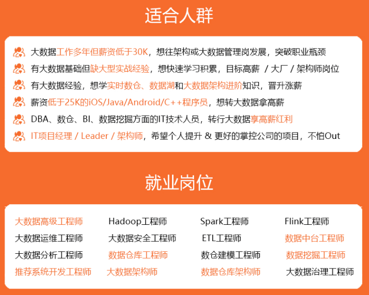

既有适合小白学习的零基础资料,也有适合3年以上经验的小伙伴深入学习提升的进阶课程,涵盖了95%以上大数据知识点,真正体系化!
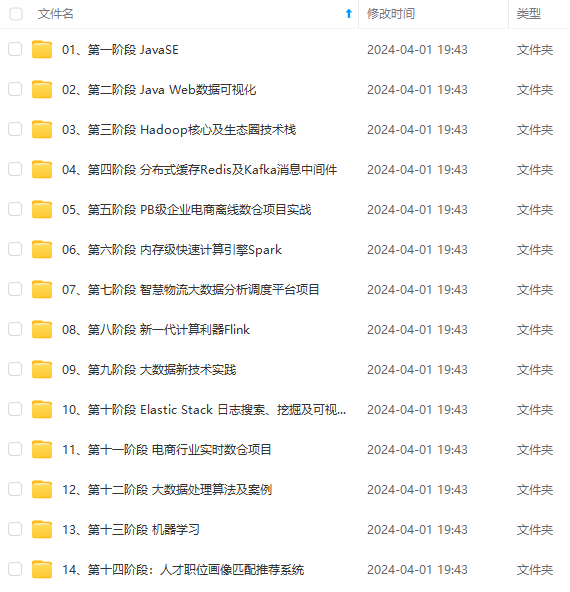
由于文件比较多,这里只是将部分目录截图出来,全套包含大厂面经、学习笔记、源码讲义、实战项目、大纲路线、讲解视频,并且后续会持续更新
x;
background-color: white;
border-radius: 100px;
box-shadow: 0 1px 5px 0px rgba(50, 50, 50, 0.05);
}
.cloud:after,
.cloud:before {
content: “”;
position: absolute;
background-color: white;
}
.cloud:after {
width: 50px;
height: 50px;
border-radius: 50%;
top: -54%;
left: 14%;
}
.cloud:before {
width: 100px;
height: 100px;
border-radius: 50%;
top: -90%;
right: 10%;
}
.cloud1 {
transform: scale(1);
opacity: 0.8;
left: 100px;
top: 410px;
z-index: 1;
}
.cloud2 {
left: 260px;
top: 360px;
transform: scale(1);
opacity: 0.9;
z-index: 1;
}
/* 文本内容 */
.stroke {
-webkit-text-stroke: 1px black;
}
[外链图片转存中…(img-YJ4oT7as-1714695921537)]
[外链图片转存中…(img-z69tZTK9-1714695921537)]
[外链图片转存中…(img-rNbF67WL-1714695921538)]
既有适合小白学习的零基础资料,也有适合3年以上经验的小伙伴深入学习提升的进阶课程,涵盖了95%以上大数据知识点,真正体系化!
由于文件比较多,这里只是将部分目录截图出来,全套包含大厂面经、学习笔记、源码讲义、实战项目、大纲路线、讲解视频,并且后续会持续更新


 1万+
1万+

 被折叠的 条评论
为什么被折叠?
被折叠的 条评论
为什么被折叠?
 到【灌水乐园】发言


