


在小程序中,默认的都是使用微信官方的导航栏,但是由于项目需求,经常需要我么自定义导航栏。下面就来讲解一下如何设计我们自己的导航栏。
1、构建效果
首先展示一下最终效果图:

我们在自定义的导航栏上面添加了触发事件,点击括号里面的内容就会触发选择城市的事件,进入到城市选择页面,选择城市。城市页面如下:

想了解如何构建城市选择列表,请参考我的另一篇博客,下面开始讲解如何构建自定义导航栏。
2、自定义导航栏
step1
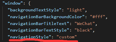
首先在 app.json 中配置 “navigationStyle”: “custom”,如下:
配置完之后你会发现原来的导航栏不见了,但是我们的页面变成了下面的这个样子

右上角的胶囊覆盖了页面,显然这是不合适的,我们现在需要将页面整体下移。其实小程序提供给我们的导航栏是两块的,一块用来展示状态信息栏(状态栏),另一块就是展示title和返回按钮的标题栏。不同设备的状态栏高度不同,我们所要做的就是根据设备来动态调整状态栏高度。
step2
查看设备状态栏高度
在 index.json 文件中添加如下方法

设备状态栏高度如下


写一个方法来保存状态栏信息
if (app.globalData && app.globalData.statusBarHeight && app.globalData.titleBarHeight) {
      this.setData({
        statusBarHeight: app.globalData.statusBarHeight,
        titleBarHeight: app.globalData.titleBarHeight
      });
    } else {
      let that = this
      wx.getSystemInfo({
        success: function (res) {
          if (!app.globalData) {
            app.globalData = {}
          }
          if (res.model.indexOf('iPhone') !== -1) {
            app.globalData.titleBarHeight = 44
          } else {
            app.globalData.titleBarHeight = 48
          }
          app.globalData.statusBarHeight = res.statusBarHeight
          that.setData({
            statusBarHeight: app.globalData.statusBarHeight,
            titleBarHeight: app.globalData.titleBarHeight
          });
        },
        failure() {
          that.setData({
            statusBarHeight: 0,
            titleBarHeight: 0
          });
        }
      })
    }
3、调用自定义导航栏
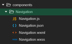
3.1、创建组件
首先、创建 Components(存放各个组件的) 文件夹,在 Components 文件夹下创建 Navigation 文件夹,用来存放我们自定义的导航栏组件,文件目录结构如下:
Navigation.js
const app = getApp();
Component({
  properties: {
    //小程序页面的表头
    title: {
      type: String,
      default: '穿衣助手拼团'
    },
    //是否展示返回和主页按钮
    showIcon: {
      type: Boolean,
      default: true
    }
  },

  data: {
    statusBarHeight: 0,
    titleBarHeight: 0,
  },

  ready: function () {
    // 因为很多地方都需要用到,所有保存到全局对象中
    if (app.globalData && app.globalData.statusBarHeight && app.globalData.titleBarHeight) {
      this.setData({
        statusBarHeight: app.globalData.statusBarHeight,
        titleBarHeight: app.globalData.titleBarHeight
      });
    } else {
      let that = this
      wx.getSystemInfo({
        success: function (res) {
          if (!app.globalData) {
            app.globalData = {}
          }
          if (res.model.indexOf('iPhone') !== -1) {
            app.globalData.titleBarHeight = 44
          } else {
            app.globalData.titleBarHeight = 48
          }
          app.globalData.statusBarHeight = res.statusBarHeight
          that.setData({
            statusBarHeight: app.globalData.statusBarHeight,
            titleBarHeight: app.globalData.titleBarHeight
          });
        },
        failure() {
          that.setData({
            statusBarHeight: 0,
            titleBarHeight: 0
          });
        }
      })
    }
  },

  methods: {
    headerBack() {
      wx.navigateBack({
        delta: 1,
      })
    },
    headerHome() {
      wx.switchTab({
        url: '/pages/index/index'
      })
    }
  }
})
Navigation.json
{
  "component": true,
  "usingComponents": {}
}
Navigation.wxml
<view  style="height:{{titleBarHeight}}px;padding-top:{{statusBarHeight}}px">
  <view class="header" style="height:{{titleBarHeight}}px;padding-top:{{statusBarHeight}}px">
    <view wx:if="{{showIcon}}" class="title-bar">
      <view class="back" bindtap="headerBack"><image src="/images/back.png"></image></view>
      <view class="line"></view>
      <view class="home" bindtap="headerHome"><image src="/images/home.png"></image></view>
    </view>
    <view class="header-title">{{title}}</view>
  </view>
</view>
Navigation.wxss
.header {
  display: flex;
  align-items: center;
  top: 0;
  position: fixed;
  width: 100%;
  background-color: #ec9643;
  z-index: 99999;
  border-bottom: 1rpx solid #f6f6f6;
}
.header .line {
  border-left: 1rpx solid #f6f6f6;
  height: 36rpx;
}
.header .back, .header .home {
  width: 40%;
  height: 100%;
  display: flex;
  align-items: center;
  justify-content: center;
}
.header .title-bar {
  display: flex;
  align-items: center;
  justify-content: space-around;
  width: 138rpx;
  height: 56rpx;
  border: 1rpx solid #f6f6f6;
  border-radius: 32rpx;
  margin-left: 14rpx;
  padding: 0 14rpx;
}
.header .title-bar  image {
  width: 32rpx;
  height: 32rpx;
  background: transparent;
  vertical-align: top;
}

.header .header-title {
  position: absolute;
  left: 50%;
  font-size: 38rpx;
  transform: translateX(-50%);
}
3.2、调用组件
比如我现在要在 page1 页面调用该组件,就在 page1.json 中添加下列代码
"usingComponents": {
    "navigation": "/components/Navigation/Navigation"
  }
在 page.wxml 中添加下列代码
<navigation id='navigation' bindtap='ChooseCity' show-icon='{{showIcon}}' title="人力 {{city}}" ></navigation>
在 page1.js 中的 data 里添加 showIcon=true。
到此,我们自定义组件的设计和调用都已经完成了。需要源码的小伙伴请在评论区留言,我看到后会尽快发给你们的。


 479
479


 被折叠的 条评论
为什么被折叠?
被折叠的 条评论
为什么被折叠?
 到【灌水乐园】发言


