


StackPanel
StackPanel 是一种常用的布局控件,可以支持水平或垂直排列,但不会换行。当子元素添加到 StackPanel 中时,它们将按照添加的顺序依次排列。默认情况下,StackPanel 的排列方向是垂直的,即子元素将从上到下依次排列。可以使用 Orientation 属性更改排列方向。可以设置两种排列方式:横排(Horizontal)和竖排(Vertical,默认)。水平排列时,每个元素都与面板一样高;垂直排列时,每个元素都与面板一样宽。
StackPanel 的Orientation属性
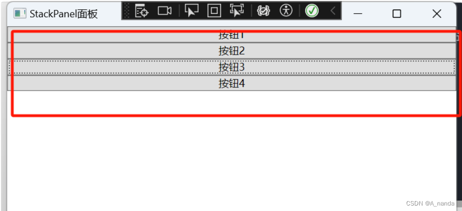
1.默认情况下Orientation="Vertical",<StackPanel Orientation="Vertical">与下方加粗字体是同一个效果 。
// StackPanel 里添加了4个按钮,默认布局,Orientation 默认垂直排列
<Window x:Class="WpfFirstApp.StackPanelWindow"
xmlns="http://schemas.microsoft.com/winfx/2006/xaml/presentation"
xmlns:x="http://schemas.microsoft.com/winfx/2006/xaml"
xmlns:d="http://schemas.microsoft.com/expression/blend/2008"
xmlns:mc="http://schemas.openxmlformats.org/markup-compatibility/2006"
xmlns:local="clr-namespace:WpfFirstApp"
mc:Ignorable="d"
Title="StackPanelWindow" Height="450" Width="800">
<StackPanel >
<Button Content="按钮1"></Button>
<Button Content="按钮2"></Button>
<Button Content="按钮3"></Button>
<Button Content="按钮4"></Button>
</StackPanel>
</Window>
效果图:
也可不在xaml中增加button,改用代码增加;效果是一样的,C#中代码如下:
// 使用C# 代码直接实现
using System;
using System.Collections.Generic;
using System.Linq;
using System.Text;
using System.Threading.Tasks;
using System.Windows;
using System.Windows.Controls;
using System.Windows.Data;
using System.Windows.Documents;
using System.Windows.Input;
using System.Windows.Media;
using System.Windows.Media.Imaging;
using System.Windows.Shapes;
namespace WpfFirstApp
{
/// <summary>
/// StackPanelWindow.xaml 的交互逻辑
/// </summary>
public partial class StackPanelWindow : Window
{
public StackPanelWindow()
{
InitializeComponent();
this.Title = "StackPanel面板";
// StackPanel 默认排列
StackPanel stackPanel = new StackPanel();
this.Content = stackPanel;
stackPanel.Children.Add(new Button(){Content="按钮1"});
stackPanel.Children.Add(new Button(){Content = "按钮2"});
stackPanel.Children.Add(new Button(){Content = "按钮3"});
stackPanel.Children.Add(new Button(){Content = "按钮4"});
}
}
}
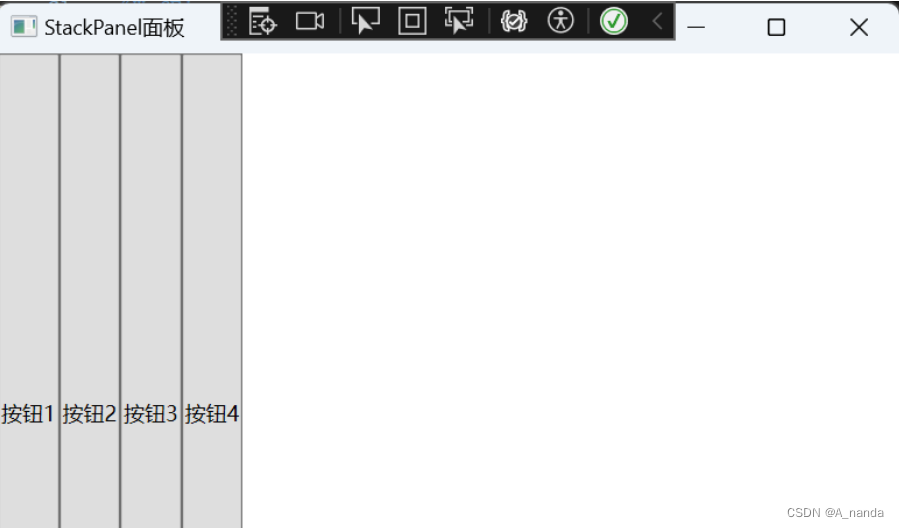
2.设置StackPanel的Orientation为横向(Horizontal)排列
// 设置 Orientation 属性(Horizontal)
<Window x:Class="WpfFirstApp.StackPanelWindow"
xmlns="http://schemas.microsoft.com/winfx/2006/xaml/presentation"
xmlns:x="http://schemas.microsoft.com/winfx/2006/xaml"
xmlns:d="http://schemas.microsoft.com/expression/blend/2008"
xmlns:mc="http://schemas.openxmlformats.org/markup-compatibility/2006"
xmlns:local="clr-namespace:WpfFirstApp"
mc:Ignorable="d"
Title="StackPanelWindow" Height="450" Width="800">
<StackPanel Orientation="Horizontal">
<Button Content="按钮1"></Button>
<Button Content="按钮2"></Button>
<Button Content="按钮3"></Button>
<Button Content="按钮4"></Button>
</StackPanel>
</Window>
效果图:
也可不在xaml中增加button,改用代码增加;效果是一样的,C#中代码如下:
// 使用C# 代码直接实现
using System;
using System.Collections.Generic;
using System.Linq;
using System.Text;
using System.Threading.Tasks;
using System.Windows;
using System.Windows.Controls;
using System.Windows.Data;
using System.Windows.Documents;
using System.Windows.Input;
using System.Windows.Media;
using System.Windows.Media.Imaging;
using System.Windows.Shapes;
namespace WpfFirstApp
{
/// <summary>
/// StackPanelWindow.xaml 的交互逻辑
/// </summary>
public partial class StackPanelWindow : Window
{
public StackPanelWindow()
{
InitializeComponent();
this.Title = "StackPanel面板";
// StackPanel 默认排列
StackPanel stackPanel = new StackPanel();
stackPanel.Orientation = Orientation.Horizontal;
this.Content = stackPanel;
stackPanel.Children.Add(new Button(){Content="按钮1"});
stackPanel.Children.Add(new Button(){Content = "按钮2"});
stackPanel.Children.Add(new Button(){Content = "按钮3"});
stackPanel.Children.Add(new Button(){Content = "按钮4"});
}
}
}
您可能会注意到的另一件事是 StackPanel 默认会拉伸其子控件。在垂直对齐的 StackPanel 上,就像第一个示例中的那样,所有子控件都被水平拉伸。在水平对齐的 StackPanel 上,所有子控件都会垂直拉伸,如上所示。StackPanel 通过将其子控件上的 HorizontalAlignment 或 VerticalAlignment 属性设置为 Stretch 来实现这一点,但如果您愿意,您可以轻松地覆盖它。看看下一个示例,我们使用与前一个示例相同的标记,但这次我们为所有子控件的 VerticalAlignment 属性赋值:
<Window x:Class="WpfTutorialSamples.Panels.StackPanel"
xmlns="http://schemas.microsoft.com/winfx/2006/xaml/presentation"
xmlns:x="http://schemas.microsoft.com/winfx/2006/xaml"
Title="StackPanel" Height="160" Width="300">
<StackPanel Orientation="Vertical">
<Button HorizontalAlignment="Left">Button 1</Button>
<Button HorizontalAlignment="Center">Button 2</Button>
<Button HorizontalAlignment="Right">Button 3</Button>
<Button HorizontalAlignment="Right">Button 4</Button>
<Button HorizontalAlignment="Center">Button 5</Button>
<Button HorizontalAlignment="Left">Button 6</Button>
</StackPanel>
</Window>
效果图:
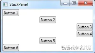
此处涉及一个属性值继承问题:button按钮作为stackpanel的子树,继承stackpanel的属性,但是button按钮同时设置了自己的属性,因此button按钮在排不上元素之间遵循stackpanel的属性进行上下排布,在元素行内又按照左中右的属性排布。
属性值继承是WPF属性系统的一项功能。 属性值继承使元素树中的子元素可以从父元素那里获取特定属性的值,并继承该值,就好像它是在最近的父元素中的任意位置设置的一样。 父元素还可以通过属性值继承来获得其值,因此系统有可能一直递归到页面根元素。 属性值继承不是属性系统的默认行为;属性必须用特定的元数据设置来建立,以便使该属性能够对子元素启动属性值继承。
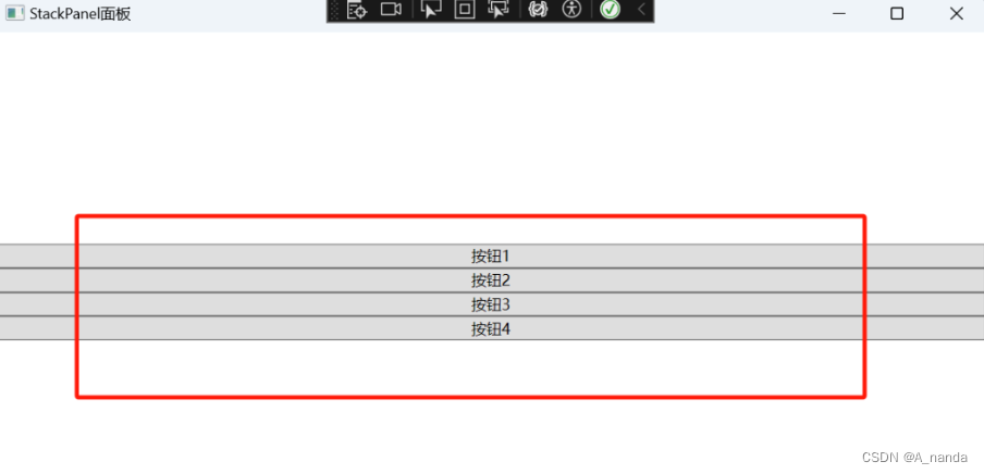
Margin属性
-
用于在子元素周围添加空白空间。Margin是System.Windows.Thickness结构的属性,可以设置上、下、左、右四个方向的外边距。通过调整Margin属性,可以控制子元素之间的间隔以及子元素与StackPanel边缘之间的距离。这对于调整布局的外观和组织元素非常有用。
-
例如设置StackPanel外边距上下左右都为30
// xaml中直接设置属性Margin="30" 当值设置一个值时,wpf 会默认填充上下左右边距为30
// 或 Margin="30 30 30 30 " 设置 左 上 右 下边距都为30
<Window x:Class="WpfFirstApp.StackPanelWindow"
xmlns="http://schemas.microsoft.com/winfx/2006/xaml/presentation"
xmlns:x="http://schemas.microsoft.com/winfx/2006/xaml"
xmlns:d="http://schemas.microsoft.com/expression/blend/2008"
xmlns:mc="http://schemas.openxmlformats.org/markup-compatibility/2006"
xmlns:local="clr-namespace:WpfFirstApp"
mc:Ignorable="d"
Title="StackPanelWindow" Height="450" Width="800">
<StackPanel Orientation="Vertical" Margin="30">
<Button Content="按钮1"></Button>
<Button Content="按钮2"></Button>
<Button Content="按钮3"></Button>
<Button Content="按钮4"></Button>
</StackPanel>
</Window>
// 使用c# 代码实现设置外边距 30 ,stackPanel.Margin = new Thickness(30)
// 或 stackPanel.Margin = new Thickness(30,30,30,30); 左上右下 设置为30
using System;
using System.Collections.Generic;
using System.Linq;
using System.Text;
using System.Threading.Tasks;
using System.Windows;
using System.Windows.Controls;
using System.Windows.Data;
using System.Windows.Documents;
using System.Windows.Input;
using System.Windows.Media;
using System.Windows.Media.Imaging;
using System.Windows.Shapes;
namespace WpfFirstApp
{
/// <summary>
/// StackPanelWindow.xaml 的交互逻辑
/// </summary>
public partial class StackPanelWindow : Window
{
public StackPanelWindow()
{
InitializeComponent();
this.Title = "StackPanel面板";
StackPanel stackPanel = new StackPanel();
this.Content = stackPanel;
// 设置为横排
stackPanel.Orientation = Orientation.Vertical;
// 设置外边距 30
stackPanel.Margin = new Thickness(30);
//或 设置外边距
//stackPanel.Margin = new Thickness(30,30,30,30);
stackPanel.Children.Add(new Button() {Content = "按钮1" });
stackPanel.Children.Add(new Button(){Content = "按钮2"});
stackPanel.Children.Add(new Button(){Content = "按钮3" });
stackPanel.Children.Add(new Button() {Content = "按钮4" });
}
}
}
效果图:

Width和Height 属性
-
用来设置控件的宽度和高度,当指定宽度和高度时则会取消自动的宽度和高度。
HorizontalAlignment和VerticalAlignment 属性
-
于设置元素在容器中的水平和垂直对齐方式。对齐方式值有 Left, Right, Center, 和 Stretch,当容器的尺寸改变时,Stretch 值将使元素扩展以填充可用空间,而其他值将使元素保持其原始大小并在指定的对齐边缘进行定位。
-
例如设置StackPanel的内容垂直排列并居中
-
// 设置Orientation="Vertical" VerticalAlignment="Center"
<Window x:Class="WpfFirstApp.StackPanelWindow"
xmlns="http://schemas.microsoft.com/winfx/2006/xaml/presentation"
xmlns:x="http://schemas.microsoft.com/winfx/2006/xaml"
xmlns:d="http://schemas.microsoft.com/expression/blend/2008"
xmlns:mc="http://schemas.openxmlformats.org/markup-compatibility/2006"
xmlns:local="clr-namespace:WpfFirstApp"
mc:Ignorable="d"
Title="StackPanelWindow" Height="450" Width="800">
<StackPanel Orientation="Vertical" VerticalAlignment="Center">
<Button Content="按钮1"></Button>
<Button Content="按钮2"></Button>
<Button Content="按钮3"></Button>
<Button Content="按钮4"></Button>
</StackPanel></Window>
using System;
using System.Collections.Generic;
using System.Linq;
using System.Text;
using System.Threading.Tasks;
using System.Windows;
using System.Windows.Controls;
using System.Windows.Data;
using System.Windows.Documents;
using System.Windows.Input;
using System.Windows.Media;
using System.Windows.Media.Imaging;
using System.Windows.Shapes;
namespace WpfFirstApp
{
/// <summary>
/// StackPanelWindow.xaml 的交互逻辑
/// </summary>
public partial class StackPanelWindow : Window
{
public StackPanelWindow()
{
InitializeComponent();
this.Title = "StackPanel面板";
StackPanel stackPanel = new StackPanel();
this.Content = stackPanel;
// 设置为竖排
stackPanel.Orientation = Orientation.Vertical;
stackPanel.VerticalAlignment = VerticalAlignment.Center;
stackPanel.Children.Add(new Button(){Content = "按钮1"});
stackPanel.Children.Add(new Button(){Content = "按钮2"});
stackPanel.Children.Add(new Button() {Content = "按钮3"});
stackPanel.Children.Add(new Button(){Content = "按钮4"
});
}
}
}
效果图:
WrapPanel 面板
-
用于将子元素排列在一行或一列中,当没有足够的空间时,它会将元素移动到下一行或列。与 StackPanel 不同,WrapPanel 会自动处理元素的对齐和换行。它也可以使用 Orientation 属性更改排列方向。Orientation 属性和StackPanel 一样,唯一的区别就是 排列 默认不同,WrapPanel 排列方式 横排(Horizontal,默认)和竖排(Vertical)
-
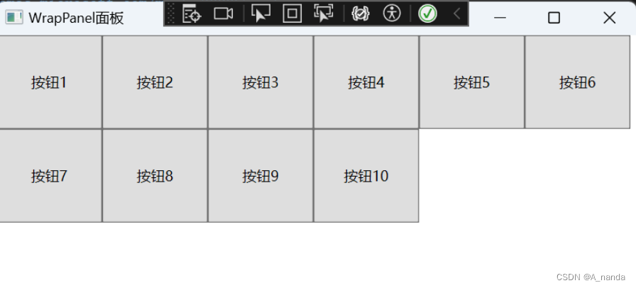
例如: 横排(Horizontal,默认)
// 默认排列方式
<Window x:Class="WpfFirstApp.WrapPanelWindow"
xmlns="http://schemas.microsoft.com/winfx/2006/xaml/presentation"
xmlns:x="http://schemas.microsoft.com/winfx/2006/xaml"
xmlns:d="http://schemas.microsoft.com/expression/blend/2008"
xmlns:mc="http://schemas.openxmlformats.org/markup-compatibility/2006"
xmlns:local="clr-namespace:WpfFirstApp"
mc:Ignorable="d"
Title="WrapPanelWindow" Height="450" Width="800">
<WrapPanel>
<Button Content="按钮1" Height="80" Width="90"></Button>
<Button Content="按钮2" Height="80" Width="90"></Button>
<Button Content="按钮3" Height="80" Width="90"></Button>
<Button Content="按钮4" Height="80" Width="90"></Button>
<Button Content="按钮5" Height="80" Width="90"></Button>
<Button Content="按钮6" Height="80" Width="90"></Button>
<Button Content="按钮7" Height="80" Width="90"></Button>
<Button Content="按钮8" Height="80" Width="90"></Button>
<Button Content="按钮9" Height="80" Width="90"></Button>
<Button Content="按钮10" Height="80" Width="90"></Button>
</WrapPanel>
</Window>
效果图:
-
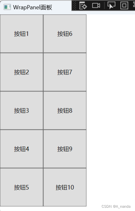
设置 Orientation 属性为Vertical,垂直排列方式
// 设置 Orientation="Vertical" 属性
<Window x:Class="WpfFirstApp.WrapPanelWindow"
xmlns="http://schemas.microsoft.com/winfx/2006/xaml/presentation"
xmlns:x="http://schemas.microsoft.com/winfx/2006/xaml"
xmlns:d="http://schemas.microsoft.com/expression/blend/2008"
xmlns:mc="http://schemas.openxmlformats.org/markup-compatibility/2006"
xmlns:local="clr-namespace:WpfFirstApp"
mc:Ignorable="d"
Title="WrapPanelWindow" Height="450" Width="800">
<WrapPanel Orientation="Vertical">
<Button Content="按钮1" Height="80" Width="90"></Button>
<Button Content="按钮2" Height="80" Width="90"></Button>
<Button Content="按钮3" Height="80" Width="90"></Button>
<Button Content="按钮4" Height="80" Width="90"></Button>
<Button Content="按钮5" Height="80" Width="90"></Button>
<Button Content="按钮6" Height="80" Width="90"></Button>
<Button Content="按钮7" Height="80" Width="90"></Button>
<Button Content="按钮8" Height="80" Width="90"></Button>
<Button Content="按钮9" Height="80" Width="90"></Button>
<Button Content="按钮10" Height="80" Width="90"></Button>
</WrapPanel>
</Window>
效果图:
DockPanel 停靠面板
用来控制UI元素在视窗中的位置就是停靠。DockPanel定义了一个Dock附加属性,其类型为Dock,是枚举类型,可取Left、Right、Top和Bottom四个值。注意Dock并没有一个Fi或Center的值,当LastChildFill属性设为True时,DockPanel用最后一个加入的UI元素填充所有剩下的地方。
// 当只有个按钮时,不控制宽高度时,默认填充所有的地方
// 增加一个按钮,第一个默认高度,并设置宽度为70,第二个高度会填充满然后看效果
// 可以依次添加停靠位置,并查看对应的效果
<Window x:Class="WpfFirstApp.DockPanelWindow"
xmlns="http://schemas.microsoft.com/winfx/2006/xaml/presentation"
xmlns:x="http://schemas.microsoft.com/winfx/2006/xaml"
xmlns:d="http://schemas.microsoft.com/expression/blend/2008"
xmlns:mc="http://schemas.openxmlformats.org/markup-compatibility/2006"
xmlns:local="clr-namespace:WpfFirstApp"
mc:Ignorable="d"
Title="DockPanel停靠面板" Height="450" Width="800">
<DockPanel>
<!--设置宽度为70,停靠方向为上-->
<Button Content="按钮靠上" Width="70" DockPanel.Dock="Top"></Button>
<!--增加一个按钮设置宽度为70,停靠方向为上,并设置右对齐-->
<Button Content="按钮靠上右" Width="70" HorizontalAlignment="Right" DockPanel.Dock="Top"></Button>
<!--第三个按钮设置停靠上,并设置外边距10-->
<Button Content="按钮靠上" Margin="10" DockPanel.Dock="Top"></Button>
<!--第四个按钮设置靠左-->
<Button Content="按钮靠左" DockPanel.Dock="Left" ></Button>
<!--第五个按钮设置靠右-->
<Button Content="按钮靠右" DockPanel.Dock="Right"></Button>
<!--第六个按钮设置靠下-->
<Button Content="按钮靠下" DockPanel.Dock="Bottom"></Button>
<!--第七个按钮默认未设置停靠-->
<Button Content="默认未设置停靠"></Button>
</DockPanel>
</Window>
效果图:
 Grid 控制面板
-
Grid控制面板是WPP中最常用的控制面板,以表格形式布局元素,可以创建复杂的二维布局。Grid的子控件被放置在一个个预先定义好的小格子中,这些格子称为单元格。每个单元格都有一个行和列的标识符,用于确定控件在该网格中的位置。当用Visual Studio创建WPF程序时Visual Studio会自动在XAML中添加
标记。Grid排版和HTML表格排版是一样的,类似于 HTML 中的 table td 中的 row span 和 colspan 。 -
WPF 中的 Grid 的每一个单元格中可以放置多个控件,但控件可能会层叠在一起, 支持单元格的合并。
-
Grid 中的行和列可以自定义高度(Height)和宽度(Width),设置高度和宽度时可以采用两种写法:
-
1. Height=”60”:不加“星号”表示固定的高度
-
2. Height=”60*”:加“星号”表示“加权”的高度,在调整窗体大小时,高度或宽度会按窗体大小改变的比例进行缩
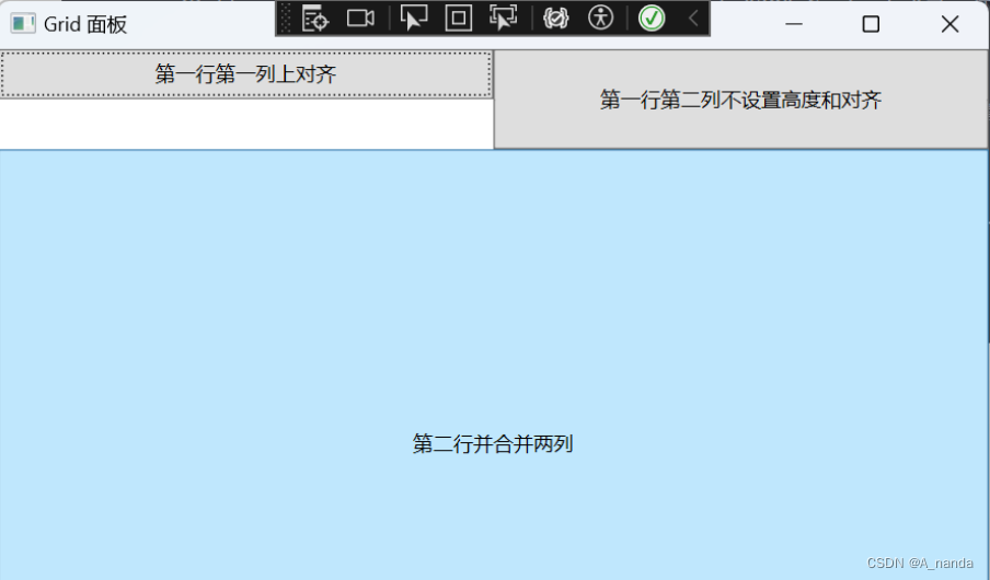
// Grid定义两行两列布局
<Window x:Class="WpfFirstApp.GridWindow"
xmlns="http://schemas.microsoft.com/winfx/2006/xaml/presentation"
xmlns:x="http://schemas.microsoft.com/winfx/2006/xaml"
xmlns:d="http://schemas.microsoft.com/expression/blend/2008"
xmlns:mc="http://schemas.openxmlformats.org/markup-compatibility/2006"
xmlns:local="clr-namespace:WpfFirstApp"
mc:Ignorable="d"
Title="Grid 面板" Height="450" Width="800">
<Grid>
<!--定义两行,两列-->
<Grid.RowDefinitions>
<RowDefinition Height="60"></RowDefinition>
<RowDefinition Height="200*"></RowDefinition>
</Grid.RowDefinitions>
<Grid.ColumnDefinitions>
<ColumnDefinition></ColumnDefinition>
<ColumnDefinition></ColumnDefinition>
</Grid.ColumnDefinitions>
<!--设置第一行第一列,并设置为上对齐,为了看效果设置为高度的一半30-->
<Button Grid.Column="0" Grid.Row="0" Height="30" Content="第一行第一列上对齐" VerticalAlignment="Top"></Button>
<!--设置第一行第二列,并设置为下对齐,为了看效果设置为高度的一半30-->
<Button Grid.Column="1" Grid.Row="0" Height="30" Content="第一行第二列下对齐" VerticalAlignment="Bottom"></Button>
<!--演示Grid内容为层叠,再增加一个按钮,会盖住上一个第二列按钮-->
<Button Grid.Column="1" Grid.Row="0" Content="第一行第二列不设置高度和对齐"></Button>
<!--设置第二行-->
<Button Grid.Column="0" Grid.Row="1" Grid.ColumnSpan="2" Content="第二行并合并两列"></Button>
</Grid>
</Window>
效果图:
-
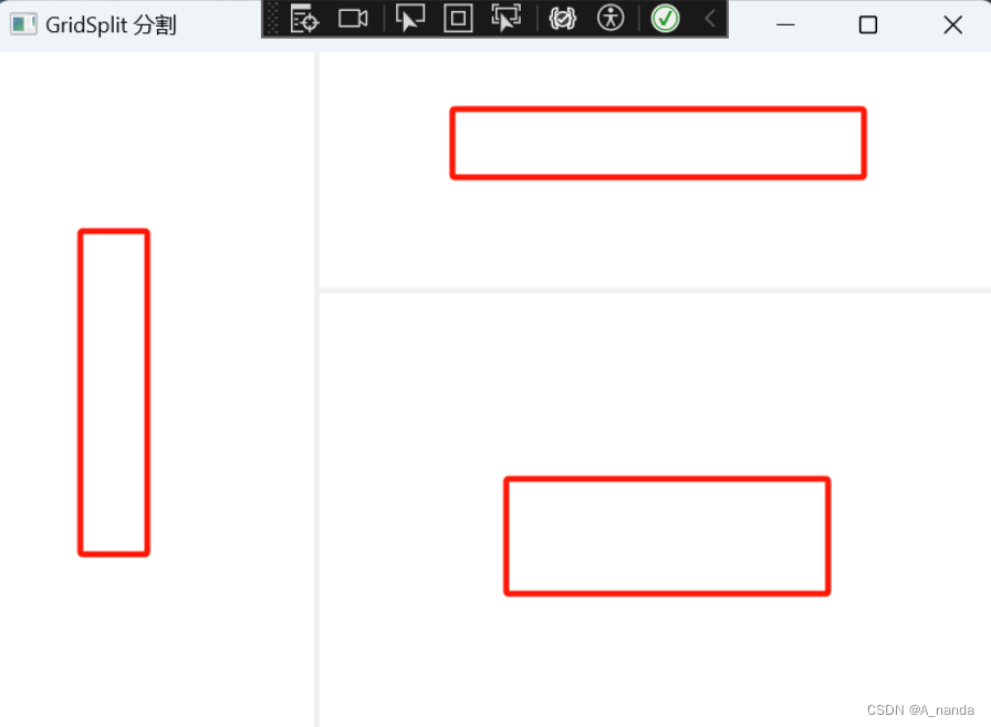
用 GridSplit 控件结合 Grid 控件实现类似于 Windows 应用程序中 SplitContai ner 的功能,实现可以左右拖动,改变宽度,以上下拖动,改变高度
// 定义 3*3 的表格,其中放置分割线的列和行的宽度和高度设置为 Auto
<Window x:Class="WpfFirstApp.GridSplitWindow"
xmlns="http://schemas.microsoft.com/winfx/2006/xaml/presentation"
xmlns:x="http://schemas.microsoft.com/winfx/2006/xaml"
xmlns:d="http://schemas.microsoft.com/expression/blend/2008"
xmlns:mc="http://schemas.openxmlformats.org/markup-compatibility/2006"
xmlns:local="clr-namespace:WpfFirstApp"
mc:Ignorable="d"
Title="GridSplit 分割" Height="450" Width="800">
<Grid>
<!--定义三行三列-->
<Grid.RowDefinitions>
<RowDefinition Height="90*"></RowDefinition>
<RowDefinition Height="Auto"></RowDefinition>
<RowDefinition Height="190*"></RowDefinition>
</Grid.RowDefinitions>
<Grid.ColumnDefinitions>
<ColumnDefinition Width="80*"></ColumnDefinition>
<ColumnDefinition Width="Auto"></ColumnDefinition>
<ColumnDefinition Width="170*"></ColumnDefinition>
</Grid.ColumnDefinitions>
<!--这里可以增加Grid列内容,不添加Button,则只会显示GridSplitter分割线-->
<!--第一列三行左边,并设置外边距3-->
<Button Content="第一列三行左边" Margin="3" Grid.Row="0" Grid.Column="0" Grid.RowSpan="3" />
<Button Content="第一行第二列上边" Margin="3" Grid.Row="0" Grid.Column="2" />
<Button Content="第三行第二列下边" Margin="3" Grid.Row="2" Grid.Column="2" />
<!--添加GridSplitter 分割-->
<!--设置在水平和垂直方向上都拉伸以填充整个空间,设置为第一列。并三行合并-->
<GridSplitter Width="3" HorizontalAlignment="Stretch" VerticalAlignment="Stretch" Grid.Row="0" Grid.Column="1" Grid.RowSpan="3"></GridSplitter>
<!--设置在水平和垂直方向上都拉伸以填充整个空间,设置为第二行,为两列-->
<GridSplitter Height="3" HorizontalAlignment="Stretch" VerticalAlignment="Stretch" Grid.Row="1" Grid.Column="2"></GridSplitter>
</Grid>
</Window>
效果图:
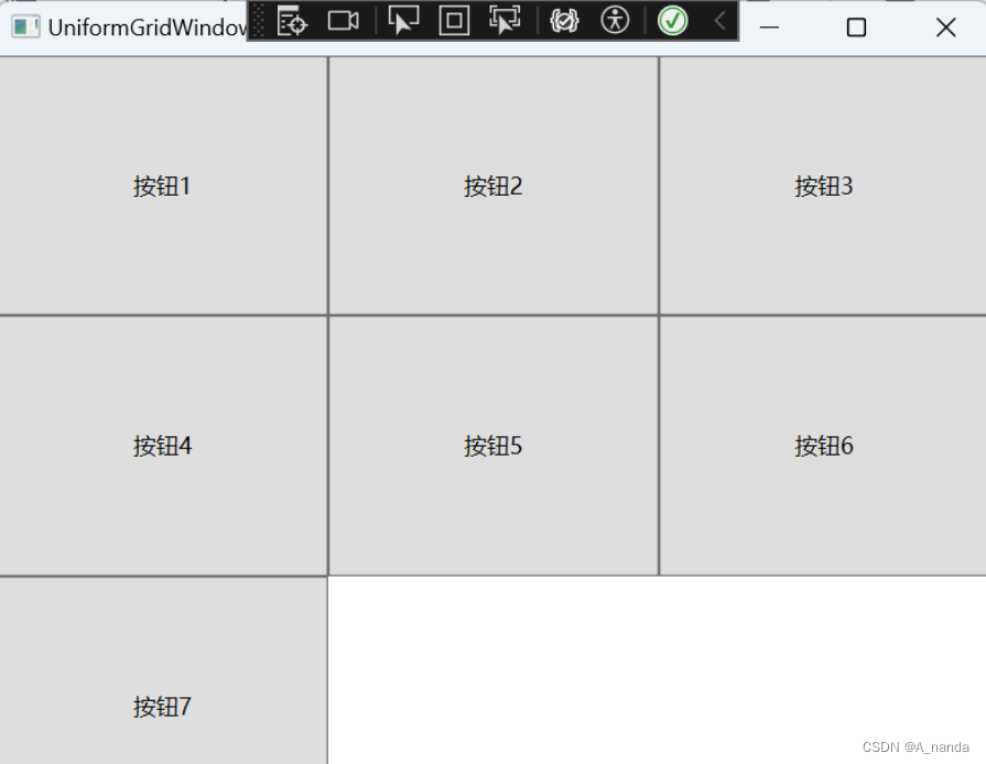
UniformGrid 控制面板
-
用于简化的网格布局。当控件添加到 UniformGrid 时,它们会排列在一个网格模式中,该网格模式会自动调整以使控件之间的距离保持均匀。单元格的数目将进行调整,以适应控件的数目。UniformGrid总是把行数和列数设为相等,每个单元只含有一个子元素。
// UniformGrid添加7个按钮它会自动排列
<Window x:Class="WpfFirstApp.UniformGridWindow"
xmlns="http://schemas.microsoft.com/winfx/2006/xaml/presentation"
xmlns:x="http://schemas.microsoft.com/winfx/2006/xaml"
xmlns:d="http://schemas.microsoft.com/expression/blend/2008"
xmlns:mc="http://schemas.openxmlformats.org/markup-compatibility/2006"
xmlns:local="clr-namespace:WpfFirstApp"
mc:Ignorable="d"
Title="UniformGridWindow" Height="450" Width="800">
<UniformGrid>
<Button Content="按钮1"></Button>
<Button Content="按钮2"></Button>
<Button Content="按钮3"></Button>
<Button Content="按钮4"></Button>
<Button Content="按钮5"></Button>
<Button Content="按钮6"></Button>
<Button Content="按钮7"></Button>
</UniformGrid>
</Window>
效果图:
创作不易,看到这了,我强烈建议您给于给于我发1元予以支持;您的支持将是我继续创作路线上的动力源泉。谢谢!


 4361
4361


 被折叠的 条评论
为什么被折叠?
被折叠的 条评论
为什么被折叠?
 到【灌水乐园】发言


