


主要介绍内容:
- BitmapDrawable
- ShapeDrawable
- LayerDrawable
- StateListDrawable
- LevelListDrawable
- TransitionDrawable
- InsetDrawable
- ScaleDrawable
- ClipDrawable
在进入真正的介绍之前,我们先来简单的了解下 Drawable。所谓的 Drawable 其实表示的是一种可以在 Canvas 上进行绘制的抽象的概念,它的种类有很多,最常见的颜色和图片都可以是一个 Drawable。它的使用非常简单,比之前我们介绍的自定义 View 的成本要低;其次,非图片类型的 Drawable 占用空间较小,这对减小 apk 的大小也很有帮助。
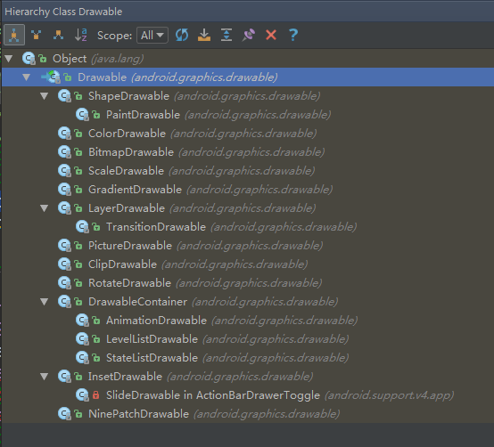
一般在实际开发中, Drawable 常被用来作为 View 的背景使用。Drawable 一遍都是通过 XML 来定义的,当然我们也可以通过代码来创建具体的 Drawable 对象,只是用代码来创建会稍显复杂。在 Android 的设计中, Drawable 是一个抽象类,它是所有 Drawable 对象的基类,每个具体的 Drawable 都是它的子类,比如 shapeDrawable、BitmapDrawable等,Drawable 的层次关系图如下所示:
Drawable 的内部宽/高这个参数比较重要,通过 getIntrinsicWidth 和 getIntrinsicHeight 这两个方法可以获取到它们。但是并不是所有的 Drawable 都有内部宽/高,比如一张图片所形成的 Drawable,它的内部宽/高就是图片的宽/高,但是一个颜色所形成的 Drawable,它就没有内部宽/高的概念。另外需要注意的是,Drawable 的内部宽/高不等同于它的大小,一般来说,Drawable 是没有大小概念的,当用作 View 的背景时,Drawable 会被拉伸至 View 的同等大小。
BitmapDrawable
这几乎是最简单的 Drawable 了,它表示的就是一张图片。在实际开发中,我们可以直接引用原始的图片即可,但是也可以通过 XML 的方式来描述它,通过 XML 来描述的 BitmapDrawable 可以设置更多的效果,如下所示:
<?xml version="1.0" encoding="utf-8"?>
<bitmap
    xmlns:android="http://schemas.android.com/apk/res/android"
    android:src="@[package:]drawable/drawable_resource"
    android:antialias=["true" | "false"]
    android:dither=["true" | "false"]
    android:filter=["true" | "false"]
    android:gravity=["top" | "bottom" | "left" | "right" | "center_vertical" | "center_horizontal" | "center" | "fill_vertical" | "fill_horizontal" | "fill" | "clip_vertical" | "clip_horizontal"]
    android:mipMap=["true" | "false"]
    android:tileMode=["disabled" | "clamp" | "repeat" | "mirror"]>

</bitmap>
下面是它各个属性的含义:
- android:src
这个很简单,就是图片的资源 id。
- android:antialias
是否开启图片抗锯齿功能。开启后会让图片变得平滑,同时也会在一定程度上降低图片的清晰度,但是这个降低的幅度较低以至于可以忽略,隐藏抗锯齿选项应该开启。
- android:dither
是否开启抖动效果。当图片的像素配置和手机屏幕的像素配置不一致时,开启这个选项可以让高质量的图片在低质量的屏幕上还能保持较好的显示效果,比如图片的色彩模式为 ARGB8888,但是设备屏幕所支持的色彩模式为 RGB5555,这个时候开启抖动选项可以让图片显示不会过于失真。在 Android 中创建的 Bitmap 一般会选用 ARGB8888 这个模式,即 ARGB 四个通道各占 8 位,在这种色彩模式下,一个像素所占的大小为 4 个字节,一个像素的位数总和越高,图像也就越逼真。根据分析,抖动效果也应该开启。
- android:filter
是否开启过滤效果。当图片尺寸被拉伸或者压缩时,开启过滤效果可以保持较好的显示效果,因此此选项也应该开启。
- android:gravity
当图片小于容器的尺寸时,设置此选项可以对图片进行定位。这个属性的可选项比较多,不同的选项可以通过 “|” 来组合使用,各个属性的含义如下所示:
top:将图片放在容器的顶部,不改变图片的大小。
bottom:将图片放在容器的底部,不改变图片的大小。
left:将图片放在容器的左部,不改变图片的大小。
right:将图片放在容器的右部,不改变图片的大小。
center_vertical:使图片竖直居中,不改变图片的大小。
center_horizontal:使图片水平居中,不改变图片的大小。
center:使图片在水平和竖直方向同时居中,不改变图片的大小。
fill_vertical:使图片竖直方向填充容器。
fill_horizontal:使图片水平方向填充容器。
fill:使图片在水平和竖直方向均填充容器,这是默认值。
clip_vertical:附加选项,表示竖直方向的裁剪,较少使用。
clip_horizontal:附加选项,表示水平方向的裁剪,较少使用。
- android:mipMap
这是一种图像相关的处理技术,也叫纹理映射,比较抽象,这里也不对其深究了,默认值为 false,在日常开发中此选项不常用。
- android:tileMode
平铺模式。这个选项有如下几个值:[“disabled” | “clamp” | “repeat” | “mirror”],其中 disable 表示关闭平铺模式,这也是默认值,当开启平铺模式后,gravity 属性会被忽略。这里主要说一下 repeat、mirror 和 clamp 的区别,这三者都表示平铺模式,但是它们的表现却有很大不同。repeat 表示的是简单的水平和竖直方向上的平铺效果;mirror 表示一种在水平和竖直方向上的镜面投影效果;而 clamp 表示的效果就更加奇特,图片四周的像素会扩展到周围区域(常见的是边缘区域被拉伸)。
接下来说一个和 BitmapDrawable 比较相似的 Drawable —— NinePatchDrawable,它表示的是一张 .9 格式的图片, .9 图片可以自动地根据所需的 宽/高 进行相应的缩放并保证不失真,之所以把它和 BitmapDrawable 放在一起介绍是因为它们都表示一张图片。 和 BitmapDrawable 一样,在实际使用中直接引用图片即可,但是也可以通过 XML 来描述 .9 图,如下所示:
<?xml version="1.0" encoding="utf-8"?>
<nine-patch
    xmlns:android="http://schemas.android.com/apk/res/android"
    android:src="@[package:]drawable/drawable_resource"
    android:dither=["true" | "false"]
上述 XML 中的属性的含义 和 BitmapDrawable 中的对应属性的含义是相同的,这里就不在描述了,另外,在实际使用中发现在 bitmap 标签中也可以使用 .9 图,即 BitmapDrawable 也可以代表一个 .9 格式的图片;
ShapeDrawable
ShapeDrawable 是一种很常见的 Drawable,可以理解为通过颜色来构造的图形,它既可以是纯色的图形,也可以是具有渐变效果的图形。ShapeDrawable 的语法稍显复杂,如下所示:
<?xml version="1.0" encoding="utf-8"?>
<shape xmlns:android="http://schemas.android.com/apk/res/android"
    android:shape=["rectangle" | "oval" | "line" | "ring"]>

    <corners
        android:bottomLeftRadius="integer"
        android:bottomRightRadius="integer"
        android:radius="integer"
        android:topLeftRadius="integer"
        android:topRightRadius="integer"></corners>

    <gradient
        android:angle="integer"
        android:centerX="integer"
        android:centerY="integer"
        android:endColor="color"
        android:centerColor="color"
        android:gradientRadius="integer"
        android:startColor="color"
        android:type=["linear" | "radial" | "sweep"]

    <padding
        android:bottom="integer"
        android:left="integer"
        android:right="integer"
        android:top="integer"></padding>

    <size
        android:width="integer"

    <solid android:color="color"></solid>

    <stroke
        android:width="integer"
        android:color="color"
        android:dashGap="integer"
        android:dashWidth="integer"></stroke>

</shape>
需要注意的是 shape 标签创建的 Drawable,其实体类实际上是 GradientDrawable,下面分别介绍各个属性的含义。
- android:shape
表示图形的形状,有四个选项:rectangle(矩形)、oval(椭圆)、line(横线) 和 ring(圆环)。它的默认值是矩形,另外 line 和 ring 这两个选项必须要通过 stroke 标签来指定线的宽度和颜色等信息,否则将无法达到预期的显示效果。
针对 ring 这个形状,有 5 个特殊的属性:android:innerRadius、android:thickness、android:innerRadiusRatio、android:thicknessRatio 和 android:useLevel,它们的含义如下所示:
android:innerRadiusRatio:内半径占整个 Drawable 宽度的比例,默认值为 9,如果为 n,那么内半径 = 宽度 / n;
android:innerRadius:圆环的内半径,和 android:innerRadiusRatio 同时存在时,以 android:innerRadius 为准。
android:thicknessRatio:厚度占整个 Drawable 宽度的比例,默认值为 3,如果为 n,那么厚度 = 宽度 / n;
android:thickness:圆环的厚度,即外半径 - 内半径的大小,和 android:thicknessRatio 同时存在时,以 android:thickness 为准。
android:useLevel:一般都应该使用 false,否则有可能无法达到预期的显示效果,除非它被当作 LevelListDrawable 来使用。
- corners
表示 shape 的四个角的角度。它只适用于矩形 shape,这里的角度是指圆角的程度,用 px 来表示,它有如下 5 个属性:
- android:radius —— 为四个角同时设定相同的角度,优先级较低,会被其他四个属性覆盖。
- android:topLeftRadius —— 设定最左上角的角度;
- android:topRightRadius —— 设定最右上角的角度;
- android:bottomLeftRadius —— 设定最左下角的角度;
- android:bottomRightRadius —— 设定最右下角的角度;
- gradient
它与 solid 标签是互相排斥的,其中 solid 表示纯色填充,而 gradient 则表示渐变效果, gradient 有如下几个属性:
- android:angle —— 渐变的角度,默认值为 0,其值必须为 45 的倍数,0表示从左到右,90 表示从下到上,具体的效果需要自行体验,总之角度会影响渐变的方向;
- android:centerX —— 渐变的中心点横坐标;
- android:centerY —— 渐变的中心点纵坐标,渐变的中心点会影响渐变的具体效果;
- android:startColor —— 渐变的起始色;
- android:centerColor —— 渐变的中间色;
- android:endColor —— 渐变的结束色;
- android:gradientRadius —— 渐变半径,仅当 android:type=”radial” 时有效;
- android:useLevel —— 一般为 false,当 Drawable 作为 StateListDrawable 使用时为 true;
- android:type —— 渐变的类别,有 linear(线性渐变)、radial(径向渐变)、sweep(扫描线渐变)三种,其中默认值为线性渐变;
关于效果的展示请大家自行尝试….
- solid
这个标签表示纯色填充,和 gradient 是互相排斥的,通过 android:color 即可指定 shape 中填充的颜色。
- strokeShape 的描边,有如下几个属性:
- android:width —— 描边的宽度,越大则 shape 的边缘线就会看起来越粗;
- android:color —— 描边的颜色;
- android:dashWidth —— 组成虚线的线段的宽度;
- android:dashGap —— 组成虚线的线段之间的间隔,间隔越大则虚线看起来空隙就越大。
注意:如果 android:dashWidth 和 android:dashGap 有任何一个为 0,那么虚线效果将不能生效。
- padding
这个表示空白,但是它表示的不是 shape 的空白,而是包含它的 View 的空白,有四个属性:android:left、android:top、android:right 和 android:bottom。
- size
shape 的大小,有两个属性:android:width 和 android:height,分别表示 shape 的宽/高。这个表示的是 shape 的固有大小,但是一般来说它并不是 shape 最总显示的大小,这个有点抽象,但是我们要明白,对于 shape 来说它并没有 宽/高 的概念,作为 View 的背景它会自适应 View 的 宽/高。我们知道 Drawable 的两个方法 getIntrinsicWidth 和 getIntrinsicHeight 表示的是 Drawable 的固有 宽/高,对于有些 Drawable 比如图片来说,它的固有 宽/高 就是图片的尺寸。而对于 shape 来说,默认情况下它是没有固有 宽/高 这个概念的,这个时候 getIntrinsicHeight 和 getIntrinsicWidth 就会返回 -1,但是如果我们通过 size 标签来指定 宽/高 信息,那么这个时候 shape 就有了所谓的固有 宽/高。因此,总结来说, size 标签设置的 宽/高 就是 ShapeDrawable 的固有 宽/高,但是作为 View 的背景时,shape 还会被拉伸或者缩小为 View 的大小。。
LayerDrawable
LayerDrawable 对应的 XML 标签是 layer-list,它表示一种层次化的 Drawable 集合,通过将不同的 Drawable 放置在不同的层上面从而达到一种叠加后的效果。
<?xml version="1.0" encoding="utf-8"?>
<layer-list xmlns:android="http://schemas.android.com/apk/res/android">
    <item android:drawable="@drawable/drawable_resource"
        android:id="@+id/resource_name"
        android:top="dimension"
        android:right="dimension"
        android:bottom="dimension"
        android:left="dimension"></item>
</layer-list>
一个 layer-list 中可以包含多个 item,每个 item 表示一个 Drawable。Item 的结构也比较简单,比较常用额属性有 android:top、android:bottom、android:left 和 android:right,它们分别表示 Drawable 相对于 View 的上下左右的偏移量,单位为像素。另外,我们可以通过 android:drawable 属性来直接引用一个已有的 Drawable 资源,也可以在 item 中自定义 Drawable。默认情况下,layer-list 中的所有的 Drawable 都会被缩放至 View 的大小,对于 bitmap 来说,需要使用 android:gravity 属性才能控制图片的显示效果。layer-list 有层次的概念,下面的 item 会覆盖上面的 item,通过合理的分层,可以实现一些特殊的叠加效果。
StateListDrawable
StateListDrawable 对应于 selector 标签,它也是表示 Drawable 集合,每个 Drawable 都对应着 View 的一种状态,这样系统就会根据 View 的状态来选择合适的 Drawable。StateListDrawable 主要用于设置可单击的 View 的背景,最常见的是 Button,这个大家应该都使用过,它的语法如下所示:
<?xml version="1.0" encoding="utf-8"?>
<selector xmlns:android="http://schemas.android.com/apk/res/android"
    android:constantSize=["true" | "false"]
    android:dither=["true" | "false"]
    android:variablePadding=["true" | "false"]>

    <item
        android:drawable="@[package:]drawable/drawable_resource"
        android:state_pressed=["true" | "false"]
        android:state_focused=["true" | "false"]
        android:state_hovered=["true" | "false"]
        android:state_selected=["true" | "false"]
        android:state_checkable=["true" | "false"]
        android:state_enabled=["true" | "false"]
        android:state_activated=["true" | "false"]
        android:state_window_focused=["true" | "false"]
        ></item>

</selector>
针对上面的语法,下面做简单介绍。
- android:constantSize
StateListDrawable 的固有大小是不随着其状态的改变而改变的,因为状态额改变会导致 StateListDrawable 切换到具体的 Drawable,而不同的 Drawable 具有不同的固有大小。 True 表示 StateListDrawable 的固有大小保持不变,这时它的固有大小是内部所有 Drawable 的固有大小的最大值,false 则会随着状态的改变而改变。此选项默认值为 false。
- android:dither
是否开启抖动效果,这个在 BitmapDrawable 中也有提到,开启此选项可以让图片在低质量的屏幕上仍然获得较好的显示效果。此选项默认值为 true。
- android:variablePadding
StateListDrawable 的 padding 表示是否随着其状态的改变而改变,true 表示会随着状态的改变而改变,false 表示 StateListDrawable 的 padding 是内部所有 Drawable 的 padding 的最大值。此选项默认值为 false,并且不建议开启此选项。
- item 标签
item 标签表示一个具体的 Drawable,它的结构也比较简单,其中 android:drawable 是一个已有 Drawable 的资源 id,剩下的属性表示的是 View 的各种状态,每个 item 表示的都是一种状态下的 Drawable 信息。View 的常见状态如下表:
- android:state_pressed —— 表示按下状态,比如 Button 被按下后仍然没有松开时的状态
- android:state_focused —— 表示 View 已经获取了焦点;
- android:state_selected —— 表示用户选择了 View;
- android:state_checked —— 表示用户选中了 View,一般适用于 CheckBox 这类在选中 和 非选中状态之间进行切换的 View;
- android:state_enabled —— 表示 View 当前处于可用状态。
下面给出具体的例子,代码如下所示:
<?xml version="1.0" encoding="utf-8"?>
<selector xmlns:android="http://schemas.android.com/apk/res/android">
    <!--pressed-->
    <item
        android:state_pressed="true"
        android:drawable="@drawable/button_pressed"
        ></item>
    <!--focused-->
    <item
        android:state_focused="true"
        android:drawable="@drawable/button_focused"
        ></item>
    <!--default-->
    <item
        android:drawable="@drawable/button_normal"
        ></item>

</selector>
系统会根据 View 当前的状态从 selector 中选择对应的 item,每个 item 对应着一个具体的 Drawable,系统按照从上到下的顺序查找,直至查找到第一条匹配的 item。一般来说,默认的 item 都应该放在 selector 的最后一条并且不附带任何的状态,这样上面的 item 都无法匹配 View 的当前状态,系统就会选择默认的 item,因为默认的 item 不附带状态,所以它可以匹配 View 的任何状态。
LevelListDrawable
LevelListDrawable 对应于 level-list 标签,它同样表示一个 Drawable 集合,集合中的每个 Drawable 都有一个等级 (level)的概念。根据不同的等级,LevelListDrawable 会切换为对应的 Drawable,它的语法如下所示:
<?xml version="1.0" encoding="utf-8"?>
<level-list xmlns:android="http://schemas.android.com/apk/res/android">
    <item android:drawable="@drawable/drawable_resource"
        android:maxLevel="integer"
        android:minLevel="integer"></item>
</level-list>
上面的语法中,每个 item 表示一个 Drawable,并且有对应的等级范围,由 android:minLevel 和 android:maxLevel 来指定,在最小值和最大值之间的等级会对应此 item 中的 Drawable。下面是一个实际的例子,当它作为 View 的背景时,可以通过 Drawable 的 setLevel 方法来设置不同的等级从而切换具体的 Drawable。如果它被用来作为 ImageView的前景 Drawable,那么还可以通过 ImageView 的 setImageLevel 方法来切换 Drawable。最后,Drawable 的等级是有范围的,即 0~10000,最小等级是 0 ,这也是默认值,最大等级是 10000.
<?xml version="1.0" encoding="utf-8"?>
<level-list xmlns:android="http://schemas.android.com/apk/res/android">
    <item android:drawable="@drawable/status_off"
        android:maxLevel="0"
        ></item>

    <item android:drawable="@drawable/status_on"
        android:maxLevel="1"
        ></item>
</level-list>
TransitionDrawable
TransitionDrawable 对应于 transition 标签,它用于实现两个 Drawable 之间的淡入淡出效果,它的语法如下所示。
<?xml version="1.0" encoding="utf-8"?>
<transition xmlns:android="http://schemas.android.com/apk/res/android">
    <item android:drawable="@[package:]drawable/drawable_resource"
        android:id="@[+][package:]id/resource_name"
        android:top="dimension"
        android:right="dimension"
        android:bottom="dimension"
        android:left="dimension"></item>
</transition>
上面语法中的属性前面已经都介绍过了,其中 android:top、android:right、android:bottom 和 android:left仍然表示的是 Drawable 四周的偏移量,这里就不多介绍了。下面给出一个实际的例子。
首先定义 TransitionDrawable,如下所示。
<?xml version="1.0" encoding="utf-8"?>
<transition xmlns:android="http://schemas.android.com/apk/res/android">
    <item android:drawable="@drawable/drawable1"></item>
    <item android:drawable="@drawable/drawable2"></item>
</transition>

<TextView
android:id="@+id/button"
android:layout_width="wrap_content"
android:layout_height="wrap_content"
android:background="@drawable/transition_drawable"/>
最后,通过它的 startTransition 和 reverseTransition 方法来实现淡入淡出的效果以及它的逆过程,如下所示:
TextView textView = (textView) findViewById(R.id.button);
TransitionDrawable drawable = (TransitionDrawable) textView.getBackground();
drawablel.startTransition(1000);
InsetDrawable
InsetDrawable 对应于 inset 标签,它可以将其他 Drawable 内嵌到自己当中,并可以在四周留出一定的间距。当一个 View 希望自己的背景比自己的实际区域小的时候,可以采用 InsetDrawable 来实现,同时我们知道,通过 LayoutDrawable 也可以实现这种效果。InsetDrawable 的语法如下所示:
<?xml version="1.0" encoding="utf-8"?>
<inset
    xmlns:android="http://schemas.android.com/apk/res/android"
    android:drawable="@drawable/drawable_resource"
    android:insetTop="dimension"
    android:insetRight="dimension"
    android:insetLeft="dimension"
    android:insetBottom="dimension"
    />
上面的属性都比较好理解,其中 android:insetTop、android:insetRight、android:insetLeft 和 android:insetBottom 分别表示顶部、右边、左边 和 底部 内凹的大小。在下面的例子中,inset 中的 shape 距离 View 的边界为 15dp。
<?xml version="1.0" encoding="utf-8"?>
<inset xmlns:android="http://schemas.android.com/apk/res/android"
    android:insetBottom="15dp"
    android:insetLeft="15dp"
    android:insetRight="15dp"
    android:insetTop="15dp">

    <shape android:shape="rectangle">
        <solid android:color="#ff0000"></solid>
    </shape>
</inset>
ScaleDrawable
ScaleDrawable 对应于 scale 标签,它可以根据自己的等级(level)将指定的 Drawable 缩放到一定比例,它的语法如下所示:
<?xml version="1.0" encoding="utf-8"?>
<scale xmlns:android="http://schemas.android.com/apk/res/android"
    android:drawable="@drawable/drawable_resource"
    android:gravity=["top" | "bottom" | "left" | "right" | "center_vertical" | "center_horizontal" | "center" | "fill_vertical" | "fill_horizontal" | "fill" | "clip_vertical" | "clip_horizontal"]
    android:scaleHeight="percentage"
    android:scaleWidth="percentage"
    />
从上面的属性中,android:gravity 的含义等同于 shape 中的 android:gravity,而 android:scaleWidth 和 android:scaleHeight 分别表示对指定 Drawable 宽 和 高 的缩放比例,以百分比的形式表示,比如 25%。
ScaleDrawable 的作用更偏向于 缩小一个特定的 Drawable。从下面的例子中,可以近似地将一张图片缩小为原大小的 30%,代码如下所示:
<?xml version="1.0" encoding="utf-8"?>
<scale xmlns:android="http://schemas.android.com/apk/res/android"
    android:drawable="@drawable/image1"
    android:scaleGravity="center"
    android:scaleHeight="70%"
    android:scaleWidth="70%"
    />
直接使用上面的 drawable 资源是不行的,还必须设置 ScaleDrawable 的等级为大于 0 且小于等于 10000 的值,如下所示:
View testScale = findViewById(R.id.test_scale);
ScaleDrawable testScaleDrawable = (ScaleDrawable) testScale.getBackground();
testScaleDrawable.setLevel(1);
ClipDrawable
ClipDrawable 对应于 clip 标签,它可以根据自己当前的等级 (level) 来裁剪另一个 Drawable,裁剪方向可以通过 android:clipOrientation 和 android:gravity 这两个属性来共同控制,它的语法如下所示:
<?xml version="1.0" encoding="utf-8"?>
<clip
    xmlns:android="http://schemas.android.com/apk/res/android"
    android:drawable="@drawable/drawable_resource"
    android:clipOrientation=["horizontal" | "vertical"]
    android:gravity=["top" | "bottom" | "left" | "right" | "center_vertical" | "center_horizontal" | "center" | "fill_vertical" | "fill_horizontal" | "fill" | "clip_vertical" | "clip_horizontal"]
    />
其中 clipOrientation 表示裁剪方向,有水平和竖直两个方向,gravity 比较复杂,需要 和 clipOrientation 一起才能发挥作用。另外 gravity 的各种选项是可以通过 “|”来组合使用的。
gravity 的各个属性介绍如下:
- top:将内部的Drawable 放在容器的顶部,不改变它的大小,如果为竖直裁剪,那么从底部开始裁剪。
- bottom:将内部的Drawable 放在容器的底部,不改变它的大小,如果为竖直裁剪,那么从顶部开始裁剪。
- left:将内部的Drawable 放在容器的左边,不改变它的大小,如果为水平裁剪,那么从右边开始裁剪,这是默认值。
- right:将内部的Drawable 放在容器的右边,不改变它的大小,如果为水平裁剪,那么从左边开始裁剪。
- center_vertical:将内部的Drawable 在容器中竖直居中,不改变它的大小,如果为竖直裁剪,那么从上下同时开始裁剪。
- center_horizontal:将内部的Drawable 在容器中水平居中,不改变它的大小,如果为水平裁剪,那么从左右两边同时开始裁剪。
- fill_vertical:使内部的 Drawable 在竖直方向上填充容器,如果为竖直裁剪,那么仅当 ClipDrawable 的等级为 0 (0表示 ClipDrawable 被完全裁剪,即不可见)时,才能有裁剪行为。
- fill_horizontal:使内部的 Drawable 在水平方向上填充容器,如果为水平裁剪,那么仅当 ClipDrawable 的等级为 0 时,才能有裁剪行为。
- center:使内部 Drawable 在容器中水平和竖直方向都居中,不改变它的大小,如果为竖直裁剪,那么从上下同时开始裁剪;如果为水平裁剪,那么从左右同时开始裁剪。
- fill:使内部的 Drawable 在水平和竖直方向上同时填充容器。仅当 ClipDrawable 的等级为 0 时,才能有裁剪行为
- clip_vertical:附加选项,表示竖直方向的裁剪,较少使用。
- clip_horizontal:附加选项,表示水平方向的裁剪,较少使用。
下面我们举个例子,我们实现将一张图片从上往下进行裁剪的效果,首先定义 ClipDrawable,XML如下:
<?xml version="1.0" encoding="utf-8"?>
<clip xmlns:android="http://schemas.android.com/apk/res/android"
    android:clipOrientation="vertical"
    android:gravity="bottom" />
``
在上面的 XML 中,因为我们要实现顶部的裁剪效果,所以裁剪方向应该为 竖直方向,同时从上面的属性介绍中可以知道,gravity 属性应该选择 bottom。有了 ClipDrawable 如何使用呢? 也很简单的,首先将它设置给 我们的 View,如下所示:
接着在代码中设置 ClipDrawable 的等级,如下所示:
ImageView testClip = (ImageView) findViewById(R.id.test_clip);
ClipDrawable testClipDrawable = (ClipDrawable) testClip.getDrawable();
testClipDrawable.setLevel(8000);
“`
在上面已经提到,Drawable 的等级 (level)是有范围的,即 0-10000,最小等级是 0,最大等级是 10000,对于 ClipDrawable 来说,等级 0 表示完全裁剪,即整个 Drawable 都不可见了,而等级 10000 表示不裁剪。将上面的代码中的等级设置为 8000 表示裁剪了2000,即在顶部裁剪掉 20% 的区域,被裁剪的区域就相当于不存在了。
对于本例来说,等级越大,表示裁剪的区域越小,因此等级 10000 表示不裁剪,这个时候这个图片都可以完全显示出来;而等级 0 则表示裁剪全部区域,这个时候整个图片将不可见。另外裁剪效果还受裁剪方向和 gravity 属性的影响,大家可自行尝试,这样就能比较好地理解不同属性对裁剪效果的影响了。


 扫一扫
扫一扫
 1万+
1万+

 被折叠的 条评论
为什么被折叠?
被折叠的 条评论
为什么被折叠?
 到【灌水乐园】发言


