


包含全部示例的代码仓库见GIthub
1 导入库
import matplotlib.pyplot as plt
import numpy as np
2 折线图
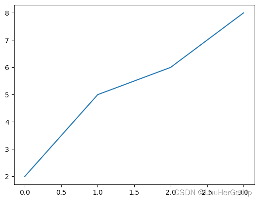
示例1
x = [1,2,3,4]
y = [2,5,6,8]
plt.plot(x, y)
plt.show()   # 早期版需要使用

plt.plot(y) # x轴默认是从零开始的整数
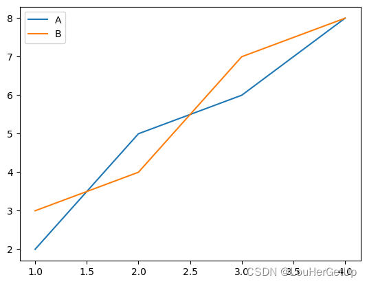
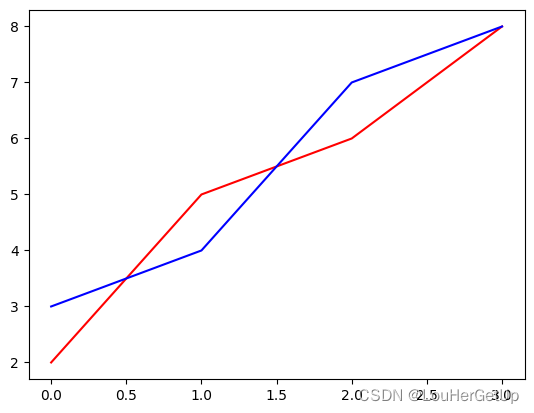
示例2
x = [1,2,3,4]
y = [2,5,6,8]
y1 = [3,4,7,8]
plt.plot(x,y,label='A')
plt.plot(x,y1,label='B')
plt.legend()
plt.show()
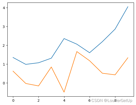
data1 = np.random.randn(10).cumsum()   # randn正态分布的随机数,cumsum累加
data2 = np.random.randn(10).cumsum()
plt.plot(data1, label='data1')
plt.plot(data2, label='data2')
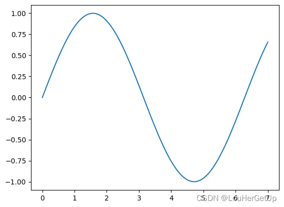
示例3
x = np.linspace(0,7,100)  # 生成100个点,默认生成50个点
y = np.sin(x)
plt.plot(x,y)
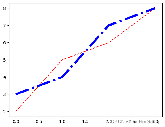
示例4
x = [1,2,3,4]
y = [2,5,6,8]
y1 = [3,4,7,8]
plt.plot(y, color='r')
plt.plot(y1, color='b')
plt.plot(y, c='r', linestyle='--')
plt.plot(y1, c='b', linestyle='-.', linewidth=5)
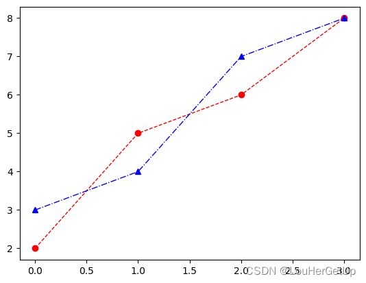
plt.plot(y, c='r', ls='--', lw=1, marker='o')
plt.plot(y1, c='b', ls='-.', lw=1, marker='^')  # marker标记
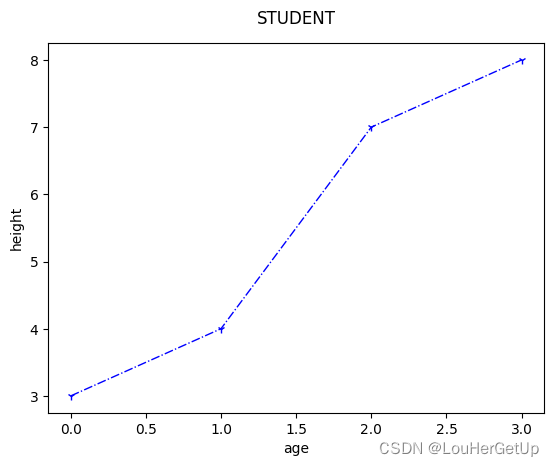
示例5
plt.plot(y1, c='b', ls='-.', lw=1, marker='1')
plt.xlabel('age')
plt.ylabel('height')
plt.title('STUDENT',y=1.03) # y=1.03,标题位置上升
示例6
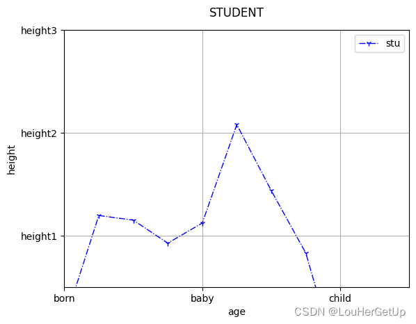
y1 = np.random.randn(10).cumsum()
plt.plot(y1, c='b', ls='-.', lw=1, marker='1',label='stu')
plt.legend(loc='best')
plt.xlabel('age')
plt.ylabel('height')
plt.title('STUDENT',y=1.03) # y=1.03,标题位置上升
plt.xlim(0,10) # x的取值范围
plt.ylim(0,5) # y的取值范围
plt.xticks([0,4,8],['born','baby','child'])  # 设置标记
plt.yticks([1,3,5],['height1','height2','height3'])  # 设置标记
plt.grid()  # 添加网格
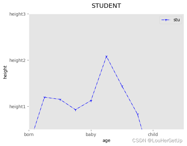
plt.style.use('ggplot')  # 使用内置样式
plt.plot(y1, c='b', ls='-.', lw=1, marker='1',label='stu')
plt.legend(loc='best')
plt.xlabel('age')
plt.ylabel('height')
plt.title('STUDENT',y=1.03) # y=1.03,标题位置上升
plt.xlim(0,10) # x的取值范围
plt.ylim(0,5) # y的取值范围
plt.xticks([0,4,8],['born','baby','child'])  # 设置标记
plt.yticks([1,3,5],['height1','height2','height3'])  # 设置标记
plt.grid()  # 添加网格
import seaborn  # 引入seaborn样式
plt.plot(y1, c='b', ls='-.', lw=1, marker='1',label='stu')
plt.legend(loc='best')
plt.xlabel('age')
plt.ylabel('height')
plt.title('STUDENT',y=1.03) # y=1.03,标题位置上升
plt.xlim(0,10) # x的取值范围
plt.ylim(0,5) # y的取值范围
plt.xticks([0,4,8],['born','baby','child'])  # 设置标记
plt.yticks([1,3,5],['height1','height2','height3'])  # 设置标记
plt.grid()  # 添加网格

示例7
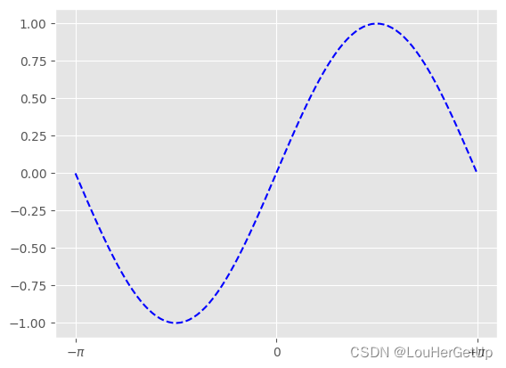
x = np.linspace(-np.pi, np.pi, 100)
y = np.sin(x)
plt.plot(x,y,'b--')
plt.xticks([-np.pi, 0, np.pi],[r'$-\pi$',0,'$+\pi$'])   # 添加符号
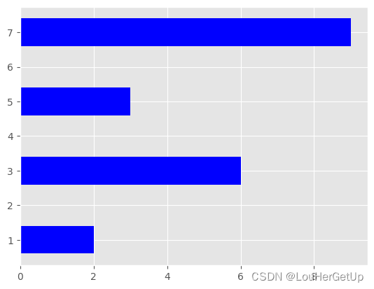
3 条形图
示例1
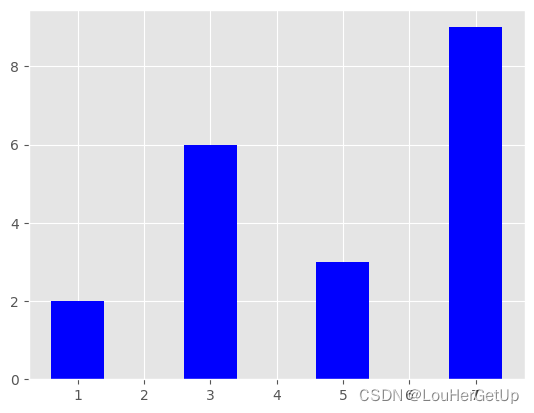
x = [1,3,5,7]
y = [2,6,3,9]
plt.bar(x,y,color='b')
plt.barh(x,y,color='b')
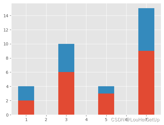
示例2
y1 = [2,4,1,6]
plt.bar(x,y)
plt.bar(x,y1,bottom=y)
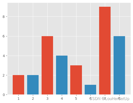
示例3
x1 = [2,4,6,8]
y1 = [2,4,1,6]
x = [1,3,5,7]
y = [2,6,3,9]
plt.bar(x,y)
plt.bar(x1,y1)
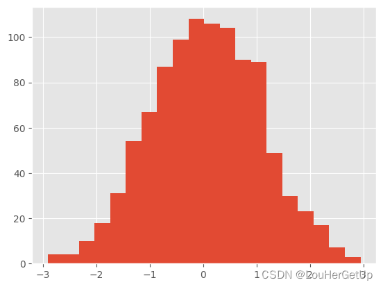
4 直方图
示例1
ata = np.random.randn(1000)  # 1000个随机数
np.max(data), np.min(data)
# output
(2.948590646198825, -2.9102793844132324)

plt.hist(data, bins=20) # bins=20 分成20份
# output
(array([  4.,   4.,  10.,  18.,  31.,  54.,  67.,  87.,  99., 108., 106.,
        104.,  90.,  89.,  49.,  30.,  23.,  17.,   7.,   3.]),
 array([-2.91027938, -2.61733588, -2.32439238, -2.03144888, -1.73850538,
        -1.44556188, -1.15261838, -0.85967487, -0.56673137, -0.27378787,
         0.01915563,  0.31209913,  0.60504263,  0.89798614,  1.19092964,
         1.48387314,  1.77681664,  2.06976014,  2.36270364,  2.65564714,
         2.94859065]),
 <BarContainer object of 20 artists>)
示例2
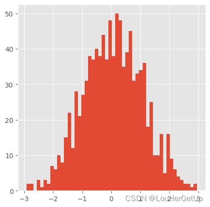
plt.figure(figsize=(5,5))  # 初始化画布,设置图片大小
plt.hist(data, bins=50)
# output
(array([ 2.,  2.,  0.,  3.,  1.,  3.,  2.,  7.,  6., 10.,  8., 15., 22.,
        12., 28., 21., 27., 31., 38., 37., 40., 38., 44., 37., 48., 38.,
        50., 48., 35., 39., 45., 31., 33., 34., 36., 18., 25., 10., 10.,
        16.,  5., 16.,  9.,  6.,  4.,  3.,  2.,  2.,  1.,  2.]),
 array([-2.91027938, -2.79310198, -2.67592458, -2.55874718, -2.44156978,
        -2.32439238, -2.20721498, -2.09003758, -1.97286018, -1.85568278,
        -1.73850538, -1.62132798, -1.50415058, -1.38697318, -1.26979578,
        -1.15261838, -1.03544097, -0.91826357, -0.80108617, -0.68390877,
        -0.56673137, -0.44955397, -0.33237657, -0.21519917, -0.09802177,
         0.01915563,  0.13633303,  0.25351043,  0.37068783,  0.48786523,
         0.60504263,  0.72222003,  0.83939744,  0.95657484,  1.07375224,
         1.19092964,  1.30810704,  1.42528444,  1.54246184,  1.65963924,
         1.77681664,  1.89399404,  2.01117144,  2.12834884,  2.24552624,
         2.36270364,  2.47988104,  2.59705844,  2.71423584,  2.83141325,
         2.94859065]),
 <BarContainer object of 50 artists>)


 659
659


 被折叠的 条评论
为什么被折叠?
被折叠的 条评论
为什么被折叠?
 到【灌水乐园】发言


