


包含全部示例的代码仓库见GIthub
1 导入库
import matplotlib.pyplot as plt
import numpy as np
2 箱型图
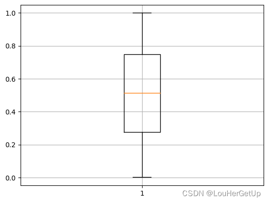
可用于观察数据分布,判断异常值
示例1
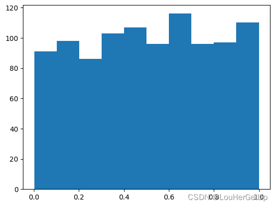
data = np.random.rand(1000)
plt.hist(data)
# output
(array([ 91.,  98.,  86., 103., 107.,  96., 116.,  96.,  97., 110.]),
 array([0.00136718, 0.10117803, 0.20098888, 0.30079973, 0.40061058,
        0.50042143, 0.60023228, 0.70004313, 0.79985398, 0.89966483,
        0.99947568]),
 <BarContainer object of 10 artists>)
plt.boxplot(data)
plt.grid()
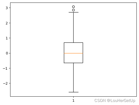
示例2
data = np.random.randn(1000)
plt.boxplot(data)
# output
{'whiskers': [<matplotlib.lines.Line2D at 0x184c9c1f8b0>,
  <matplotlib.lines.Line2D at 0x184c9c1f700>],
 'caps': [<matplotlib.lines.Line2D at 0x184c9c1f910>,
  <matplotlib.lines.Line2D at 0x184c9c1eb90>],
 'boxes': [<matplotlib.lines.Line2D at 0x184c9c1fc10>],
 'medians': [<matplotlib.lines.Line2D at 0x184c9c1e830>],
 'fliers': [<matplotlib.lines.Line2D at 0x184c9c1f160>],
 'means': []}
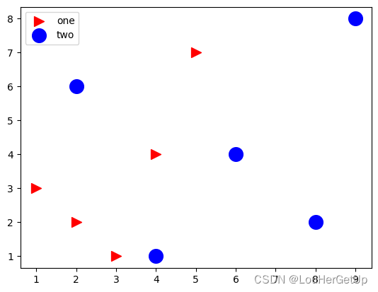
3 散点图
x1 = [1,2,3,4,5]
y1 = [3,2,1,4,7]
x2 = [2,4,6,8,9]
y2 = [6,1,4,2,8]
plt.scatter(x1,y1,color='r',marker='>', label='one', s=100)  # s=100 点的大小
plt.scatter(x2,y2,color='b',marker='o', label='two', s=200)  # s可传动态参数
plt.legend()


 1万+
1万+


 被折叠的 条评论
为什么被折叠?
被折叠的 条评论
为什么被折叠?
 到【灌水乐园】发言


