


*(shape)中文意思是形状的意思
被叫做形状,但是他的功能就像它的名字一样,可以做出很多种图片形状效果.并且自带.9png 图片的效果,实在是虐杀UI设计师的杀手锏之一.
下面让我们一一介绍他的每个标签所代表的属性和效果展示:
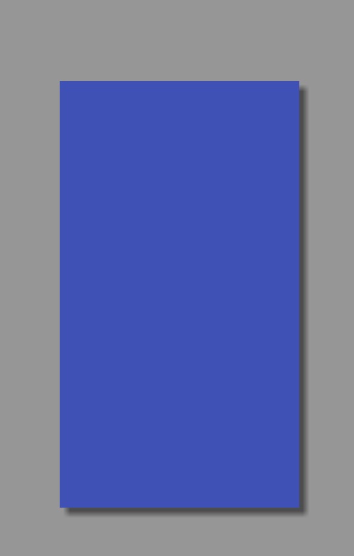
1. solid (填充颜色)
<?xml version="1.0" encoding="utf-8"?>
<shape xmlns:android="http://schemas.android.com/apk/res/android">
    <!--填充控件的颜色设置-->
    <solid android:color="@color/c_0000ff" />
</shape>
效果图:
2. corners(设置图片四个角的角度)
android:radius="30dp" //设置四个角的角度
android:bottomLeftRadius="20dp" //设置左下角的角度
android:topLeftRadius="20dp"  //设置左上角的角度
android:bottomRightRadius="20dp" //设置右下角的角度
android:topRightRadius="20dp" //设置右上角的角度
看代码和效果图的展示
*设置四个角度
<?xml version="1.0" encoding="utf-8"?>
<shape xmlns:android="http://schemas.android.com/apk/res/android">
    <!--填充控件的颜色设置-->
    <solid android:color="@color/colorPrimary" />
    <!--控件四个角的角度-->
    <corners android:radius="60dp" />
</shape>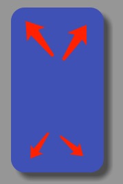
*设置左上角
<?xml version="1.0" encoding="utf-8"?>
<shape xmlns:android="http://schemas.android.com/apk/res/android">
    <!--填充控件的颜色设置-->
    <solid android:color="@color/colorPrimary" />
    <!--控件四个角的角度-->
    <corners android:topLeftRadius="60dp" />
</shape>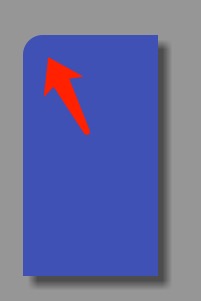
*设置右上角
<?xml version="1.0" encoding="utf-8"?>
<shape xmlns:android="http://schemas.android.com/apk/res/android">
    <!--填充控件的颜色设置-->
    <solid android:color="@color/colorPrimary" />
    <!--控件四个角的角度-->
    <corners android:topRightRadius="60dp" />
</shape>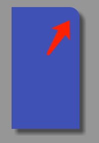
*设置右下角
<?xml version="1.0" encoding="utf-8"?>
<shape xmlns:android="http://schemas.android.com/apk/res/android">
    <!--填充控件的颜色设置-->
    <solid android:color="@color/colorPrimary" />
    <!--控件四个角的角度-->
    <corners android:bottomRightRadius="60dp" />
</shape>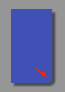
*设置左下角
<?xml version="1.0" encoding="utf-8"?>
<shape xmlns:android="http://schemas.android.com/apk/res/android">
    <!--填充控件的颜色设置-->
    <solid android:color="@color/colorPrimary" />
    <!--控件四个角的角度-->
    <corners android:bottomLeftRadius="60dp" />
</shape>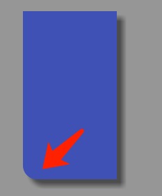
3 stroke(设置图片的最外边线)
    android:width="20dp" //边线的宽度
    android:color="@android:color/holo_red_dark" //边线的颜色
    android:dashGap="20dp"  //虚线的长度
    android:dashWidth="20dp" //实线的长度
*设置边线的宽度和颜色
<?xml version="1.0" encoding="utf-8"?>
<shape xmlns:android="http://schemas.android.com/apk/res/android">
    <!--填充控件的颜色设置-->
    <solid android:color="@color/colorPrimary" />
    <!--控件四个角的角度-->
    <corners android:bottomLeftRadius="60dp" />
    <!--设置边角线-->
    <stroke
        android:width="20dp"//边线宽度
        android:color="@android:color/holo_red_dark"/>//边线颜色
</shape>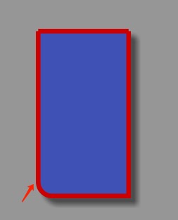
*设置虚线(虚线的长度)
<?xml version="1.0" encoding="utf-8"?>
<shape xmlns:android="http://schemas.android.com/apk/res/android">
    <!--填充控件的颜色设置-->
    <solid android:color="@color/colorPrimary" />
    <!--控件四个角的角度-->
    <corners android:bottomLeftRadius="60dp" />
    <!--设置边角线-->
    <stroke
        android:width="20dp"//边线宽度
        android:color="@android:color/holo_red_dark"//边线颜色
        android:dashGap="60dp"//虚线的长度
        android:dashWidth="20dp" />//实线的宽度
</shape>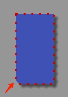
*设置虚线(实线的长度)
<?xml version="1.0" encoding="utf-8"?>
<shape xmlns:android="http://schemas.android.com/apk/res/android">
    <!--填充控件的颜色设置-->
    <solid android:color="@color/colorPrimary" />
    <!--控件四个角的角度-->
    <corners android:bottomLeftRadius="60dp" />
    <!--设置边角线-->
    <stroke
        android:width="20dp"//边线宽度
        android:color="@android:color/holo_red_dark"//边线颜色
        android:dashGap="20dp"//虚线的长度
        android:dashWidth="60dp" />//实线的宽度
</shape>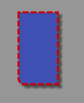
4 . pading(设置内容距离边的距离)
<?xml version="1.0" encoding="utf-8"?>
<shape xmlns:android="http://schemas.android.com/apk/res/android">
    <!--填充控件的颜色设置-->
    <solid android:color="@color/colorPrimary" />
    <!--设置边角线-->
    <stroke
        android:width="20dp"
        android:color="@android:color/holo_red_dark"
        android:dashGap="20dp"
        android:dashWidth="60dp" />
    <!--设置内容距离边的距离-->
    <padding
        android:bottom="20dp"  //距离底部
        android:left="20dp"   //距离左边
        android:right="20dp"   //距离右边
        android:top="20dp" />  //距离顶部
</shape>
5 . size(设置控件的宽和高)
<?xml version="1.0" encoding="utf-8"?>
<shape xmlns:android="http://schemas.android.com/apk/res/android">
    <!--填充控件的颜色设置-->
    <solid android:color="@color/colorPrimary" />
    <!--设置内容距离边的距离-->
    <padding
        android:bottom="20dp"
        android:left="30dp"
        android:right="40dp"
        android:top="50dp" />
    <!--大小-->
    <size
        android:width="20dp" //宽
        android:height="20dp" />//高
</shape>
6 . gradient(设置控件的渐变颜色
<?xml version="1.0" encoding="utf-8"?>
<shape xmlns:android="http://schemas.android.com/apk/res/android">
    <!--填充控件的颜色设置-->
    <solid android:color="@color/colorPrimary" />
    <!--设置内容距离边的距离-->
    <padding
        android:bottom="20dp"
        android:left="30dp"
        android:right="40dp"
        android:top="50dp" />
    <!--大小-->
    <size
        android:width="20dp"
        android:height="20dp" />
    <!-- 渐变 -->
    <gradient
        android:angle="45" //角度
        android:centerColor="@android:color/black" //中间颜色
        android:centerX="0"
        android:centerY="0"
        android:endColor="@android:color/holo_red_dark"//结束颜色
        android:gradientRadius="90"
        android:startColor="@android:color/white" //开始颜色
        android:type="linear" //线型的
        android:useLevel="true" />
</shape>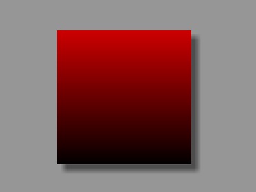
Ps:当设置填充颜色后,无渐变效果。angle的值必须是45的倍数(包括0),仅在type=”linear”有效,不然会报错。
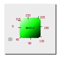
下图是angle的位置示意图:
好了shape的介绍到此结束,有什么不理解的可以留言给我,谢谢!!!


 987
987

 被折叠的 条评论
为什么被折叠?
被折叠的 条评论
为什么被折叠?
 到【灌水乐园】发言


