


改文章布局会有一些综合的练习,后续会跟新补充…
文章目录
HarmonyOS Next 纯血星河版【四】
Flex- 弹性布局
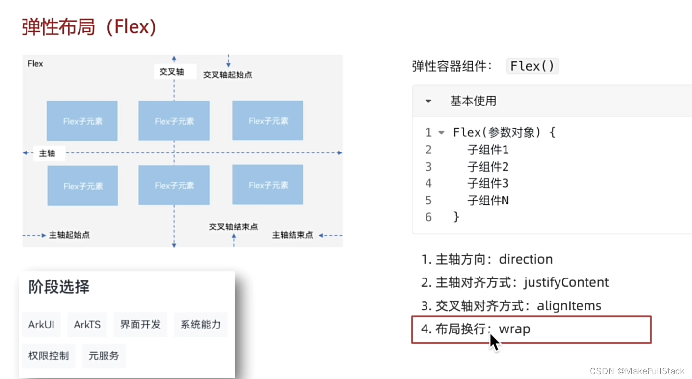
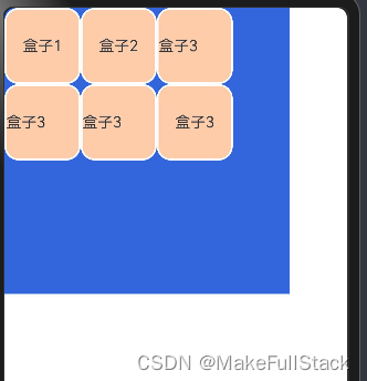
一、 Flex- 基本使用
@Entry
@Component
struct FlexDemo {
build() {
Column() {
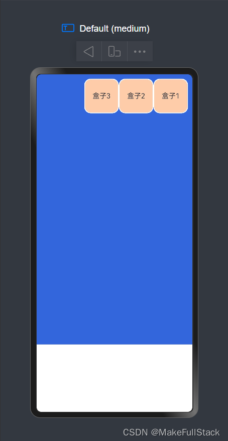
Flex({
// 三个参数 : 1. 主轴方向 2. 主轴对齐方式 3. 交叉轴对齐方式
direction: FlexDirection.RowReverse,
justifyContent: FlexAlign.Start,
alignItems: ItemAlign.Start
}) {
Text('盒子1')
.width(80)
.height(80)
.backgroundColor('#FFCCAA')
.borderRadius(15)
.border({
width: 2,
color: Color.White
})
.textAlign(TextAlign.Center)
Text('盒子2')
.width(80)
.height(80)
.backgroundColor('#FFCCAA')
.borderRadius(15)
.border({
width: 2,
color: Color.White
})
.textAlign(TextAlign.Center)
Text('盒子3')
.width(80)
.height(80)
.backgroundColor('#FFCCAA')
.borderRadius(15)
.border({
width: 2,
color: Color.White
})
.textAlign(TextAlign.Center)
}
}
.height('80%')
.width('100%')
.backgroundColor('#36D')
.padding(10)
}
}
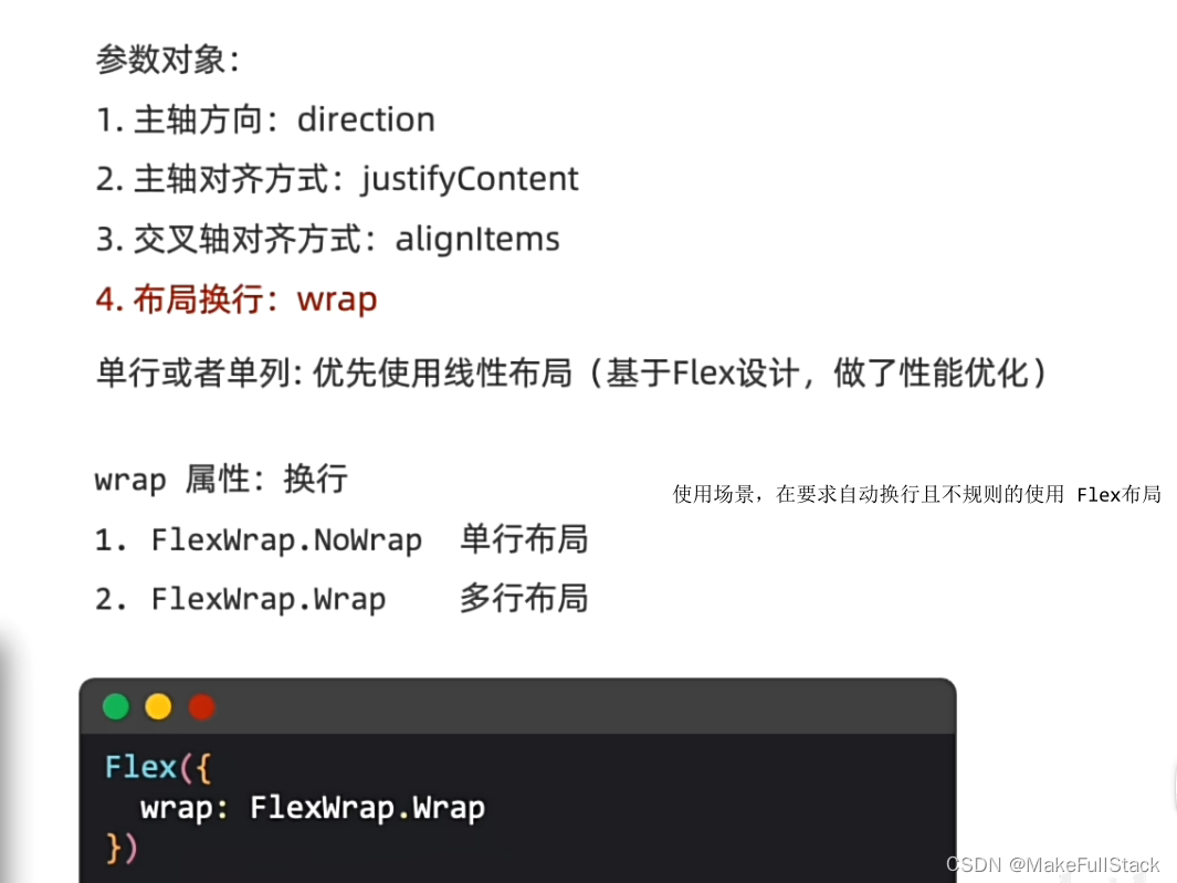
二、 Flex- 换行 - wrap
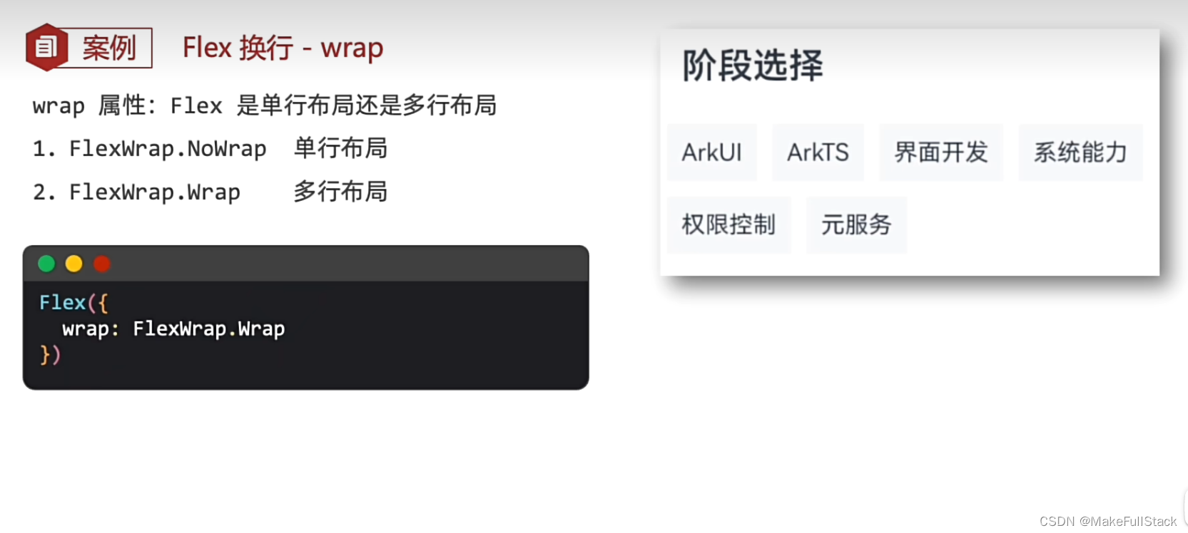
代码示例:
@Entry
@Component
struct FlexWrapDemo {
  build() {
    Column() {
      Flex({
        direction: FlexDirection.Row,
        justifyContent: FlexAlign.Start,
        wrap: FlexWrap.Wrap
      }) {
        Text('盒子1')
          .width(80)
          .height(80)
          .backgroundColor('#FFCCAA')
          .borderRadius(15)
          .border({
            width: 2,
            color: Color.White
          })
          .textAlign(TextAlign.Center)
        Text('盒子2')
          .width(80)
          .height(80)
          .backgroundColor('#FFCCAA')
          .borderRadius(15)
          .border({
            width: 2,
            color: Color.White
          })
          .textAlign(TextAlign.Center)
        Text('盒子3')
          .width(80)
          .height(80)
          .backgroundColor('#FFCCAA')
          .borderRadius(15)
          .borderRadius(15)
          .border({
            width: 2,
            color: Color.White
          })
        Text('盒子3')
          .width(80)
          .height(80)
          .backgroundColor('#FFCCAA')
          .borderRadius(15)
          .borderRadius(15)
          .border({
            width: 2,
            color: Color.White
          })
        Text('盒子3')
          .width(80)
          .height(80)
          .backgroundColor('#FFCCAA')
          .borderRadius(15)
          .borderRadius(15)
          .border({
            width: 2,
            color: Color.White
          })
        Text('盒子3')
          .width(80)
          .height(80)
          .backgroundColor('#FFCCAA')
          .borderRadius(15)
          .borderRadius(15)
          .border({
            width: 2,
            color: Color.White
          })
          .textAlign(TextAlign.Center)
      }
    }
    .width(300)
    .height(300)
    .backgroundColor('#36D')
  }
}
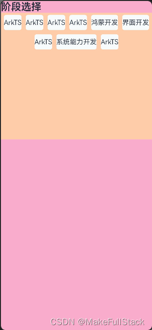
三、 Flex练习
代码示例:
@Entry
@Component
struct FlexTest {
  build() {
    Column() {
      Text('阶段选择')
        .width('100%')
        .fontSize(24)
        .fontWeight(700)
      Column() {
        Flex({
          direction: FlexDirection.Row,
          justifyContent: FlexAlign.Center,
          alignItems: ItemAlign.Start,
          wrap: FlexWrap.Wrap
        }) {
          Text('ArkTS')
            .height(36)
            .backgroundColor('#f8fbfc')
            .borderRadius(5)
            .margin(5)
          Text('ArkTS')
            .height(36)
            .backgroundColor('#f8fbfc')
            .borderRadius(5)
            .margin(5)
          Text('ArkTS')
            .height(36)
            .backgroundColor('#f8fbfc')
            .borderRadius(5)
            .margin(5)
          Text('ArkTS')
            .height(36)
            .backgroundColor('#f8fbfc')
            .borderRadius(5)
            .margin(5)
          Text('鸿蒙开发')
            .height(36)
            .backgroundColor('#f8fbfc')
            .borderRadius(5)
            .margin(5)
          Text('界面开发')
            .height(36)
            .backgroundColor('#f8fbfc')
            .borderRadius(5)
            .margin(5)
          Text('ArkTS')
            .height(36)
            .backgroundColor('#f8fbfc')
            .borderRadius(5)
            .margin(5)
          Text('系统能力开发')
            .height(36)
            .backgroundColor('#f8fbfc')
            .borderRadius(5)
            .margin(5)
          Text('ArkTS')
            .height(36)
            .backgroundColor('#f8fbfc')
            .borderRadius(5)
            .margin(5)
        }
        .width('100%')
        .height(300)
        .backgroundColor('#FFCCAA')
      }
    }
    .width('100%')
    .height('100%')
    .backgroundColor('#FAACCD')

  }
}
四、 Flex 总结
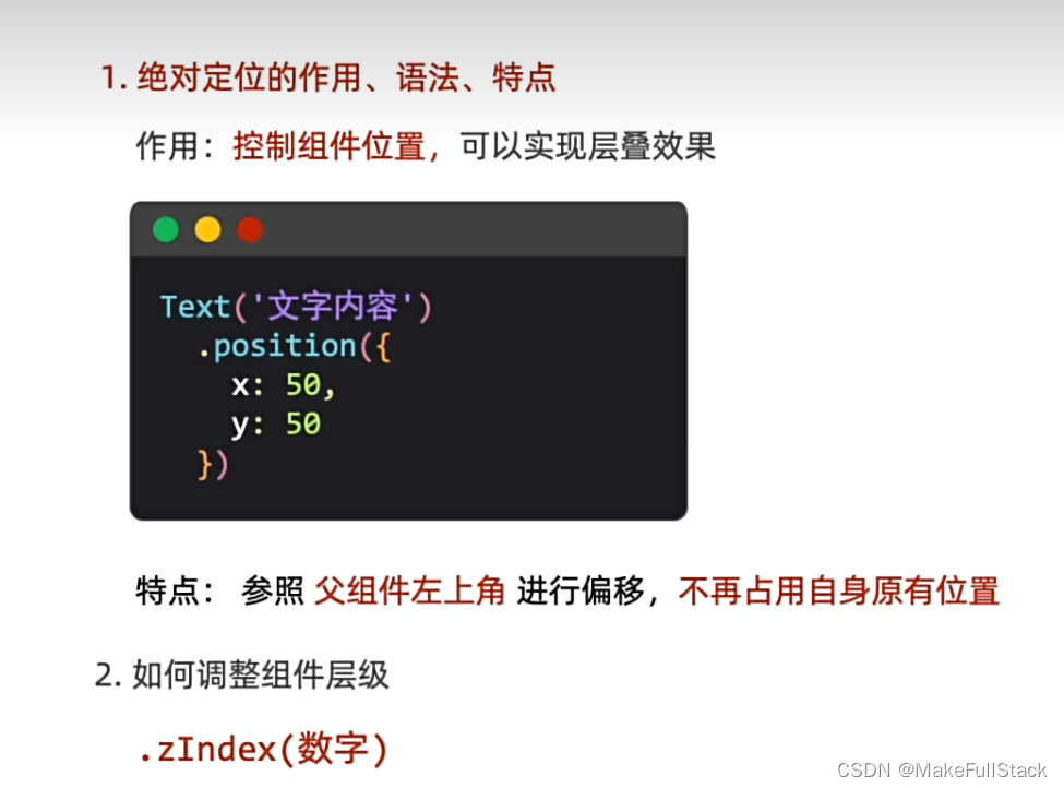
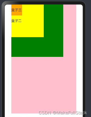
position - 绝对定位
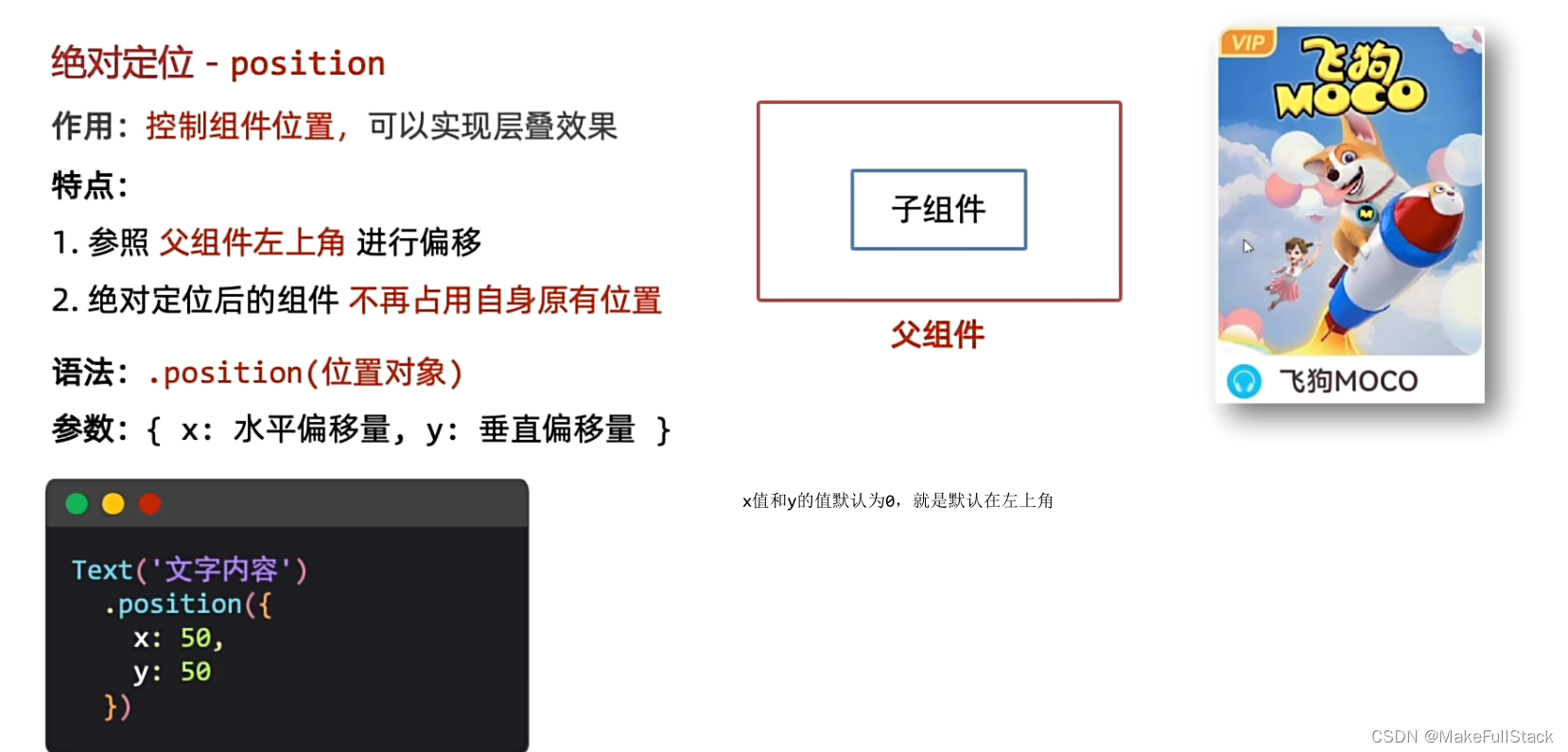
一、绝对定位的基本使用
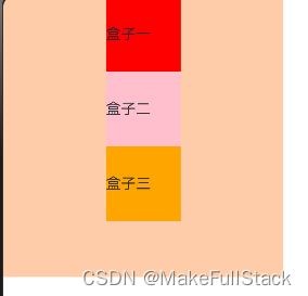
不使用 绝对定位 如下所示:
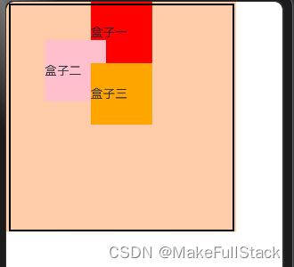
当我们添加了绝对定位代码后
@Entry
@Component
struct PositionDemo {
  build () {
    Column() {
      Text('盒子一')
        .width(80)
        .height(80)
        .backgroundColor(Color.Red)
      Text('盒子二')
        .width(80)
        .height(80)
        .backgroundColor(Color.Pink)
        // 添加绝对定位 position 默认左上角 也就是 x: 0   y : 0
        .position({
          x: 50,
          y: 50
        })
      Text('盒子三')
        .width(80)
        .height(80)
        .backgroundColor(Color.Orange)
    }
    .width(300)
    .height(300)
    .backgroundColor('#FFCCAA')
  }
}
使用后效果图如下:
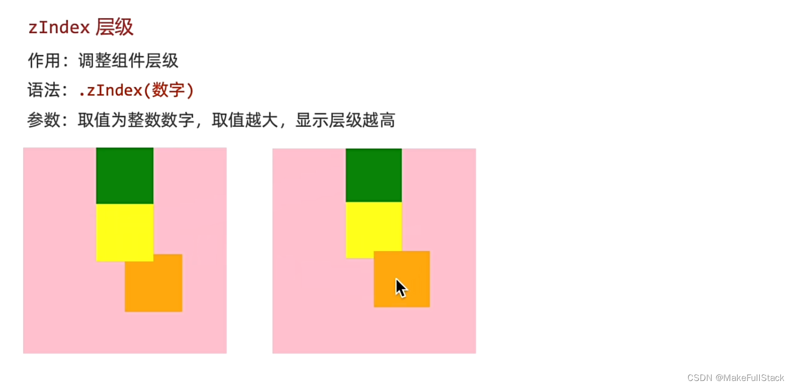
二、 zIndex - 层级关系
        .position({
          x: 50,
          y: 50
        })
        .zIndex(1)
- 这样就可以实现层级的提升了
三、 绝对定位总结
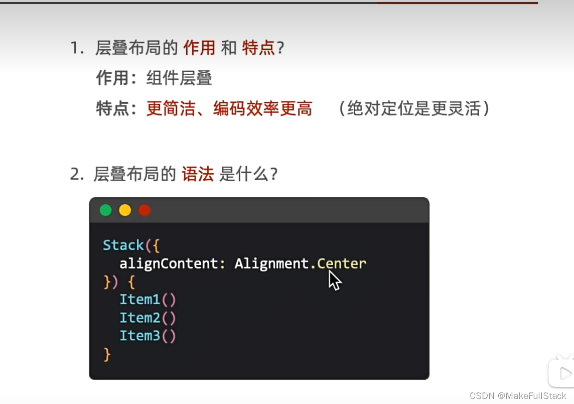
层叠布局 - Stack
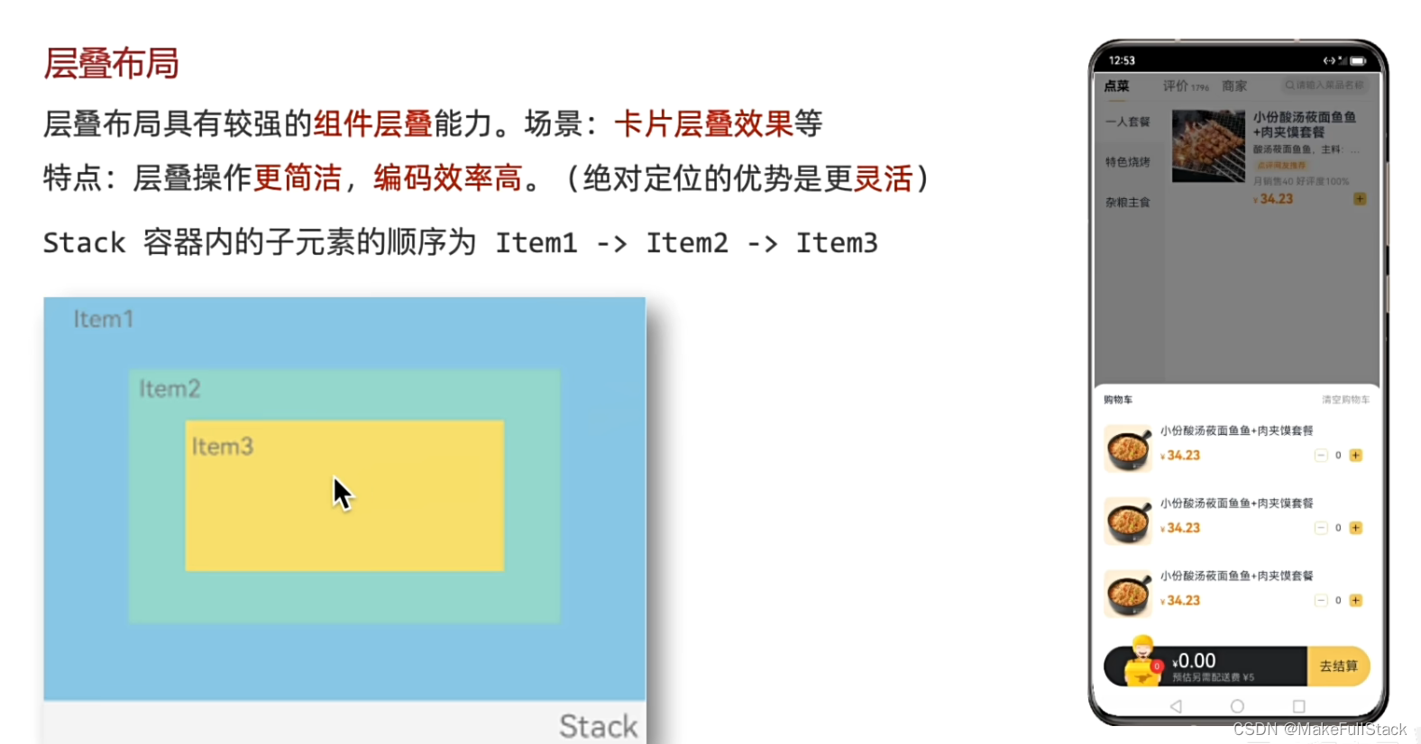
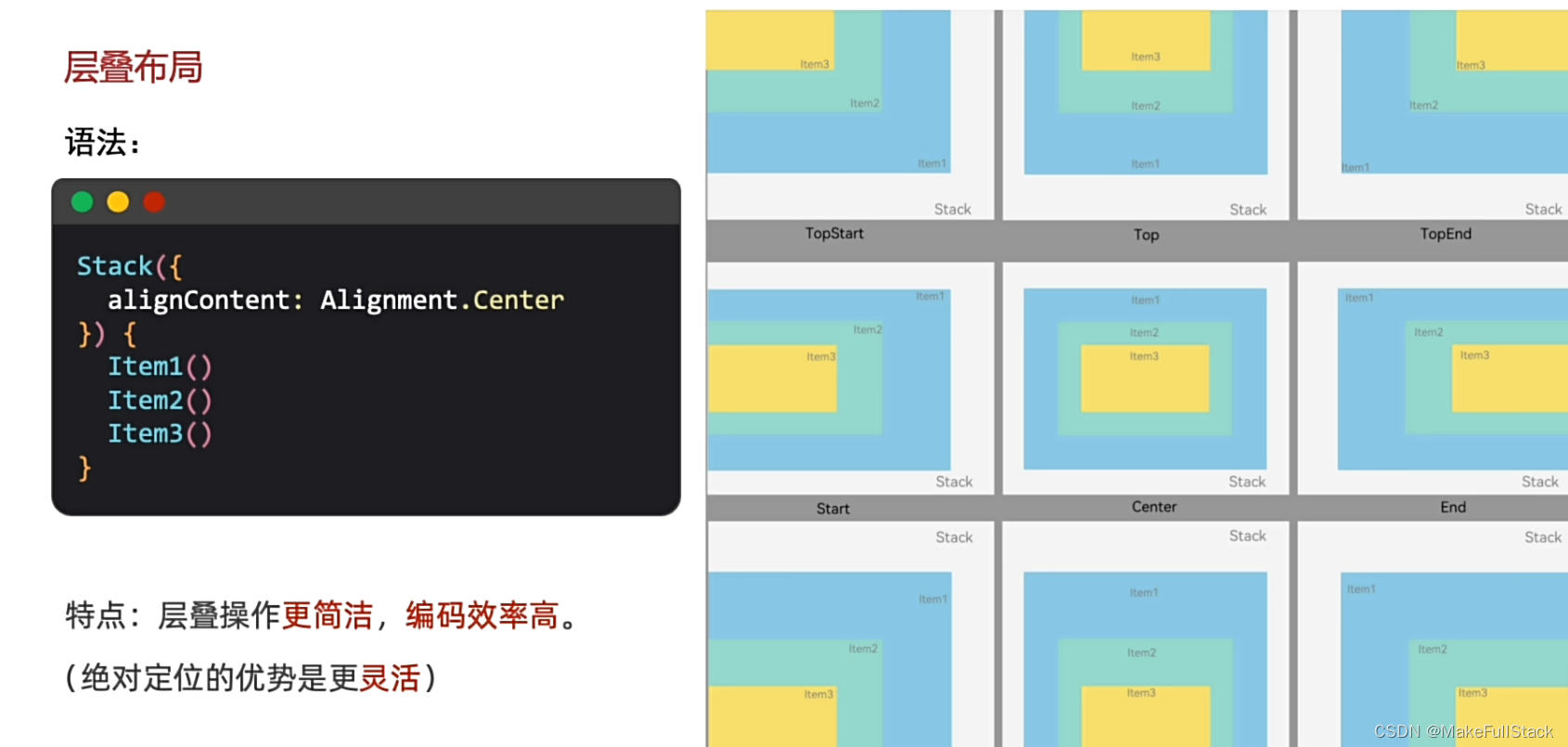
一、使用 Stack
- 可以使用 zIndex修改层级哦
@Entry
@Component
struct StackDemo {
  build () {
    // Stack ({ 指定层叠的规则 }) { 需要层叠的组件 }
    Column() {
      Stack({
        alignContent: Alignment.TopStart
      }) {
        Text('盒子一')
          .width(240)
          .height(240)
          .backgroundColor(Color.Green)
        Text('盒子二')
          .width(150)
          .height(150)
          .backgroundColor(Color.Yellow)
        Text('盒子三')
          .width(50)
          .height(50)
          .backgroundColor(Color.Orange)
      }
      .width(300)
      .height(500)
      .backgroundColor(Color.Pink)
    }
    .width('100%')
    .height('100%')
  }
}
二、 总结:
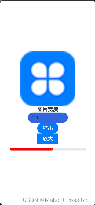
Slider 滑动条组件
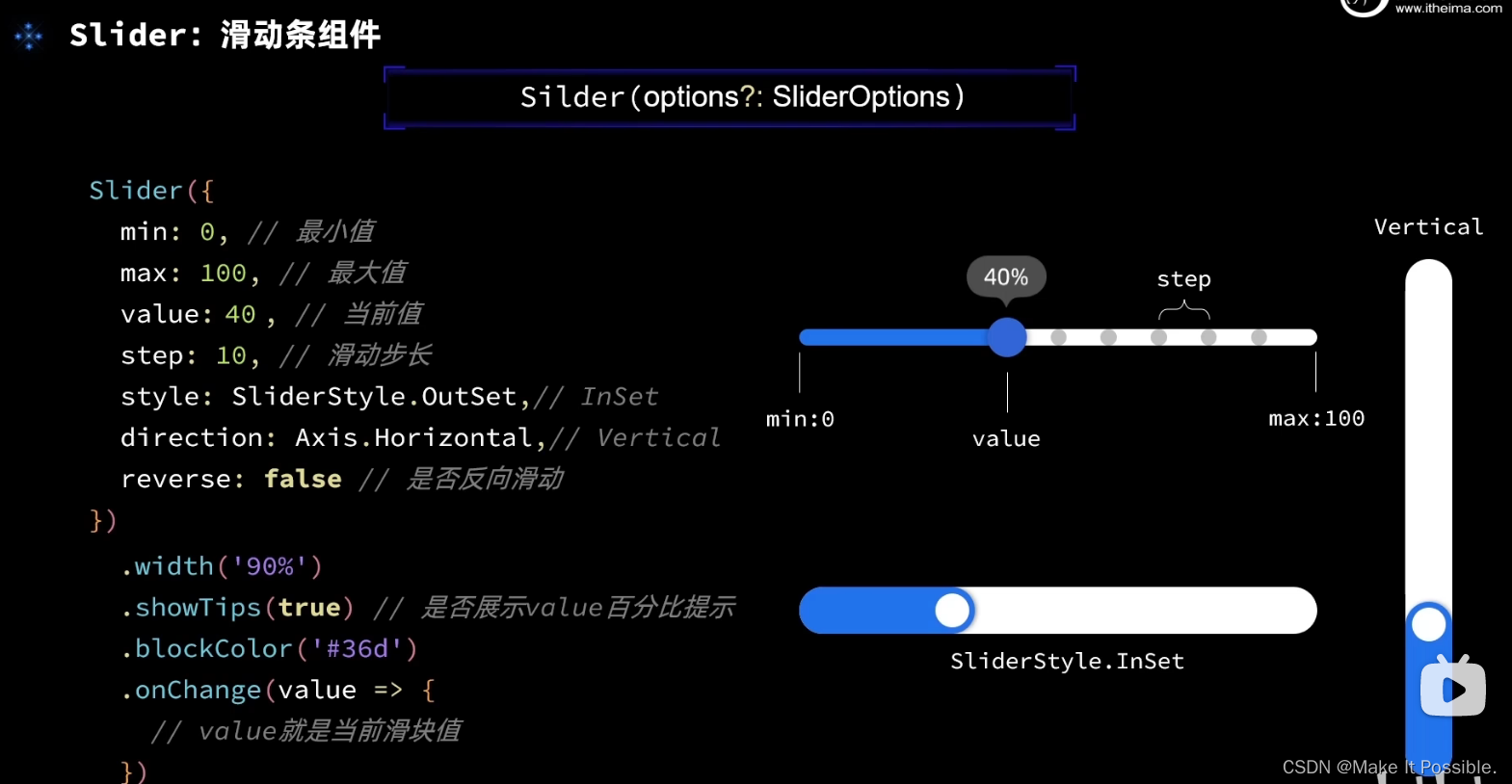
Slider({
          value: this.imageWidth,
          min: 100,
          max: 300,
          step: 10,
          style: SliderStyle.InSet
        })
          .width(300)
          .blockColor('#36D')
          .selectedColor('#ff0000')
          .showSteps(true)
          .showTips(true)
          .trackThickness(10)
          .onChange(value => {
            this.imageWidth = value
          })
效果图如下:
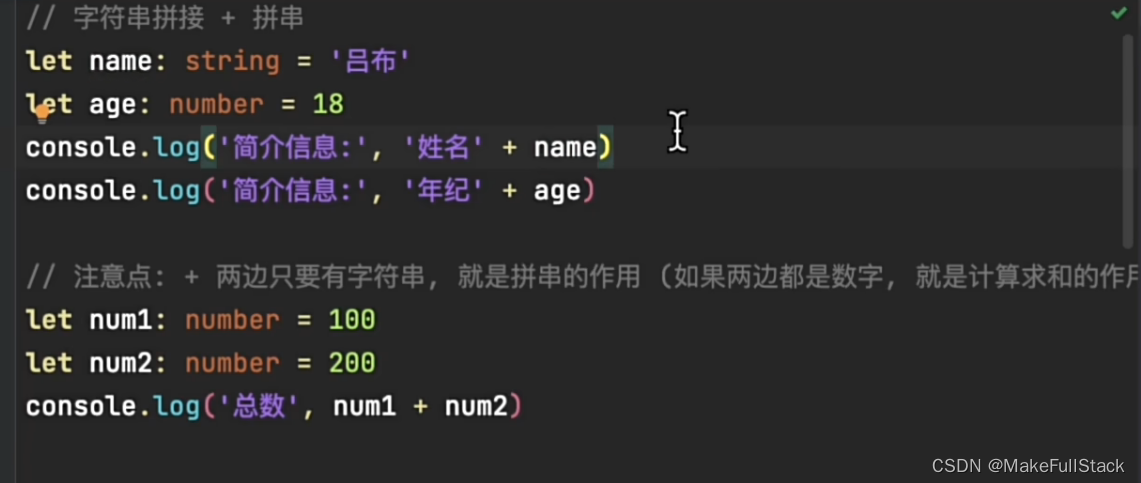
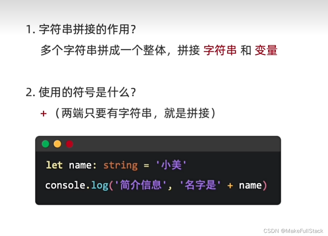
字符串拼接
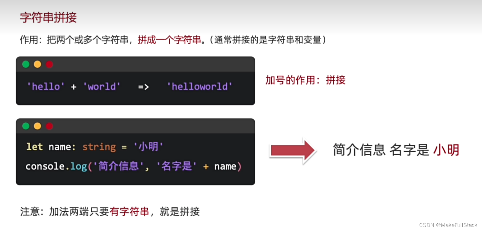
一、基本使用
二、 总结
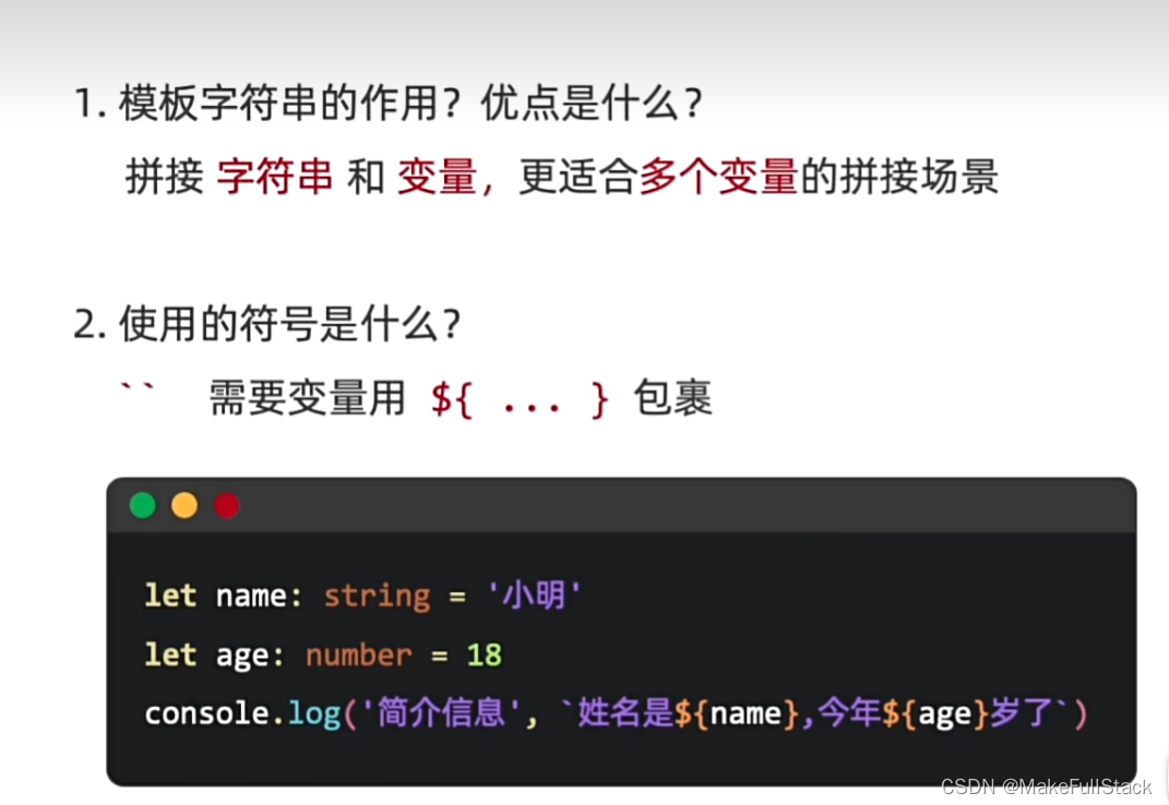
模板字符串
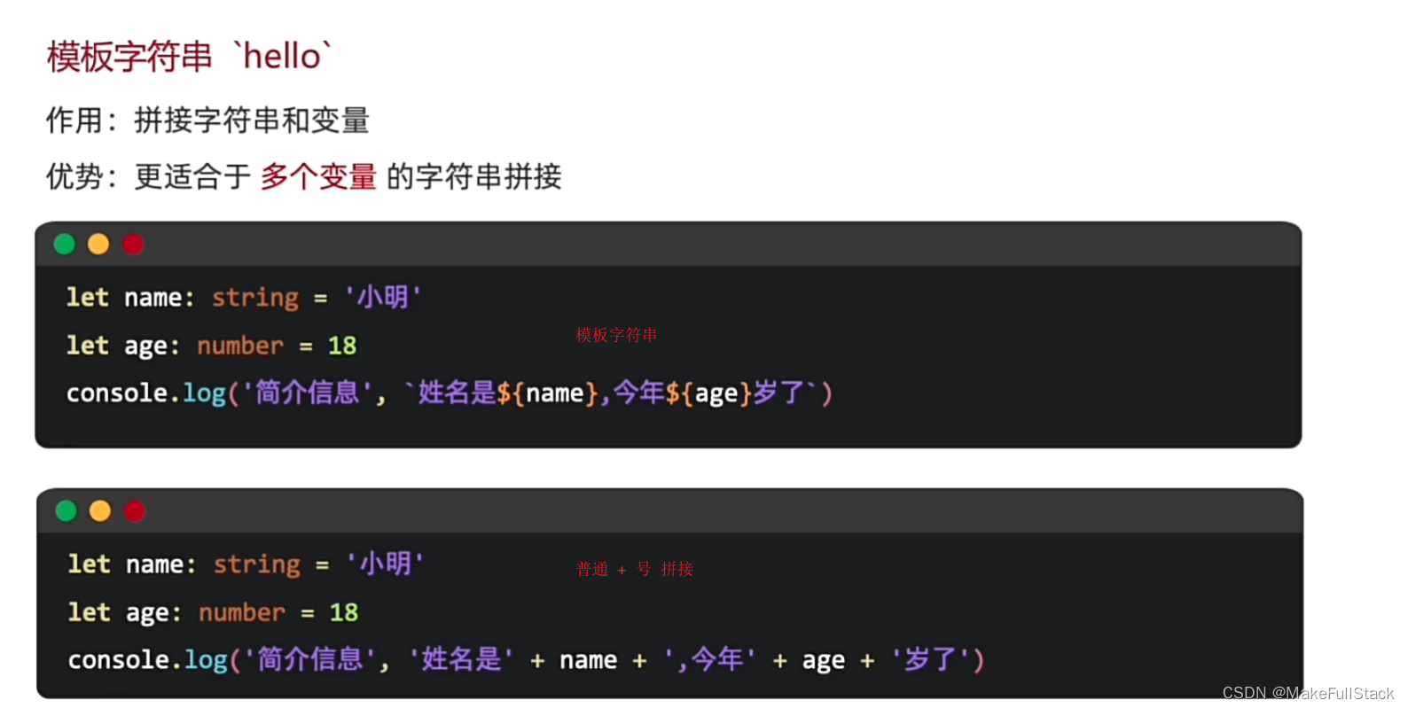
一、基本使用
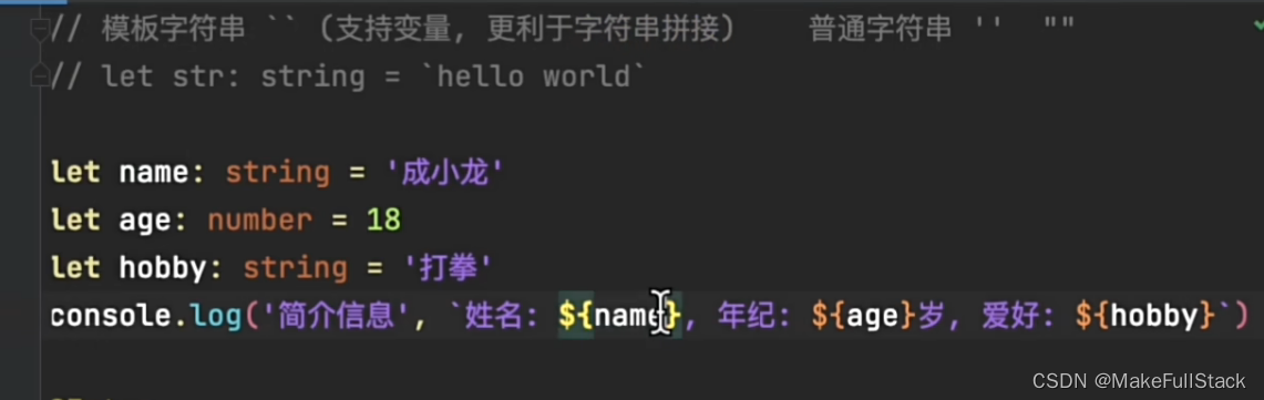
二、总结
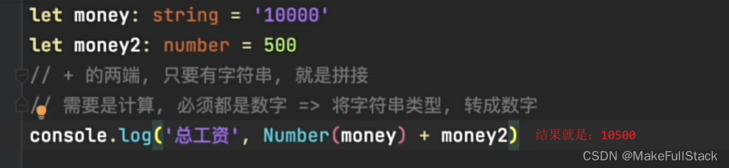
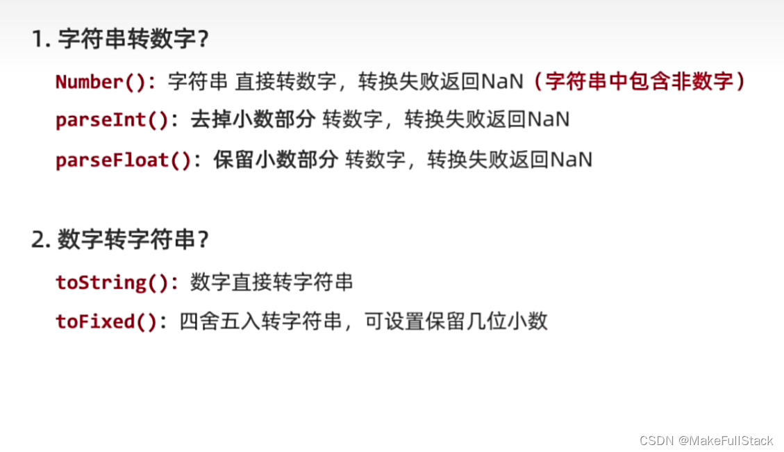
类型转换(数字和字符串)
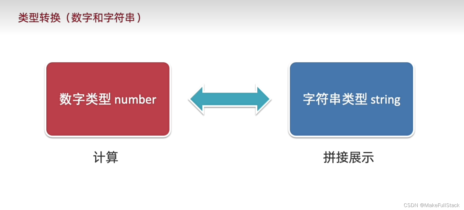
一、基本使用
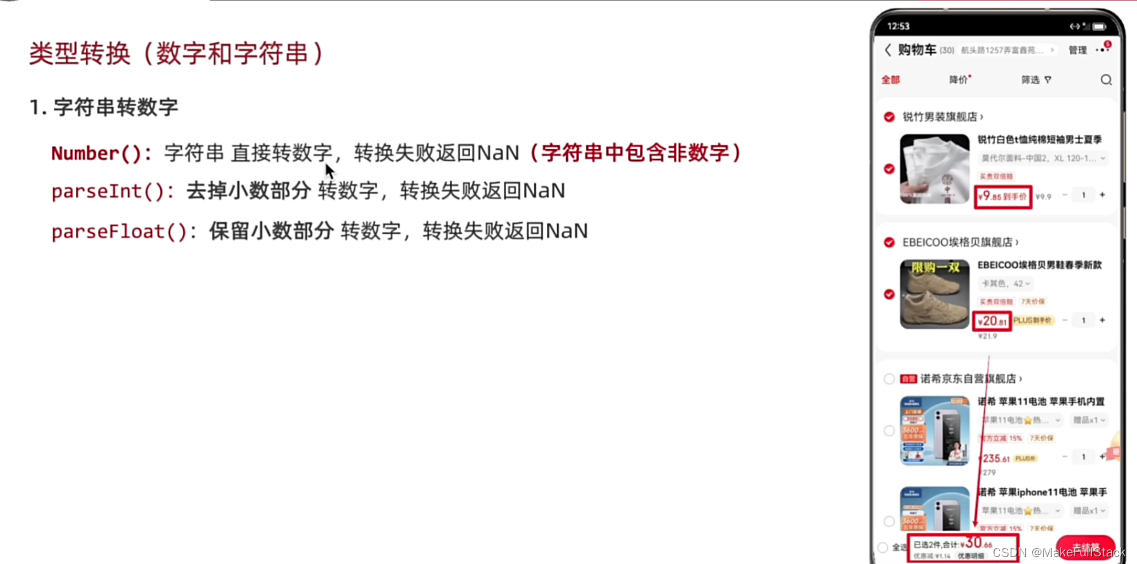
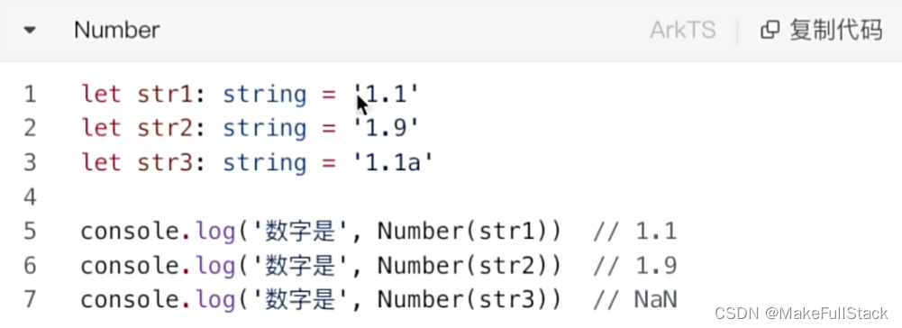
字符串转数字
Number() 最常用的
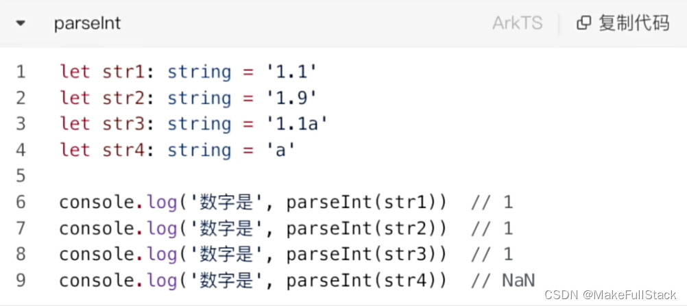
parseInt ()
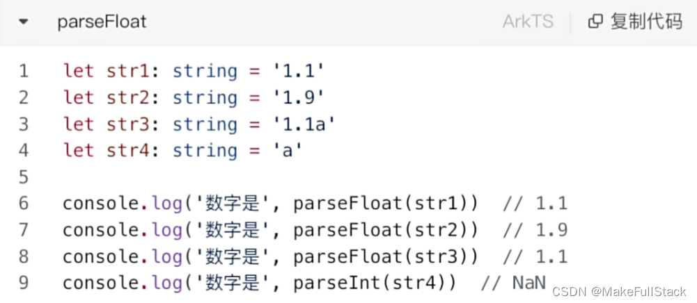
parseFloat ()
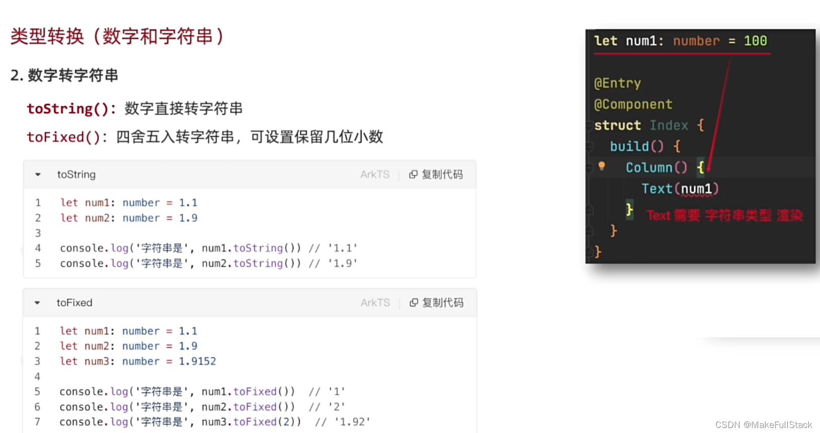
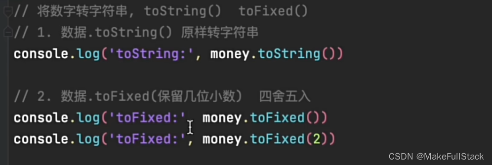
数字转字符串
toString 和 toFixed
总结


 2916
2916


 被折叠的 条评论
为什么被折叠?
被折叠的 条评论
为什么被折叠?
 到【灌水乐园】发言


