


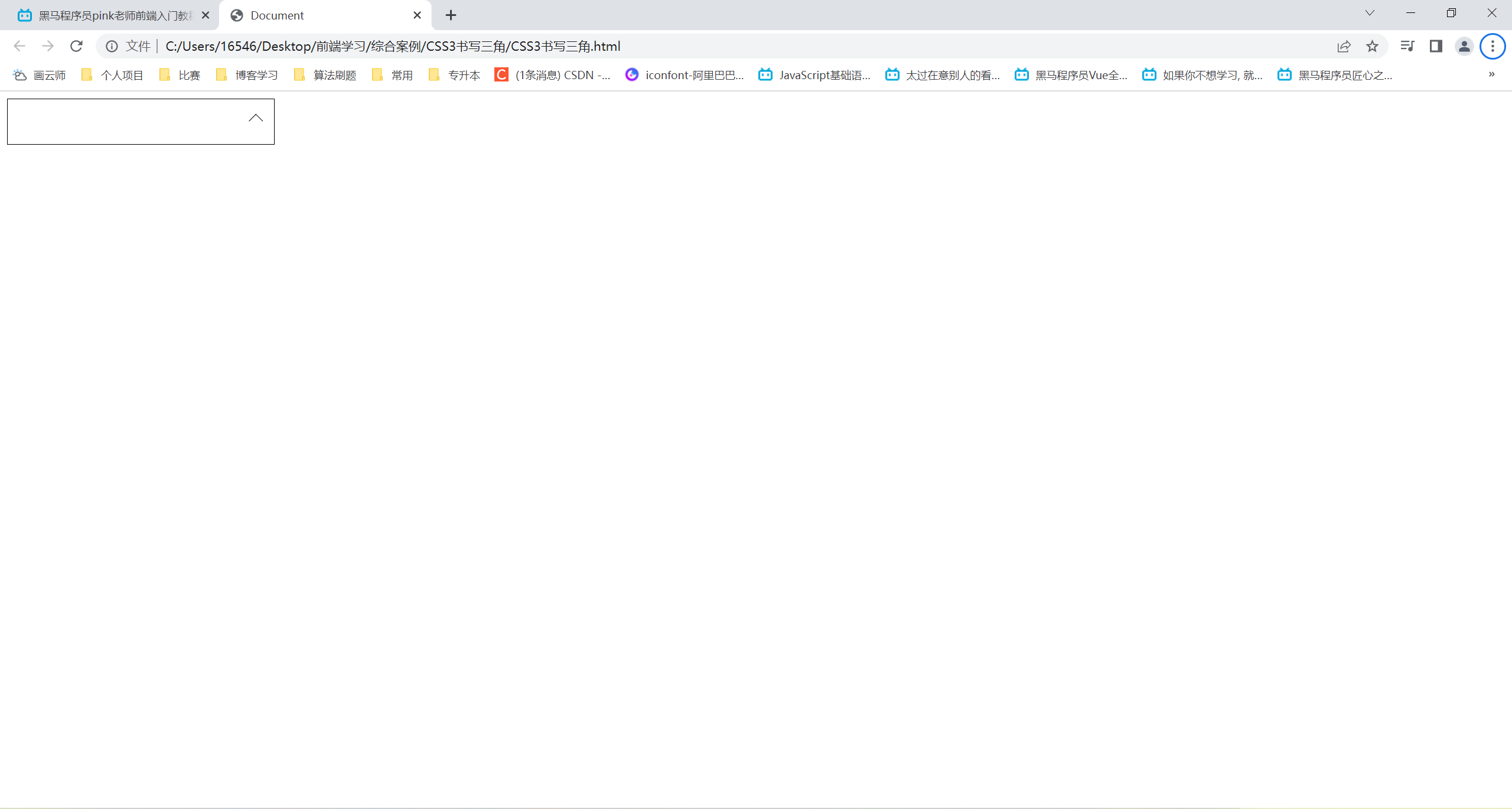
CSS3书写三角
<!DOCTYPE html>
<html lang="en">
<head>
    <meta charset="UTF-8">
    <meta http-equiv="X-UA-Compatible" content="IE=edge">
    <meta name="viewport" content="width=device-width, initial-scale=1.0">
    <title>Document</title>
    <style>
        div {
            position: relative;
            width: 300px;
            height: 50px;
            border: 1px solid #000;
        }
        div::after {
            content: "";
            position: absolute;
            top: 19px;
            right: 15px;
            width: 10px;
            height: 10px;
            border-right: 1px solid #000;
            border-bottom: 1px solid #000;
            transform: rotate(45deg);
            transition: all 0.3s;
        }
        div:hover::after {
            transform: rotate(225deg);
        }
    </style>
</head>
<body>
    <div></div>
</body>
</html>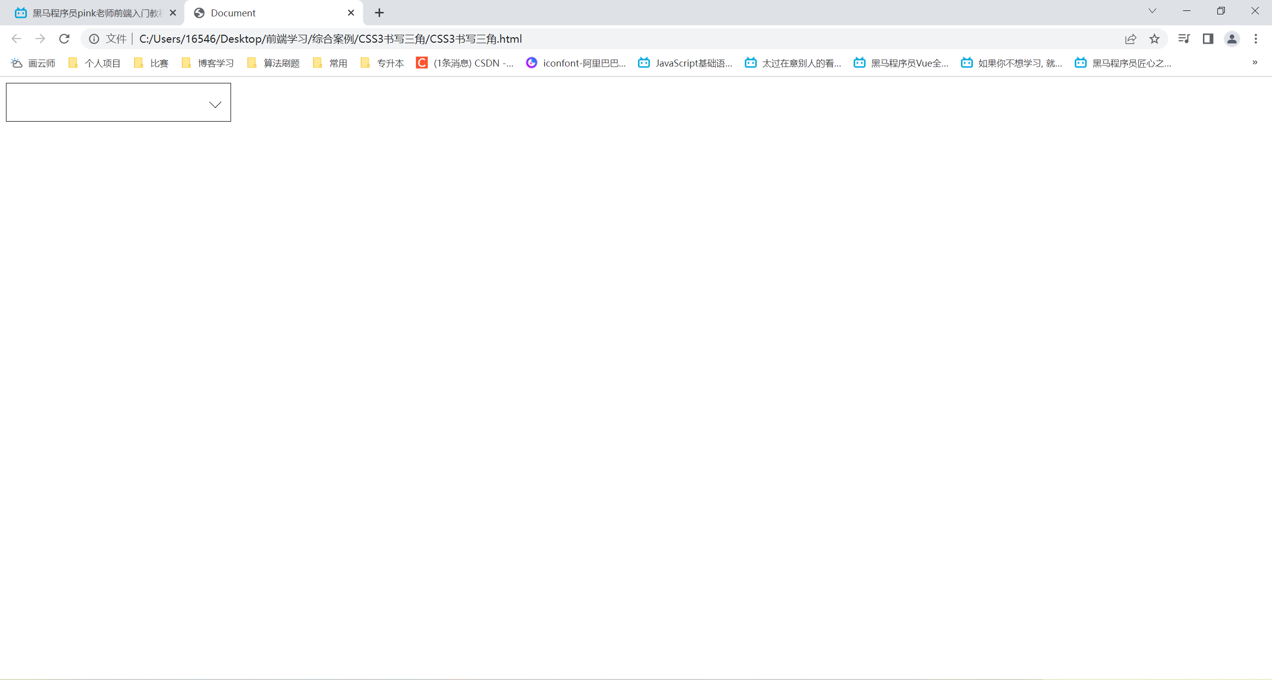
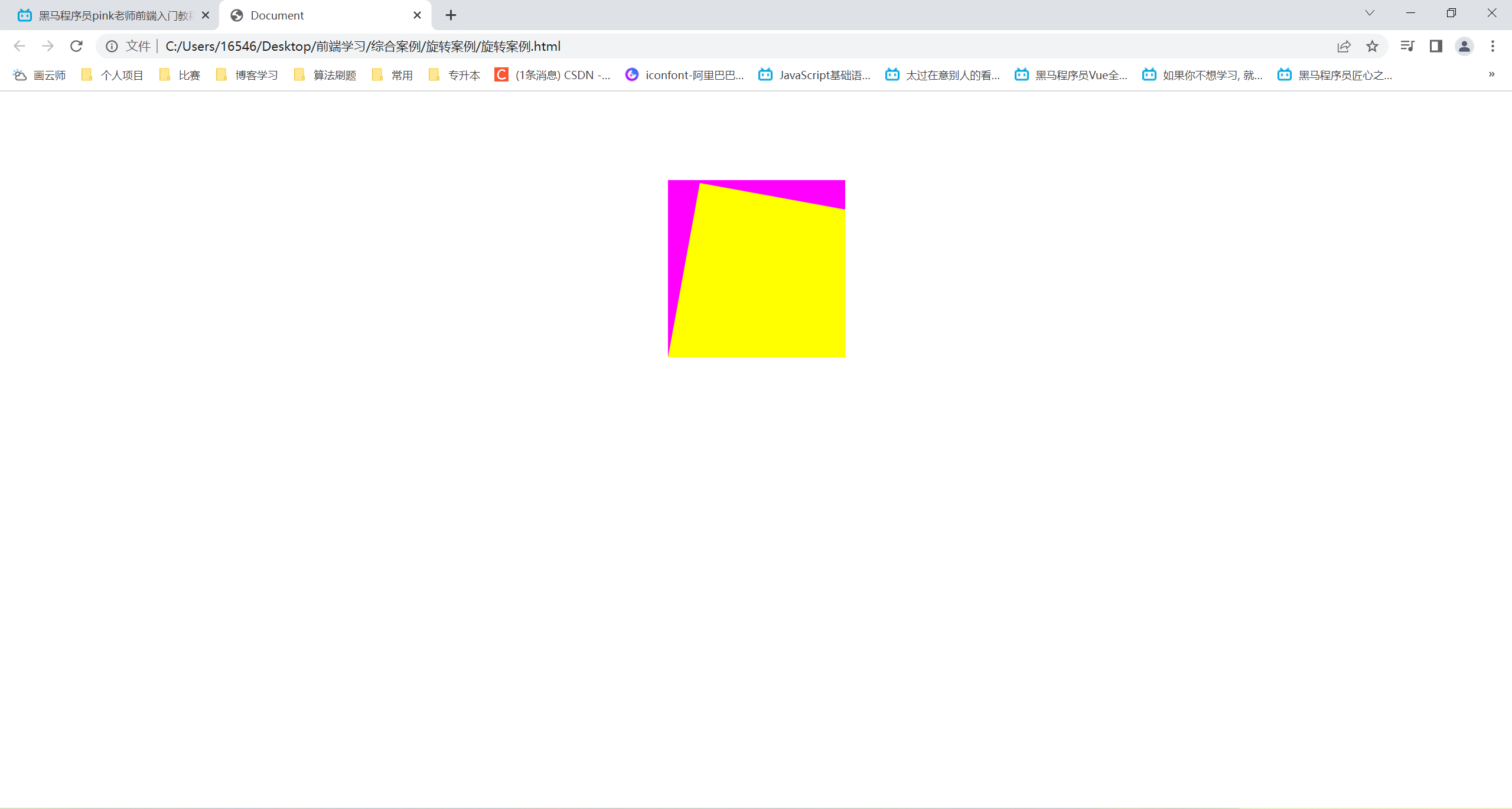
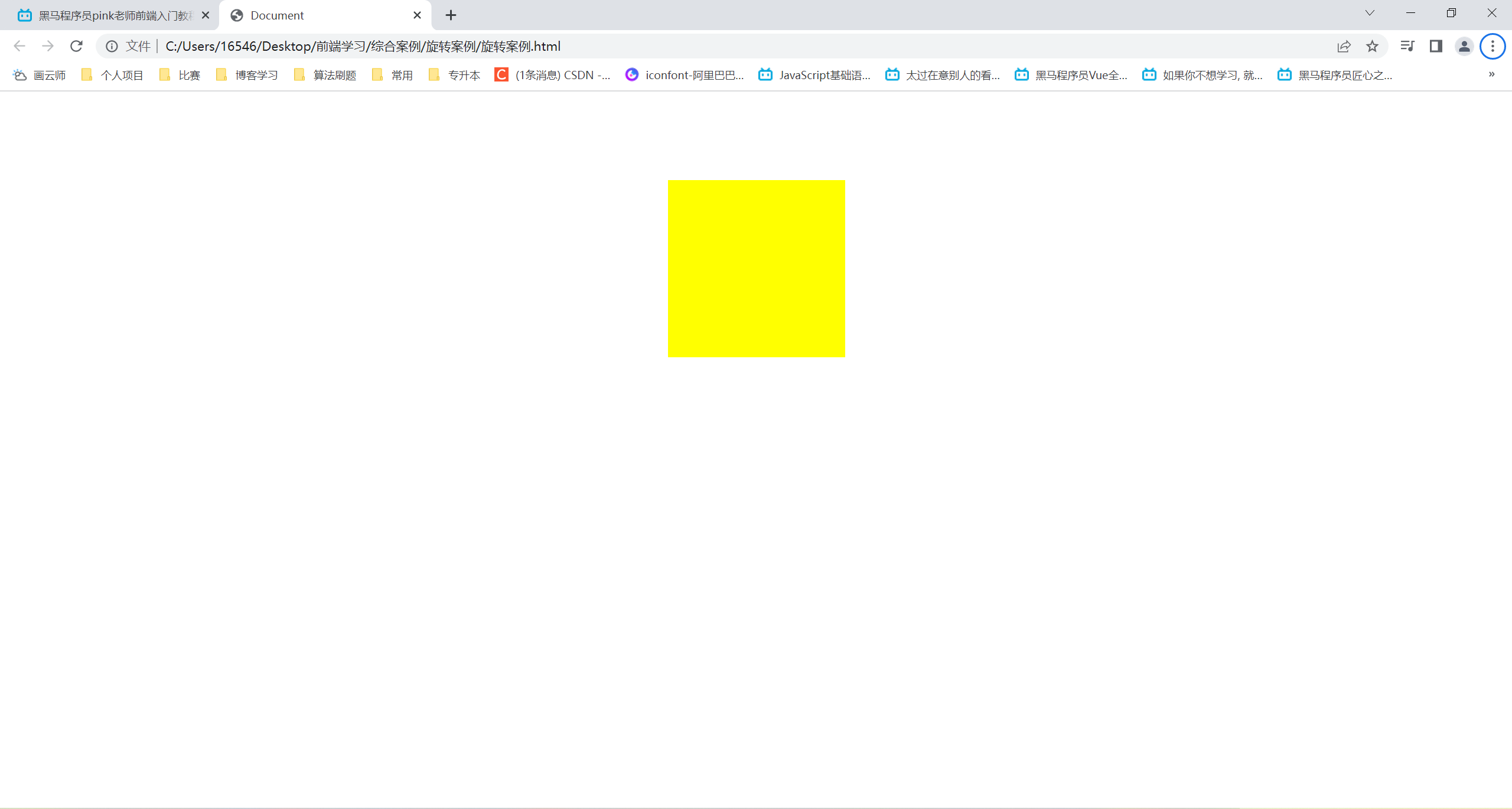
旋转案例
<!DOCTYPE html>
<html lang="en">
<head>
    <meta charset="UTF-8">
    <meta http-equiv="X-UA-Compatible" content="IE=edge">
    <meta name="viewport" content="width=device-width, initial-scale=1.0">
    <title>Document</title>
    <style>
        div {
            margin: 100px auto;
            width: 200px;
            height: 200px;
            background-color: #f0f;
            overflow: hidden;
        }
        div::before {
            content: "";
            display: block;
            width: 200px;
            height: 200px;
            background-color: #ff0;
            transform-origin: left bottom;
            transform: rotate(90deg);
            transition: all 0.5s;
        }
        div:hover::before {
            transform: rotate(0deg);
        }
    </style>
</head>
<body>
    <div></div>
</body>
</html>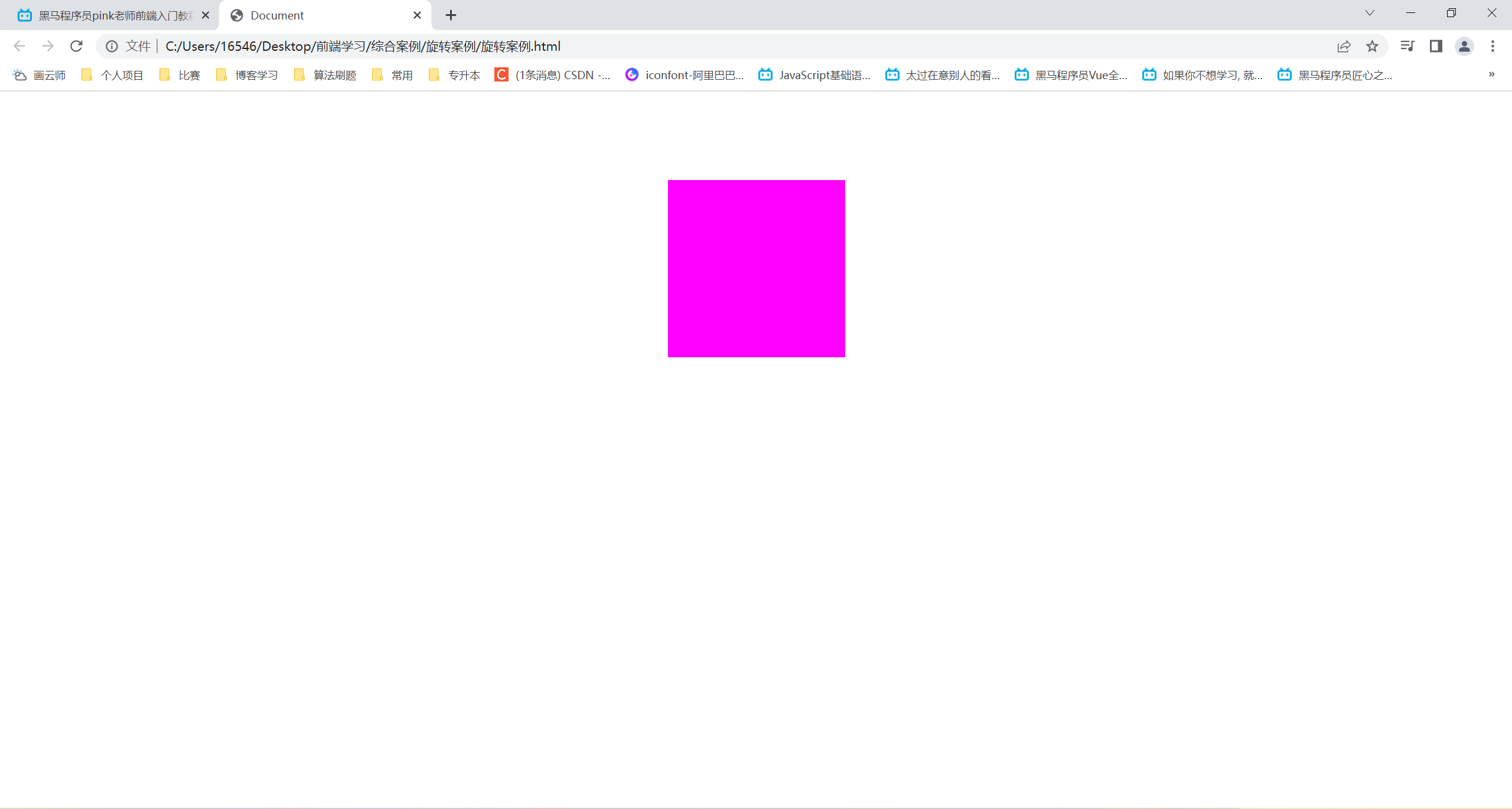
图片放大案例
<!DOCTYPE html>
<html lang="en">
<head>
    <meta charset="UTF-8">
    <meta http-equiv="X-UA-Compatible" content="IE=edge">
    <meta name="viewport" content="width=device-width, initial-scale=1.0">
    <title>Document</title>
    <style>
        div {
            overflow: hidden;
            margin: 200px auto;
            width: 600px;
        }
        div:hover img {
            transform: scale(1.2);
        }
        div img {
            width: 600px;
            transition: all 0.4s;
        }
    </style>
</head>
<body>
    <div>
        <img src="云韵 .jpg" alt="">
    </div>
</body>
</html>
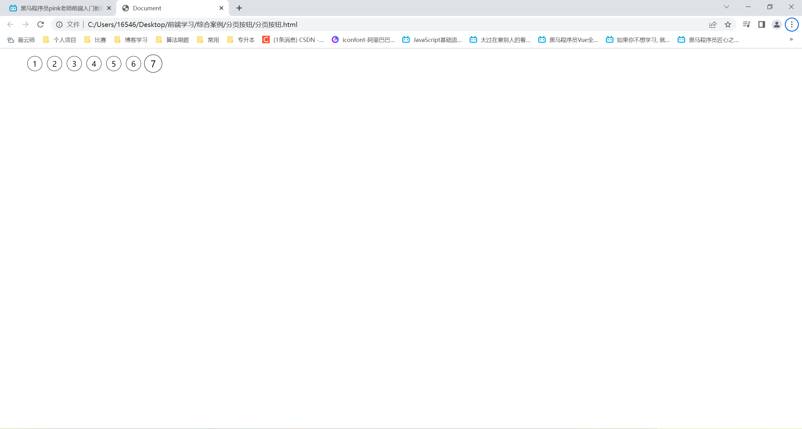
分页按钮
<!DOCTYPE html>
<html lang="en">
<head>
    <meta charset="UTF-8">
    <meta http-equiv="X-UA-Compatible" content="IE=edge">
    <meta name="viewport" content="width=s, initial-scale=1.0">
    <title>Document</title>
    <style>
        li {
            float: left;
            margin-left: 10px;
            width: 30px;
            height: 30px;
            border: 1px solid #000;
            text-align: center;
            line-height: 30px;
            border-radius: 50%;
            list-style: none;
            transition: all 0.4s;
        }
        li:hover {
            transform: scale(1.2);
        }
    </style>
</head>
<body>
    <ul>
        <li>1</li>
        <li>2</li>
        <li>3</li>
        <li>4</li>
        <li>5</li>
        <li>6</li>
        <li>7</li>
    </ul>
</body>
</html>


 1万+
1万+


 被折叠的 条评论
为什么被折叠?
被折叠的 条评论
为什么被折叠?
 到【灌水乐园】发言


