


Element 基本使用
Element 介绍
-
Element:网站快速成型工具。是饿了么公司前端开发团队提供的一套基于 Vue 的网站组件库。
-
使用 Element 前提必须要有 Vue。
-
组件:组成网页的部件,例如 超链接、按钮、图片、表格等等~
-
Element 官网:https://element.eleme.cn/#/zh-CN
-
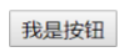
自己完成的按钮
-
Element 提供的按钮

Element 快速入门
- 下载 Element 核心库。
- 引入 Element 样式文件。
- 引入 Vue 核心 js 文件。
- 引入 Element 核心 js 文件。
- 编写按钮标签。
- 通过 Vue 核心对象加载元素。
<!DOCTYPE html>
<html lang="en">
<head>
    <meta charset="UTF-8">
    <meta name="viewport" content="width=device-width, initial-scale=1.0">
    <title>快速入门</title>
    <link rel="stylesheet" href="element-ui/lib/theme-chalk/index.css">
    <script src="js/vue.js"></script>
    <script src="element-ui/lib/index.js"></script>
</head>
<body>
    <button>我是按钮</button>
    <br>
    <div id="div">
        <el-row>
            <el-button>默认按钮</el-button>
            <el-button type="primary">主要按钮</el-button>
            <el-button type="success">成功按钮</el-button>
            <el-button type="info">信息按钮</el-button>
            <el-button type="warning">警告按钮</el-button>
            <el-button type="danger">危险按钮</el-button>
          </el-row>
          <br>
          <el-row>
            <el-button plain>朴素按钮</el-button>
            <el-button type="primary" plain>主要按钮</el-button>
            <el-button type="success" plain>成功按钮</el-button>
            <el-button type="info" plain>信息按钮</el-button>
            <el-button type="warning" plain>警告按钮</el-button>
            <el-button type="danger" plain>危险按钮</el-button>
          </el-row>
          <br>
          <el-row>
            <el-button round>圆角按钮</el-button>
            <el-button type="primary" round>主要按钮</el-button>
            <el-button type="success" round>成功按钮</el-button>
            <el-button type="info" round>信息按钮</el-button>
            <el-button type="warning" round>警告按钮</el-button>
            <el-button type="danger" round>危险按钮</el-button>
          </el-row>
          <br>
          <el-row>
            <el-button icon="el-icon-search" circle></el-button>
            <el-button type="primary" icon="el-icon-edit" circle></el-button>
            <el-button type="success" icon="el-icon-check" circle></el-button>
            <el-button type="info" icon="el-icon-message" circle></el-button>
            <el-button type="warning" icon="el-icon-star-off" circle></el-button>
            <el-button type="danger" icon="el-icon-delete" circle></el-button>
          </el-row>
    </div>
</body>
<script>
    new Vue({

        el:"#div"
    });
</script>
</html>
Element 常用组件
布局方式
- 基础布局:将页面分成最多 24 个部分,自由切分。

<!DOCTYPE html>
<html lang="en">
<head>
    <meta charset="UTF-8">
    <meta name="viewport" content="width=device-width, initial-scale=1.0">
    <title>基础布局</title>
    <link rel="stylesheet" href="element-ui/lib/theme-chalk/index.css">
    <script src="js/vue.js"></script>
    <script src="element-ui/lib/index.js"></script>
    <style>
        .el-row {

            /* 行距为20px */
            margin-bottom: 20px;
        }
        .bg-purple-dark {

            background: red;
        }
        .bg-purple {

            background: blue;
        }
        .bg-purple-light {

            background: green;
        }
        .grid-content {

            /* 边框圆润度 */
            border-radius: 4px;
            /* 行高为36px */
            min-height: 36px;
        }
      </style>
</head>
<body>
    <div id="div">
        <el-row>
            <el-col :span="24"><div class="grid-content bg-purple-dark"></div></el-col>
          </el-row>
          <el-row>
            <el-col :span="12"><div class="grid-content bg-purple"></div></el-col>
            <el-col :span="12"><div class="grid-content bg-purple-light"></div></el-col>
          </el-row>
          <el-row>
            <el-col :span="8"><div class="grid-content bg-purple"></div></el-col>
            <el-col :span="8"><div class="grid-content bg-purple-light"></div></el-col>
            <el-col :span="8"><div class="grid-content bg-purple"></div></el-col>
          </el-row>
          <el-row>
            <el-col :span="6"><div class="grid-content bg-purple"></div></el-col>
            <el-col :span="6"
最低0.47元/天 解锁文章


 364
364


 被折叠的 条评论
为什么被折叠?
被折叠的 条评论
为什么被折叠?
 到【灌水乐园】发言


