


Tableau File Types and Folders
You can save your work using several different Tableau specific file types: workbooks, bookmarks, packaged data files, data extracts, and data connection files. Each of these file types are described below. For related details, see Save Your Work.
-
Workbooks (.twb) – Tableau workbook files have the .twb file extension. Workbooks hold one or more worksheets, plus zero or more dashboards and stories.
它包含在每个视图中使用的字段的详细信息以及应用于度量的聚合公式。还应用了格式和样式。它还包含数据源连接信息和为该连接创建的任何元数据信息。 -
Packaged Workbooks (.twbx) – Tableau packaged workbooks have the .twbx file extension. A packaged workbook is a single zip file that contains
-
a workbook(.twb) along with
-
any supporting local file data and
-
background images.
-
This format is the best way to package your work for sharing with others who don’t have access to the original data.(前提是它不需要来自服务器的数据) For more information, see Packaged Workbooks.
-
-
Data Source (.tds) – Tableau data source files have the .tds file extension. Data source files are shortcuts for quickly connecting to the original data that you use often. Data source files do not contain the actual data but rather
-
the information necessary to connect to the actual data as well as
在连接细节中,它存储源类型(excel/relational/sap等)以及列的数据类型 -
any modifications you've made on top of the actual data such as
-
changing default properties,
-
creating calculated fields,
-
adding groups, and so on.
-
For more information, see Save Data Sources.
-
-
-
Packaged Data Source (.tdsx) – Tableau packaged data source files have the .tdsx file extension. A packaged data source is a zip file that contains
-
the data source file (.tds) described above as well as
-
any local file data such as
-
extract files (.hyper or .tde),
-
text files,
-
Excel files,
-
Access files, and
-
local cube files本地多维数据集文件.
-
- Use this format to create a single file that you can then share with others who may not have access to the original data stored locally on your computer. For more information, see Save Data Sources.
-
-
Extract (.hyper or .tde) – Depending on the version the extract was created in,(此文件包含高压缩的柱状数据格式的.twb文件中使用的数据。这有助于存储优化。它还保存在分析中应用的聚合计算。此文件应刷新以从源获取更新的数据)
Tableau extract files can have either the .hyper or .tde file extension. Extract files are-
a local copy of a subset
-
or entire data set that you can use to share data with others, when you need to work offline, and improve performance.
-
For more information, see Extract Your Data.
-
-
Bookmarks (.tbm) – Tableau bookmark files have the .tbm file extension. Bookmarks contain a single worksheet and are an easy way to quickly share your work. For more information, see Save a bookmark(Link opens in a new window).
-
Tableau偏好设置.tps - 此文件存储所有工作簿中使用的颜色首选项。它主要用于在用户之间保持一致的外观和感觉
The cycle of analytics
As someone who works with and seeks to understand data, you will find yourself working within the cycle of analytics. This cycle might be illustrated as follows: 
Tableau allows you to jump to any step of the cycle, move freely between steps, and iterate through the cycle very rapidly. With Tableau, you have the ability to do the following:
- Data discovery: You can very easily explore a dataset using Tableau and begin to understand what data you have visually.
- Data preparation: Tableau allows you to connect to data from many different sources and, if necessary, create a structure that works best for your analysis. Most of the time, this is as easy as pointing Tableau to a database or opening a file, but Tableau gives you the tools to bring together even complex and messy data from multiple sources.
- Data analysis: Tableau makes it easy to visualize the data, so you can see and understand trends, outliers, and relationships. In addition to this, Tableau has an ever-growing set of analytical functions that allow you dive deep into understanding complex relationships, patterns, and correlations in the data.
- Data storytelling: Tableau allows you to build fully interactive dashboards and stories with your visualizations and insights so that you can share the data story with others.
All of this is done visually. Data visualization is the heart of Tableau. You can iterate through countless ways of visualizing the data to ask and answer questions, raise new questions, and gain new insights. And you'll accomplish this as a flow of thought.
Connecting to data
Tableau connects to data stored in a wide variety of files and databases. This includes
- flat files, such as Excel documents, spatial files, and
- text files;
- relational databases, such as SQL Server and Oracle;
- cloud-based data sources, such as Google Analytics and Amazon Redshift; and
- OLAP(online analytical processing) ) data sources, such as Microsoft Analysis Services.
With very few exceptions, the process of analysis and creating visualizations will be the same, no matter what data source you use.
We'll cover details of connecting to different types of data sources in Chapter 2 , Working with Data in Tableau. And we'll cover data spanning跨越 a wide variety of industries in other chapters. For now, we'll connect to a text file, specifically, a comma-separated values file ( .csv ). The data is a variation of the sample that ships with Tableau: Superstore, a fictional retail chain that sells various products to customers across the United States. Please use the supplied data file instead of the Tableau sample data, as the variations will lead to differences in visualizations.
- 1. Open Tableau. You should see the home screen with a list of connection options on the left and, if applicable, thumbnail previews of recently edited workbooks in the center, along with sample workbooks at the bottom.
- 2. Under Connect and To a File, click Text File.
- 3. In the Open dialogue box, navigate to the \Learning Tableau\Chapter 01 directory and select the Superstore.csv file.

- 4. You will now see the data connection screen, which allows you to visually create connections to data sources. Tableau has already added and given a preview of the file for the connection:

- 5. click Sheet1

We'll refer to elements of the interface throughout the book using specific terminology, so take a moment to familiarize yourself with the terms used for various components numbered in the preceding screenshot:
- 1. The Menu contains various menu items for performing a wide range of functions
- 2. The Toolbar allows for common functions such as undo
 , redo
 , save
 , add a data source
 , and so on.
 - 3. The Side Bar contains tabs for Data and Analytics
 . When the Data tab is active, we'll refer to the side bar as the data pane. When the Analytics tab is active, we'll refer to the side bar as the analytics pane. Note that the data pane shows the data source at the top and contains a list of fields from the data source below, divided into Dimensions and Measures.
 - 4. Various shelves such as Columns, Rows, Pages, and Filters serve as areas to drag and drop fields from the data pane. The Marks card contains additional shelves such as Color, Size, Text, Detail, and Tooltip. Tableau will visualize data based on the fields you drop on to the shelves.
Data fields in the data pane are available to add to a view. Fields that have been dropped on to a shelf are called in the view or active fields because they play an active role in the way Tableau draws the visualization.

- 5. The canvas or view is where Tableau will draw the data visualization. You may also drop fields directly on to the view. You'll find the seamless title at the top of the canvas. By default, it will display the name of the sheet( here is Sheet 1 ), but it can be edited or even hidden.
- 6. Show Me is a feature that allows you to quickly iterate through various types of visualizations based on data fields of interest.
- 7. The tabs at the bottom of the window give you options for editing the Data Source, as well as navigating between and adding any number of sheets, dashboards, or stories. Many times, any tab (whether it is a sheet, a dashboard, or a story) is referred to generically as a sheet.
A Tableau workbook is a collection of data sources, sheets, dashboards, and stories. All of this is saved as a single Tableau workbook file ( . twb or . twbx ). A workbook is organized into a collection of tabs of various types:- A sheet is a single data visualization, such as a bar chart or a line graph. Since Sheet is also a generic term for any tab, we'll often refer to a sheet as a view because it is a single view of the data.
- A dashboard is a presentation of any number of related views and other elements (such as text or images) arranged together as a cohesive[koʊˈhiːsɪv]有凝聚力的;使团结的 whole to communicate a message to an audience. Dashboards are often designed to be interactive.
- A story is a collection of dashboards or single views arranged to communicate a narrative[ˈnærətɪv]记叙文,叙述 from the data. Stories may also be interactive.
- 8. As you work, the status bar will display important information and details about the view, selections, and the user.
- 9. Various controls allow you to navigate between sheets, dashboards, and stories, as well as view the tabs with Show Filmstrip
 or switch to a sheet sorter
 showing an interactive thumbnail of all sheets in the workbook. Now that you have connected to the data in the text file, we'll explore some examples that lay the foundation for data visualization and then move on to building some foundational visualization types.
Foundations for building visualizations
From the \learning Tableau\Chapter01 directory, open the file Chapter 01 Starter.twbx . This file contains a connection to the Superstore data file and is designed to help you walk through the examples in this chapter.

Measures(aggregation) and dimensions(groups)
The fields from the data source are visible in the data pane and are divided into Measures and Dimensions. The difference between measures and dimensions is a fundamental concept to understand when using Tableau:
- Measures are values that are aggregated. For example, they are summed, averaged, counted, or have a minimum or a maximum.
- Dimensions are values that determine the level of detail at which measures are aggregated. You can think of them as slicing the measures or creating groups into which the measures fit. The combination of dimensions used in the view define the view's basic level of detail.
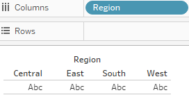
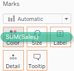
As an example (which you can view in the Chapter 01 Starter workbook on the Measures and Dimensions sheet), consider a view created using the Region fields and Sales from the Superstore connection: 
The ![]() field is used as a measure in this view. Specifically, it is being aggregated as a
field is used as a measure in this view. Specifically, it is being aggregated as a
sum![]() . When you use a field as a measure in the view, the type aggregation (for example, SUM , MIN , MAX , and AVG ) will be shown on the active field. Note that in the preceding example, the active field on rows clearly indicates the sum aggregation of Sales : SUM(Sales) .
. When you use a field as a measure in the view, the type aggregation (for example, SUM , MIN , MAX , and AVG ) will be shown on the active field. Note that in the preceding example, the active field on rows clearly indicates the sum aggregation of Sales : SUM(Sales) .
The ![]() field is a dimension with one of four values for each record of data: Central, East, South, or West. When the field is used as a dimension in the view, it slices the measure. So, instead of an overall sum of sales, the preceding view shows the sum of sales for each region.
field is a dimension with one of four values for each record of data: Central, East, South, or West. When the field is used as a dimension in the view, it slices the measure. So, instead of an overall sum of sales, the preceding view shows the sum of sales for each region.![]()
Discrete and continuous fields
Another important distinction to make with fields is whether a field is being used as discrete or continuous. Whether a field is discrete or continuous, determines how Tableau visualizes it based on where it is used in the view. Tableau will give a visual indication of the default for a field (the color of the icon in the data pane) and how it is being used in the view (the color of the active field on a shelf). Discrete fields, such as Region in the previous example, are blue. Continuous fields, such as Sales, are green.
Discrete fields
Discrete (blue, group/classification) fields have values that are shown as distinct and separate from one another. Discrete values can be reordered and still make sense. For example, you could easily rearrange the values of Region to be East, South, West, and Central, instead of the default order in the preceding screenshot.
When a discrete field is used on the Rows or Columns shelves, the field defines headers. Here, the discrete field Region defines column headers: (Note: click Hide Title on the drag down menu ![]() )
) vs (row headers)
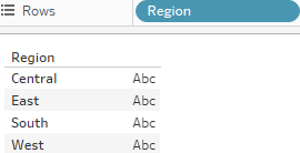
When used for color, a Discrete field defines a discrete color palette in which each color aligns with a distinct value of the field: (drag the Region and then drop it to the ![]() )
)
Continuous fields
Continuous (green) fields have values that flow from first to last as a continuum. Numeric and date fields are often (though not always) used as continuous fields in the view. The values of these fields have an order that it would make little sense to change.
When used on Rows or Columns, a continuous field defines an axis:  vs
vs
When used for color, a continuous field defines a gradient:
drag the Sales and then drop it to the ![]() <==
<== , then click "Edit Colors..." on the drop down Menu
It is very important to note that continuous and discrete are different concepts from Measure and Dimension. While most dimensions(group/classification) are discrete by default, and most measures(aggregation) are continuous by default, it is possible to use any measure as a discrete field and some dimensions as continuous fields in the view.
Tips:
- To change the default of a field, right-click the field in the data pane and select Convert to Discrete(such as Sales) or Convert to Continuous(such as Order Date).
- To change how a field is used in the view, right-click the field in the view and select Discrete or Continuous.
Alternatively, you can drag and drop the fields between Dimensions and Measures in the data pane.
In general, you can think of the differences between the types of fields as follows:
- Choosing between dimension and measure tells Tableau how to slice or aggregate the data
- Choosing between discrete and continuous tells Tableau how to display the data with a header(legend) or an axis and defines individual colors or a gradient.
Visualizing data
A new connection to a data source is an invitation[ˌɪnvɪˈteɪʃn]请求,邀请 to explore and discover! At times, you may come to the data with very well-defined questions and a strong sense of what you expect to find. Other times, you will come to the data with general questions and very little idea of what you will find. The visual analytics capabilities of Tableau empower you to rapidly and iteratively explore the data, ask new questions, and make new discoveries.
The following visualization examples cover a few of the most foundational visualization types. As you work through the examples, keep in mind that the goal is not simply to learn how to create a specific chart. Rather, the examples are designed to help you think through the process of asking questions of the data and getting answers through iterations of visualization. Tableau is designed to make that process intuitive, rapid, and transparent.
Something that is far more important than memorizing the steps to create a specific chart type is understanding how and why to use Tableau to create a bar chart, and adjusting your visualization to gain new insights as you ask new questions.
Bar charts
Bar charts visually represent data in a way that makes the comparing of values across different categories easy. The length of the bar is the primary means by which you will visually understand the data. You may also incorporate color, size, stacking, and order to communicate additional attributes and values.
Creating bar charts in Tableau is very easy. Simply drag and drop the measure you want to see onto either the Rows or Columns shelf and the dimension that defines the categories onto the opposing Rows or Columns shelf.
As an analyst for Superstore , you are ready to begin a discovery process focused on sales (especially the dollar value of sales). As you follow the examples, work your way through the sheets in the Chapter 01 Starter workbook. The Chapter 01 Complete workbook contain, the complete examples so you can compare your results at any time:
- Click on the the Sales by Department tab to view that sheet.

- Drag and drop the Sales field from Measures in the data pane onto the Columns shelf. You now have a bar chart with a single bar representing the sum of sales for all the data in the data source.
- Drag and drop the Department field from Dimensions in the data pane to the Rows shelf. This slices the data to give you three bars, each having a length that corresponds to the sum of sales for each department:

the technology department has more total sales than either the furniture or office supplies departments
You now have a horizontal bar chart. This makes comparing the sales between the departments easy. The mark type drop-down menu on the Marks card is set to Automatic and shows an indication that Tableau has determined that bars are the best visualization given the fields you have placed in the view.
- As a dimension, the Department slices the data.
Being discrete, it defines row headers for each department in the data. - As a measure, the Sales field is aggregated.
Being continuous, it defines an axis.
The mark type of bar causes individual bars for each department to be drawn from 0 to the value of the sum of sales for that department.
Typically, Tableau draws a mark (such as a bar, a circle, a square) for every intersection of dimensional values in the view. In this simple case, Tableau is drawing a single bar mark for each dimensional value (Furniture, Office Supplies, and Technology) of Department. The type of mark is indicated and can be changed in the drop-down menu on the Marks card. The number of marks drawn in the view can be observed on the lower-left status bar. ![]()
Tableau draws different marks in different ways; for example, bars are drawn from 0 (or the end of the previous bar, if stacked) along the axis. (Show Me ==> stacked bars)
You can use Ctrl+Shift+B to change the size of the pie chart
Circles and other shapes are drawn at locations defined by the value(s) of the field defining the axis.
Take a moment to experiment with selecting different mark types from the drop-down menu on the Marks card. Having an understanding of how Tableau draws different mark types will help you master the tool.
Iterations of bar charts for deeper analysis
Using the preceding bar chart, you can easily see that the technology department has more total sales than either the furniture or office supplies departments. What if you want to further understand sales amounts for departments across various regions? Follow these two steps:
- 1. Navigate to the Bar Chart (two levels) sheet, where you will find an initial view identical to the one you created earlier

- 2. Drag the Region field from Dimensions in the data pane to the Rows shelf and
drop it to the left of the Department field already in view
You still have a horizontal bar chart, but now you've introduced引入 Region as another dimension that changes the level of detail in the view and further slices the aggregate of the sum of sales. By placing Region before Department , you are able to easily compare the sales of each department within a given region. - 3. Drag the Department field from Dimensions in the data pane to the Marks shelf and
drop it to the drop it to the Color shelf

Now you are starting to make some discoveries. For example: the Technology department has the most sales in every region, except in the East, where Furniture had higher sales. Office Supplies never has the highest sales in any region.
Let's take a look at a different view, using the same fields arranged differently:
- 1. Navigate to the Bar Chart (stacked) sheet, where you will find a view identical to the original bar chart.

- 2. Drag the Region field from the Rows shelf and drop it on to the Color shelf:

Stacked bars can be useful when you want to understand part-to-whole relationships. It is now fairly easy to see what portion of the total sales of each department is made in each region. However, it is very difficult to compare sales for most of the regions across departments.
For example, can you easily tell which department had the highest sales in the East region? It is difficult because, with the exception of West, every segment of the bar has a different starting place.
Instead of a side-by-side bar chart, you now have a stacked bar chart. Each segment of the bar is color-coded by the Region field. Additionally, a color legend has been added to the workspace. You haven't changed the level of detail in the view, so sales are still summed for every combination of region and department:
The View Level of Detail is a key concept when working with Tableau. In most basic visualizations,
- the combination of values of all the dimensions in the view defines the lowest level of detail for that view.
- All measures will be aggregated or sliced by the lowest level of detail.
- In the case of most simple views, the number of marks (indicated in the lower-left status bar) corresponds to the number of intersections of dimensional values. That is, there will be one mark for each combination of dimension values.
If Department is the only field used as a dimension, you will have a view at the department level of detail, and all measures in the view will be aggregated per department.
If Region is the only field used as a dimension, you will have a view at the region level of detail, and all measures in the view will be aggregated per region.
If you use both Department and Region as dimensions in the view, you will have a view at the level of department and region. All measures will be aggregated per unique combination of department and region, and there will be one mark for each combination of department and region.
- 3. Navigate to the Bar Chart (experimentation) sheet.

- 4. Drag and drop Sales from the Measures section of the data pane on top of the Region field on the Marks card.

- Drag the Sales field to Color if necessary, and notice how the color legend is a gradient for the continuous field.

Line charts
Line charts connect related marks in a visualization to show movement or relationship between those connected marks. The position of the marks and the lines that connect them are the primary means of communicating the data. Additionally, you can use size and color to communicate additional information.
The most common kind of line chart is a Time Series. A time series shows the movement of values over time. Creating one in Tableau requires only a date and a measure.
- 1. Navigate to the Sales over time sheet.

- 2. Drag the Sales field from Measures to Rows. This gives you a single, vertical bar representing the sum of all sales in the data source.
- 3. To turn this into a time series, you must introduce a date. Drag the Order Date field from Dimensions in the data pane on the left and drop it into Columns. Tableau has a built-in date hierarchy, and the default level of Year has given you a line chart connecting four years. Notice that you can clearly see an increase in sales year after year:


- 4. Use the drop-down menu on the YEAR(Order Date) field on Columns (or right-click the field) and switch the date field to use Quarter. You may notice that Quarter is listed twice in the drop-down menu. We'll explore the various options for date parts, values, and hierarchies in the Visualizing Dates and Times section of Chapter 3 , Venturing on to Advanced Visualizations. For now, select the second option:
Notice that the cyclical pattern周期性模式 is quite evident[ˈevɪdənt]清楚的,显然的 when looking at sales by quarter:
Iterations of line charts for deeper analysis
Right now, you are looking at the overall sales over time. Let's do some analysis at a slightly deeper level:
- 1. Navigate to the Sales over time (overlapping lines) sheet, where you will find a view identical to the one you just created.

- 2. Drag the Region field from Dimensions to Color. Now you have a line per region, with each line a different color, and a legend indicating which color is used for which region. As with the bars, adding a dimension to color splits the marks.
 However, unlike the bars, where the segments were stacked, the lines are not stacked. Instead, the lines are drawn at the exact value for the sum of sales for each region and quarter. This allows for easy and accurate comparison. It is interesting to note that the cyclical pattern can be observed for each region:
With only four regions, it's fairly easy to keep the lines separate. But what about dimensions that have even more distinct values? The steps are as follows:
- 1. Navigate to the Sales over time (multiple rows) sheet, where you will find a view identical to the one you just created.

- 2. Drag the Category field from Dimensions and drop it directly on top of the Region field currently on the Marks card. This replaces the Region field with Category.
 You now have 17 overlapping lines. Often, you'll want to avoid more than two or three overlapping lines.
But you might also consider using color or size to showcase an important line in the context of the others.
Also note that clicking an item in the color legend will highlight the associated line in the view. Highlighting is an effective way to pick out a single item and compare it to all the others. - 3. Drag the Category field from Color on the Marks card and drop it into Rows.
 You now have a line chart for each category. Now you have a way of comparing each product over time without an overwhelming overlap, and you can still compare trends and patterns over time. This is the start of a spark-lines visualization that will be developed more fully in the Advanced Visualizations section of Chapter 11 , Advanced Visualizations, Techniques, Tips, and Tricks.
Geographic visualizations
In Tableau, the built-in geographic database recognizes geographic roles for fields, such as Country , State , City , Airport , Congressional District[kənˌɡreʃənl ˈdɪstrɪkt]国会选区, or Zip Code . Even if your data does not contain latitude and longitude values, you can simply use geographic fields to plot locations on a map. If your data does contain latitude and longitude fields, you may use those instead of the generated values.
Tableau will automatically assign geographic roles to some fields based on a field name and a sampling of values in the data. You can assign or reassign geographic roles to any field by right-clicking the field in the data pane and using the Geographic Role option. This is also a good way to see what built-in geographic roles are available.
Tableau can also read shape files and geometries from some databases. These and other geographic capabilities will be covered in more detail in the Mapping Techniques section of Chapter 11 , Advanced Visualizations, Techniques, Tips, and Tricks. In the following examples, we'll consider some of the key concepts of geographic visualizing.
Geographic visualization is incredibly[ɪnˈkredəbli]难以置信地,非常地 valuable when you need to understand where things happen and whether there are any spatial relationships within the data. Tableau offers three main types of geographic visualization:
- Filled maps (simply referred to as maps in the Tableau interface)
- Symbol maps
- Density maps
Filled maps
Filled maps fill areas such as countries, states, counties, or ZIP codes to show a location. The color that fills the area can be used to encode values, most often of aggregated measures but sometimes also dimensions. These maps are also called choropleth maps地区分布图 ; 面量图.
Let's say you want to understand sales for Superstore and see whether there are any patterns geographically. You might take an approach similar to the following:
- 1. Navigate to the Sales by State sheet.

- 2. Double-click the State field in the data pane. Tableau automatically creates a geographic visualization using the Latitude (generated) , Longitude (generated) , and State fields.
- 3. Drag the Sales field from the data pane and drop it on the Color shelf on the Marks card. Based on the fields and shelves you've used, Tableau has switched the automatic mark type to Map:

The filled map fills each state with a single color to indicate the relative sum of sales for that state. The color legend, now visible in the view, gives the range of values and indicates that the state with the least sales had a total of 1,316,665 and and the state with the most sales had a total of 82,042,980.
When you look at the number of marks displayed in the bottom status bar, you'll see that it is 49. Careful examination reveals that the marks consist of the lower 48 states and Washington DC; Hawaii and Alaska are not shown.
Tableau will only draw a geographic mark, such as a filled state, if it exists in the data and is not excluded by a filter.
Observe that the map does display Canada, Mexico, and other locations not included in the data. These are part of a background image retrieved from an online map service. The state marks are then drawn on top of the background image. We'll look at how you can customize the map and even use other map services in the Mapping Techniques section of Chapter 11 , Advanced Visualizations, Techniques, Tips, and Tricks.
Filled maps can work well in interactive dashboards and have quite a bit of aesthetic[iːsˈθetɪk]美学 value. However, certain kinds of analyses[əˈnæləsiːz]分析 are very difficult with filled maps. Unlike other visualization types, where size can be used to communicate facets of the data, the size of a filled geographic region only relates to the geographic size and can make comparisons difficult. For example: which state has the highest sales? You might be tempted[ˈtemptɪd]被引诱 (而想做) 的,禁不住 to say Texas or California because they appear larger, but would you have guessed Massachusetts? Some locations may be small enough that they won't even show up compared to larger areas. Use filled maps with caution谨慎 and consider pairing them with other visualizations on dashboards for clear communication.
Symbol maps
With symbol maps, marks on the map are not drawn as filled regions; rather, marks are shapes or symbols placed at specific geographic locations. The size, color, and shape may also be used to encode additional dimensions and measures.
Continue your analysis of Superstore sales by following these steps:
- 1. Navigate to the Sales by Postal Code sheet.

- 2. Double-click Postal Code under Dimensions. Tableau automatically adds Postal Code to the Detail of the Marks card and Longitude (generated) and Latitude (generated) to Columns and Rows. The mark type is set to a circle by default, and a single circle is drawn for each postal code at the correct latitude and longitude.

- 3. Drag Sales from Measures to the Size shelf
 on the Marks card. This causes each circle to be sized according to the sum of sales for that postal code.
- 4. Drag Profit from Measures to the Color shelf on the Marks card. This encodes the mark color to correspond to the sum of profit.


You can now see the geographic location of profit and sales at the same time. This is useful because you will see some locations with high sales and low profit, which may require some action措施.
Sometimes, you'll want to adjust the marks on symbol map to make them more visible. Some options include the following:
- If the marks are overlapping, click the Color shelf and set the transparency to somewhere between 50% and 75% (25%<opacity<50%) . Additionally, add a dark border. This makes the marks stand out, and you can often better discern any overlapping marks.
 ==>
==>
- If marks are too small, click on the Size shelf and adjust the slider.
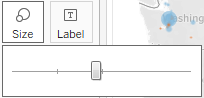 You may also
double-click the size legend and edit the details of how Tableau assigns size.
- If the marks are too faint[feɪnt]模糊的, double-click the color legend and edit the details of how Tableau assigns color. This is especially useful when you are using a continuous field that defines a color gradient.
A combination of tweaking the size and using Stepped Color and Use Full Color Range, as shown here, produced the final result for this example:
Unlike filled maps, symbol maps allow you to use size to visually encode aspects of the data. Symbol maps also allow for greater precision. In fact, if you have latitude and longitude in your data, you can very precisely plot marks at a street address-level of detail. This type of visualization also allows you to map locations that do not have clearly defined boundaries.
Sometimes, when you manually select Map in the Marks card drop-down menu, you will get an error message indicating that filled maps are not supported at the level of detail in the view. In those cases, Tableau is rendering a geographic location that does not have built-in shapes. Other than cases where filled maps are not possible, you will need to decide which type best meets your needs. We'll also consider the possibility of combining filled maps and symbol maps in a single view in later chapters.
Density maps
Density maps show the spread and concentration of values within a geographic area. Instead of individual points or symbols, the marks blend together, showing intensity in areas with a high concentration. You can control color, size, and intensity.
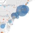
Let's say you want to understand the geographic concentration of orders. You might create a density map using the following steps:
- 1. Navigate to the Density of Orders sheet.

- 2. Double-click the Postal Code field in the data pane. Just as before, Tableau automatically creates a symbol map geographic visualization using the Latitude (generated) , Longitude (generated) , and State fields.
- 3. Using the drop-down menu on the Marks card,
 change the mark type to Density.
  ==>
==>
The individual circles now blend together showing concentrations:
This density map displays a high concentration of orders from the East Coast. Sometimes, you'll see patterns that merely reflect population density—in which case, your analysis may not be particularly meaningful. In this case, the concentration on the East Coast compared to the lack of density on the west coast is intriguing.
Several color palettes are available that work well for density marks (the default ones work well with light color backgrounds, but there are others designed to work with dark color backgrounds). The Intensity slider allows you to determine how intense the marks should be drawn based on concentrations.
Using Show Me
Show Me is a powerful component of Tableau that arranges selected and active fields into the places required for the selected visualization type. The Show Me toolbar displays small thumbnail images of different types of visualizations, allowing you to create visualizations with a single click. Based on the fields you select in the data pane and the fields that are already in view, Show Me will enable possible visualizations and highlight a recommended visualization.
Explore the features of Show Me by following these steps:
- 1. Navigate to the Show Me sheet.

- 2. If the Show Me pane is not expanded, click the Show Me button
 in the upper-right of the toolbar to expand the pane.
 - 3. Press and hold the Ctrl key while clicking the Postal Code, State, and Profit fields in the data pane to select each of those fields. With those fields highlighted, Show Me should look like this:

Notice that the Show Me window has enabled certain visualization types such as text tables, heat maps, symbol maps, filled maps, and bar charts. These are the visualizations that are possible given the fields already in the view, in addition to any selected in the data pane. Show Me highlights the recommended visualization for the selected fields and also gives a description of what fields are required as you hover over each visualization type. Symbol maps, for example, require one geographic dimension and 0 to 2 measures.
Other visualizations are greyed-out, such as lines, area charts, and histograms. Show Me will not create these visualization types with the fields that are currently in the view and selected in the data pane. Hover over the greyed-out line-charts option in Show Me. It indicates that line charts require one or more measures (which you have selected) but also require a date field (which you have not selected).
Tableau will draw line charts with fields other than dates. Show Me gives you options for what is typically considered good practice for visualizations. However, there may be times when you know that a line chart would represent your data better. Understanding how Tableau renders visualizations based on fields and shelves instead of always relying on Show Me will give you much greater flexibility in your visualizations and will allow you to rearrange things when Show Me doesn't give the exact results you want. At the same time, you will need to cultivate[ˈkʌltɪveɪt]培育,培养 an awareness of good visualization practices.
Show Me can be a powerful way to quickly iterate through different visualization types as you search for insights into the data. But as a data explorer, analyst, and story-teller, you should consider Show Me as a helpful guide that gives suggestions. You may know that a certain visualization type will answer your questions more effectively than the suggestions of Show Me. You also may have a plan for a visualization type that will work well as part of a dashboard but isn't even included in Show Me.
You will be well on your way to learning and mastering Tableau when you can use Show Me effectively, but feel just as comfortable building visualizations without it. Show Me is powerful for quickly iterating through visualizations as you look for insights and raise new questions. It is useful for starting with a standard visualization that you will further customize. It is wonderful as a teaching and learning tool.
However, be careful not to use it as a crutch[krʌtʃ]依靠,用拐杖支撑,支持 without understanding how visualizations are actually built from the data. Take time to evaluate why certain visualizations are or are not possible. Pause to see what fields and shelves were used when you selected a certain visualization type.
End the Show Me example by experimenting with Show Me by clicking various visualization types, looking for insights into the data that may be more or less obvious based on the visualization type.
- Circle views
 and box-and-whisker plots
 show the distribution of postal codes for each state.
- Bar charts easily expose several postal codes with negative profit.

Now that you have become familiar with creating individual views of the data, let's turn our attention to putting it all together in a dashboard.
Putting everything together in a dashboard
Often, you'll need more than a single visualization to communicate the full story of the data. In these cases, Tableau makes it very easy for you to use multiple visualizations together on a dashboard. In Tableau, a dashboard is a collection of views, filters, parameters, images, and other objects that work together to communicate a data story. Dashboards are often interactive and allow end users to explore different facets方面 of the data.
Dashboards serve a wide variety of purposes and can be tailored[ˈteɪlərd]定做(衣服),迎合,使适应 to suit a wide variety of audiences. Consider the following possible dashboards:
- A summary-level view of profit and sales to allow executives to have a quick glimpse into the current status of the company
- An interactive dashboard, allowing sales managers to drill into深入了解 sales territories地区,领土 to identify threats or opportunities
- A dashboard allowing doctors to track patient readmissions[ˌriːədˈmɪʃn]重新接纳 , diagnoses, and procedures to make better decisions about patient care
- A dashboard allowing executives of a real-estate company to identify trends and make decisions for various apartment complexes[ˈkɑmpleks]复合物,大楼
- An interactive dashboard for loan officers to make lending decisions based on portfolios broken down细分 by credit ratings and geographic location
Considerations for different audiences and advanced techniques will be covered in detail in Chapter 7 , Telling a Data Story with Dashboards.
The Dashboard interface
When you create a new dashboard, the interface will be slightly different than it is when designing a single view. We'll start designing your first dashboard after a brief look at the interface. You might navigate to the Superstore Sales sheet 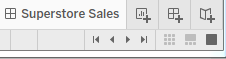 and take a quick look at it yourself.
The dashboard window consists of several key components. Techniques for using these objects will be detailed in Chapter 7 , Telling a Data Story with Dashboards. For now, focus on gaining some familiarity with the options that are available. One thing you'll notice is that the left sidebar has been replaced with dashboard-specific content: and
and
The left side-bar contains two tabs:
- A Dashboard tab, for sizing options(Size) and adding Sheets and Objects to the dashboard
- The Dashboard pane contains options for previewing based on target device along with several sections:
- A Size section, for dashboard sizing options
- A Sheets section, containing all sheets (views) available to place on the
dashboard - An Objects section with additional objects that can be added to the dashboard
- Horizontal and Vertical layout containers will give you finer control over the
layout - Text allows you to add text labels and titles
- An Image and even embedded Web Page content can be added
- A Blank object allows you to preserve blank space in a dashboard, or it can serve as a place holder until additional content is designed
- A Button is an object that allows the user to navigate between dashboards
- An Extension gives you the ability to add controls and objects that you or a third party have developed for interacting with the dashboard and providing
extended functionality - Using the toggle[ˈtɑːɡl] 切换键, you can select whether new objects will be added as Tiled or Floating平铺或浮动.
Tiled objects will snap into a tiled layout next to other tiled objects or within layout containers.
Floating objects will float on top of the dashboard in successive layers连续层.
- Horizontal and Vertical layout containers will give you finer control over the
- The Dashboard pane contains options for previewing based on target device along with several sections:
- A Layout tab, for adjusting the layout of various objects on the dashboard
When a worksheet is first added to a dashboard, any legends, filters, or parameters that were visible in the worksheet view will be added to the dashboard. If you wish to add them at a later point, select the sheet in the dashboard and click the little drop-down caret[ˈkærət]插入符号 on the upper right. Nearly every object has the drop-down caret, providing many options for fine-tuning the appearance and controlling behavior.
Take note of the various User Interface (UI) elements that become visible for selected objects on the dashboard: (double-click Sales by Postal Code on the dashboard)
You can resize an object on the dashboard using the border. The Grip, marked in the screenshot, allows you move the object once it has been placed. We'll consider other options as we go.
Building your dashboard
With an overview of the interface, you are now ready to build a dashboard by following these steps:
- 1. Navigate to the Superstore Sales sheet. You should see a blank dashboard.
- 2. Successively double-click each of the following sheets listed in the Dashboard section on the left: Sales by Department, Sales over time, and Sales by Postal Code. Notice that double-clicking the object adds it to the layout of the dashboard.
- 3. Add a title to the dashboard by checking Show Dashboard title in the lower left of the sidebar.
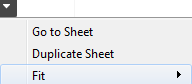
- 4. Select the Sales by Department sheet in the dashboard and click the drop-down arrow to show the menu
 .
.
- 5. Select Fit | Entire View. The Fit options describe how the visualization should fill any available space.
Be careful when using various Fit options.- If you are using a dashboard with a size that has not been fixed
- or if your view dynamically changes the number of items displayed based on interactivity,
- then what might have once looked good might not fit the view nearly as well.
- 5. Select Fit | Entire View. The Fit options describe how the visualization should fill any available space.
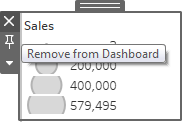
- 6. Select the Sales size legend by clicking it. Use the Remove UI element to remove the legend from the dashboard.
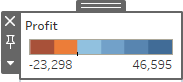
- 7. Select the Profit color legend by clicking it. Use the grip to drag the legend, and place it under the map(Sales by Postal Code).
 ==>
==> ==>
==>
- 8. For each view (Sales by Department, Sales by Postal Code, and Sales over time), select the view by clicking an empty area in the view. Then, click the Use as Filter UI element
 to make that view an interactive filter for the dashboard
 . Your dashboard should look similar to this:
- 9. Take a moment to interact with your dashboard. Click on various marks, such as the bars, states, and points of the line. Notice that each selection filters the rest of the dashboard. Clicking a selected mark will deselect it and clear the filter.
Notice also that selecting marks in multiple views causes filters to work together. For example, selecting the bar for Furniture in Sales by Department and the 2016 Q2 in Sales over time allows you to see all the ZIP codes(in the Sales by Postal Code) that had furniture sales in the first quarter of 2016.
Congratulations! You have now created a dashboard that allows for interactive analysis!
As an analyst for the Superstore chain, your visualizations allowed you to explore and analyze the data. The dashboard you created can be shared with members of management, and it can be used as a tool to help them see and understand the data to make better decisions. When a manager selects the furniture department, it immediately becomes obvious that there are locations where sales are quite high(mark size, here is Circle size) but the profit is actually very low(color)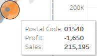 . This may lead to decisions such as a change in marketing or a new sales focus for that location. Most likely, this will require additional analysis to determine the best course of action. In this case, Tableau will empower you to continue the cycle of discovery, analysis, and storytelling.
Summary
Tableau's visual environment allows for a rapid and iterative process of exploring and analyzing data visually. You've taken your first steps toward understanding how to use the platform. You connected to data and then explored and analyzed the data using some key visualization types such as bar charts, line charts, and geographic visualizations. Along the way, you focused on learning the techniques and understanding key concepts such as the difference between measures and dimensions, and discrete and continuous fields. Finally, you put all the pieces together to create a fully functional dashboard that allows an end user to understand your analysis and make discoveries of their own.
In the next chapter, we'll explore how Tableau works with data. You will be exposed to fundamental concepts and practical examples of how to connect to various data sources. Combined with the key concepts you just learned about building visualizations, you will be well equipped to move on to more advanced visualizations, deeper analysis, and telling fully interactive data stories.


 2227
2227


 被折叠的 条评论
为什么被折叠?
被折叠的 条评论
为什么被折叠?
 到【灌水乐园】发言


