


下面是我们作图需要使用到的数据(数据是个人虚构的、不代表各品牌真实销售数据)
| 品牌 | 子品牌 | 销量 | 总销量/台 |
| 比亚迪 | 唐 | 10000 | 29000 |
| 比亚迪 | 宋 | 9000 | 29000 |
| 比亚迪 | 元 | 6000 | 29000 |
| 比亚迪 | 海豚 | 4000 | 29000 |
| 特斯拉 | Model3 | 8000 | 17500 |
| 特斯拉 | ModelS | 6000 | 17500 |
| 特斯拉 | ModelY | 3500 | 17500 |
| 大众 | 朗逸 | 3000 | 12000 |
| 大众 | 速腾 | 3000 | 12000 |
| 大众 | 高尔夫 | 6000 | 12000 |
| 丰田 | 卡罗拉 | 6000 | 12000 |
| 丰田 | 雷凌 | 4000 | 12000 |
| 丰田 | 凯美瑞 | 2000 | 12000 |
| 奇瑞 | 艾瑞泽5 | 1000 | 2000 |
| 奇瑞 | 艾瑞泽8 | 1000 | 2000 |
| 领克 | 领克01 | 1000 | 1000 |
1.各品牌的销售数量饼图
import  pandas as pd
from matplotlib import pyplot as plt

#解决中文乱码
plt.rcParams['font.sans-serif'] = ['SimHei']

data=pd.read_excel(r'汽车销量数据数据.xlsx',sheet_name='Sheet1')

#根据各品牌去重

data_total_sale=data.loc[:,["品牌","总销量"]].drop_duplicates()
print(data_total_sale)
out:

    品牌    总销量
0   比亚迪  29000
4   特斯拉  17500
7    大众  12000
10   丰田  12000
13   奇瑞   2000
15   领克   1000

fig, ax = plt.subplots(figsize=(10, 7))
ax.pie(data_total_sale['总销量'],labels=data_total_sale['品牌'],autopct='%1.1f%%')
plt.show()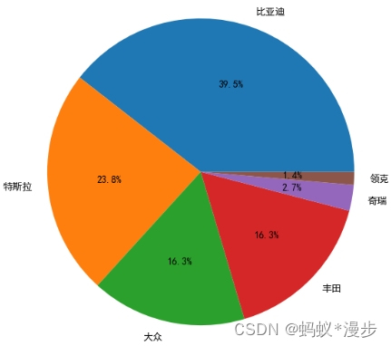
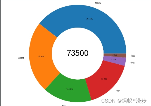
2.各品牌销售数据圆环图
import  pandas as pd
from matplotlib import pyplot as plt

#解决中文乱码
plt.rcParams['font.sans-serif'] = ['SimHei']

data=pd.read_excel(r'汽车销量数据数据.xlsx',sheet_name='Sheet1')

#根据各品牌去重

data_total_sale=data.loc[:,["品牌","总销量"]].drop_duplicates()

total_sale=data_total_sale['总销量'].sum()

fig, ax = plt.subplots(figsize=(10, 7))

ax.pie(data_total_sale['总销量'], radius=1.5, wedgeprops={'width': 0.7}, labels = data_total_sale['品牌'], autopct='%3.2f%%',  pctdistance=0.75)  #保留2位小数
plt.text(0, 0, total_sale, ha='center', va='center', fontsize=28)
plt.show()
3.将数据少的合并为其它
import  pandas as pd
from matplotlib import pyplot as plt

#解决中文乱码
plt.rcParams['font.sans-serif'] = ['SimHei']

data=pd.read_excel(r'汽车销量数据数据.xlsx',sheet_name='Sheet1')

#根据各品牌去重

data_total_sale=data.loc[:,["品牌","总销量"]].drop_duplicates()

others=["奇瑞","领克"]
data_new=data_total_sale.loc[~data['品牌'].isin(others)]
other_sum=data_total_sale['总销量'].loc[data['品牌'].isin(others)].sum()
data_new=data_new.append({"品牌":'其它',"总销量":other_sum},ignore_index=True)
fig, ax = plt.subplots(figsize=(10, 7))
ax.pie(data_new['总销量'],labels=data_new['品牌'],autopct='%1.1f%%')
plt.show()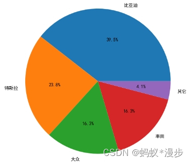
4.其它类中展开
import  pandas as pd
from matplotlib import pyplot as plt
from matplotlib.patches import ConnectionPatch
from matplotlib import cm

#解决中文乱码
plt.rcParams['font.sans-serif'] = ['SimHei']

data=pd.read_excel(r'汽车销量数据数据.xlsx',sheet_name='Sheet1')

#根据各品牌去重

data_total_sale=data.loc[:,["品牌","总销量"]].drop_duplicates()

others=["奇瑞","领克"]
data_new=data_total_sale.loc[~data['品牌'].isin(others)]
other_sum=data_total_sale['总销量'].loc[data['品牌'].isin(others)].sum()
data_new=data_new.append({"品牌":'其它',"总销量":other_sum},ignore_index=True)
data_other=data_total_sale.loc[data['品牌'].isin(others)]
fig = plt.figure(figsize=(10,4))
ax1 = fig.add_subplot(1,2,1)
ax1.pie(data_new['总销量'],labels=data_new['品牌'],autopct='%1.1f%%')
ax2 = fig.add_subplot(1,2,2)
ax2.pie(data_other['总销量'],labels=data_other['品牌'],autopct='%1.1f%%',radius=0.5,wedgeprops=dict(width=0.3, edgecolor='w'))

theta1, theta2 = ax1.patches[-1].theta1+15, ax1.patches[-1].theta2-15
center, r = ax1.patches[-1].center,ax1.patches[-1].r
x = r*np.cos(np.pi/180*theta1)+center[0]
y = np.sin(np.pi/180*theta1)+center[1]
con1 = ConnectionPatch(xyA=(0, 0.5),xyB=(x,y),
                     coordsA=ax2.transData, coordsB=ax1.transData,axesA=ax2,axesB=ax1)

x = r * np.cos(np.pi / 180 * theta2) + center[0]
y = np.sin(np.pi / 180 * theta2) + center[1]
con2 = ConnectionPatch(xyA=(-0.1, -0.49),
                       xyB=(x, y),
                       coordsA=ax2.transData,
                       coordsB=ax1.transData,
                       axesA=ax2, axesB=ax1)
for con in [con1, con2]:
    con.set_color('gray')
    ax2.add_artist(con)
    con.set_linewidth(1)
fig.subplots_adjust(wspace=0)
plt.show()


 84
84

 被折叠的 条评论
为什么被折叠?
被折叠的 条评论
为什么被折叠?
 到【灌水乐园】发言


